Fall 2020
4 weeks
4 weeks
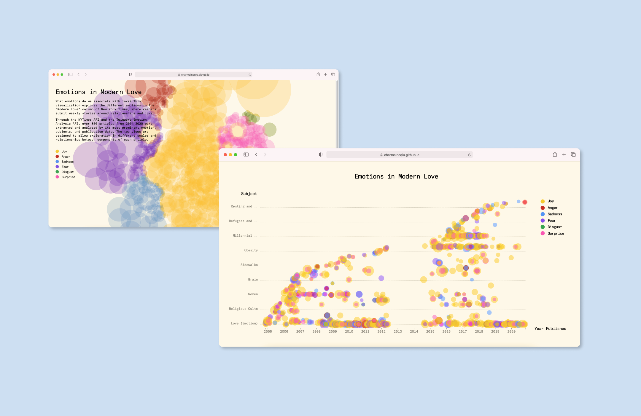
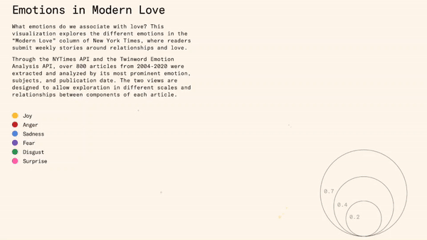
Emotions in Modern Love visualizes what writers associate with “Love”
Modern Love, a weekly column from the NYT, showcases reader-submitted stories about love. These pieces vary in length from short 100-word submissions to longer narratives. Recognizing the diverse and intricate relationships depicted in these entries, our team devised two distinct views to enable exploration at various scales and relationships between components of each article.
I was responsible for designing Web interface prototypes.
Skills
Data Visualization
Web Design
Teammates
Elizabeth Han
Mimi Jiao
Data Visualization
Web Design
Teammates
Elizabeth Han
Mimi Jiao
Site 01
Emotions View
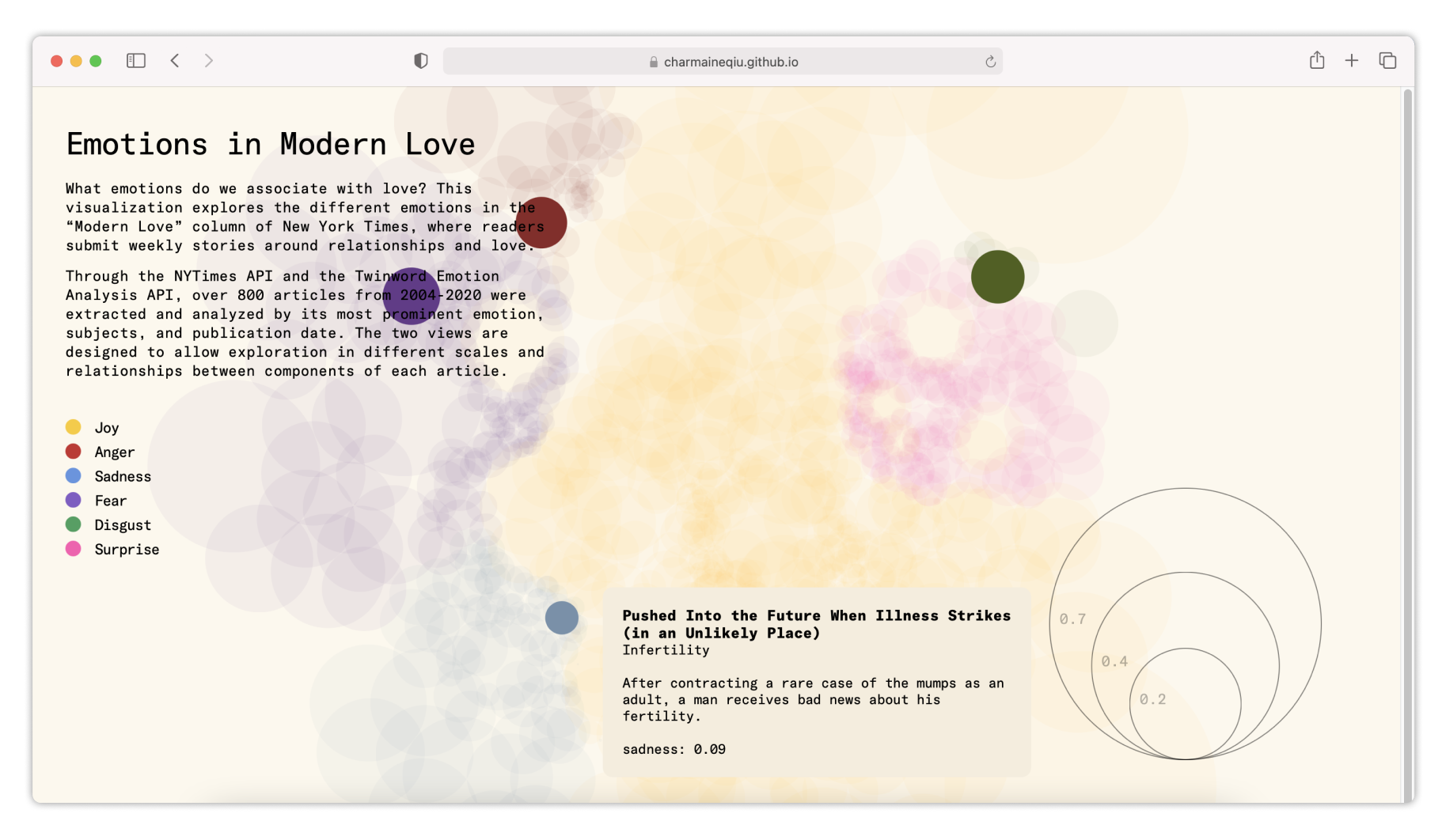
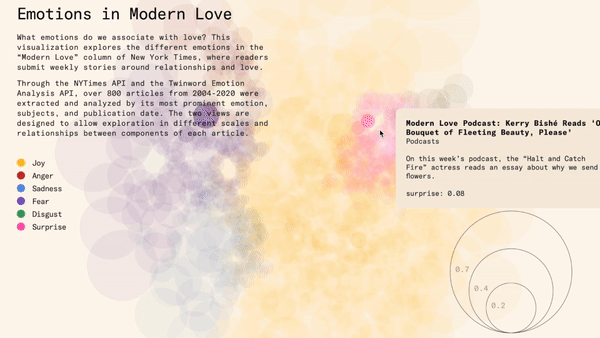
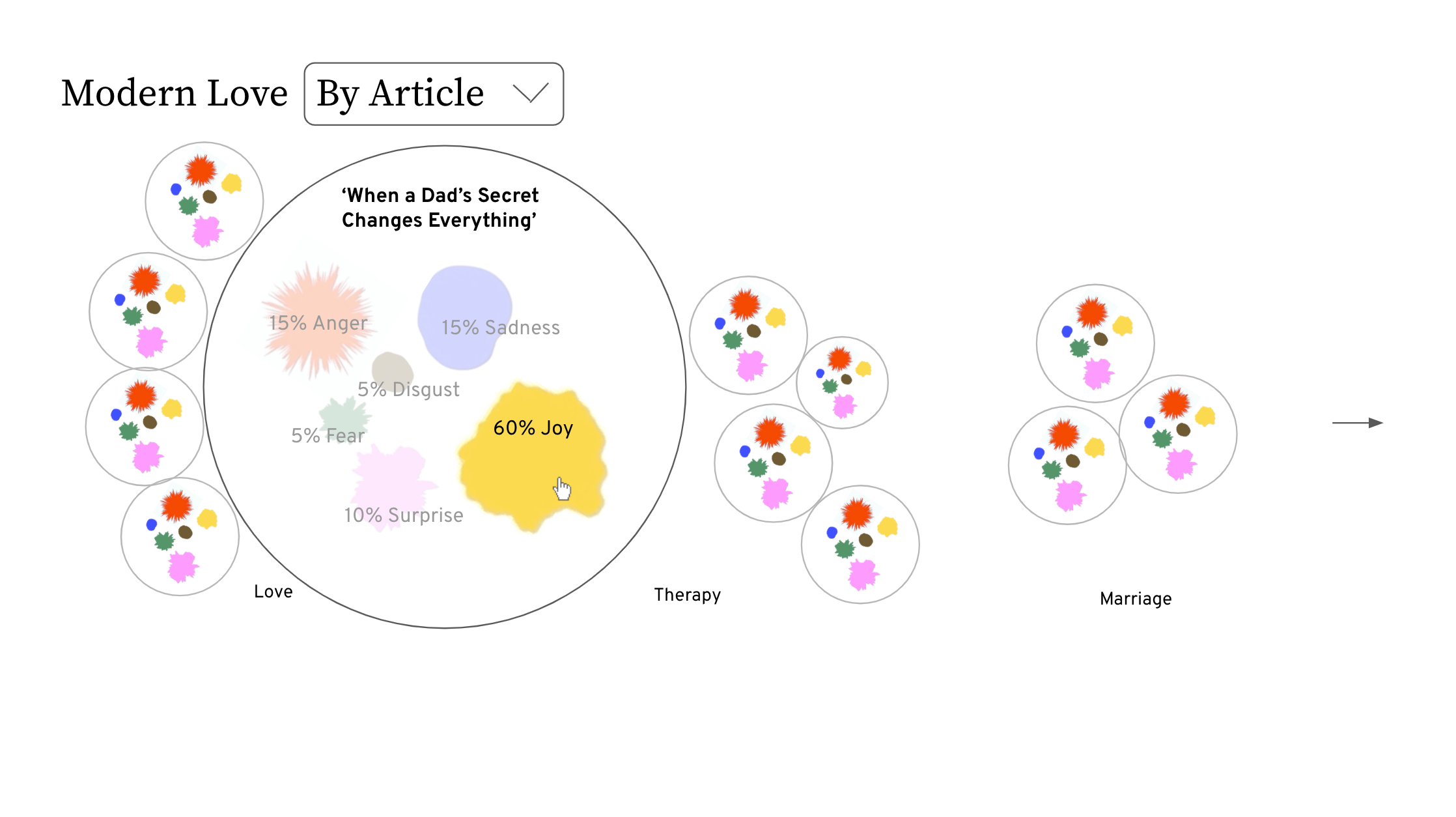
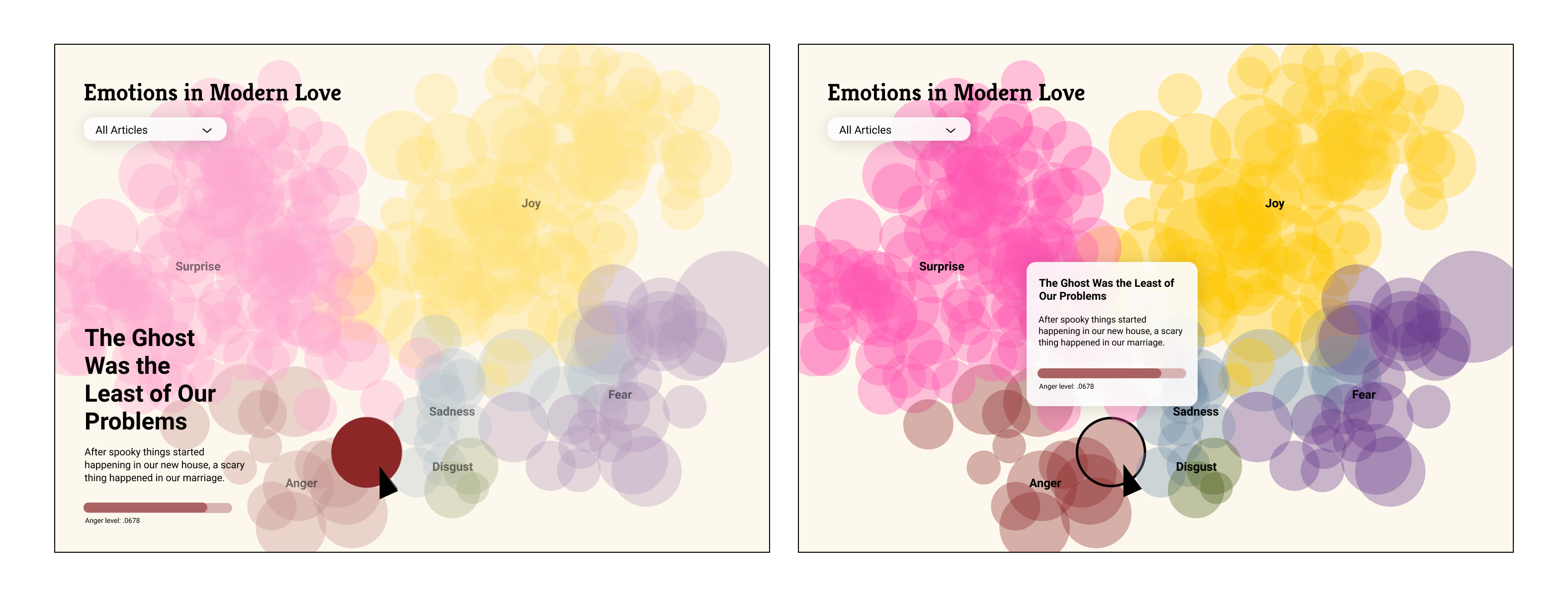
The emotions view presents a visualization of the proportions of six emotions—joy, anger, sadness, fear, disgust, and surprise—that we chose to explore. Each article is represented by a circular shape, allowing viewers to delve into the diverse emotions associated with each piece.
View Website
Emotions View
The emotions view presents a visualization of the proportions of six emotions—joy, anger, sadness, fear, disgust, and surprise—that we chose to explore. Each article is represented by a circular shape, allowing viewers to delve into the diverse emotions associated with each piece.
View Website
Site 02
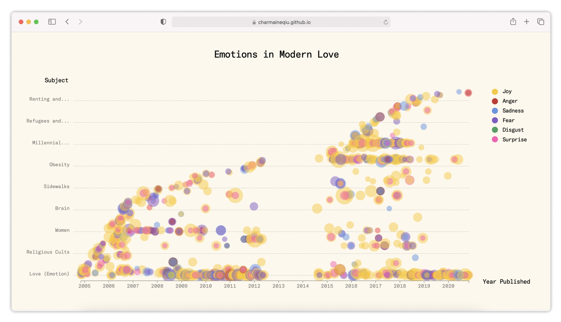
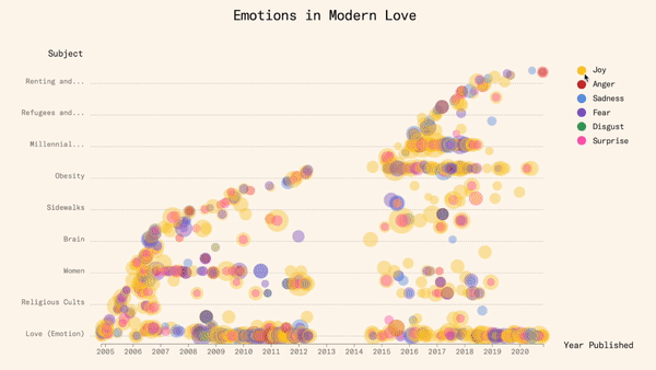
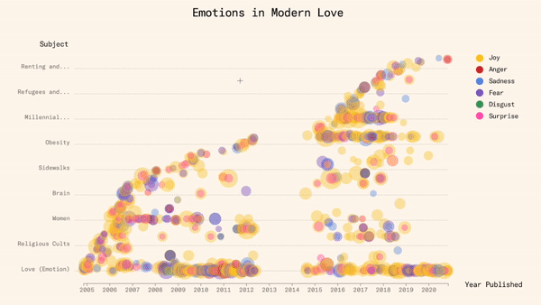
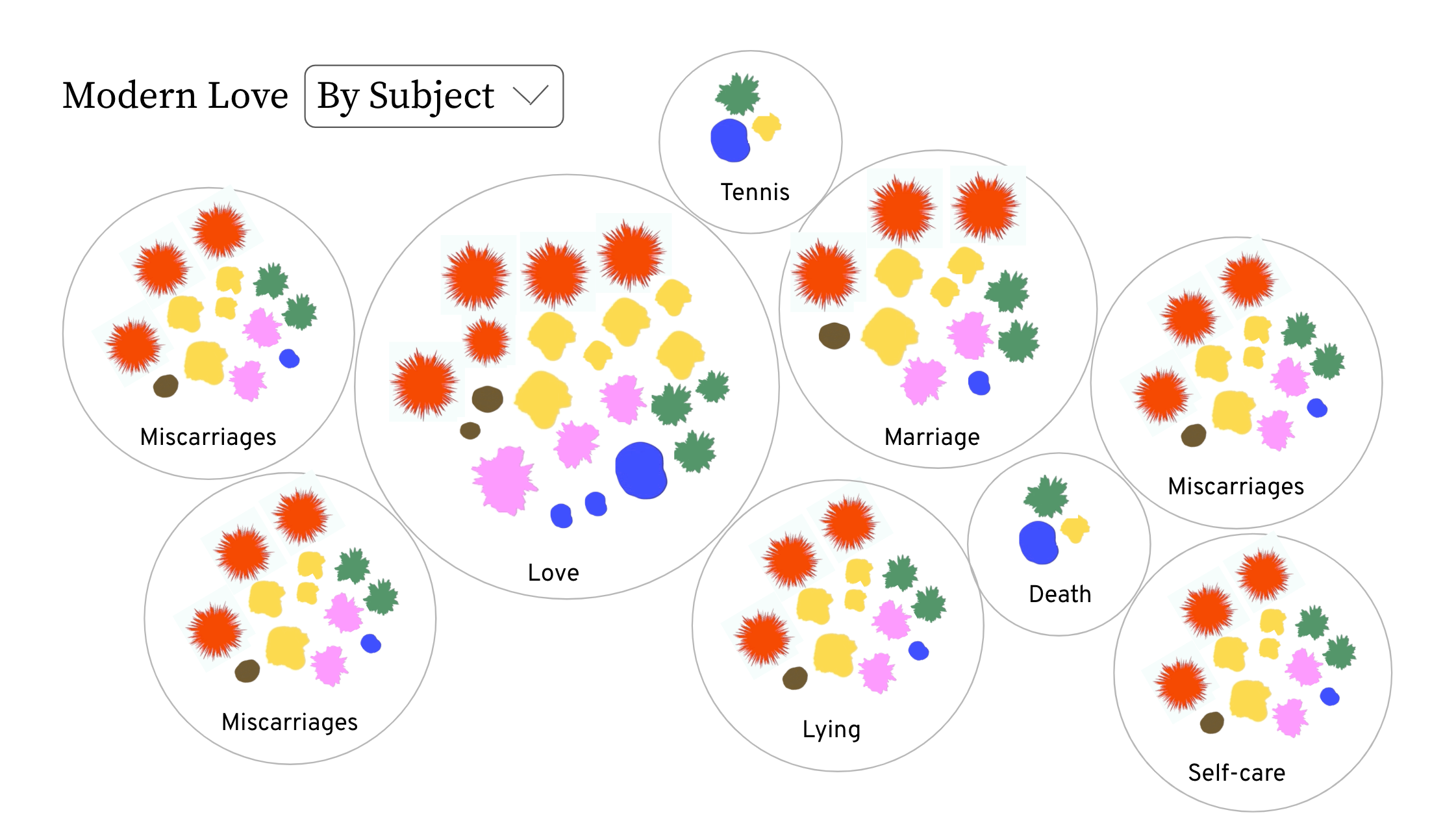
Subject View
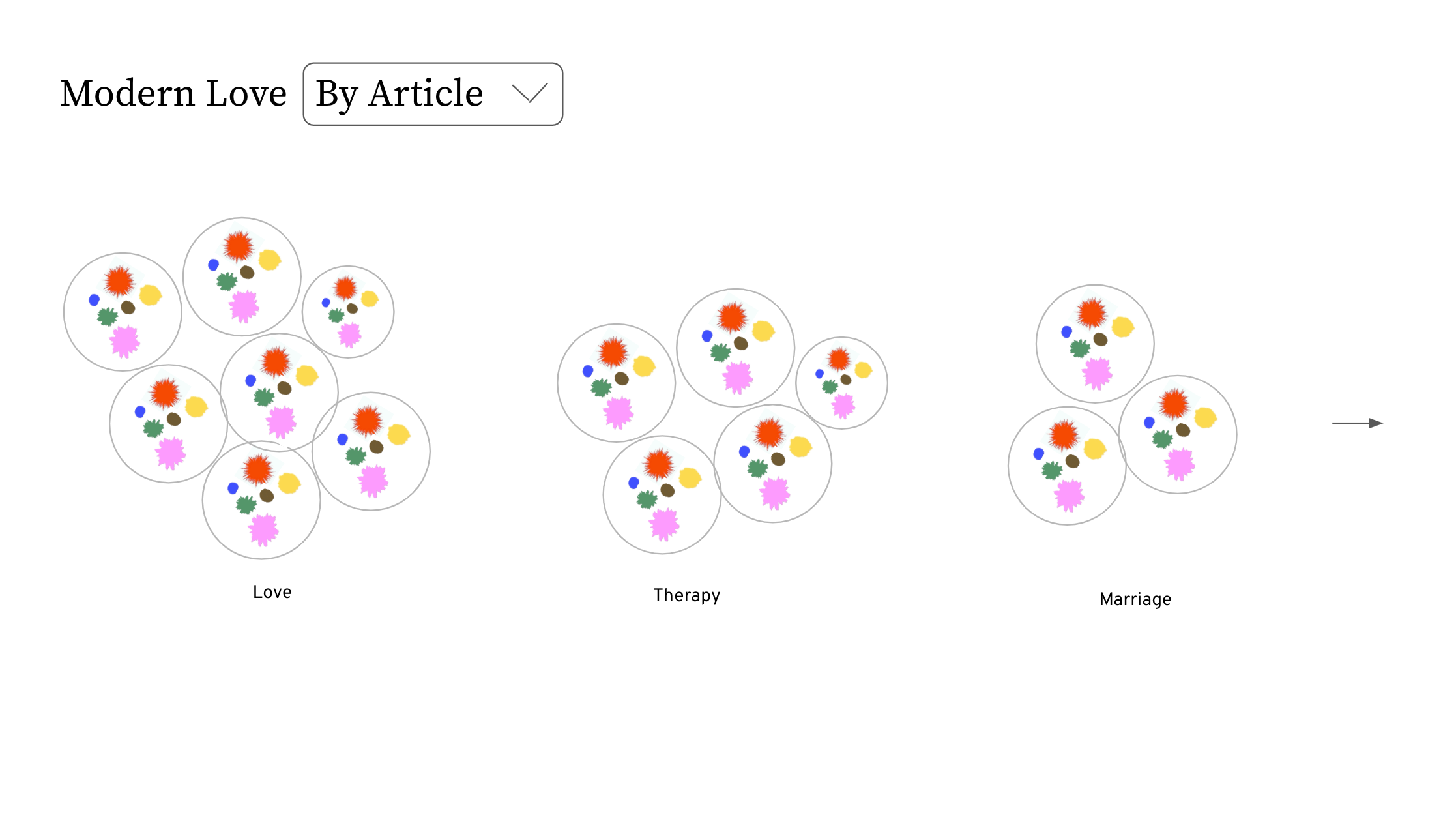
The subjects view enables exploration of the relationship between different subjects and the publication date of each article. Viewers can zoom in and out of the chart to analyze various subjects and observe trends over time.
View Website
Subject View
The subjects view enables exploration of the relationship between different subjects and the publication date of each article. Viewers can zoom in and out of the chart to analyze various subjects and observe trends over time.
View Website

Design Process
Initial explorations
Initial explorations
Our design process commenced with identifying the key elements of "Modern Love" articles that could evoke reflection when represented visually through data. We drew inspiration from organic visualization styles that highlight the human aspects of emotions.
![]()
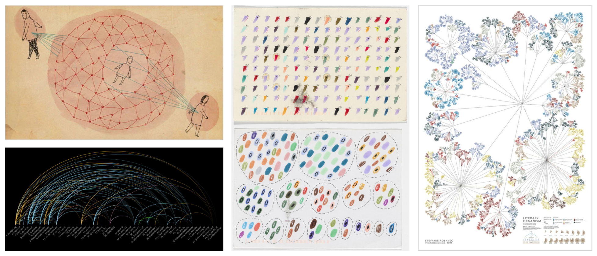
Moodboard
In our initial explorations, we concentrated on methods to organize data and depict emotions in dynamic ways. However, we observed that visual redundancy occurred when the same emotions overlapped across different groupings. Given our aim for users to grasp the diverse emotions and topics within "Modern Love" articles, we opted to design two views with distinct purposes.


Wireframes
We chose colors that are commonly used to identify corresponding emotions, and used opacity to allow overlapping in the visual representation.

Colors
When designing the two different views, we focused on finding ways to present data by the purpose of each view. In the emotions view, we used a macro-view of all articles to help viewers make connections of emotions within an article. On the other hand, the subject's view utilized a graph structure to better present the various subjects and its relationship with the year published.
When designing the two different views, we focused on finding ways to present data by the purpose of each view. In the emotions view, we used a macro-view of all articles to help viewers make connections of emotions within an article. On the other hand, the subject's view utilized a graph structure to better present the various subjects and its relationship with the year published.
Emotions View
![]() Subjects View
Subjects View
![]()
 Subjects View
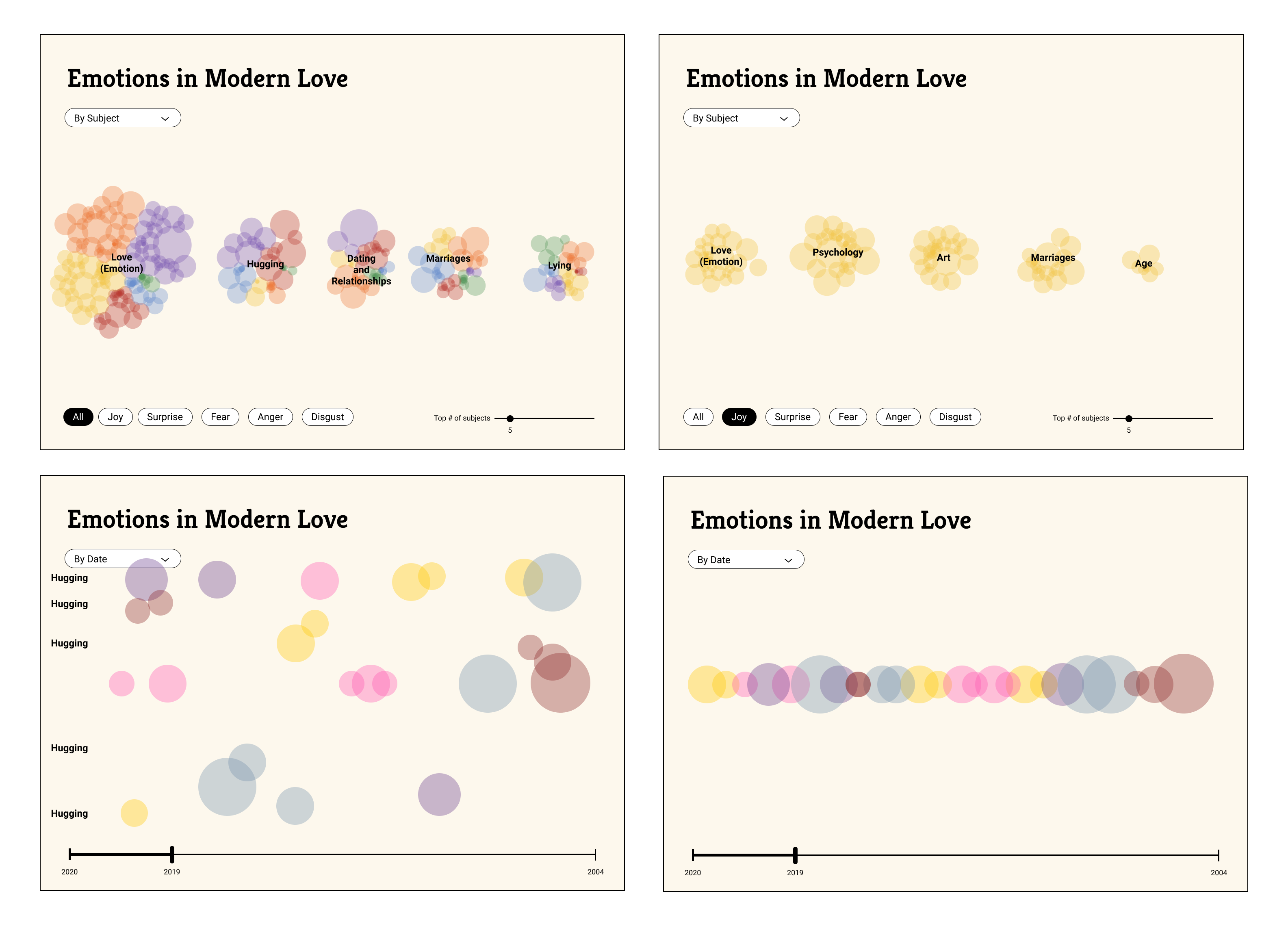
Reflection
Working on this project allowed me to collaborate within a diverse team and appreciate the creative potential of using code as a medium. One significant challenge was integrating data into the design process. Predicting the outcome of screen designs before implementation proved difficult, limiting my ability to wireframe the UI. However, this uncertainty ultimately became a source of beauty in working with data, as we were pleasantly surprised by the visualizations' outcomes.
© CHARMAINE QIU 2025