8 months
2023
2023
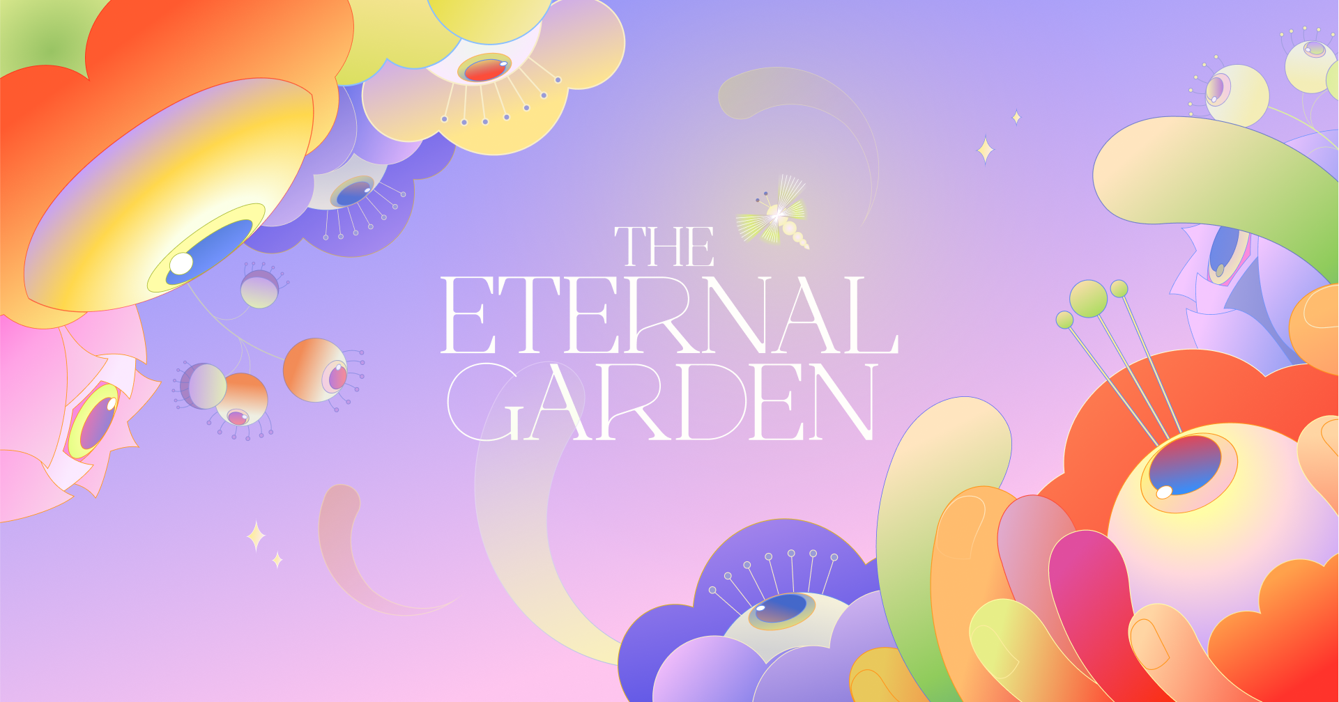
Building a brand for Pittsburgh’s largest fashion show.
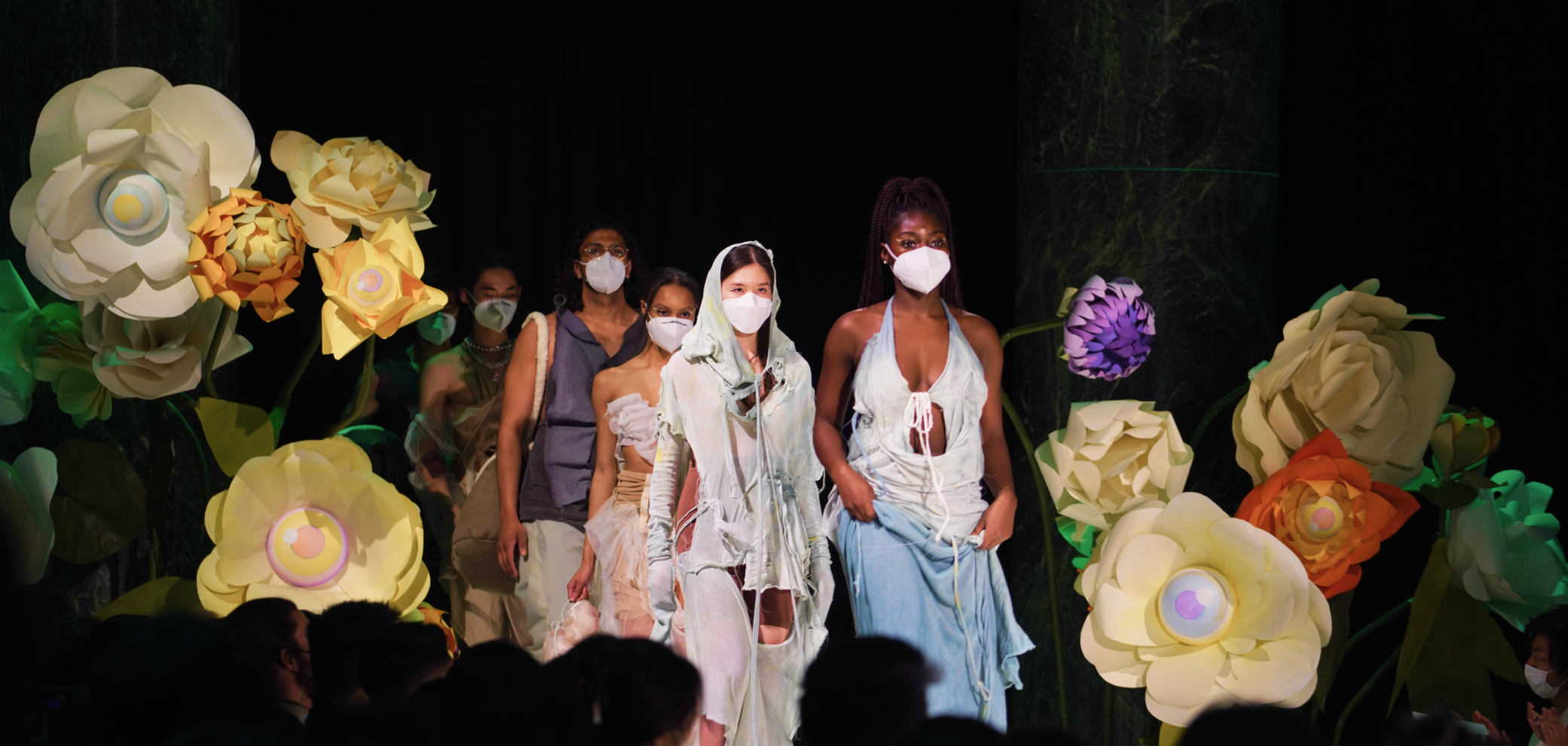
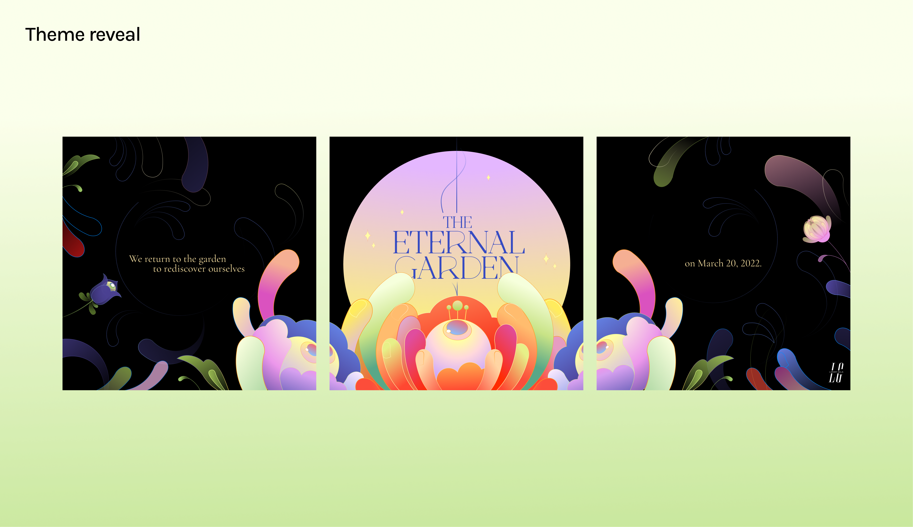
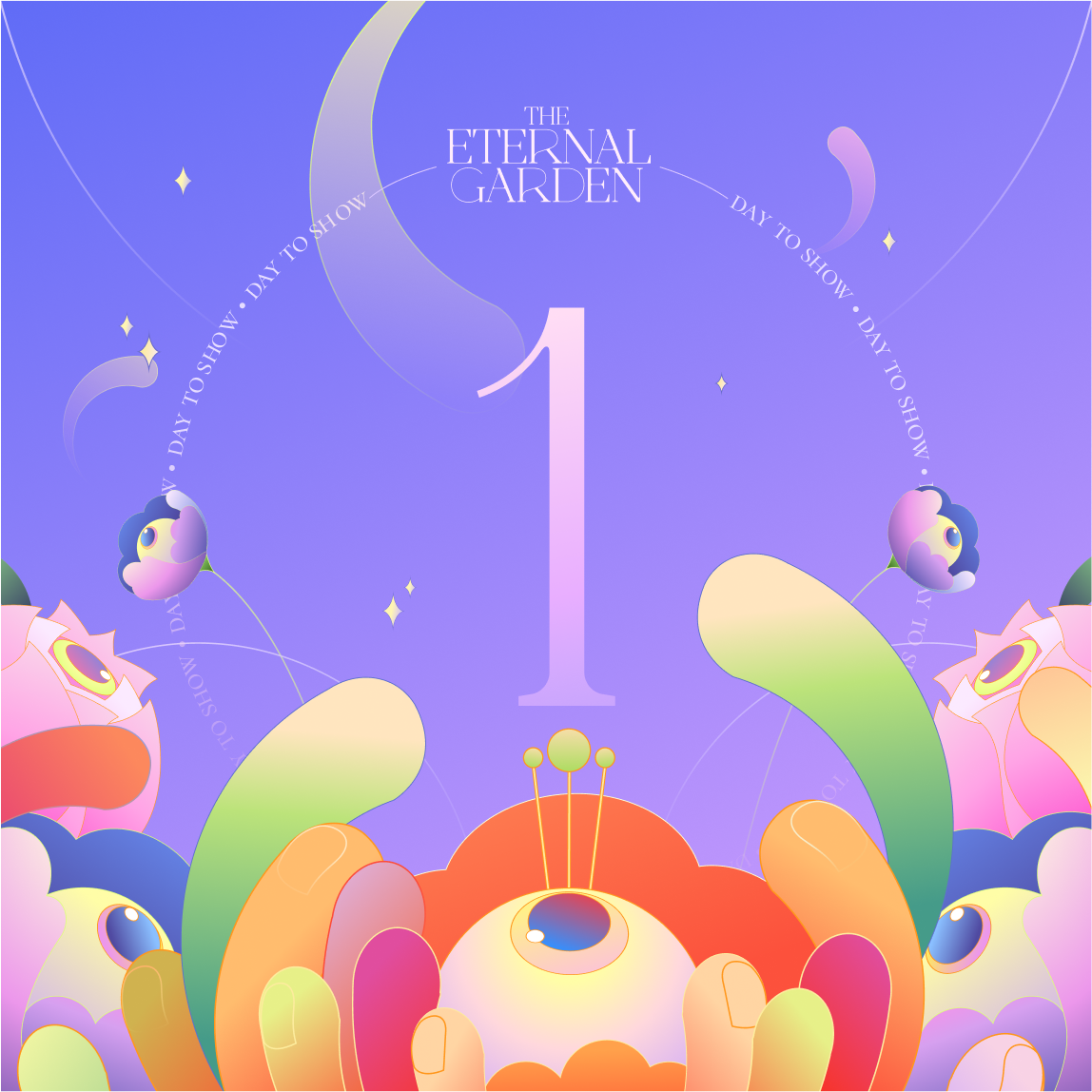
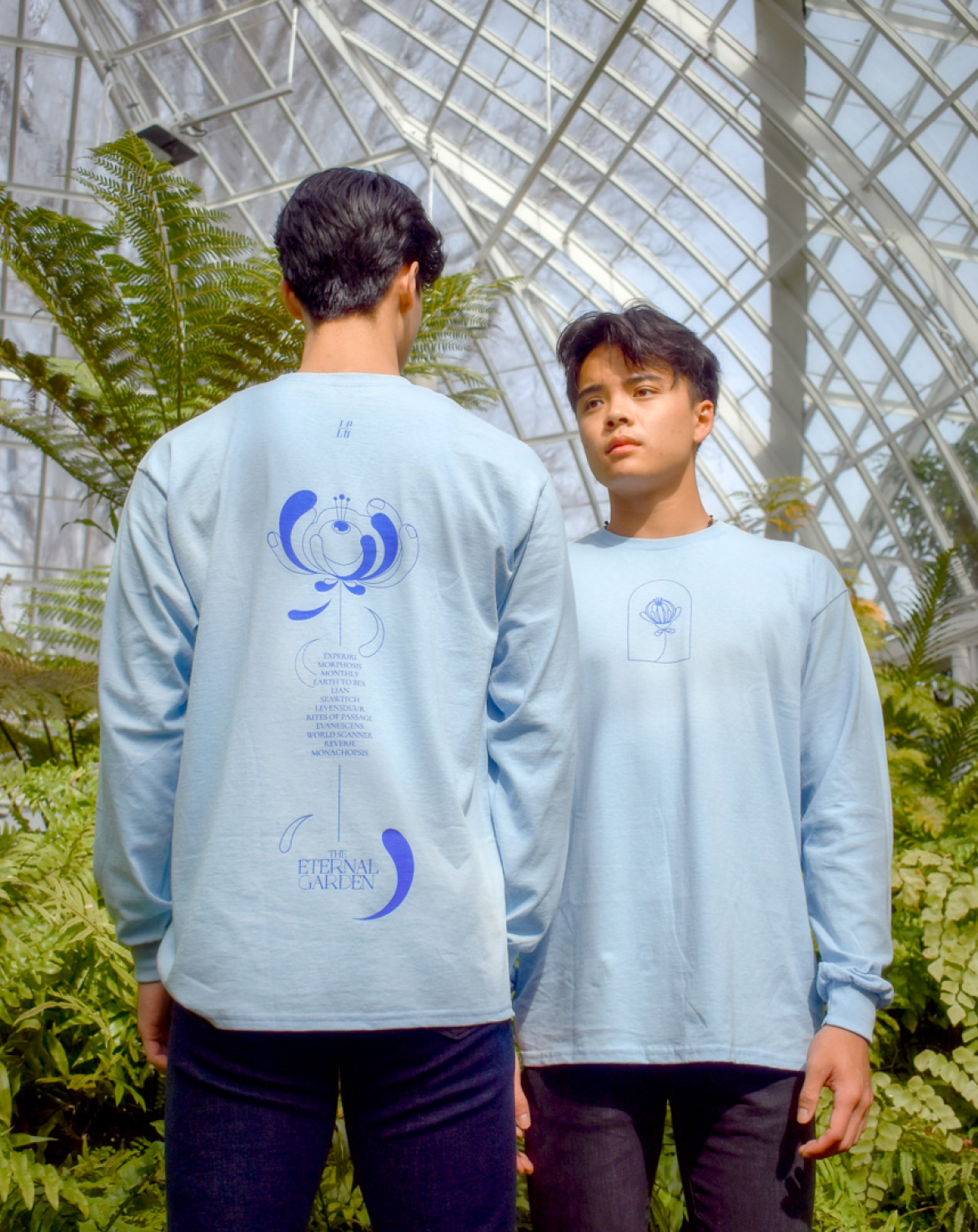
Born in 1996, Lunar Gala is an annual fashion show that showcases brilliant artistry in design, modeling, production, and dance performance. The theme for 2022, The Eternal Garden, celebrates our inner youth.
As a core member of the branding team, I contributed by exploring visual directions and creating both print and digital deliverables for various visual touchpoints surrounding the event.
Skills
Graphic Design
Illustration
Print Design
Motion Graphics
Teammates
Ricky Chen
Jacky Lococo
Maggie Ma
Francis Park
Elysha Tsai
Ethan Yang
Graphic Design
Illustration
Print Design
Motion Graphics
Teammates
Ricky Chen
Jacky Lococo
Maggie Ma
Francis Park
Elysha Tsai
Ethan Yang
The Eternal Garden Identity
Rediscovering the Inner Child Within
The Eternal Garden is a journey back to the garden within each of us. Here, we tend to the flowers, dance across the grass, and feel the warmth of youth upon our skin. In this mysterious yet familiar world, we rediscover our inner child...
Inspired by the whimsicality of youth, our visual system for The Eternal Garden uses a vibrant palette and quirky flower illustrations to evoke a sense of wonder and discovery. These lively elements are balanced with elegant patterns and refined typography, blending joy with sophistication.
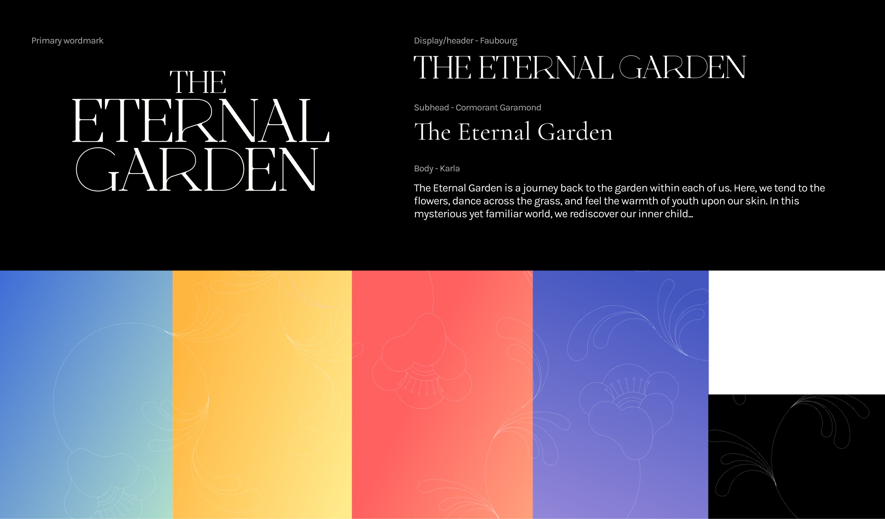

We designed three tiers of illustrations to create versatile hierarchies with both type and image.

Design Output
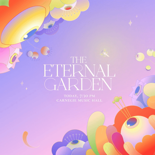
Before the show, we promoted the event through various digital touchpoints
We used digital platforms as our main promotional strategy, leveraging social media and a branded website to spread awareness among the student body and the Pittsburgh community.
We used digital platforms as our main promotional strategy, leveraging social media and a branded website to spread awareness among the student body and the Pittsburgh community.
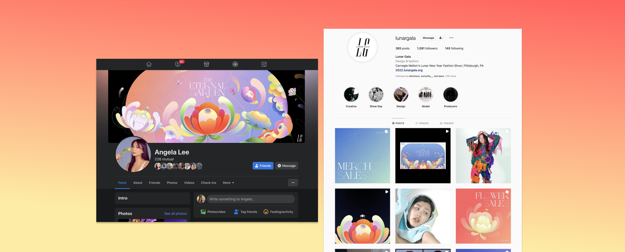
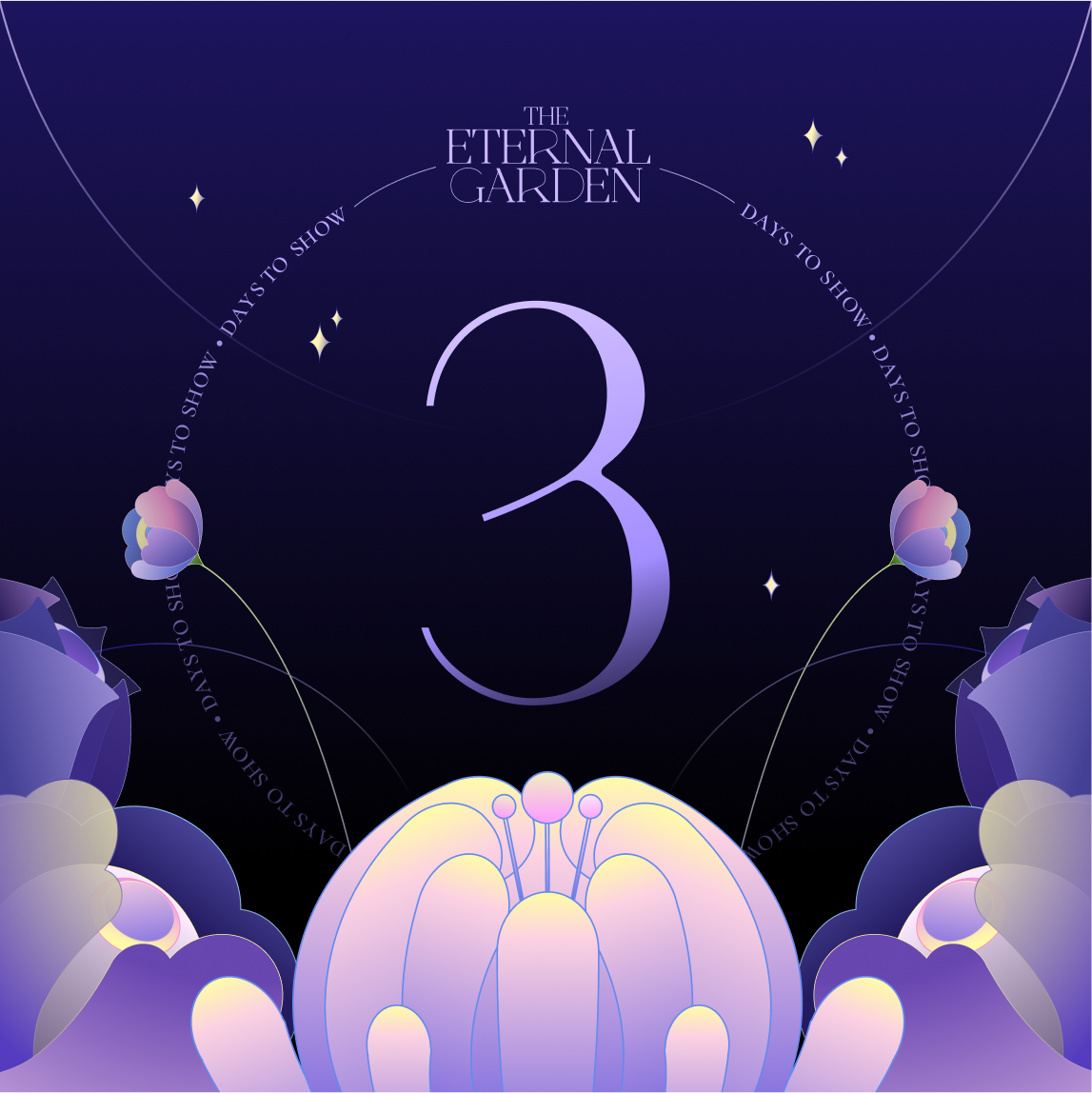
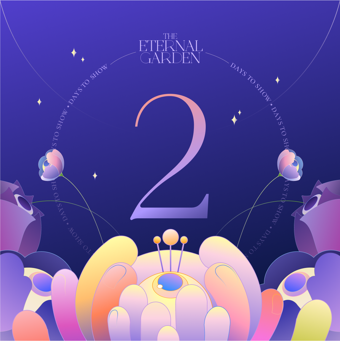
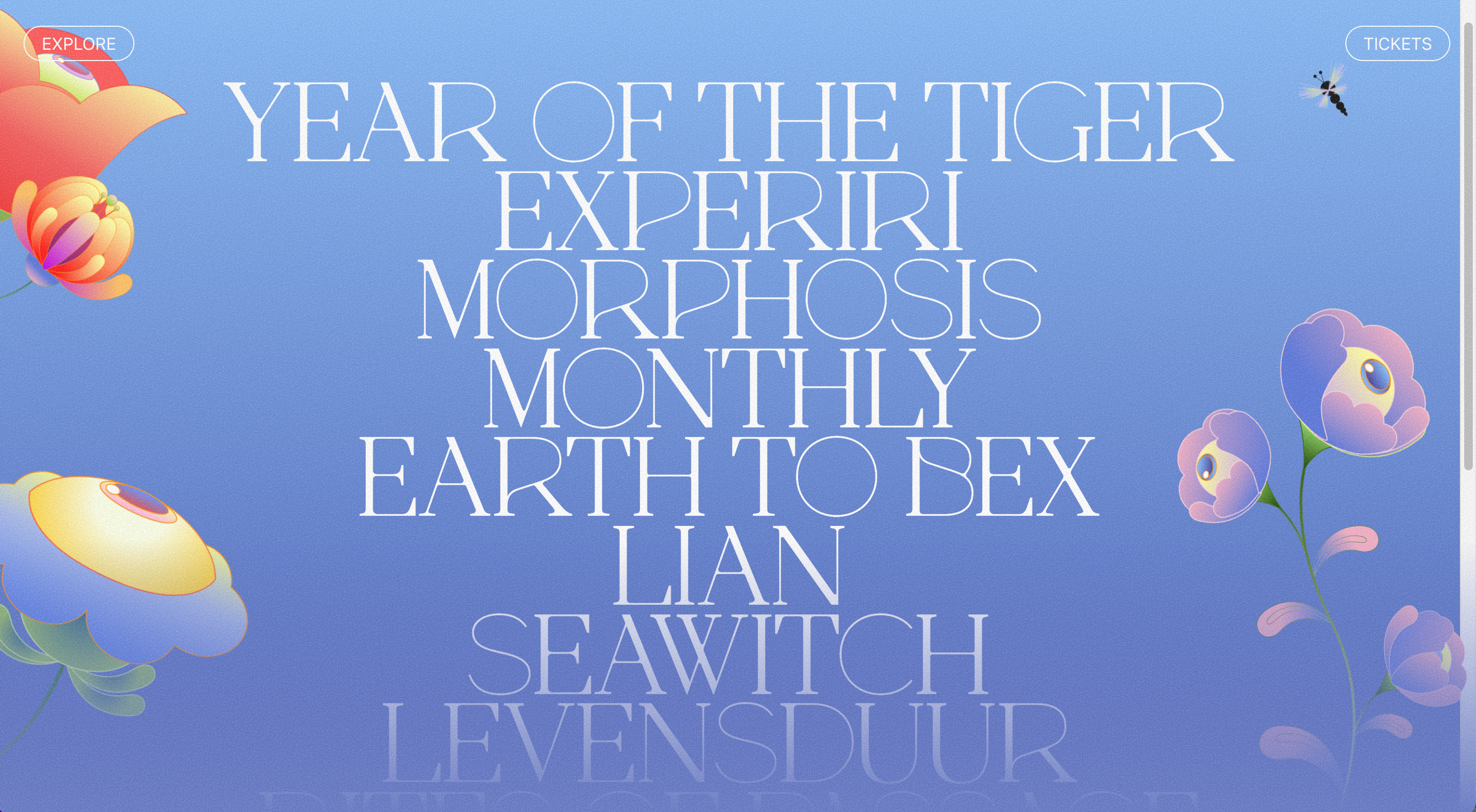
Our team developed a 5-week show reveal strategy on Instagram to build excitement for the event. We utilized different tiers of illustrations to highlight various aspects and purposes leading up to the show.
We created a teaser video that brings the garden to life. Guided by a dragonfly, the garden unfolds with gentle, swaying motions, revealing the diverse flowers of the Eternal Garden.
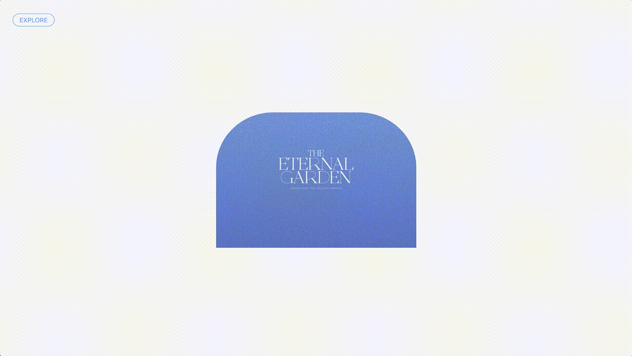
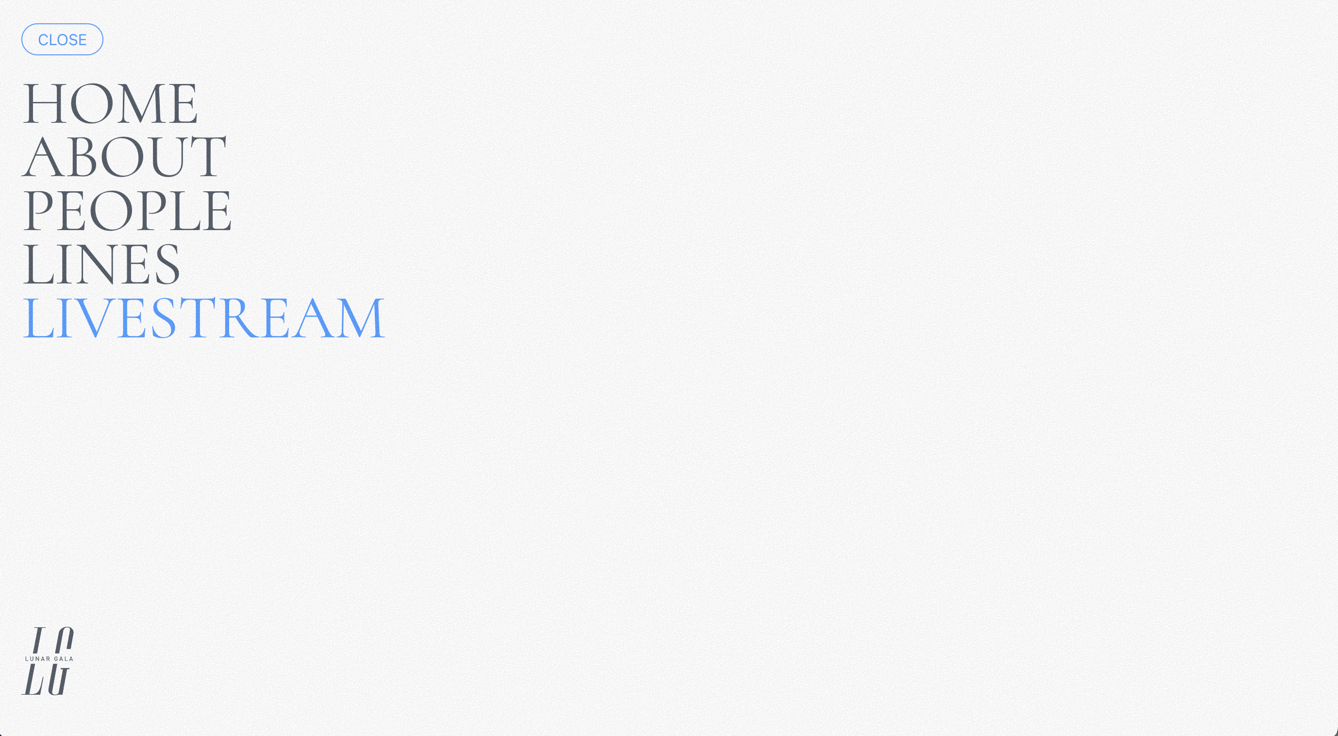
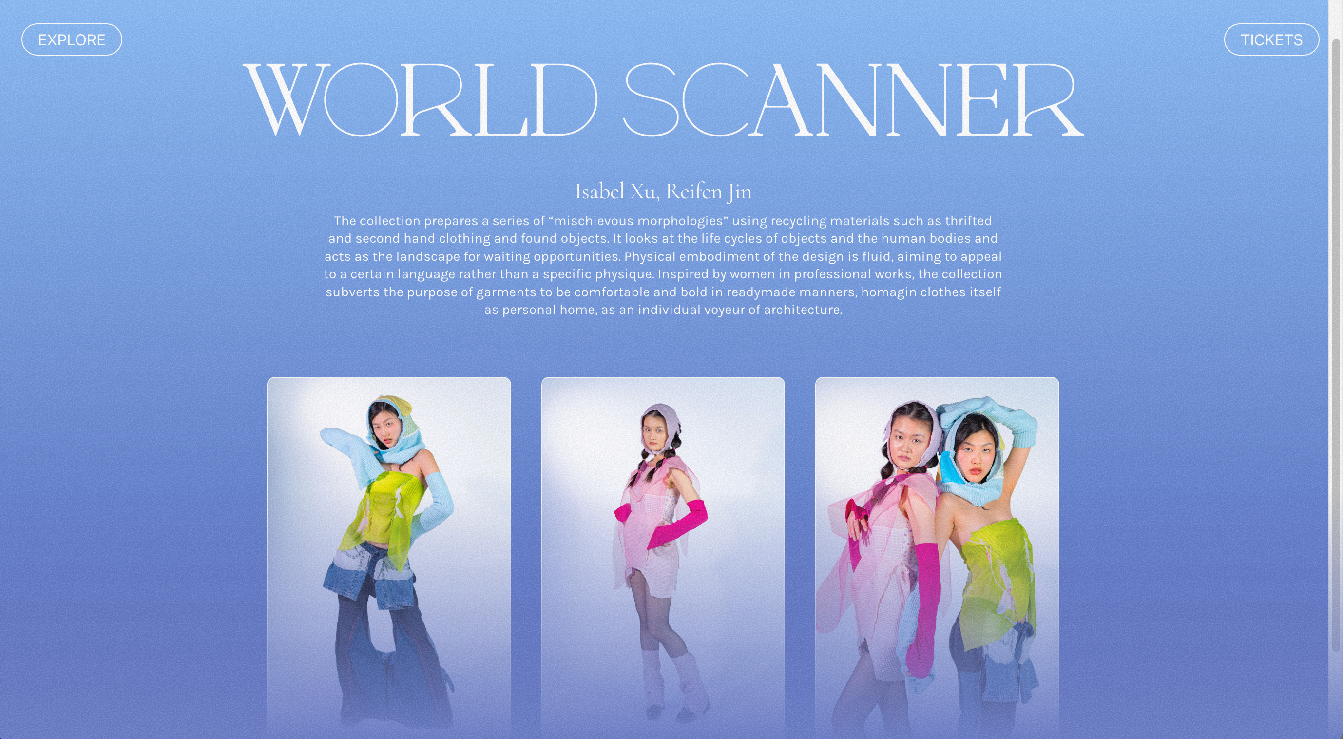
Our website incorporates illustrated assets and motion as key brand elements. It provides additional information, including details about the lines featured in the show and profiles of the people behind the scenes.


Design Output
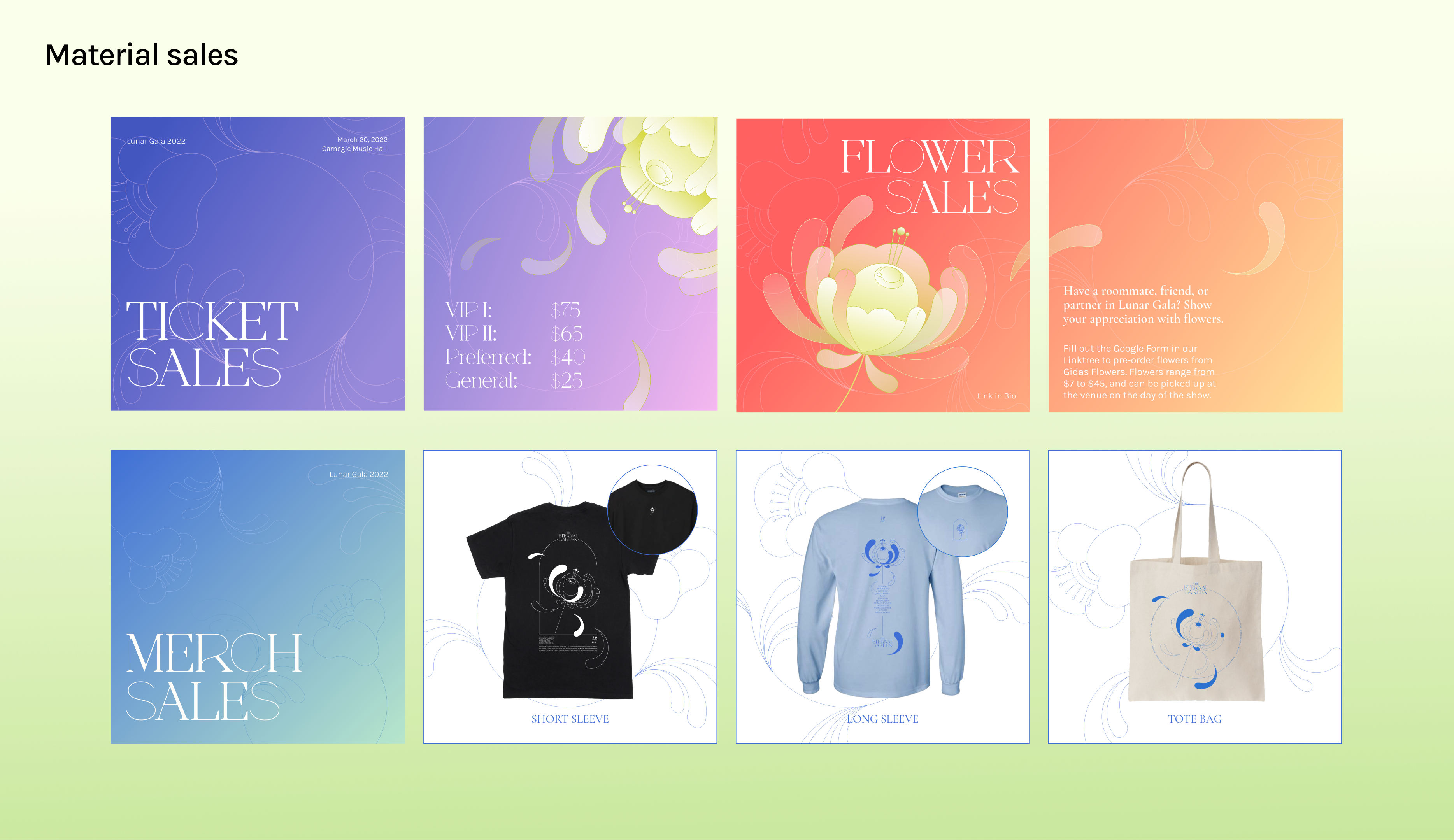
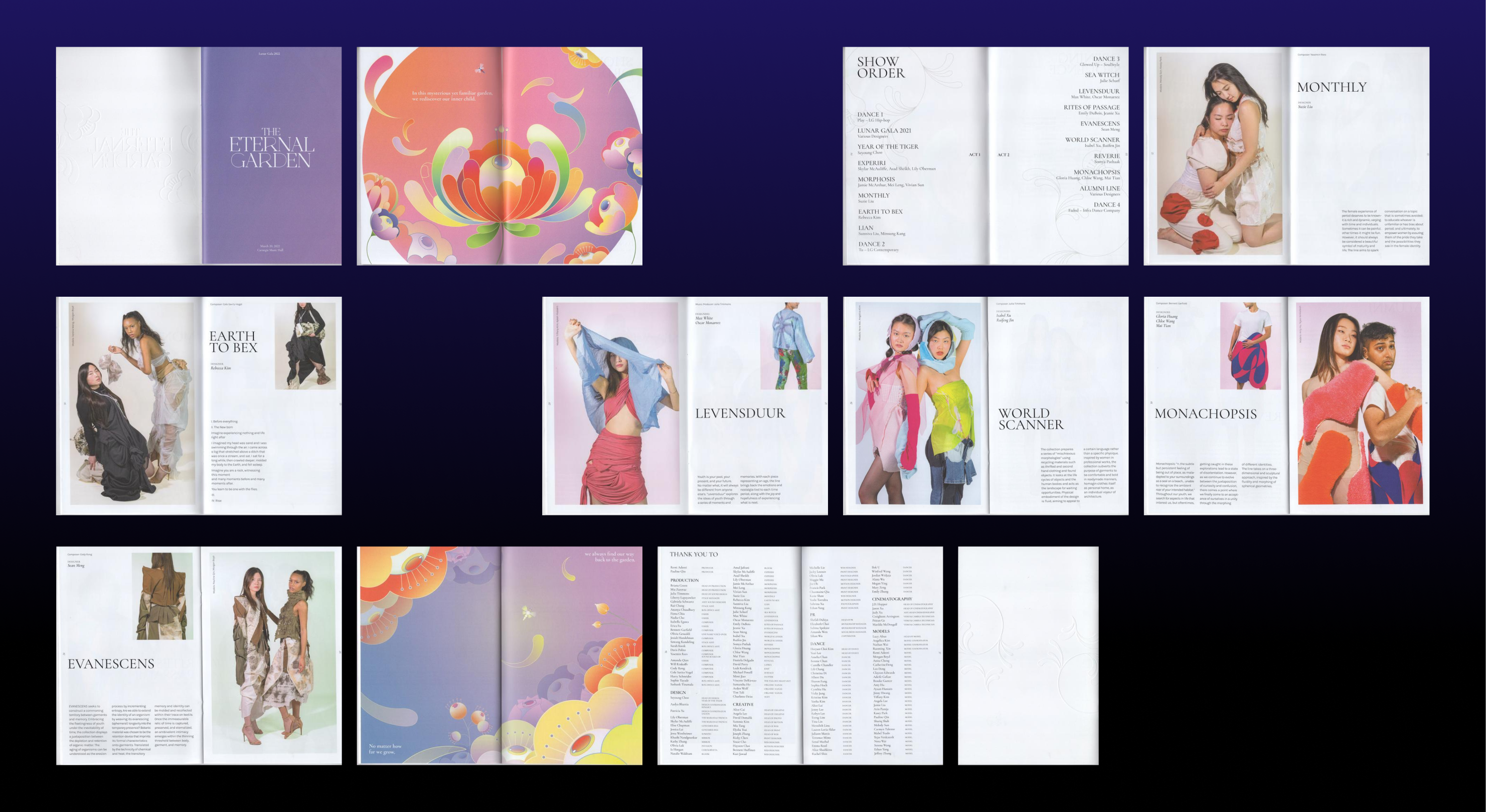
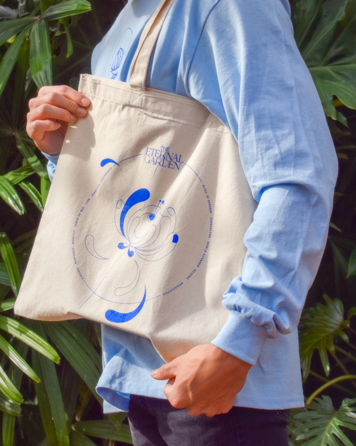
During the show, we produced print materials and merchandise for attendees to engage with.

2022
7 weeks
7 weeks
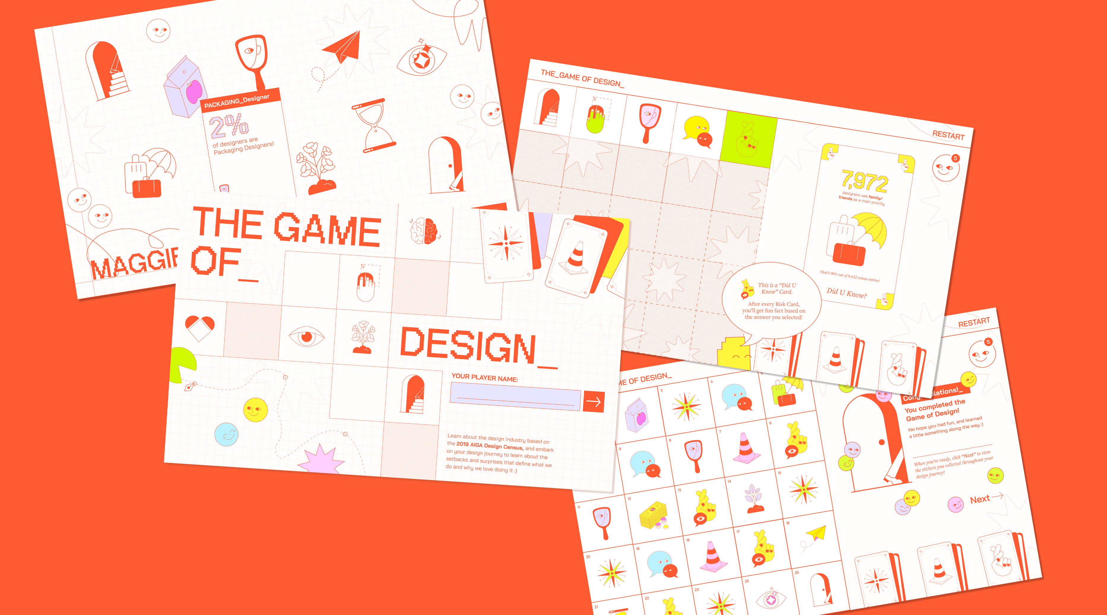
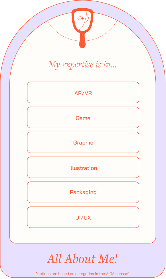
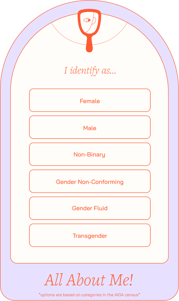
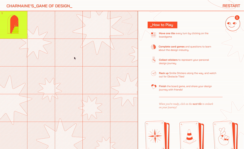
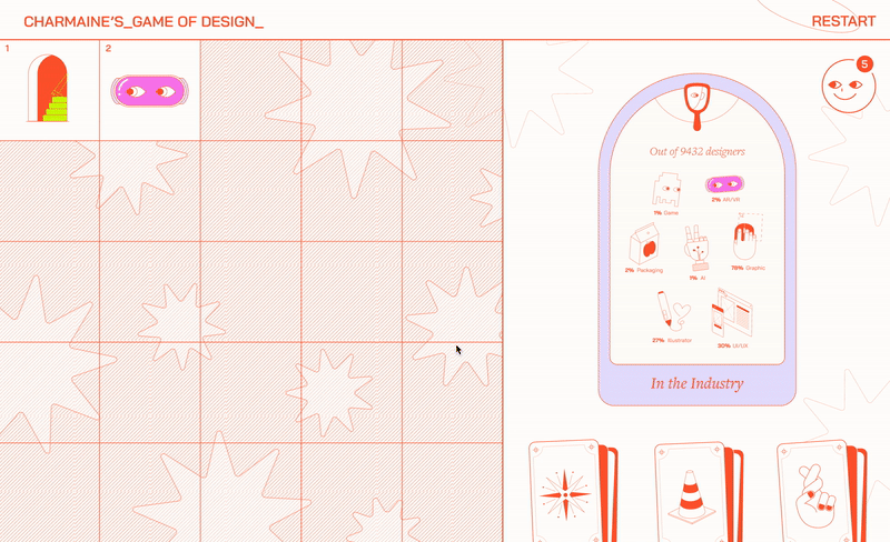
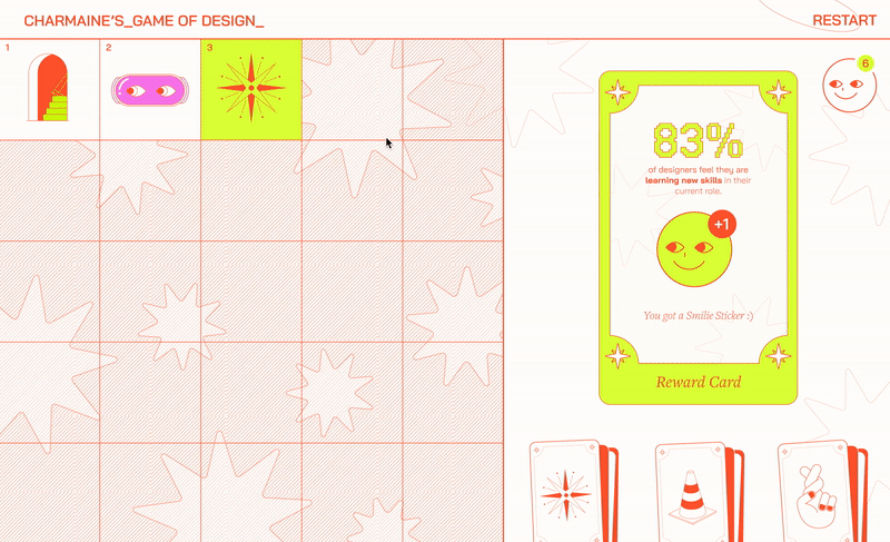
The_Game of Design_ is a digital board game of a designer’s journey
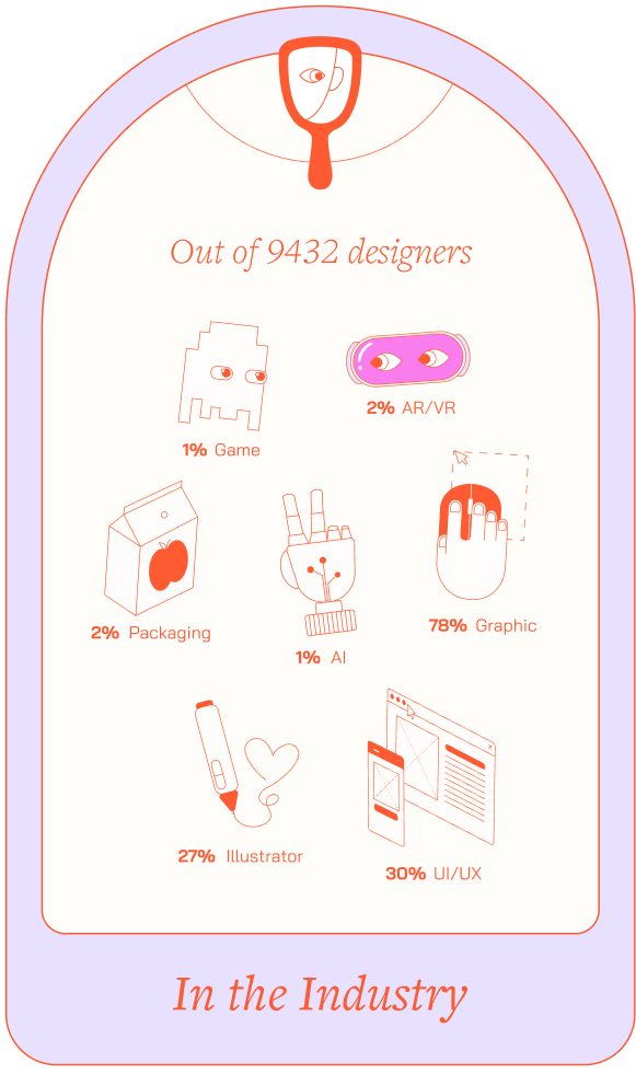
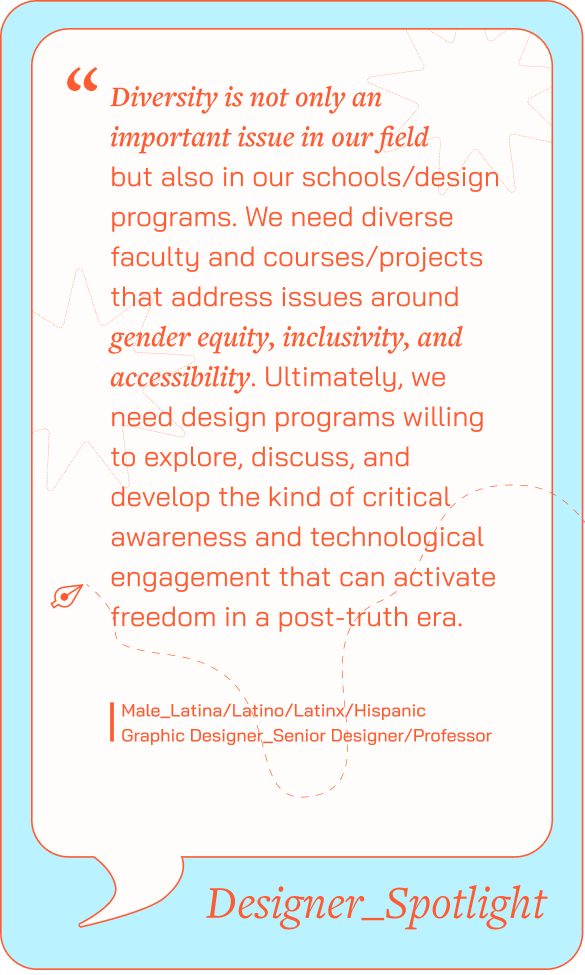
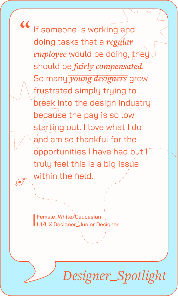
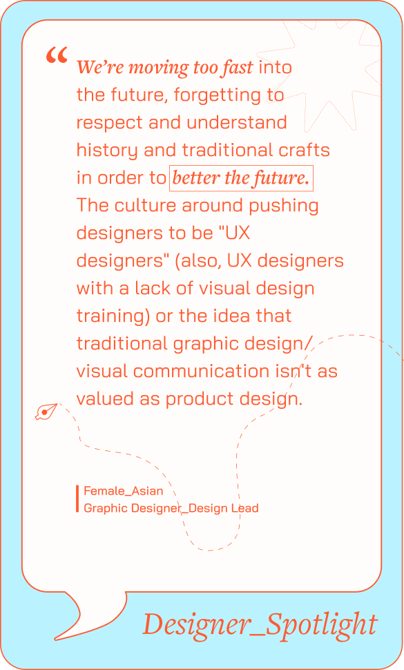
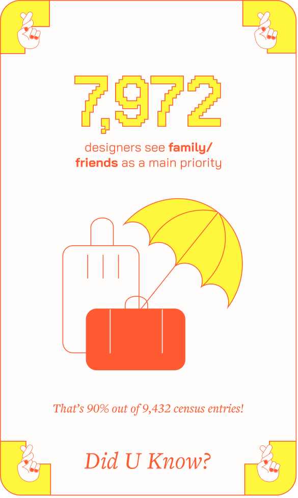
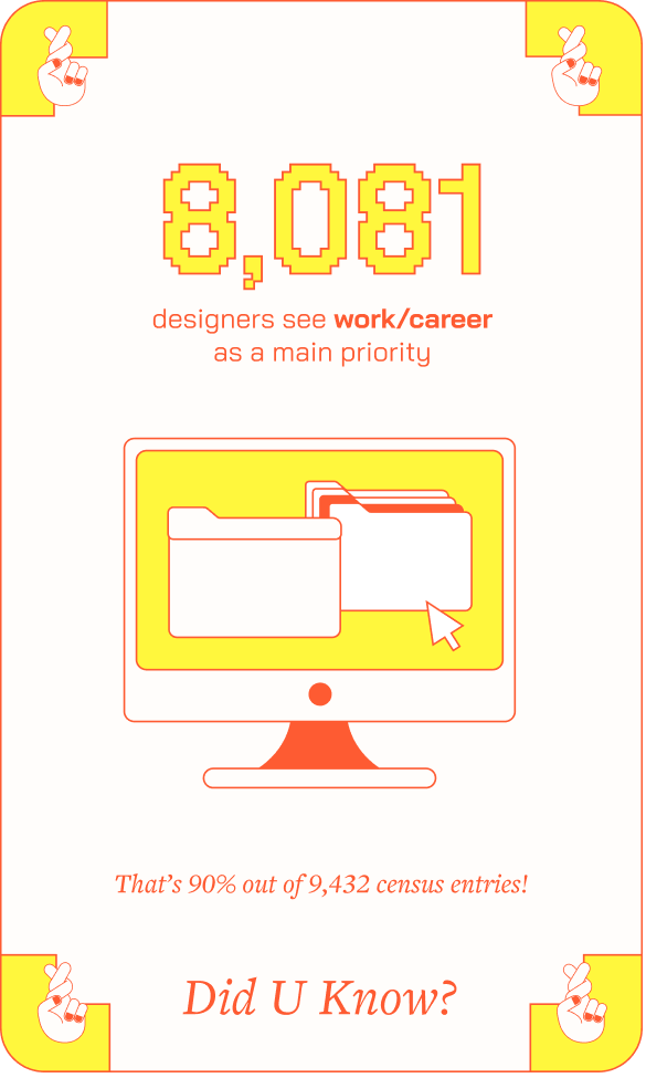
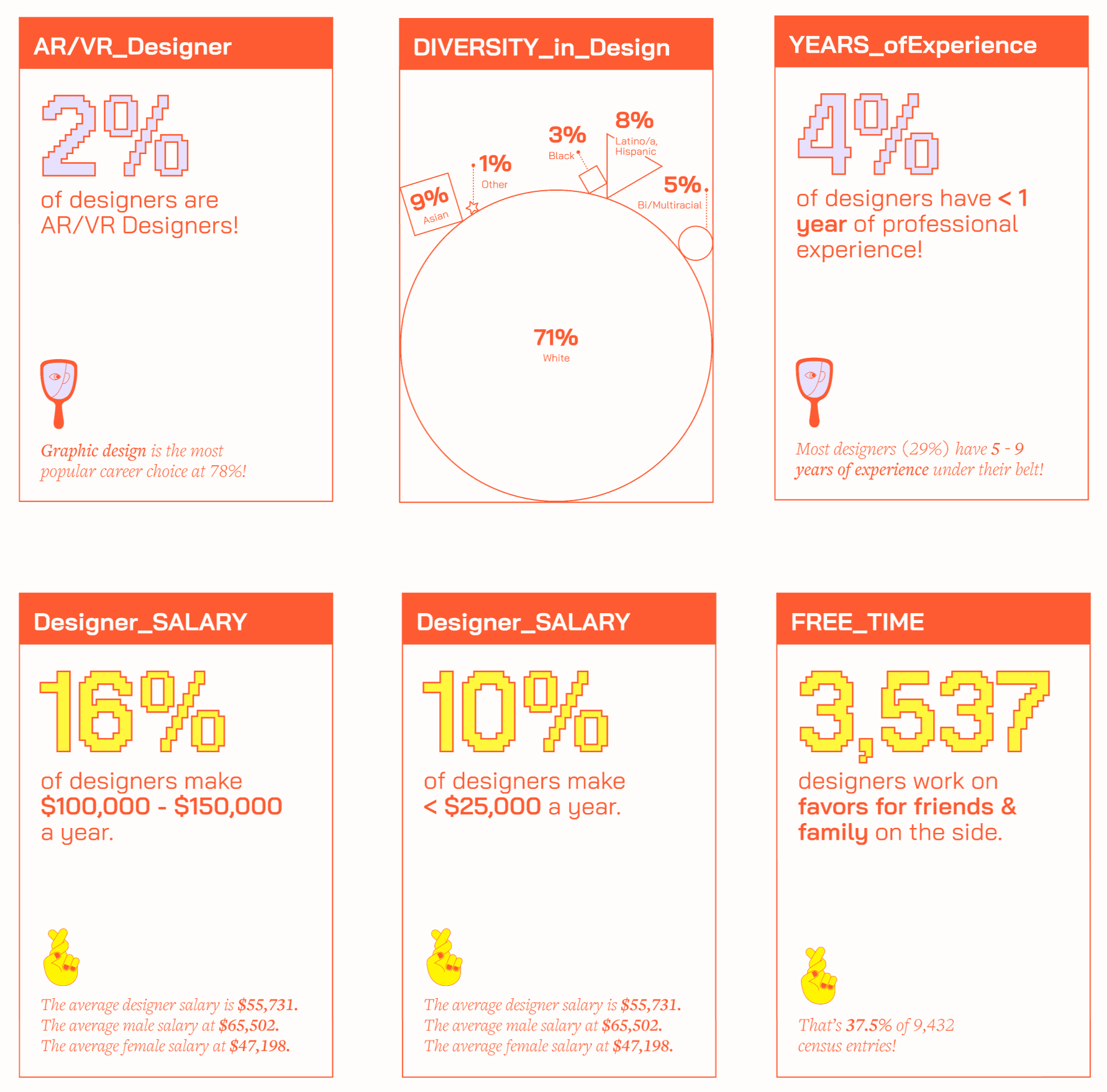
The AIGA Design Census is a comprehensive report featuring 9,432 entries that highlight both factual and emotional aspects of the design industry. To showcase this intricate data, our team created an interactive board game, allowing designers to learn more about their place in the community.
I was responsible for developing branding, illustrations, and UI/UX prototypes.
Team
Dorothy Li
Maggie Ma
Dorothy Li
Maggie Ma
Skills
Branding
Illustration
Web Design
Data Visualization
Branding
Illustration
Web Design
Data Visualization
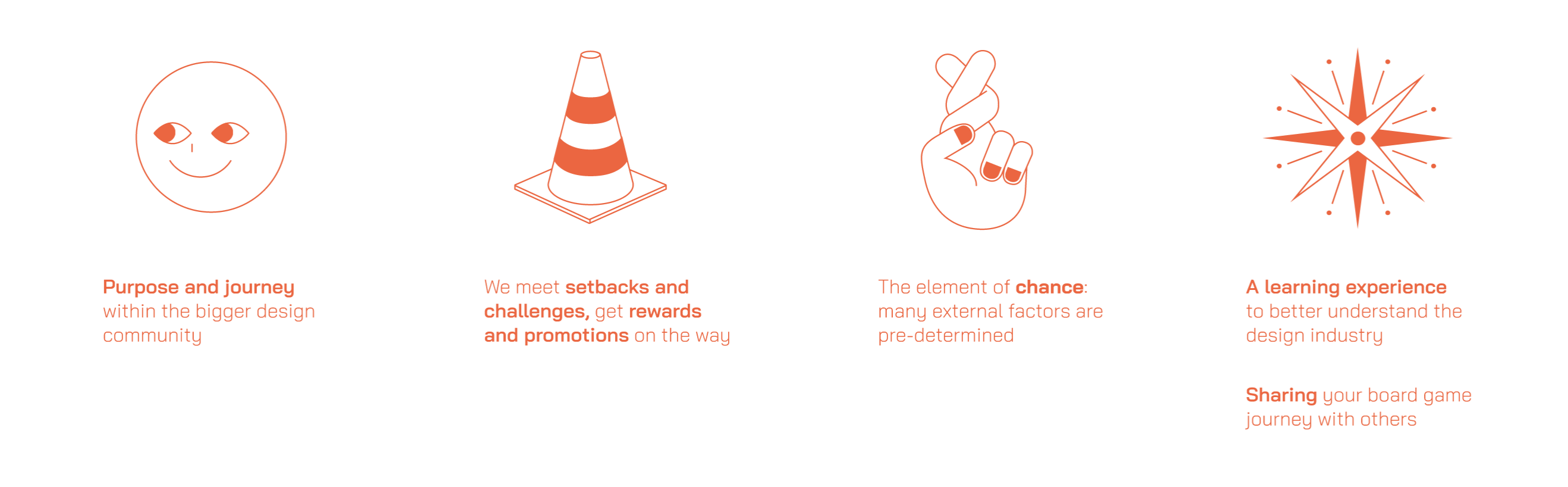
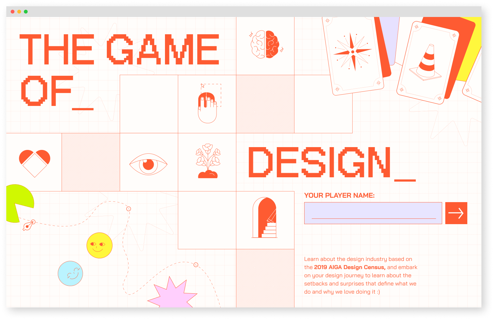
Concept - A Digital Board Game
As designers, we each embark on unique journeys of growth and self-discovery. Our board game visualizes the realities of the design industry by curating personalized gameplay based on the user’s background in design.
How might we educate designers about their place in the current industry?
As designers, we each embark on unique journeys of growth and self-discovery. Our board game visualizes the realities of the design industry by curating personalized gameplay based on the user’s background in design.
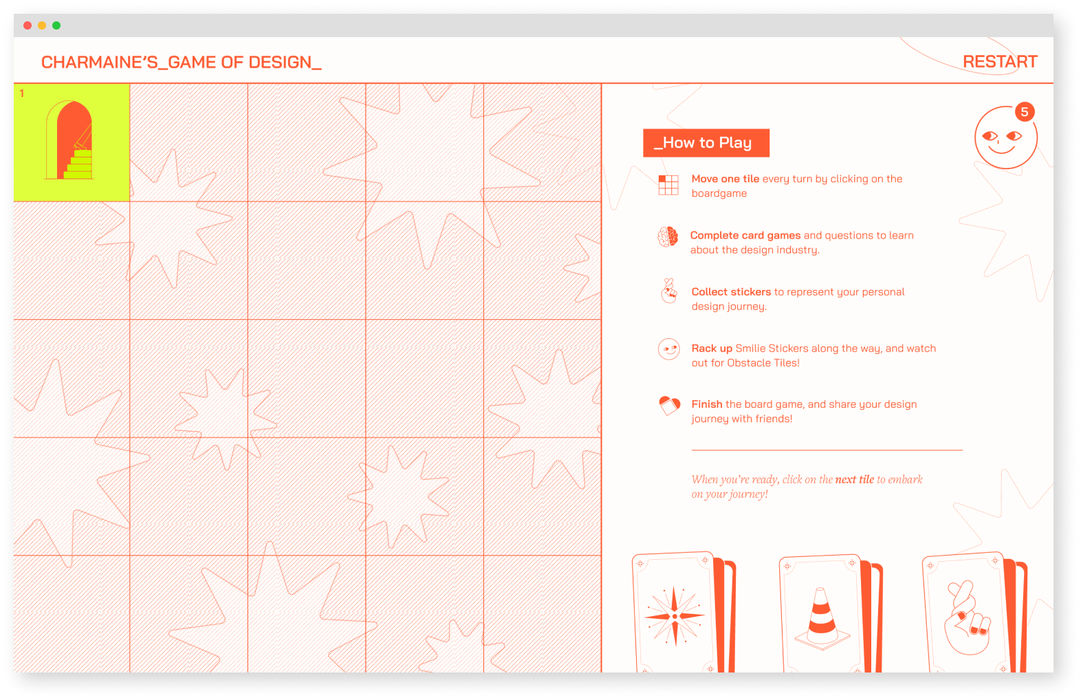
The Site
The site features a board game-like navigation, where each block triggers an interaction. To add a sense of unpredictability, the overall board remains hidden until the user reaches each new block.
The site features a board game-like navigation, where each block triggers an interaction. To add a sense of unpredictability, the overall board remains hidden until the user reaches each new block.
Landing Page
![]()
Instruction Page
![]()
Instruction Page
User Flow
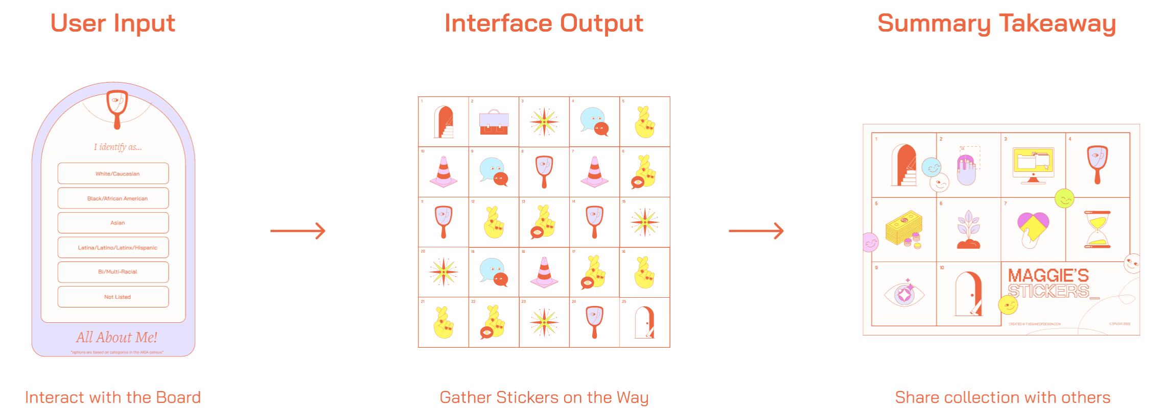
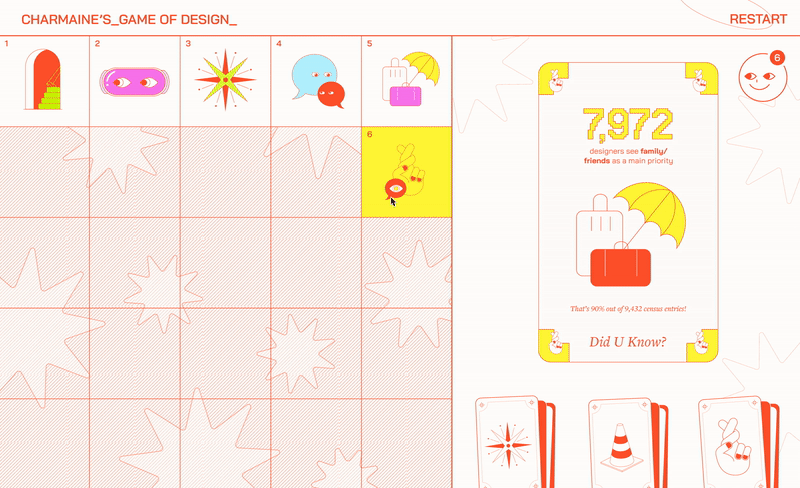
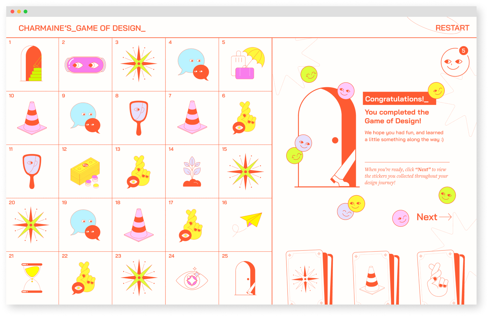
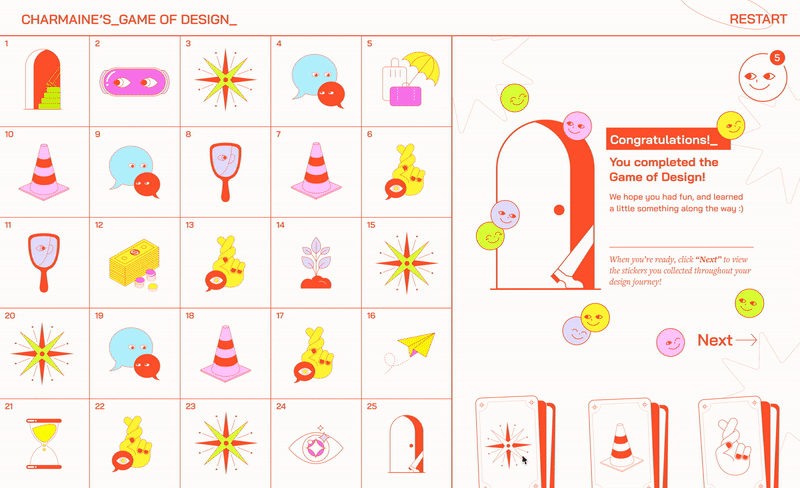
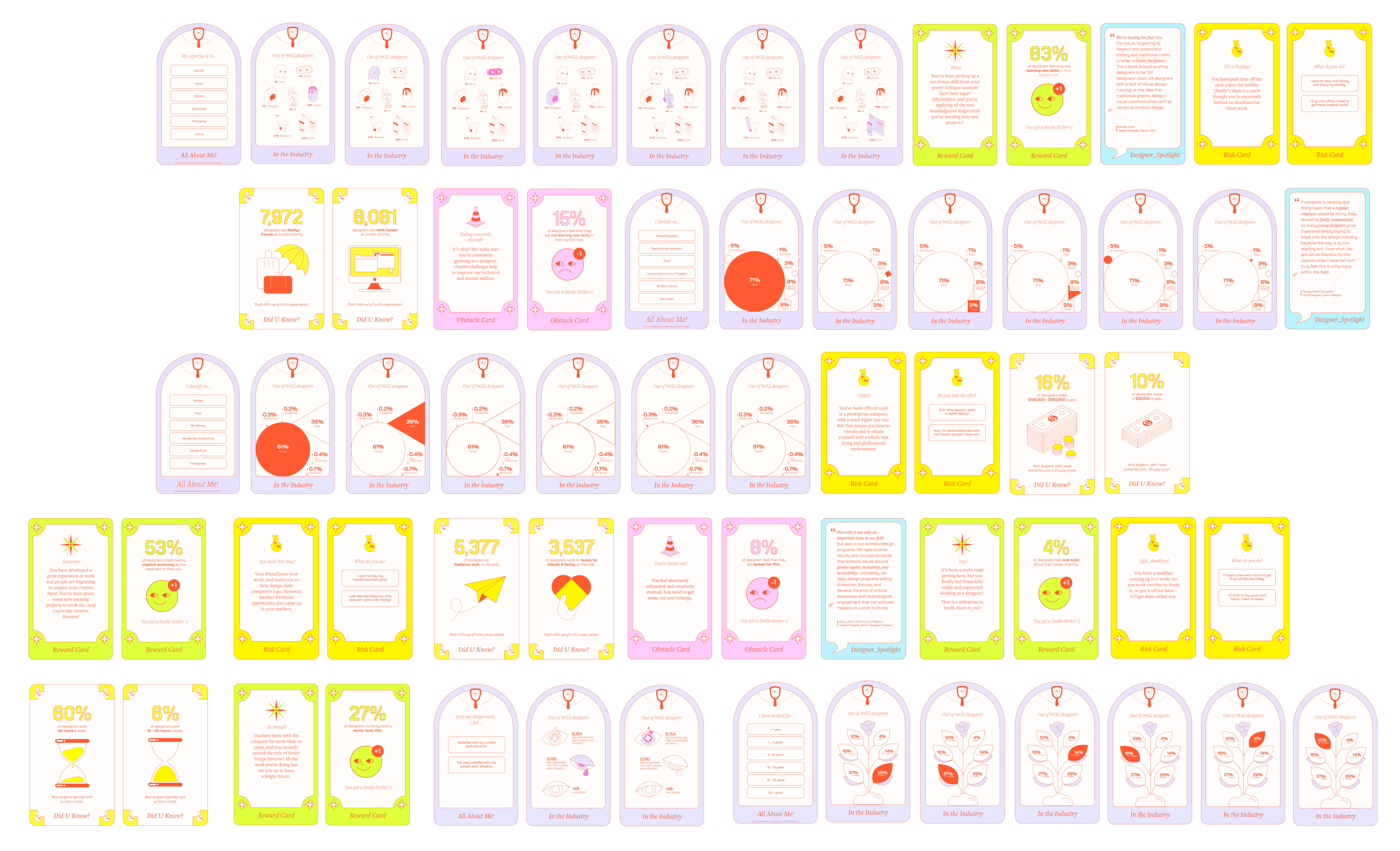
The player navigates through 25 blocks on the board by interacting with cards that appear on each block. By inputting their answers on the cards, players collect stickers as rewards. As a final takeaway, players receive a personalized sticker collection that reflects their own statistics, which they can learn from and share with others.
Interacting with Data
The player navigates through 25 blocks on the board by interacting with cards that appear on each block. By inputting their answers on the cards, players collect stickers as rewards. As a final takeaway, players receive a personalized sticker collection that reflects their own statistics, which they can learn from and share with others.
Card Type 01
About Me Card
About Me Card
Invites players to provide answers based on their personal experiences and backgrounds.
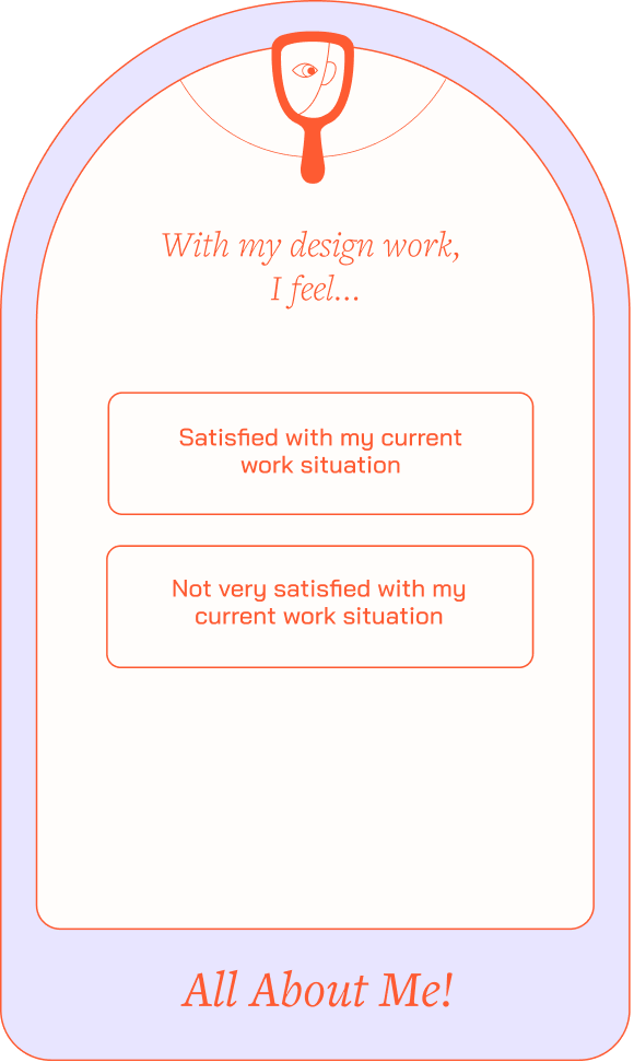

Click to view variations
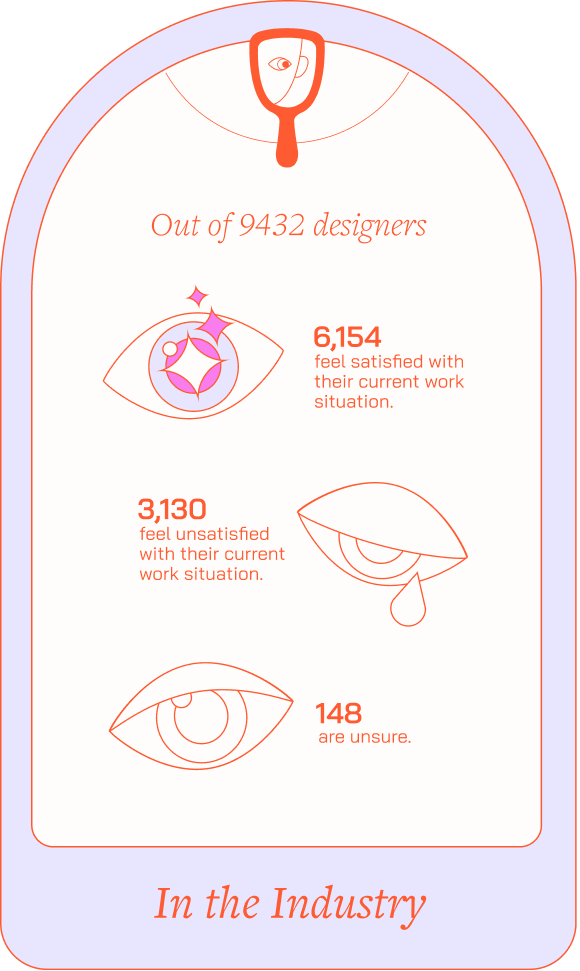
Card Type 02
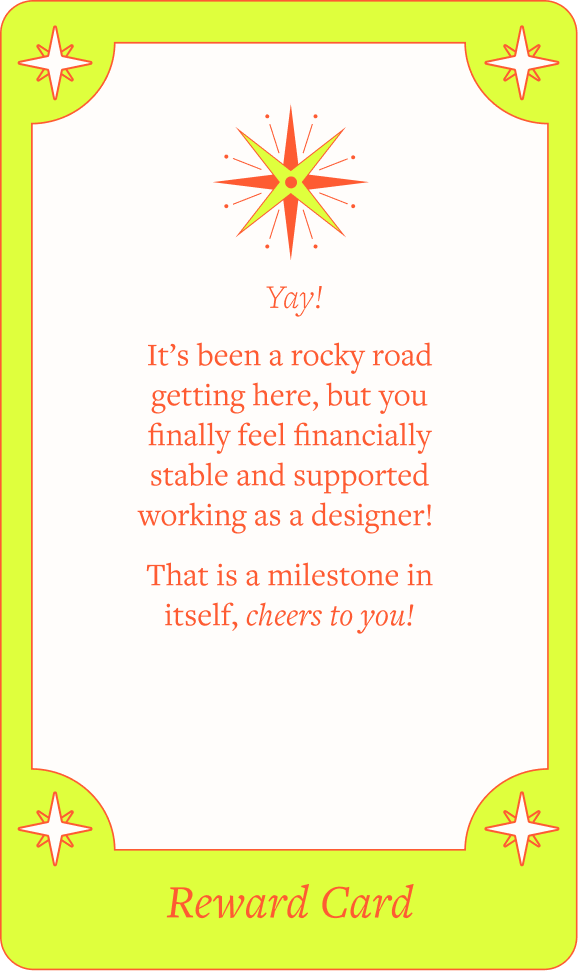
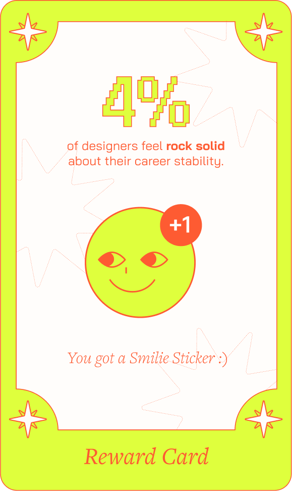
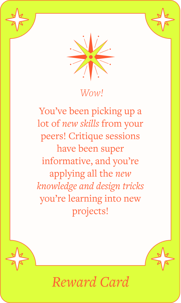
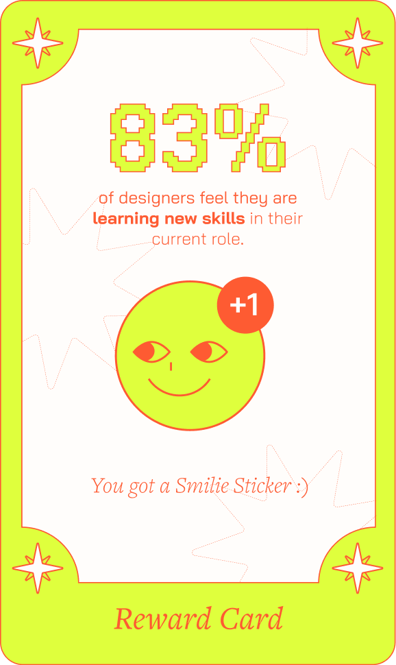
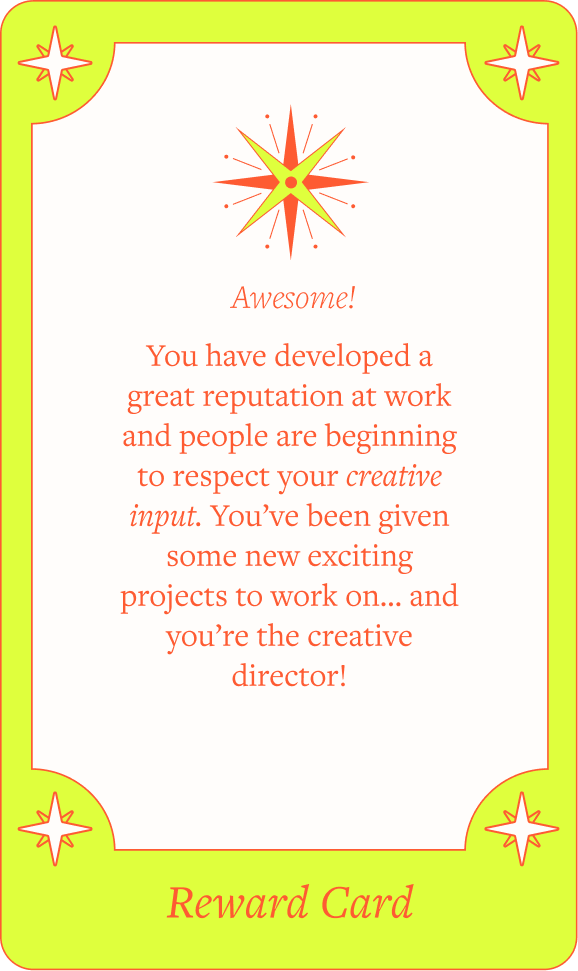
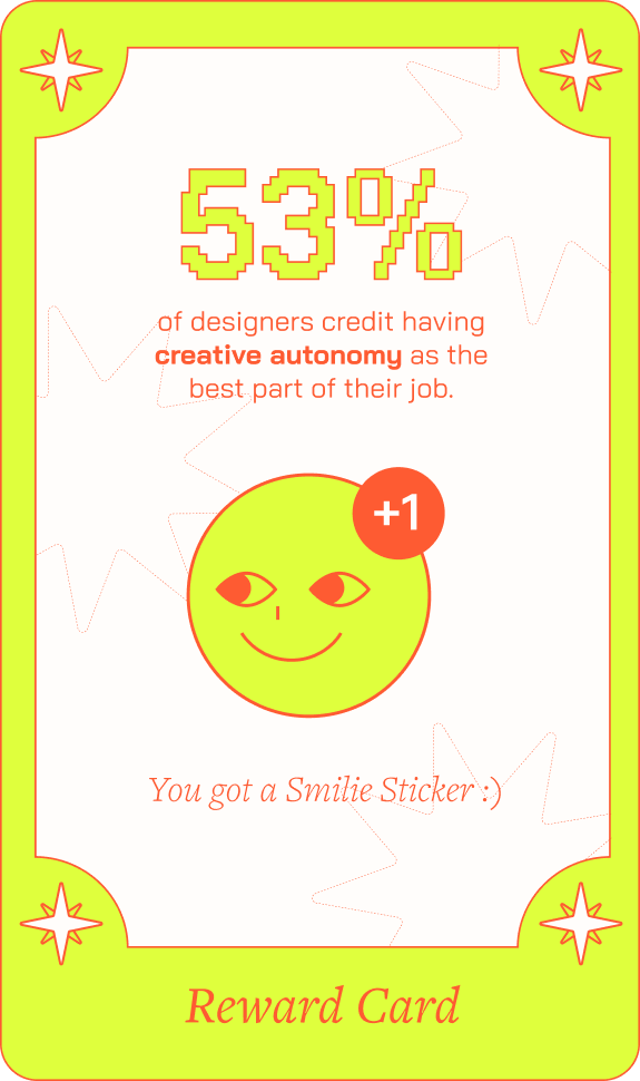
Reward Card
Reward Card
Presents players with a reward scenario where they learn facts about the industry and earn a happy face sticker.
Click to view variations
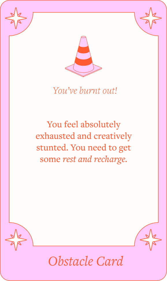
Card Type 03
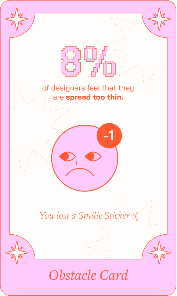
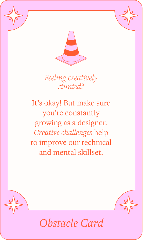
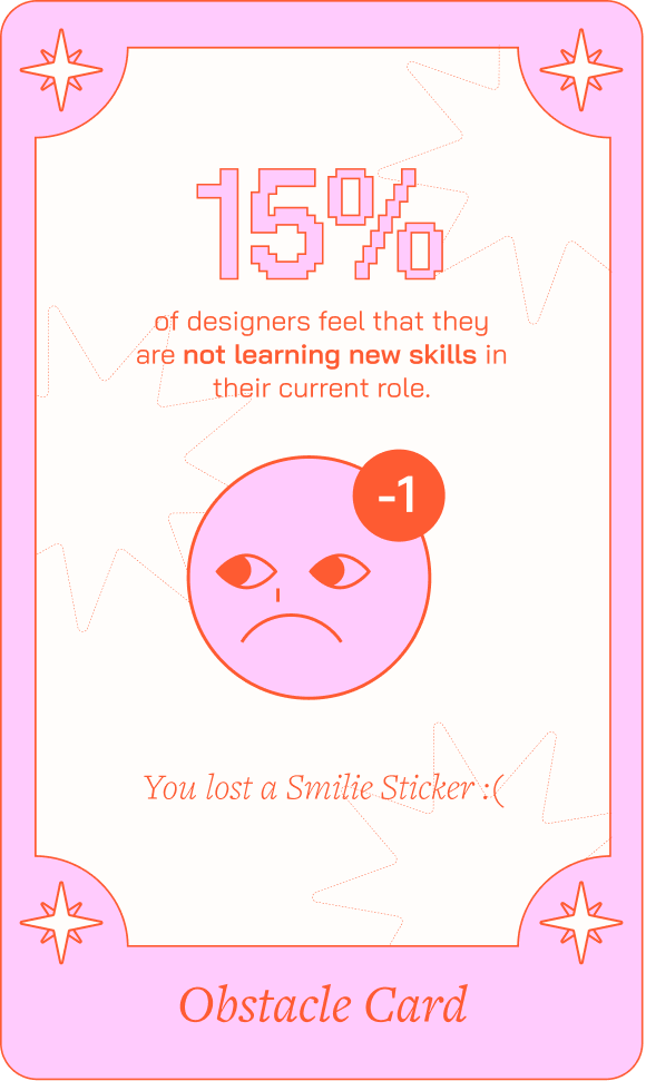
Obstacle Card
Obstacle Card
Presents players with an obstacle scenario where they learn facts about the industry and have a happy face sticker taken away.
Click to view variations
Card Type 04
Quote Card
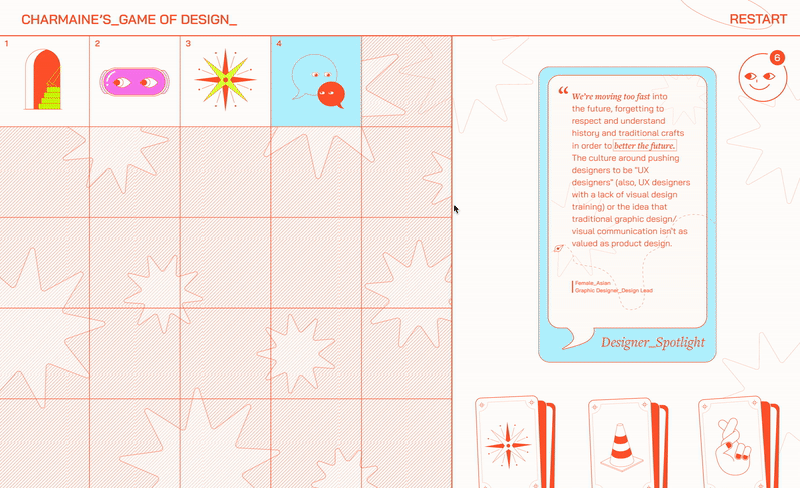
Introduces a quote by a real designer, offering a personal perspective on the design industry.
Click to view variations
Card Type 05
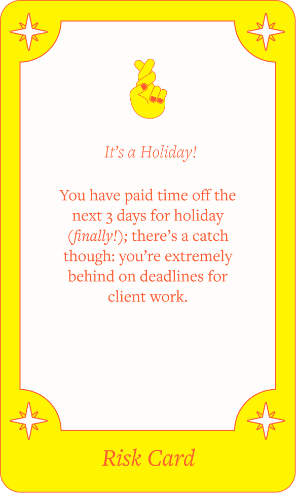
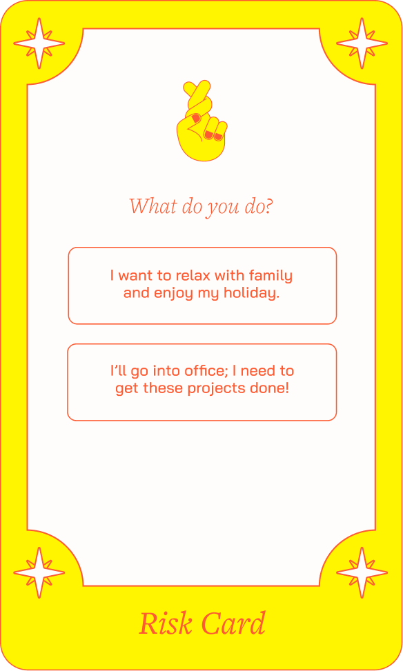
Risk Card
Risk Card
Presents players with scenarios that lead to different outcomes based on their choices. The reverse side of the card displays relevant data related to the chosen outcome.
Click to view variations
Ending the Journey with Purpose
After navigating through all the blocks, the final screen displays all the stickers collected by the player. Hovering over each sticker reveals the statistics associated with their choices throughout the journey.
Completion page
![]()
Visual System
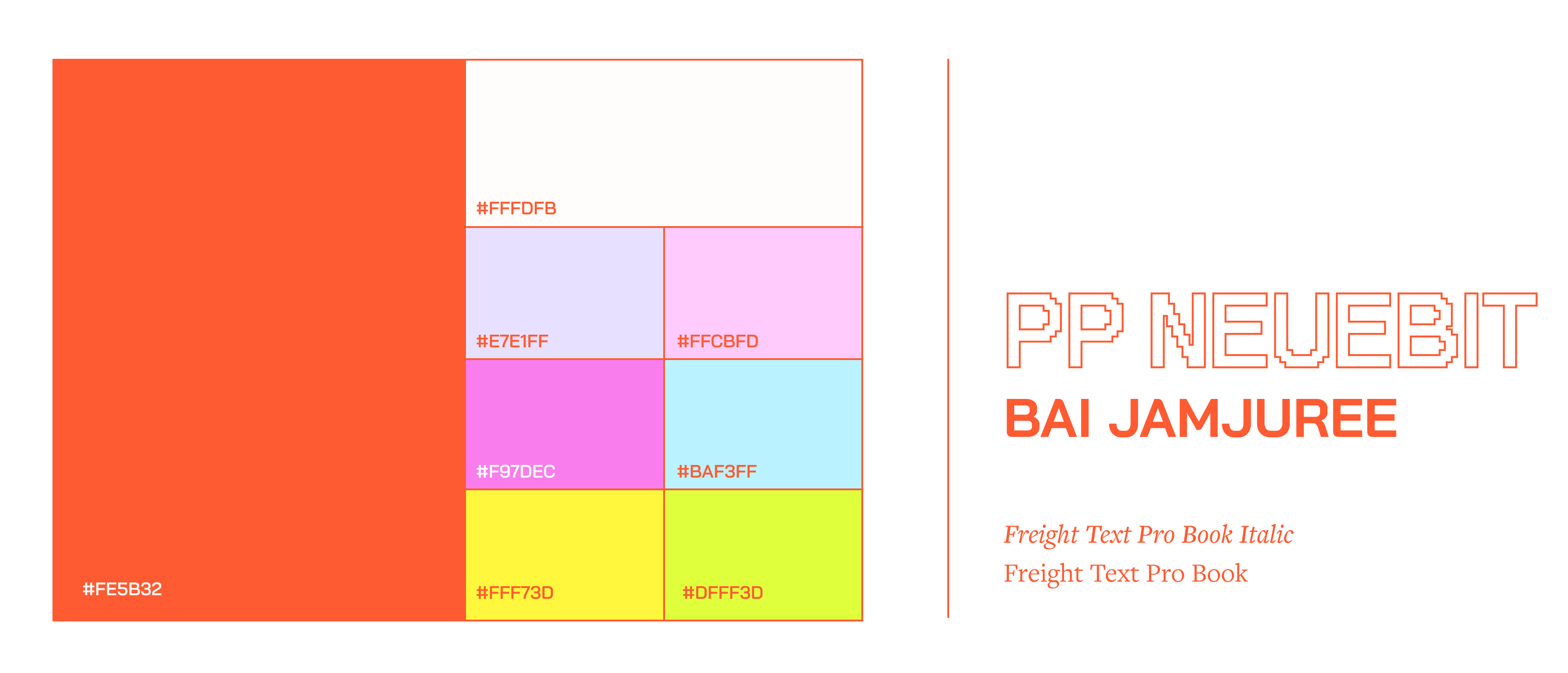
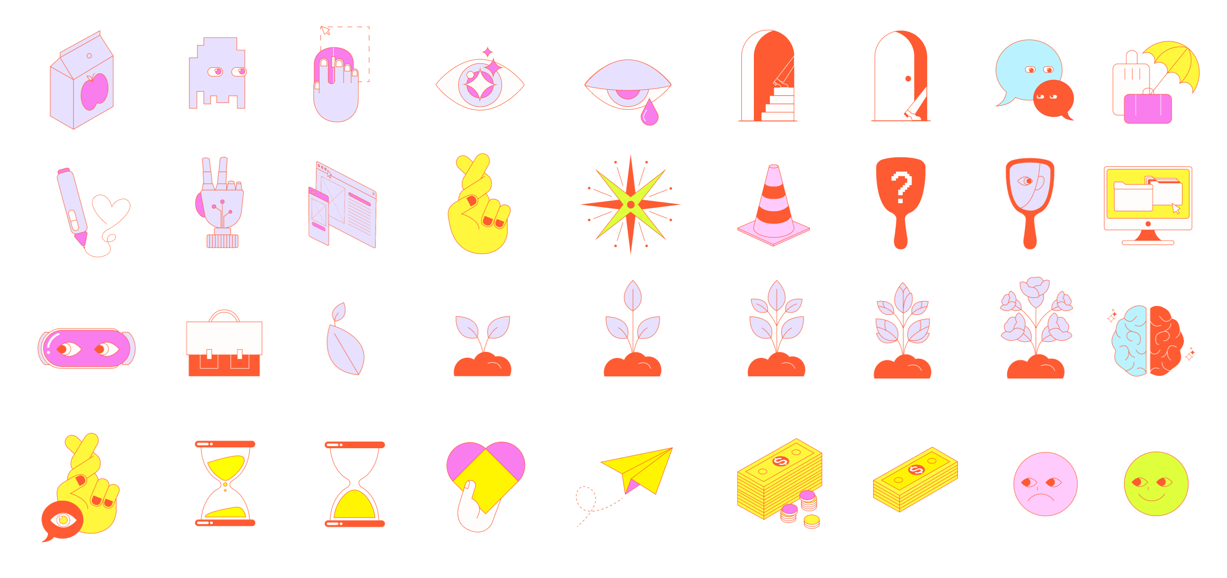
Creating a Playful Identity of the Board Game
The use of a game-like typeface and vibrant colors creates a lighthearted mood reminiscent of playing a board game. The accompanying stickers and cards feature a simple yet quirky design, adding extra personality to the brand.
Additionally, we employed various data visualization techniques to introduce diversity across the different types of cards.
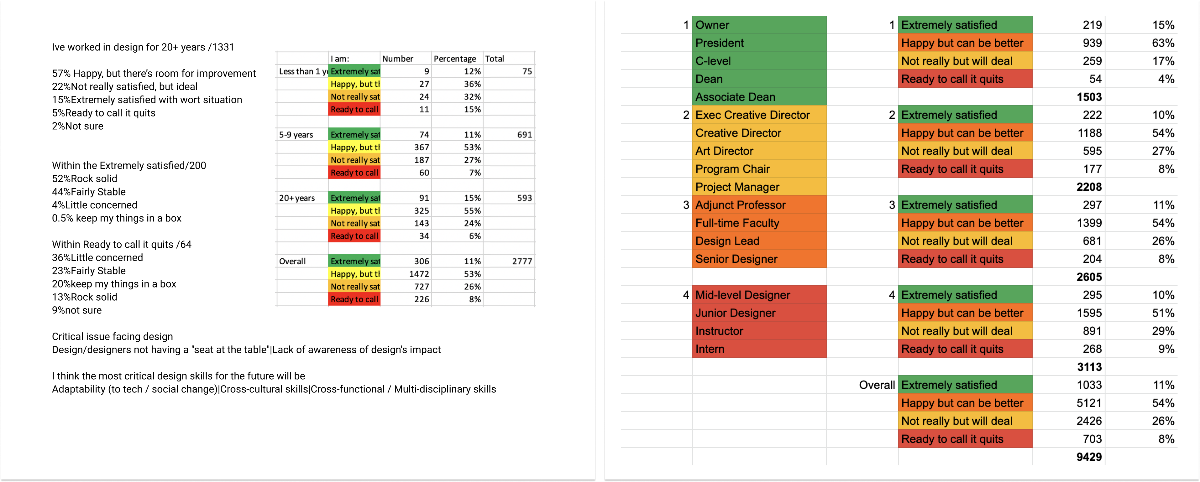
Initial Research
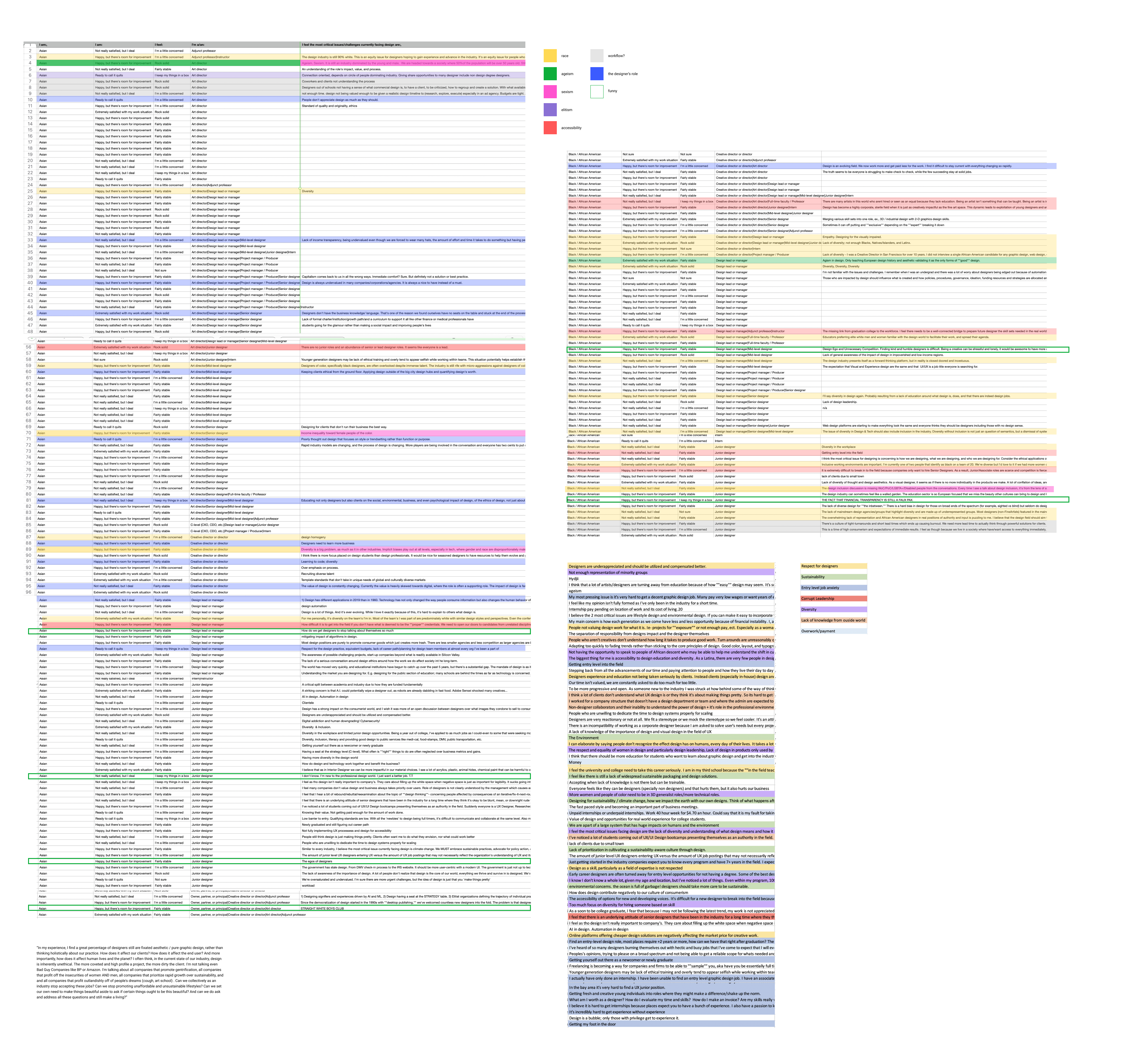
Working with the AIGA Dataset
Before beginning the design process, our team analyzed the dataset to identify correlations between different categories. We were particularly interested in designers' job satisfaction and compared these levels across various factors such as job title, salary, years of experience, and gender.
![]()
![]()
![]()
The Concept
The Board Game Narrative
Our team chose to create a digital board game because it serves as a metaphor for an unpredictable yet charming journey filled with challenges and surprises. We recognized the opportunity to integrate various interactions that lead to unique outcomes throughout the journey.
![]()
Working with the AIGA Dataset
Before beginning the design process, our team analyzed the dataset to identify correlations between different categories. We were particularly interested in designers' job satisfaction and compared these levels across various factors such as job title, salary, years of experience, and gender.
The Concept
The Board Game Narrative
Our team chose to create a digital board game because it serves as a metaphor for an unpredictable yet charming journey filled with challenges and surprises. We recognized the opportunity to integrate various interactions that lead to unique outcomes throughout the journey.
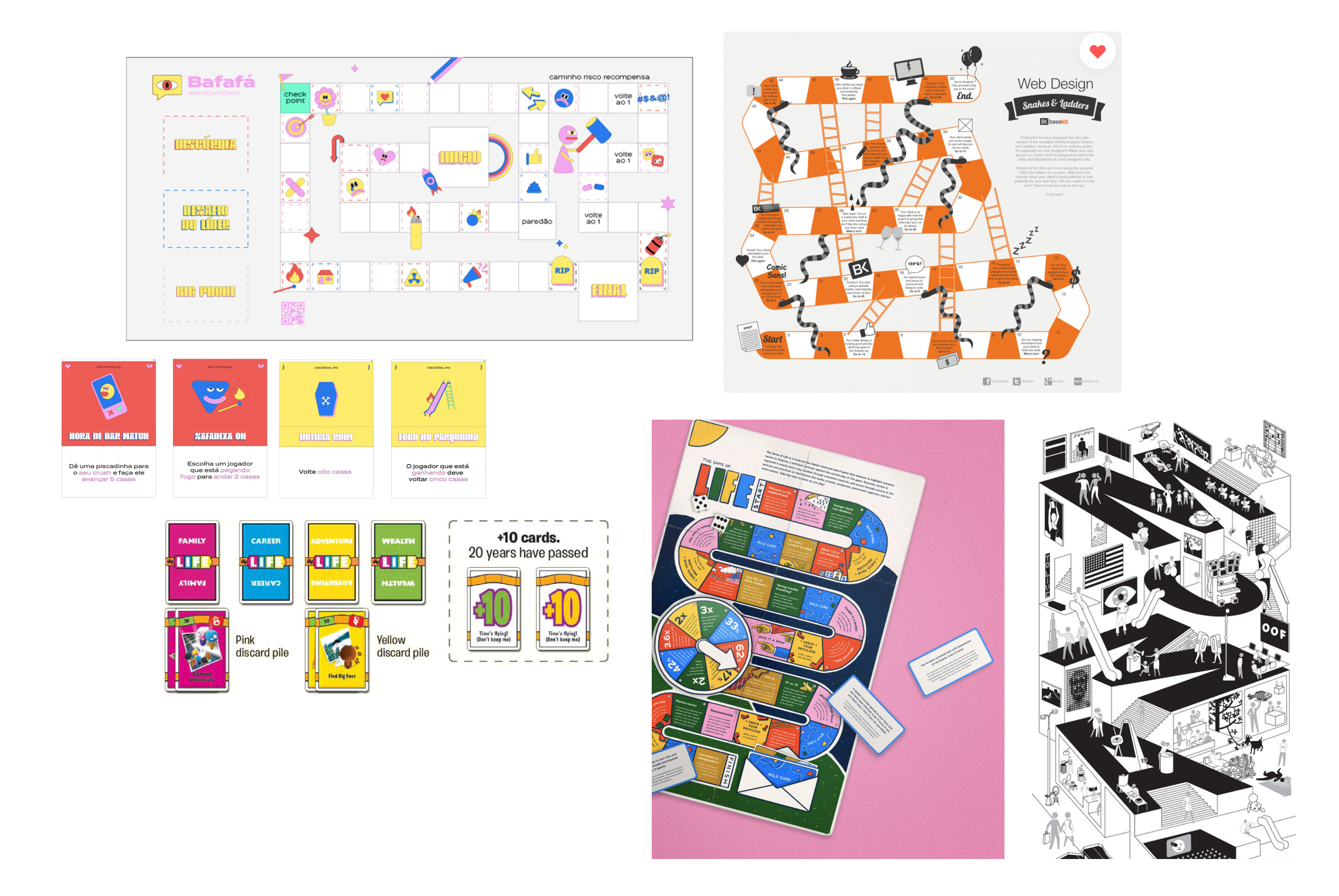
Moodboard
When designing the layout of the board, we focused on achieving an optimal balance between the board itself, the cards, and the collected stickers. We settled on a layout that features an overview of the board, allowing users to track their progress through the journey while engaging with the interactive elements of the cards. 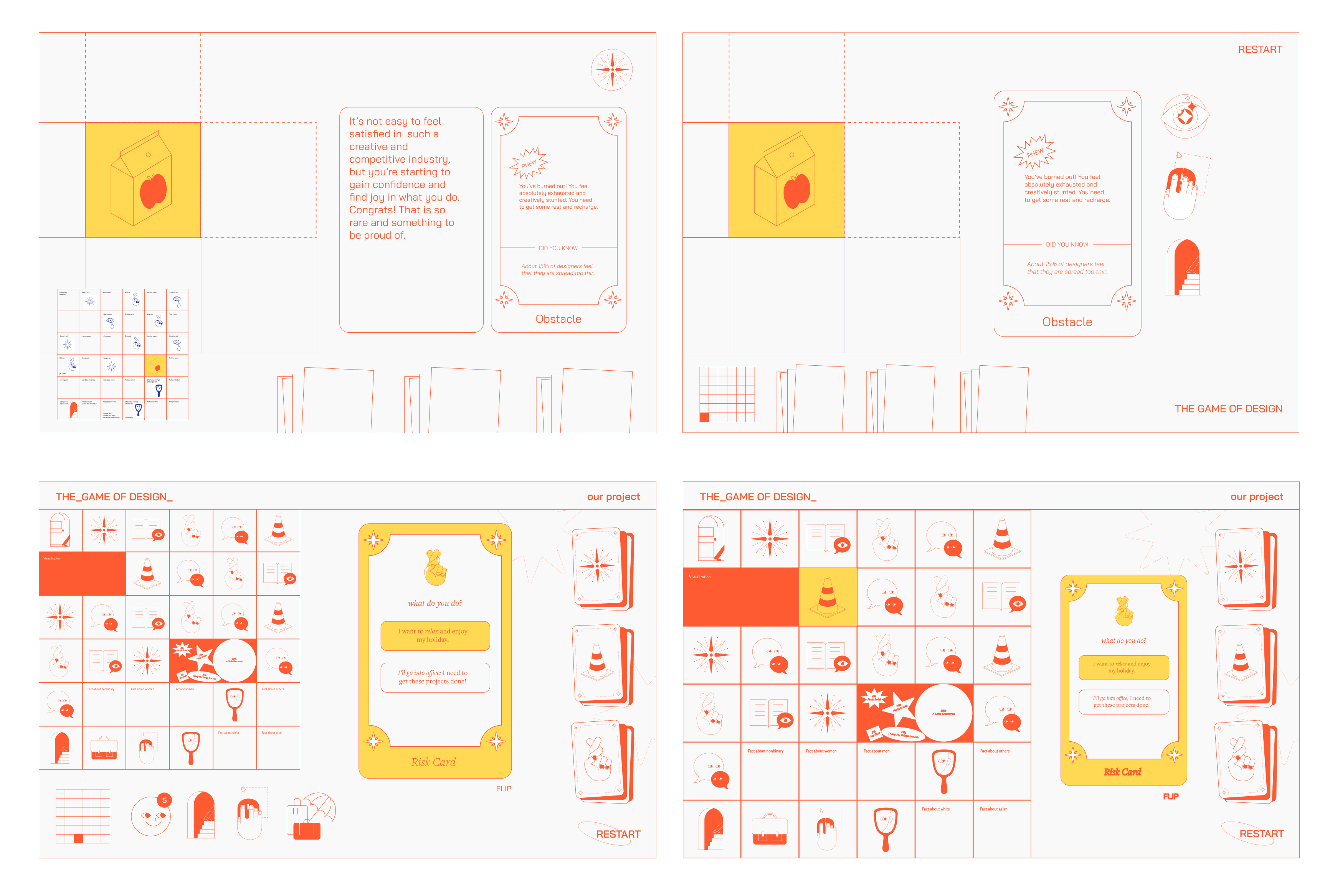
Layout exploration
Reflection
This project provided me with the opportunity to delve into data visualization through the creation of a digital game, adopting a highly visual approach. It was intriguing to integrate customization features of the game as educational tools. After establishing the visual system and the flow of the board, I transitioned to an asset-based workflow, preparing assets for delivery to the developer.
Given more time, I would explore additional micro-interactions, such as sticker animations and dynamic hints, to maintain engagement throughout the journey.
Fall 2020
4 weeks
4 weeks
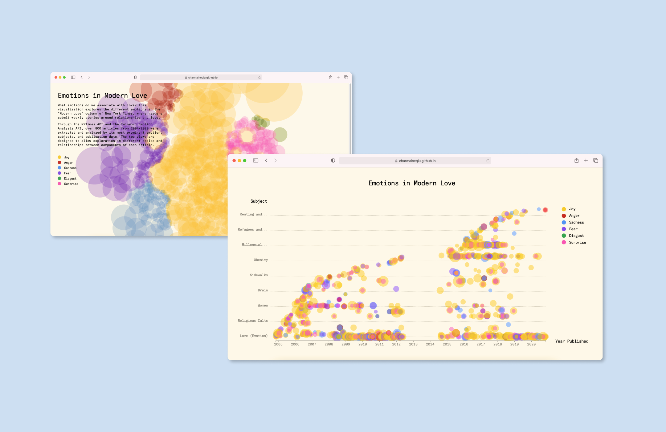
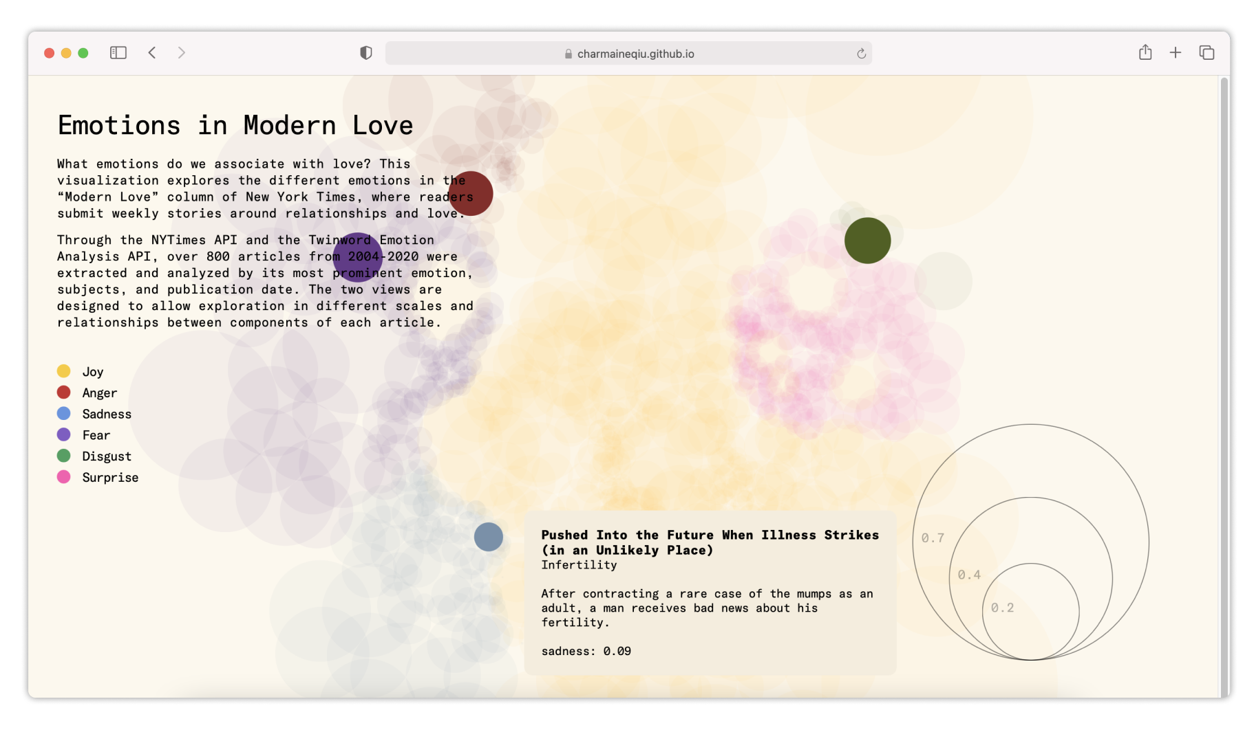
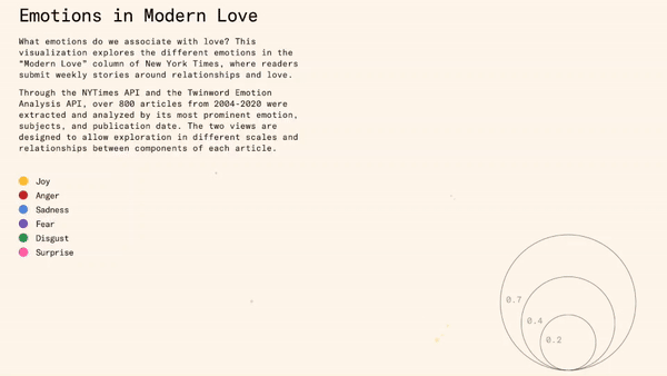
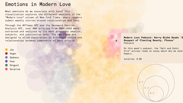
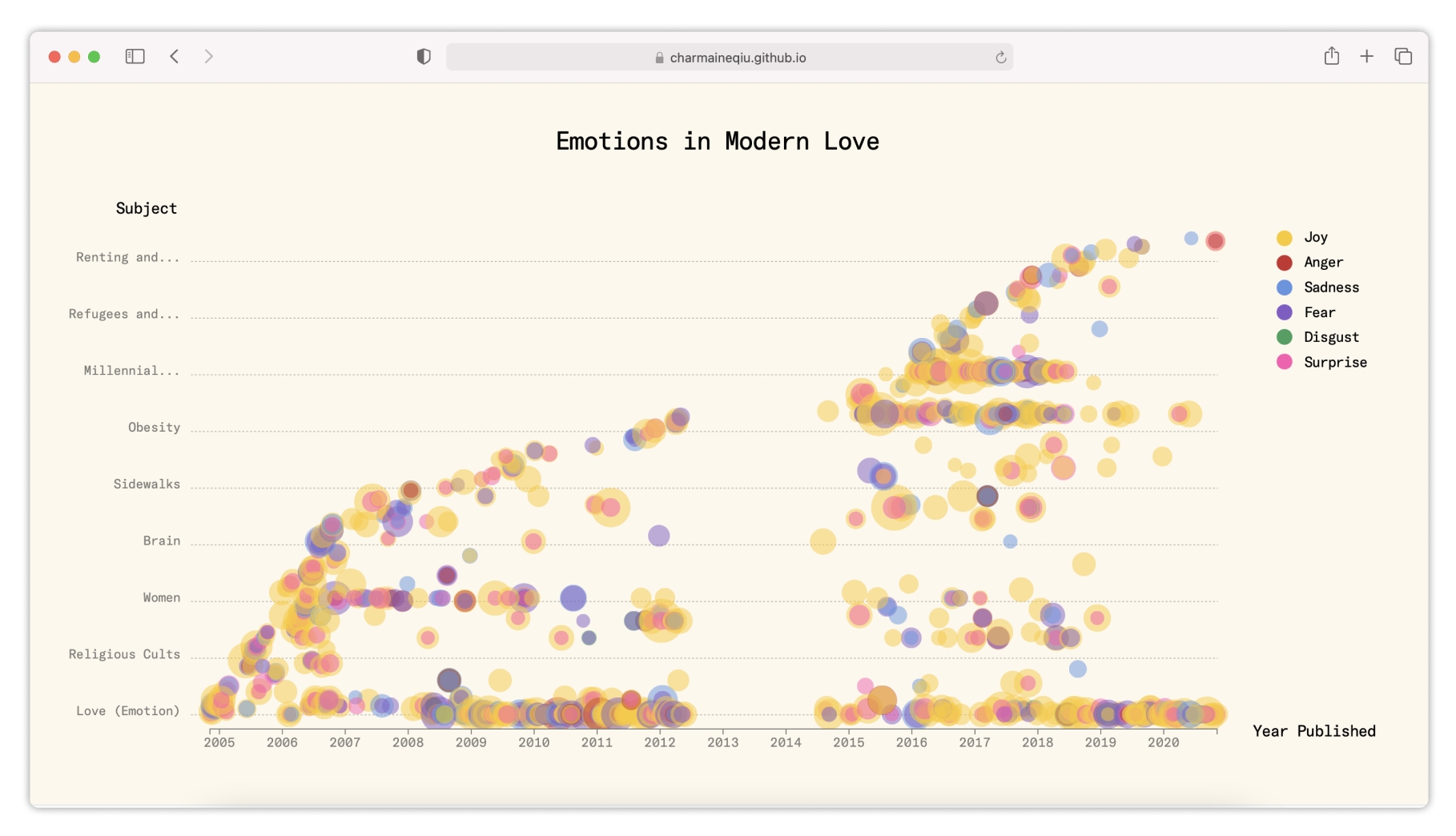
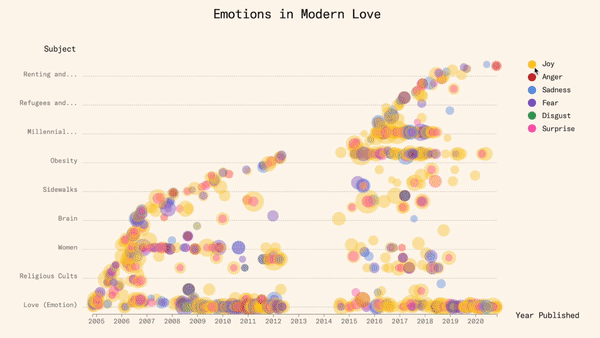
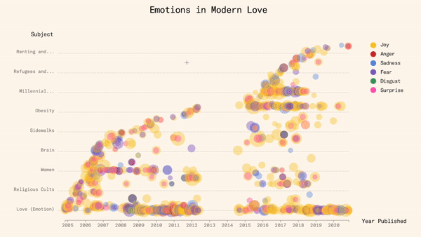
Emotions in Modern Love visualizes what writers associate with “Love”
Modern Love, a weekly column from the NYT, showcases reader-submitted stories about love. These pieces vary in length from short 100-word submissions to longer narratives. Recognizing the diverse and intricate relationships depicted in these entries, our team devised two distinct views to enable exploration at various scales and relationships between components of each article.
I was responsible for designing Web interface prototypes.
Team
Elizabeth Han
Mimi Jiao
Elizabeth Han
Mimi Jiao
Skills
Data Visualization
Web Design
Data Visualization
Web Design
Site 01
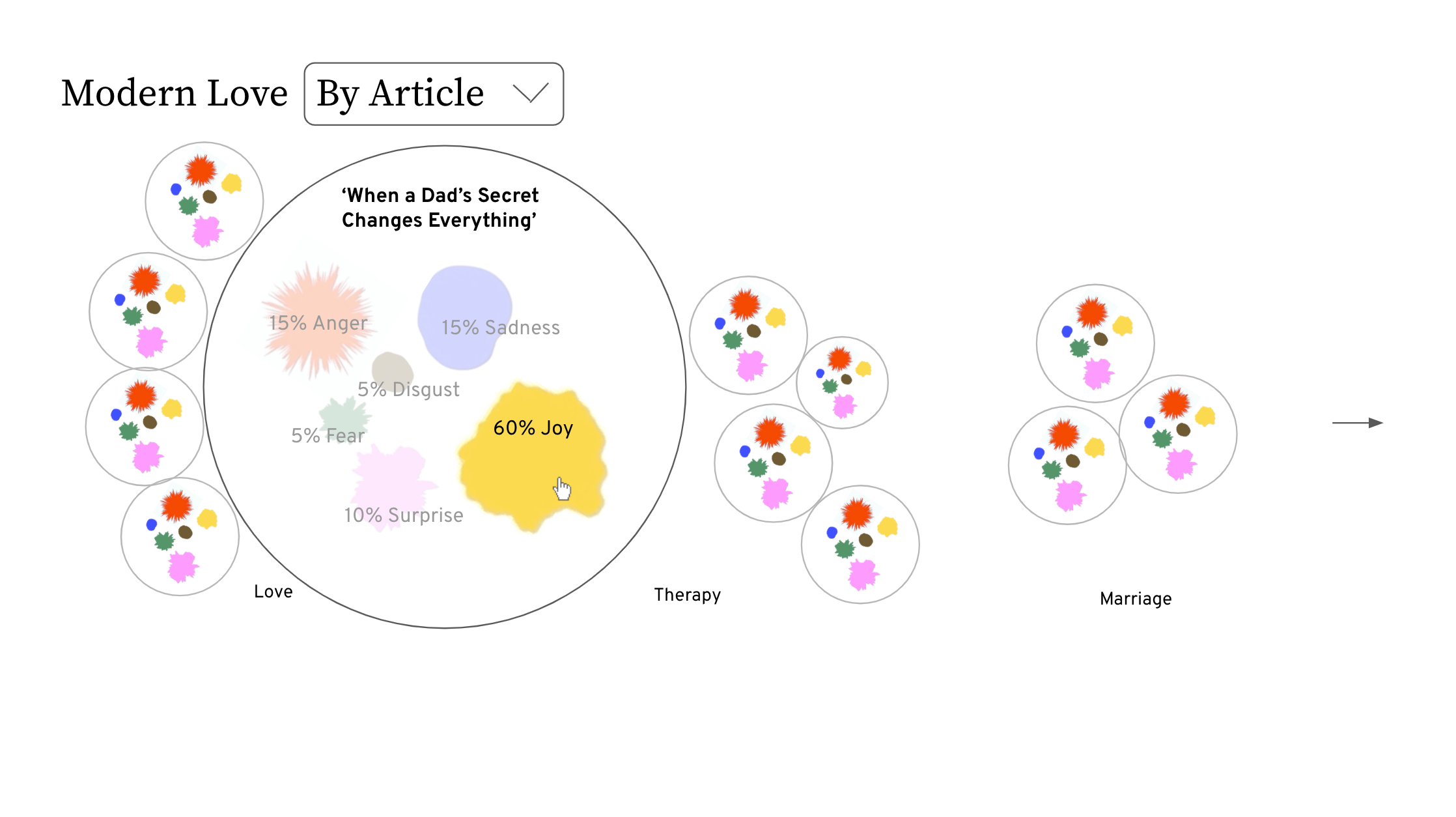
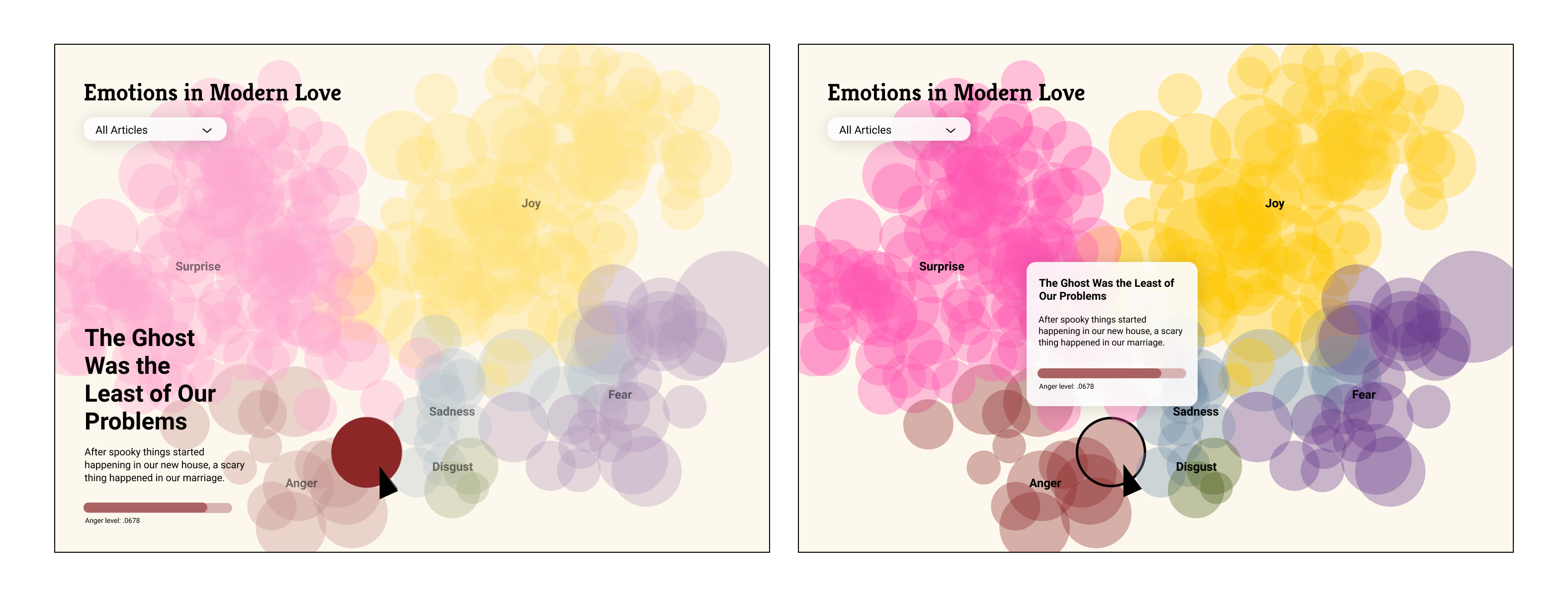
Emotions View
The emotions view presents a visualization of the proportions of six emotions—joy, anger, sadness, fear, disgust, and surprise—that we chose to explore. Each article is represented by a circular shape, allowing viewers to delve into the diverse emotions associated with each piece.
View Website
Site 02
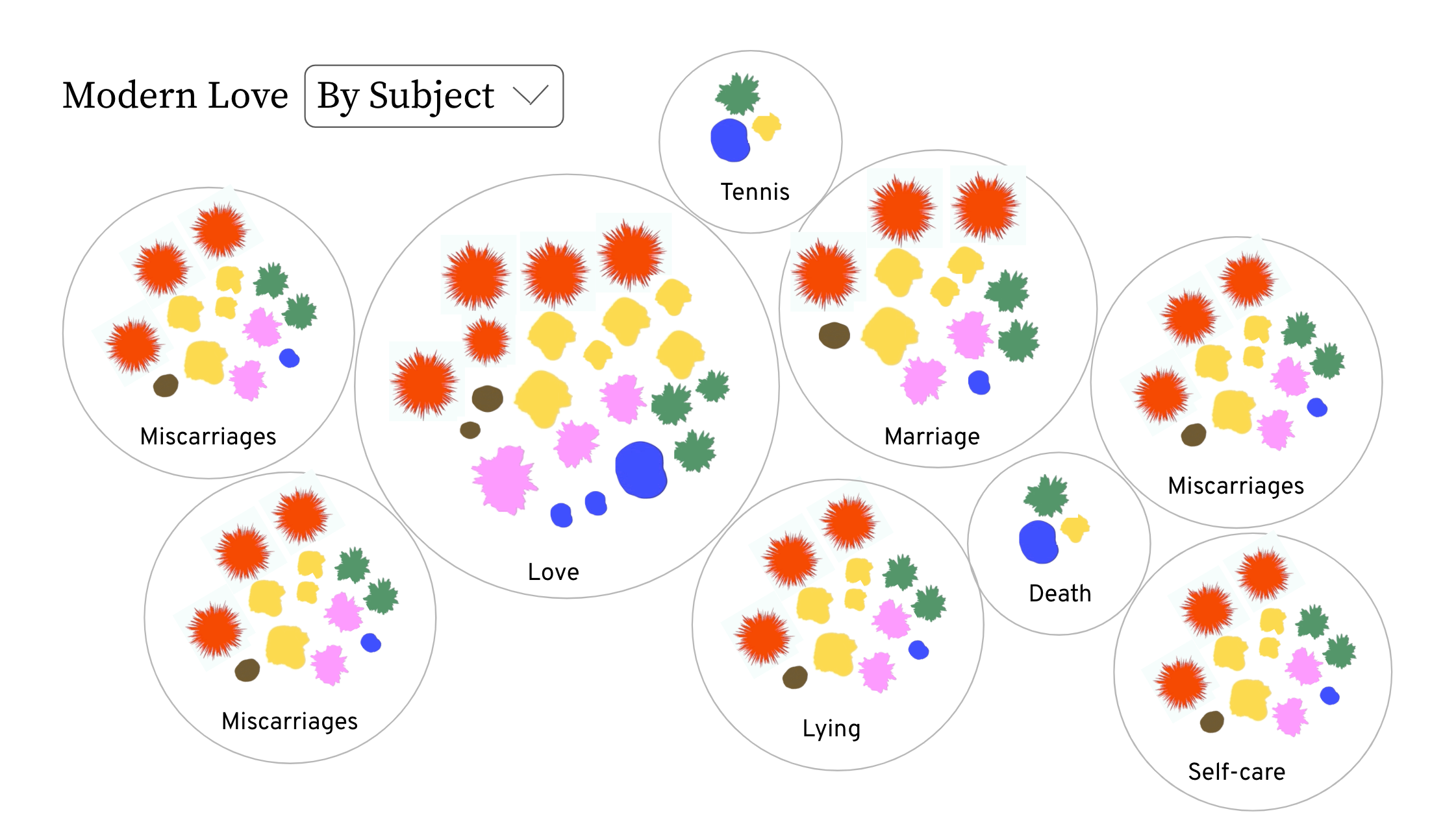
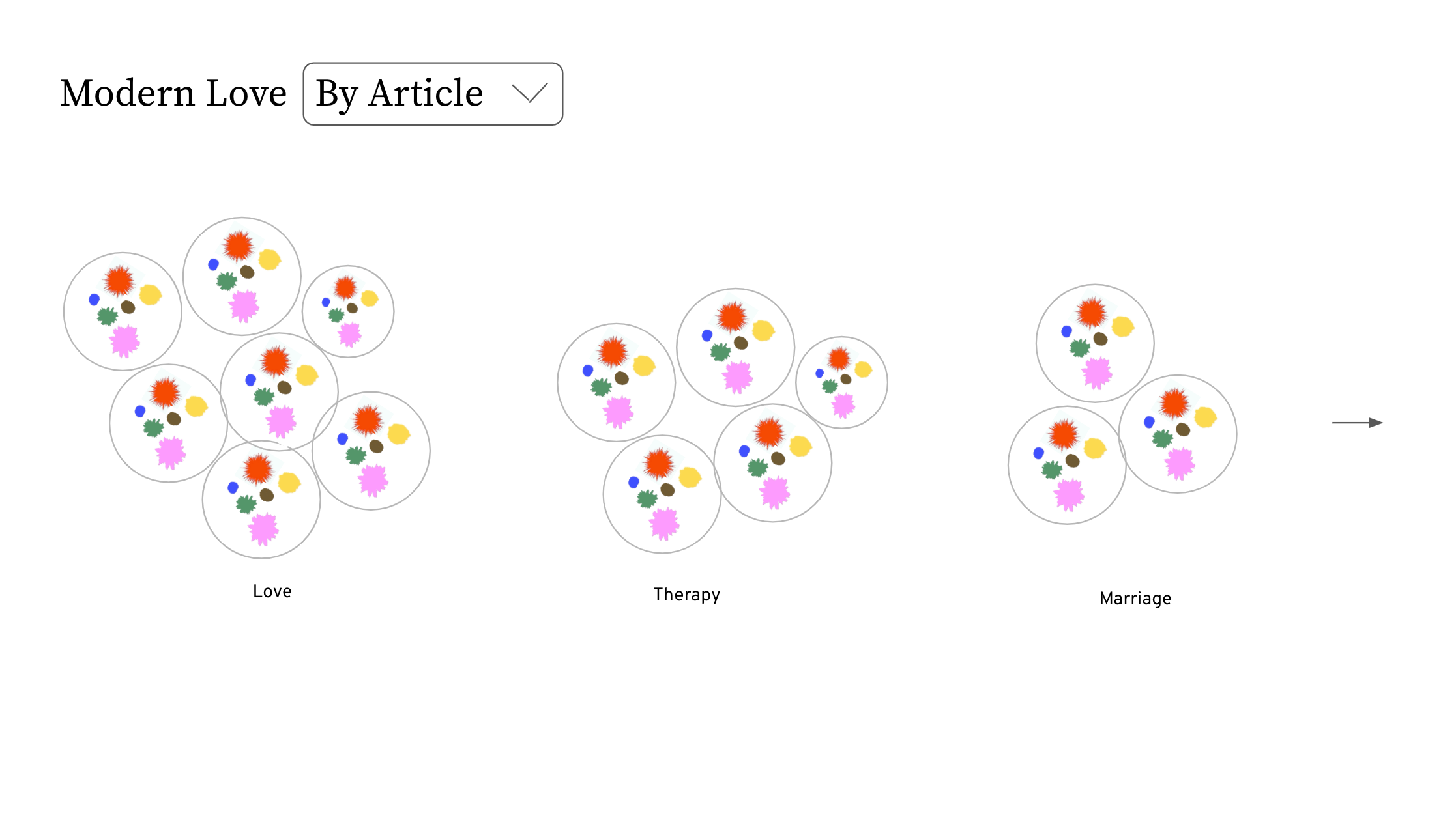
Subject View
The subjects view enables exploration of the relationship between different subjects and the publication date of each article. Viewers can zoom in and out of the chart to analyze various subjects and observe trends over time.
View Website
Subject View
The subjects view enables exploration of the relationship between different subjects and the publication date of each article. Viewers can zoom in and out of the chart to analyze various subjects and observe trends over time.
View Website

Design Process
Initial explorations
Initial explorations
Our design process commenced with identifying the key elements of "Modern Love" articles that could evoke reflection when represented visually through data. We drew inspiration from organic visualization styles that highlight the human aspects of emotions.
![]()
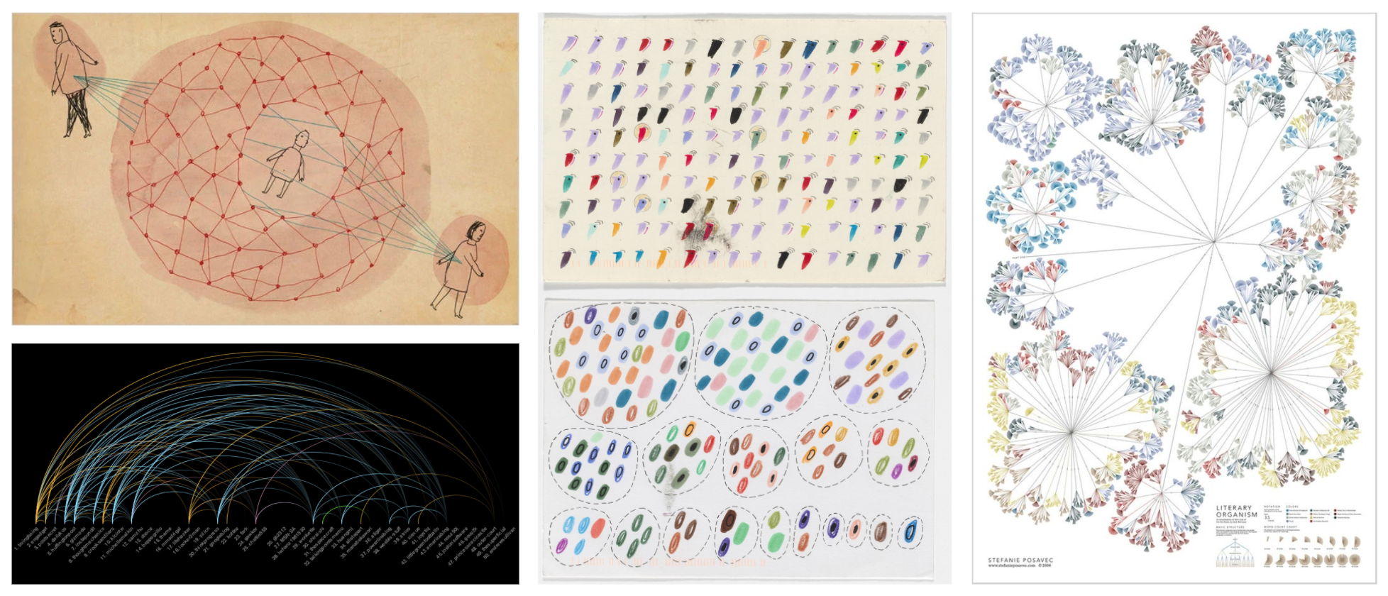
Moodboard
In our initial explorations, we concentrated on methods to organize data and depict emotions in dynamic ways. However, we observed that visual redundancy occurred when the same emotions overlapped across different groupings. Given our aim for users to grasp the diverse emotions and topics within "Modern Love" articles, we opted to design two views with distinct purposes.


Wireframes
We chose colors that are commonly used to identify corresponding emotions, and used opacity to allow overlapping in the visual representation.

Colors
When designing the two different views, we focused on finding ways to present data by the purpose of each view. In the emotions view, we used a macro-view of all articles to help viewers make connections of emotions within an article. On the other hand, the subject's view utilized a graph structure to better present the various subjects and its relationship with the year published.
When designing the two different views, we focused on finding ways to present data by the purpose of each view. In the emotions view, we used a macro-view of all articles to help viewers make connections of emotions within an article. On the other hand, the subject's view utilized a graph structure to better present the various subjects and its relationship with the year published.
Emotions View
![]() Subjects View
Subjects View
![]()
 Subjects View
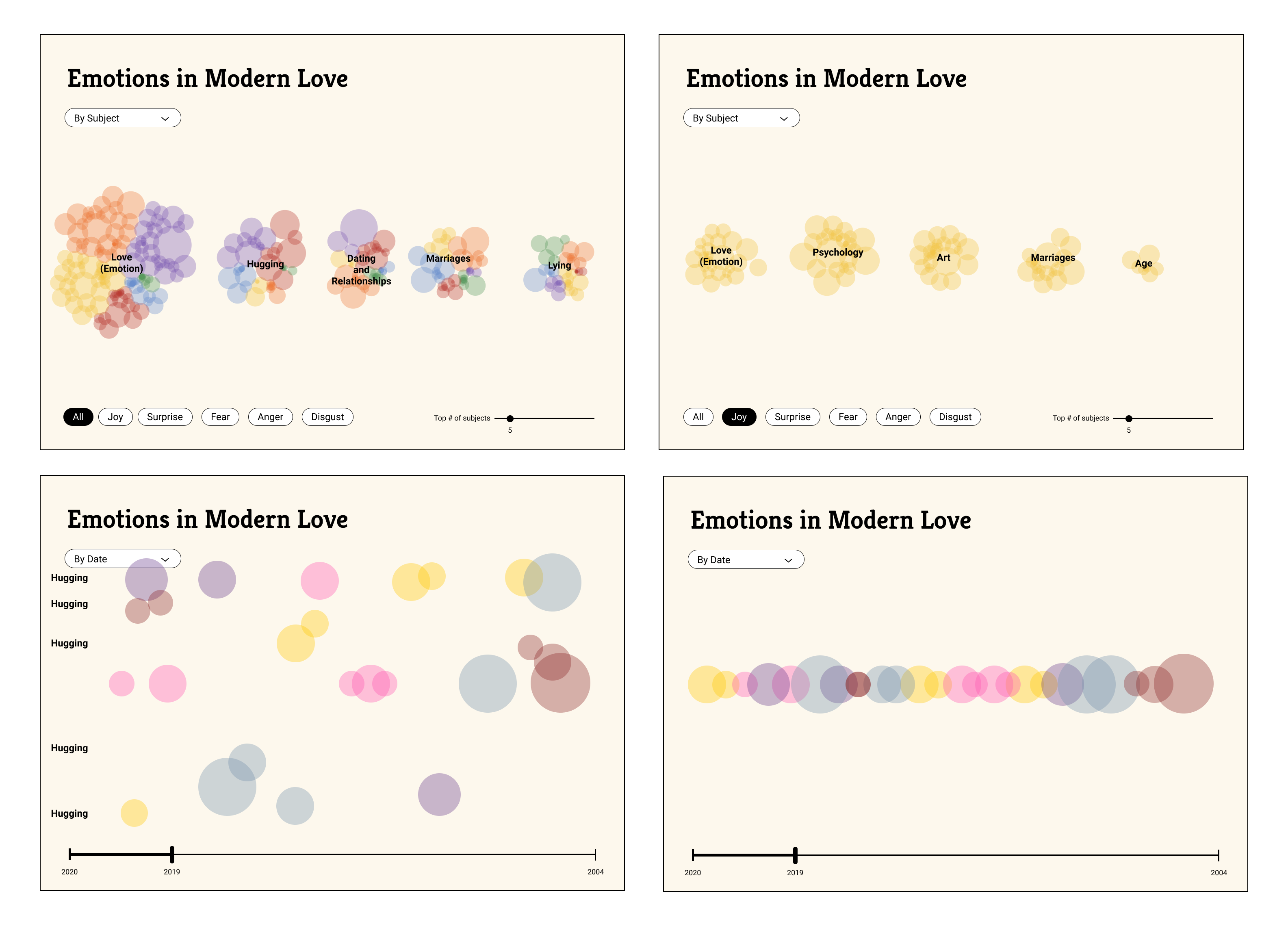
Reflection
Working on this project allowed me to collaborate within a diverse team and appreciate the creative potential of using code as a medium. One significant challenge was integrating data into the design process. Predicting the outcome of screen designs before implementation proved difficult, limiting my ability to wireframe the UI. However, this uncertainty ultimately became a source of beauty in working with data, as we were pleasantly surprised by the visualizations' outcomes.
Spring 2021
6 weeks
6 weeks
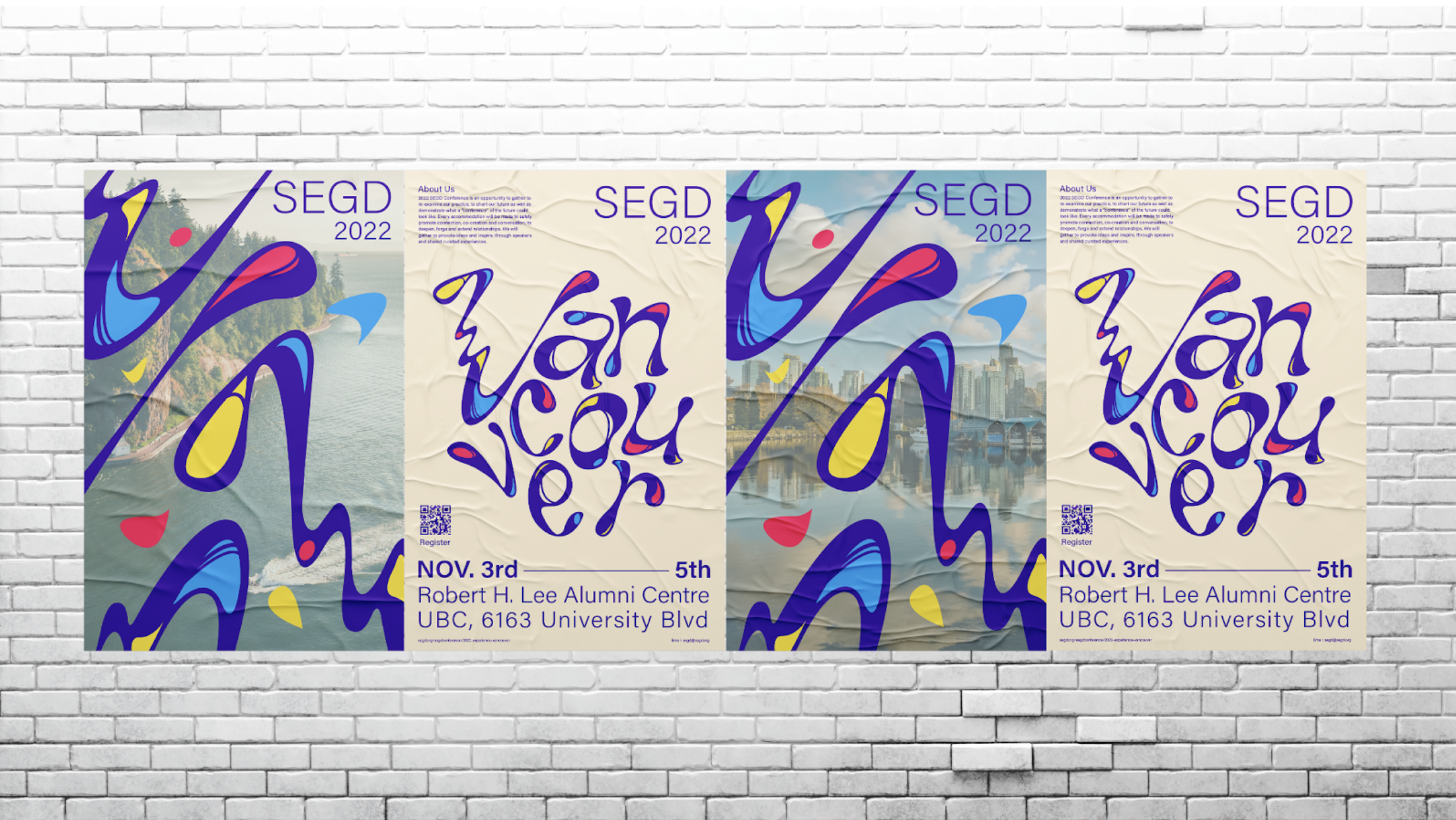
Creating a brand identity for Vancouver SEGD 2022
As a global, multidisciplinary community of over 2200 members from 35 countries, SEGD plans, designs, and builds experiences that connect people to places.
I designed the identity for the SEGD 2022 conference, presuming the event would be held in Vancouver. Aiming to strengthen the connection between public spaces and their users through placemaking, I infused the identity of this cross-disciplinary event with elements that reflect the unique character of Vancouver.
Team
Individual
Individual
Skills
Branding
Experimental Type
Graphic Design
Signage Design
Branding
Experimental Type
Graphic Design
Signage Design

Concept
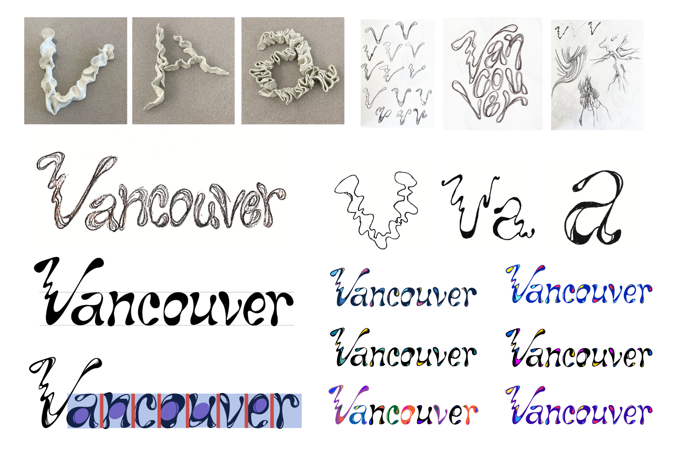
A Creative Space that is dynamic and constantly evolving in new directions without boundaries.
The logotype is inspired by Vancouver's natural surroundings, particularly its oceanic features, reflected in its free-flowing and fluid design. Guided by strokes of diverse weights, vibrant highlights, and a subtle slant to the letters, the design captures a sense of movement and dynamism.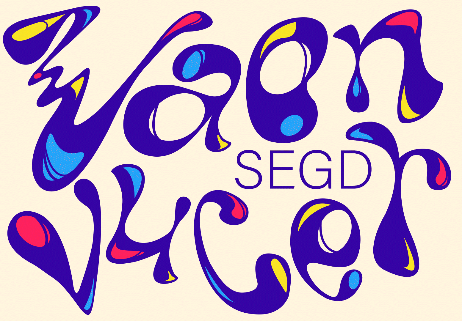
Logo Animation

Logotype with alternative color and arrangement
Design System
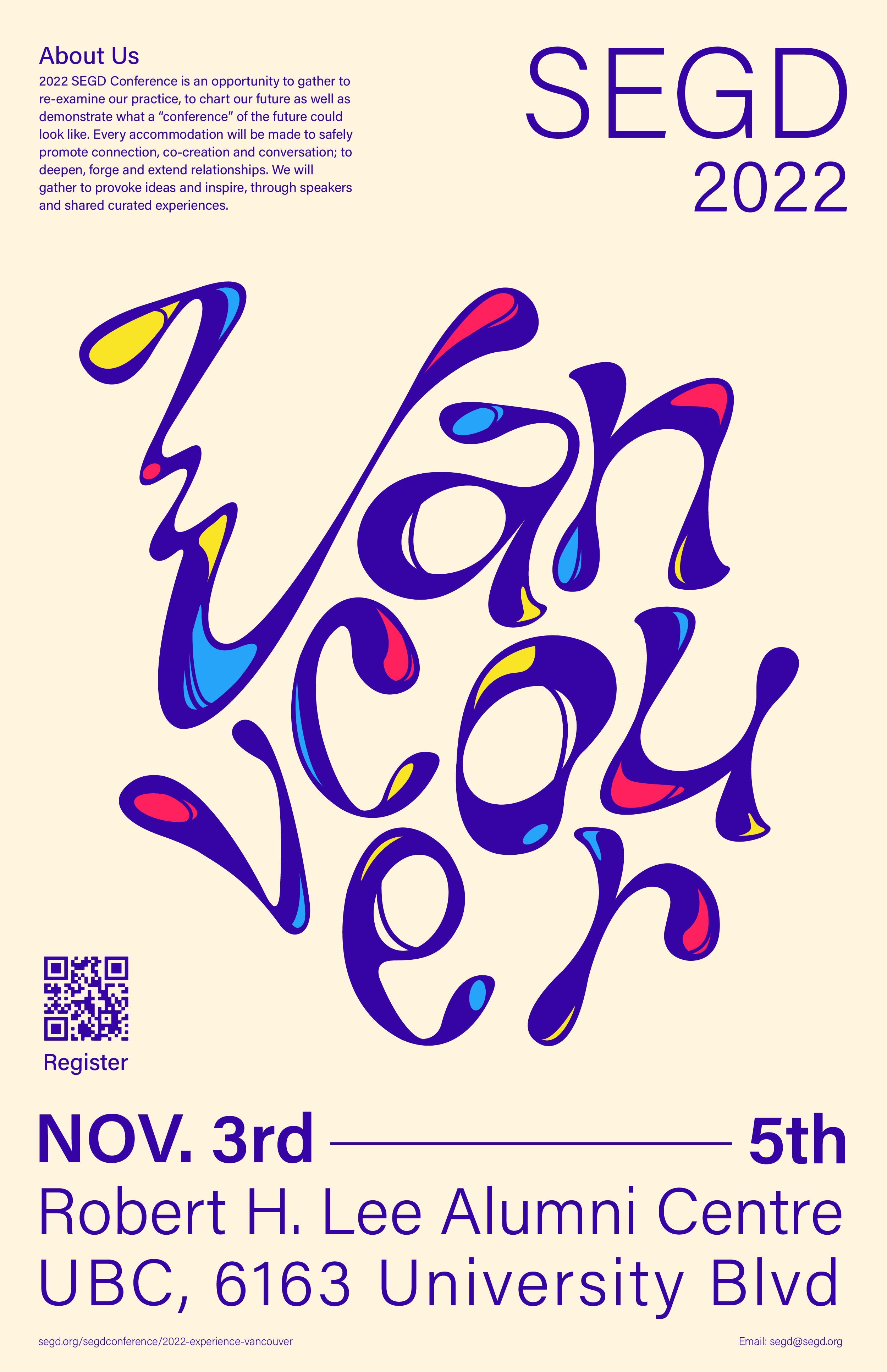
Color and Supporting Typeface
The primary color palette features a deep blue reminiscent of the ocean, complemented by a contrasting cream shade as the backdrop. Three additional supporting colors are selected to infuse elements of vibrancy into the creative event. To balance the intricacy of the logotype, a simple and legible typeface is chosen as the supporting font, creating a clear contrast.

Communication piece
Posters
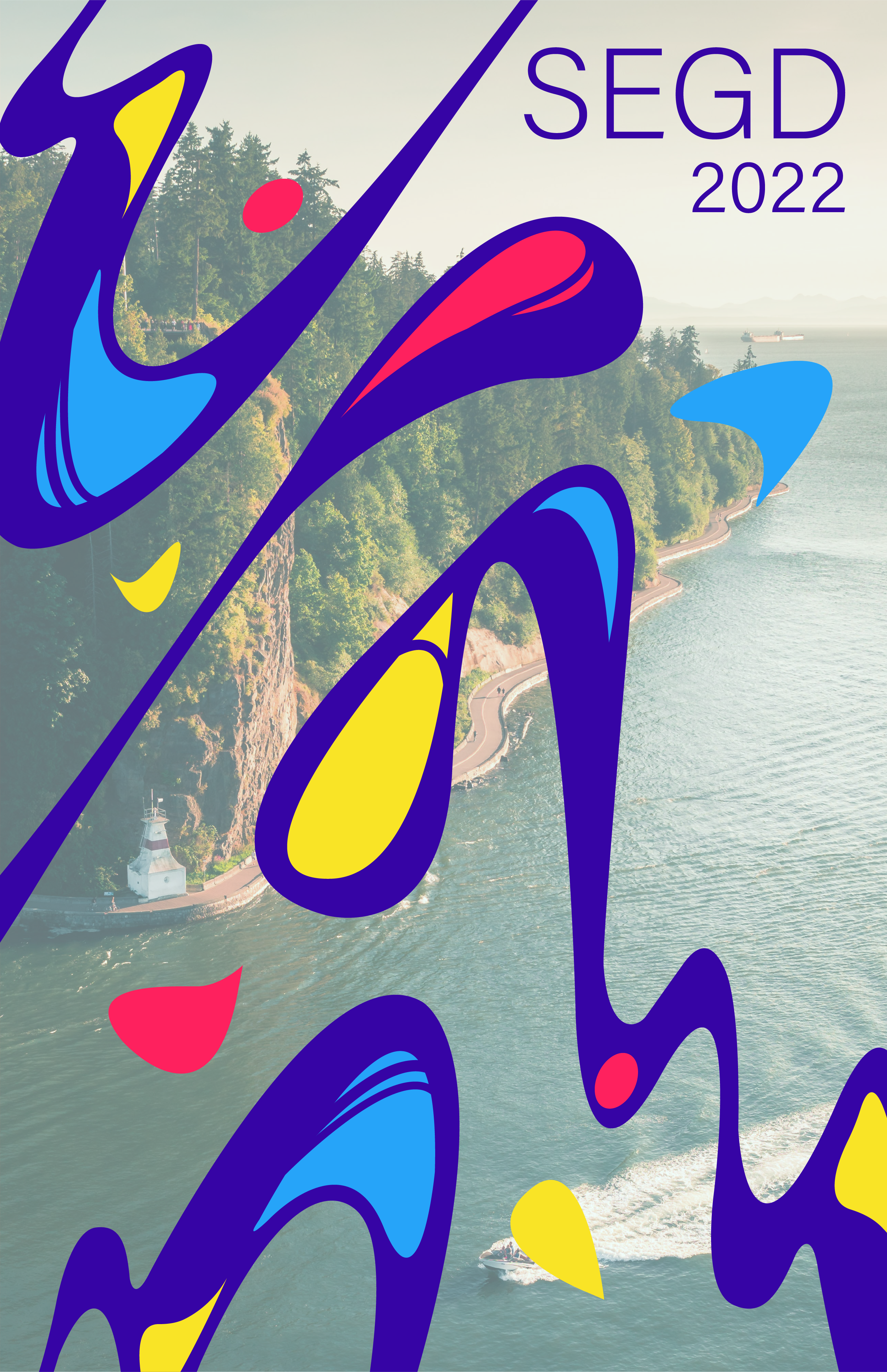
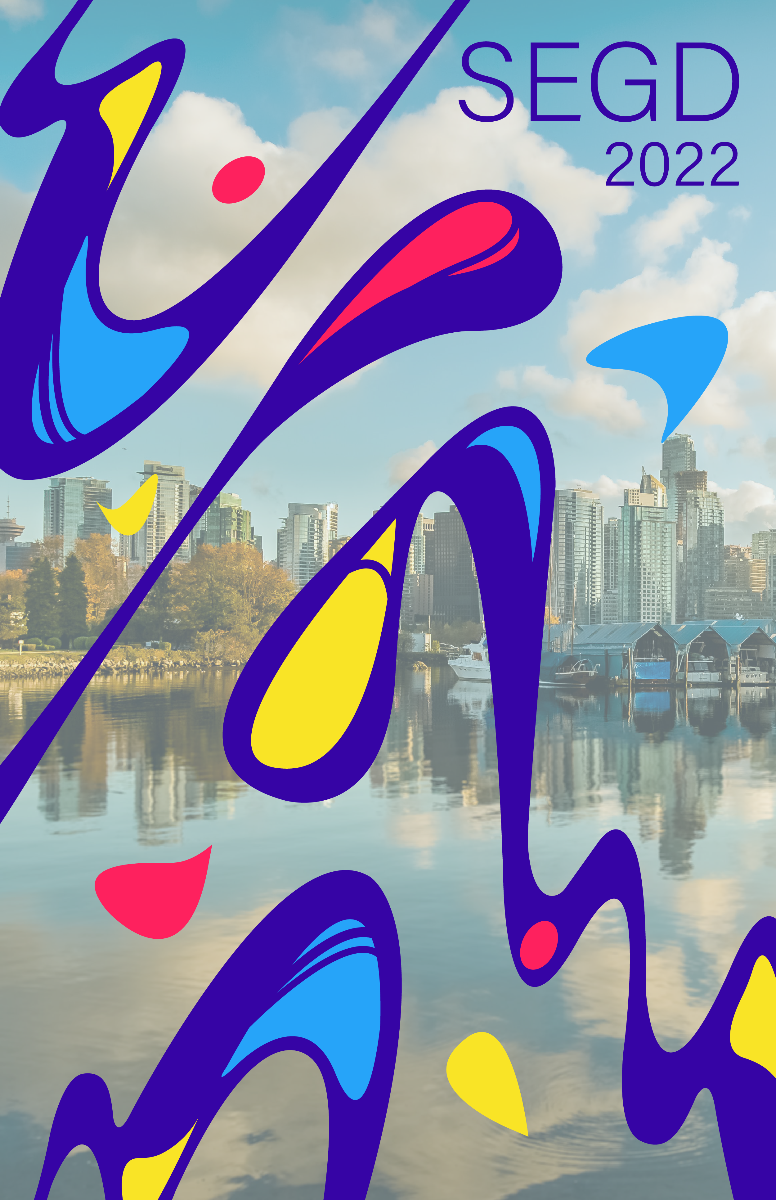
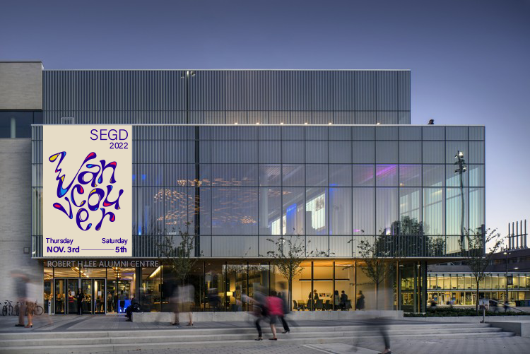
These posters serve as communication tools leading up to and during the event. I managed the amount of information on each poster according to its scale. For street posters, I juxtaposed close-up sections of the logotype with images of Vancouver, establishing a direct connection between the city and my design outputs.
Posters
These posters serve as communication tools leading up to and during the event. I managed the amount of information on each poster according to its scale. For street posters, I juxtaposed close-up sections of the logotype with images of Vancouver, establishing a direct connection between the city and my design outputs.
Communication piece
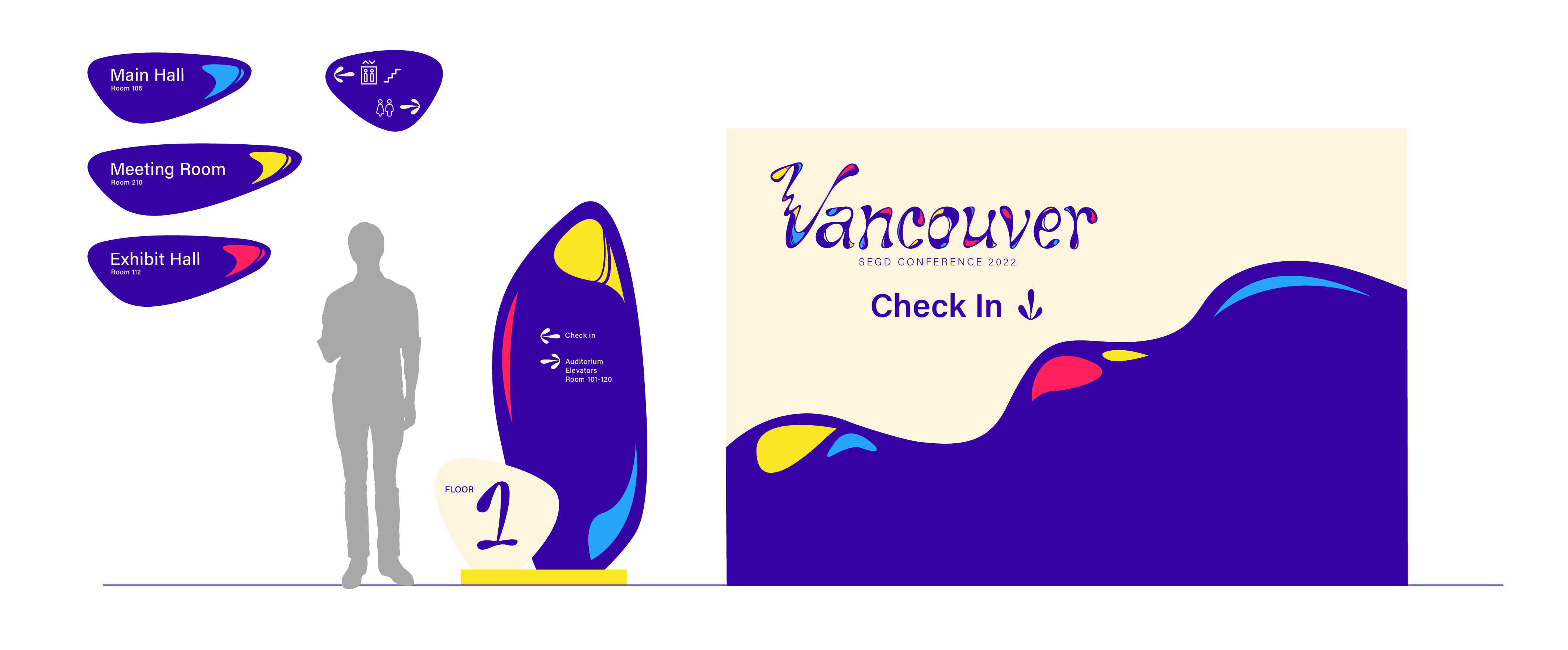
Interior Signage
I created navigational signage available in various scales, offering crucial information about each floor and the surrounding area.

Communication piece
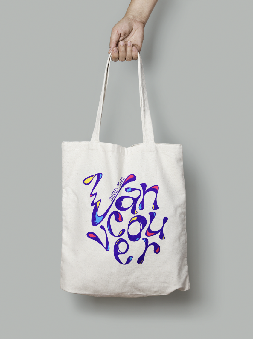
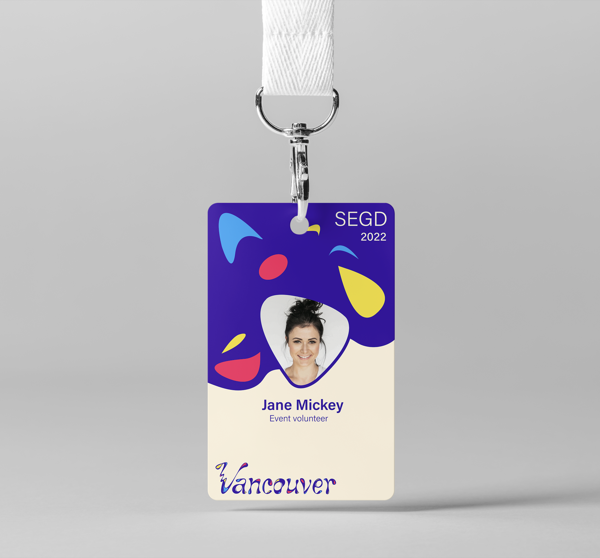
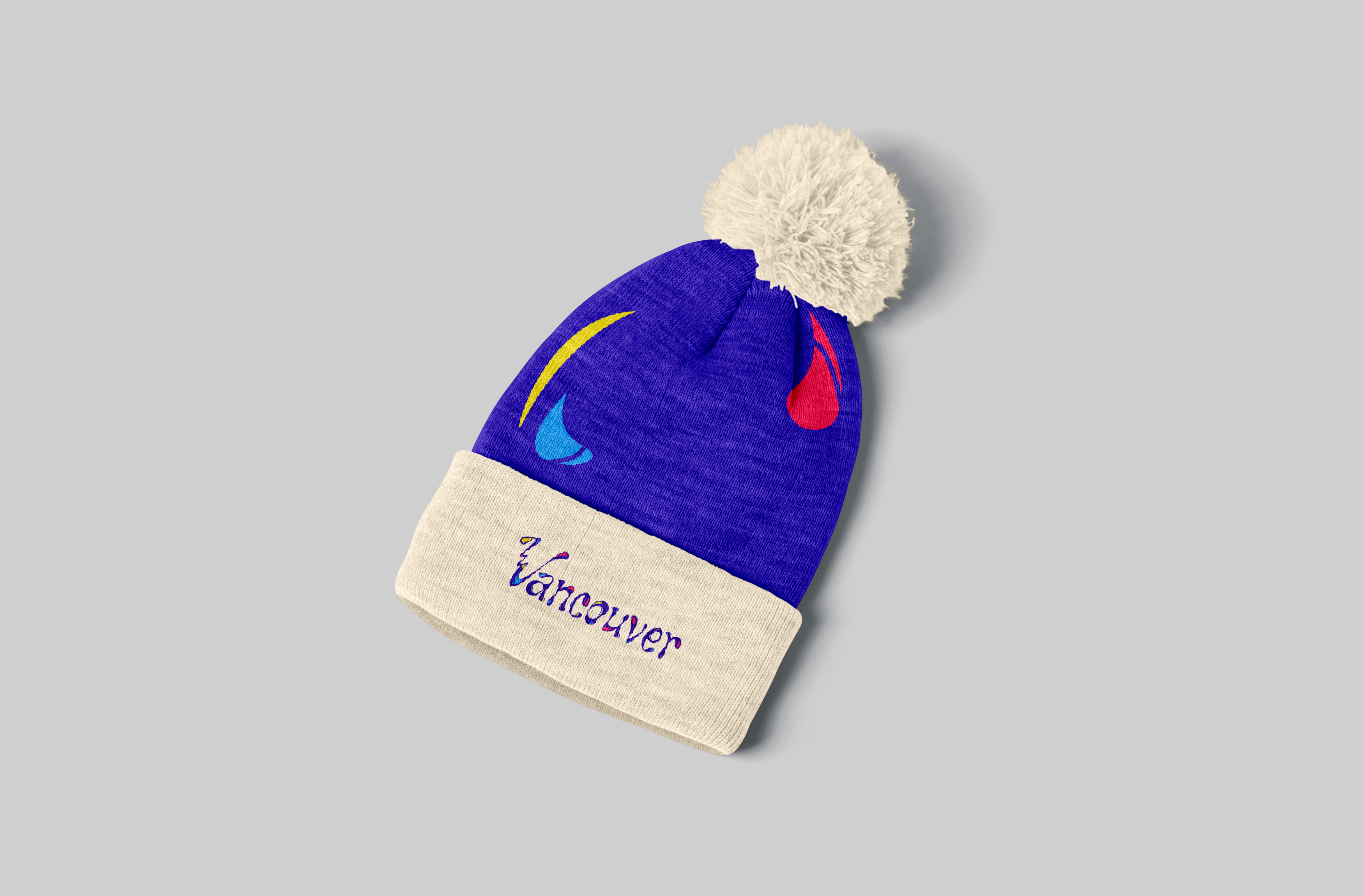
Merchandise
To bolster the event's identity, I crafted event-specific peripherals like name cards and merchandise, adhering to the established design system.
To bolster the event's identity, I crafted event-specific peripherals like name cards and merchandise, adhering to the established design system.


Process
![]()
Reflection
This project encouraged me to deeply explore the environment I'm designing for, extracting essential characteristics to guide my design choices. I discovered the significance of striking a balance between introducing transformation and new elements to the design while maintaining the overall coherence. Every variation and expansion in design should serve to enhance the event's identity.
Fall 2020
10 weeks
10 weeks
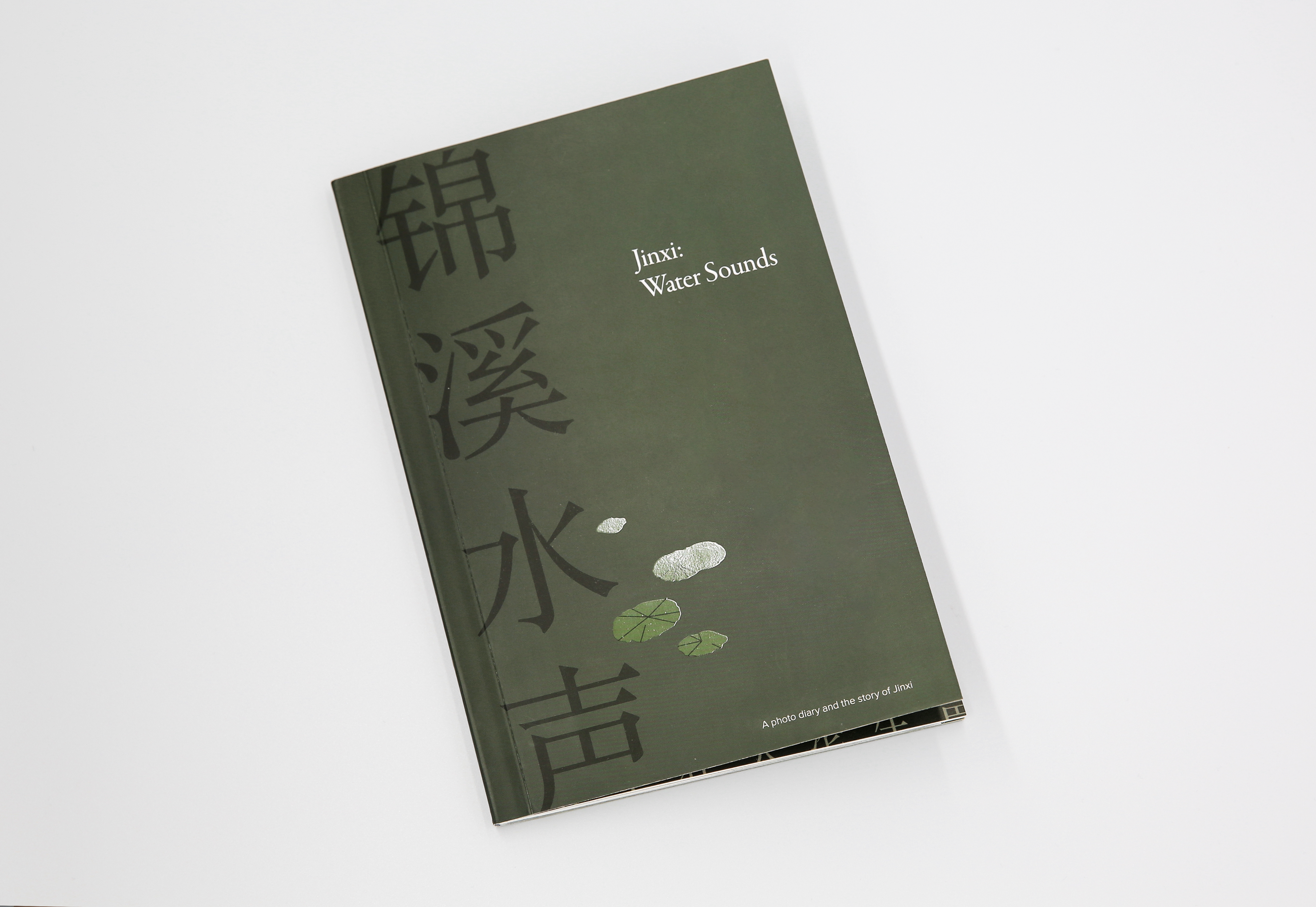
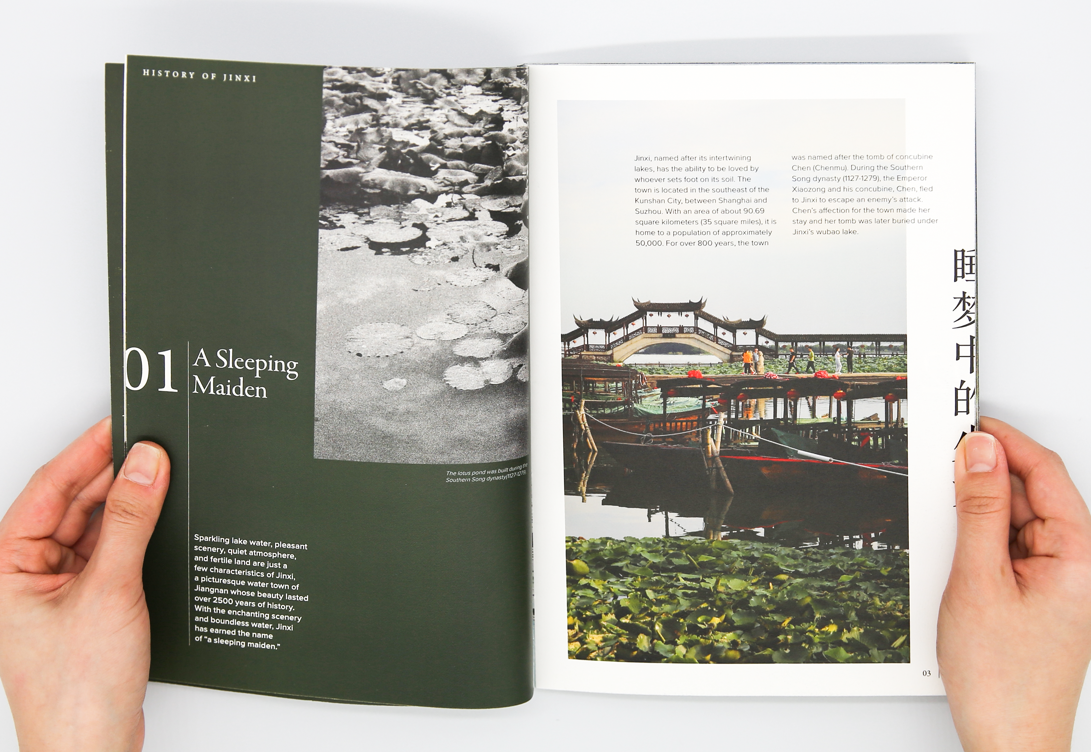
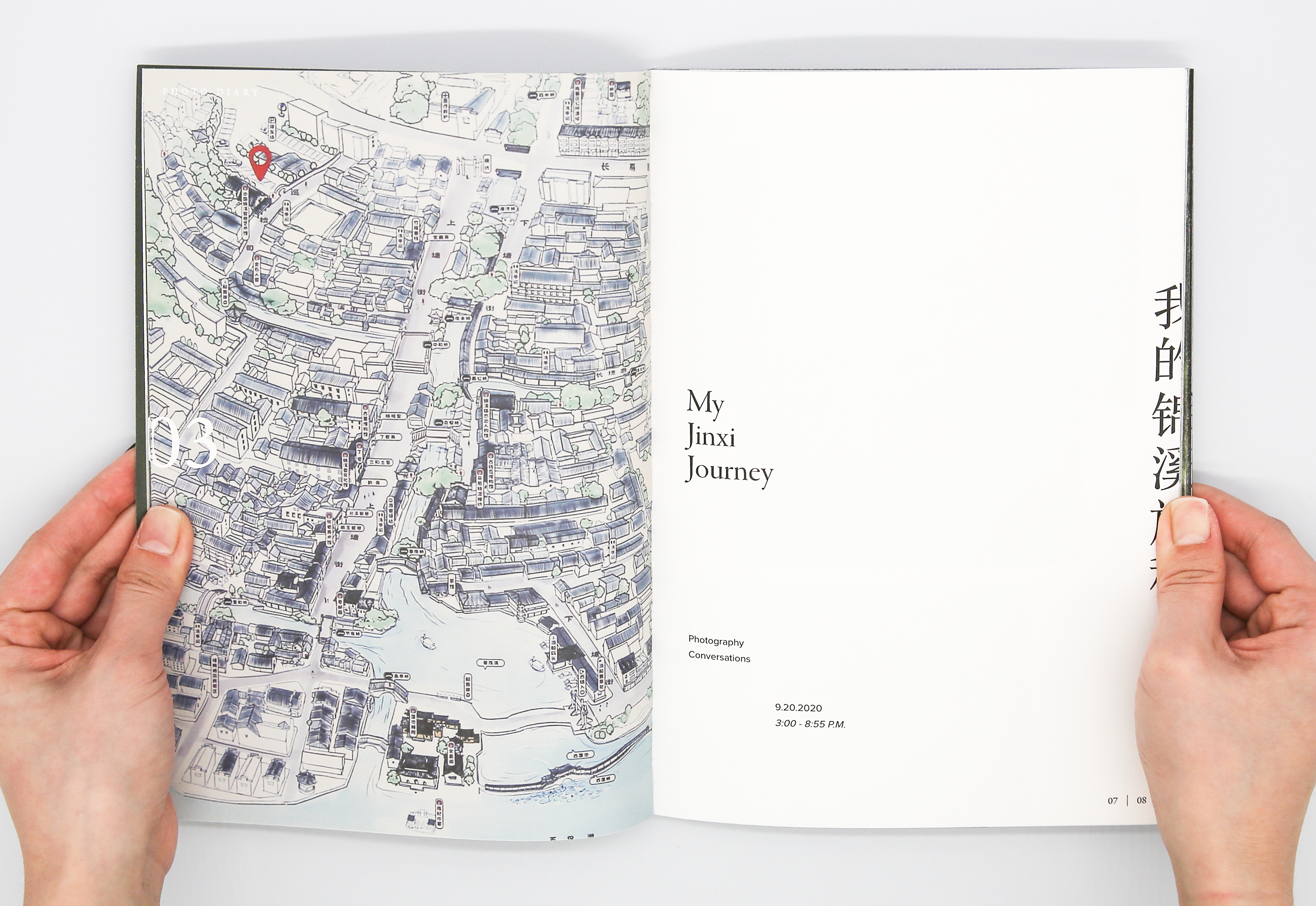
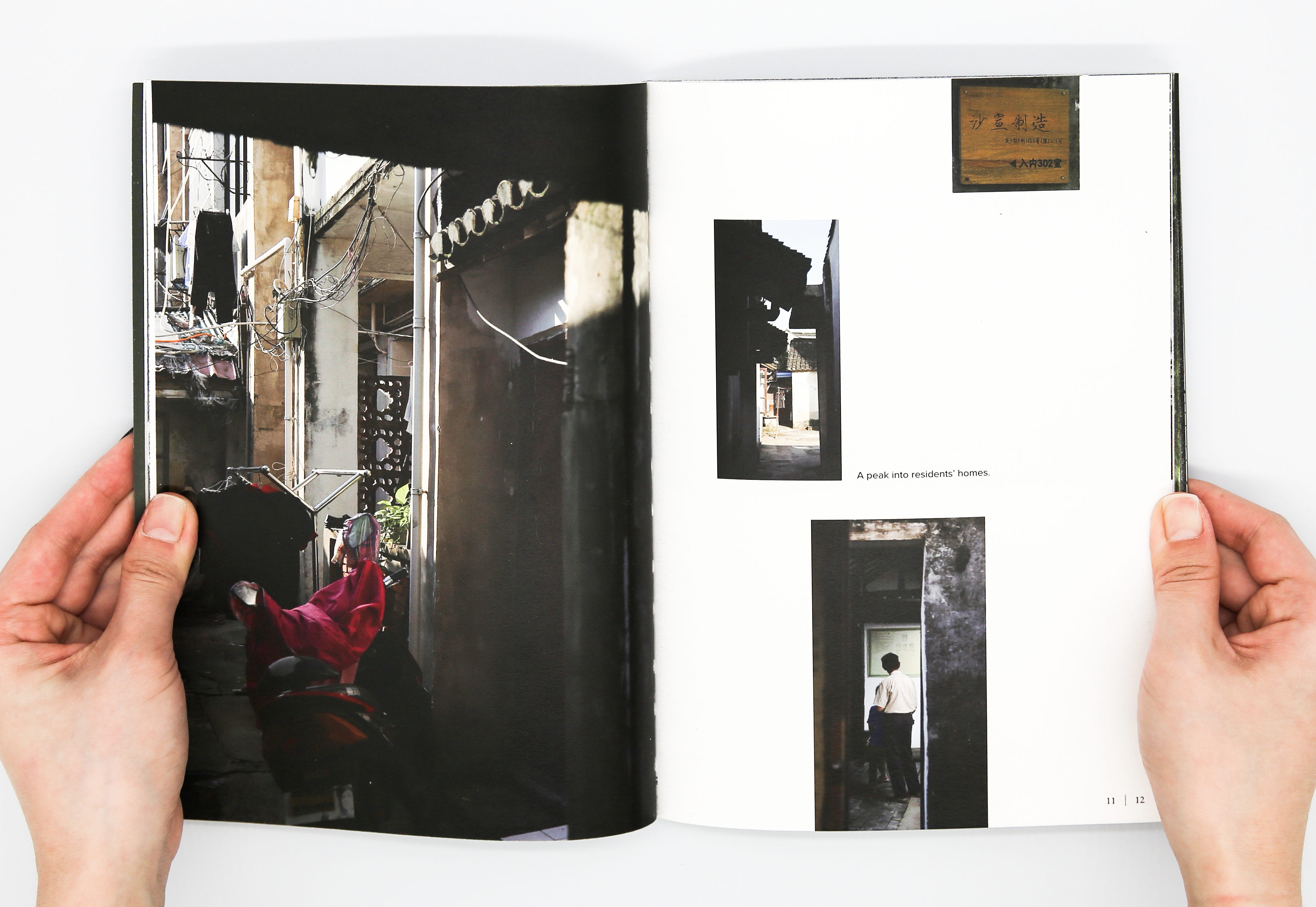
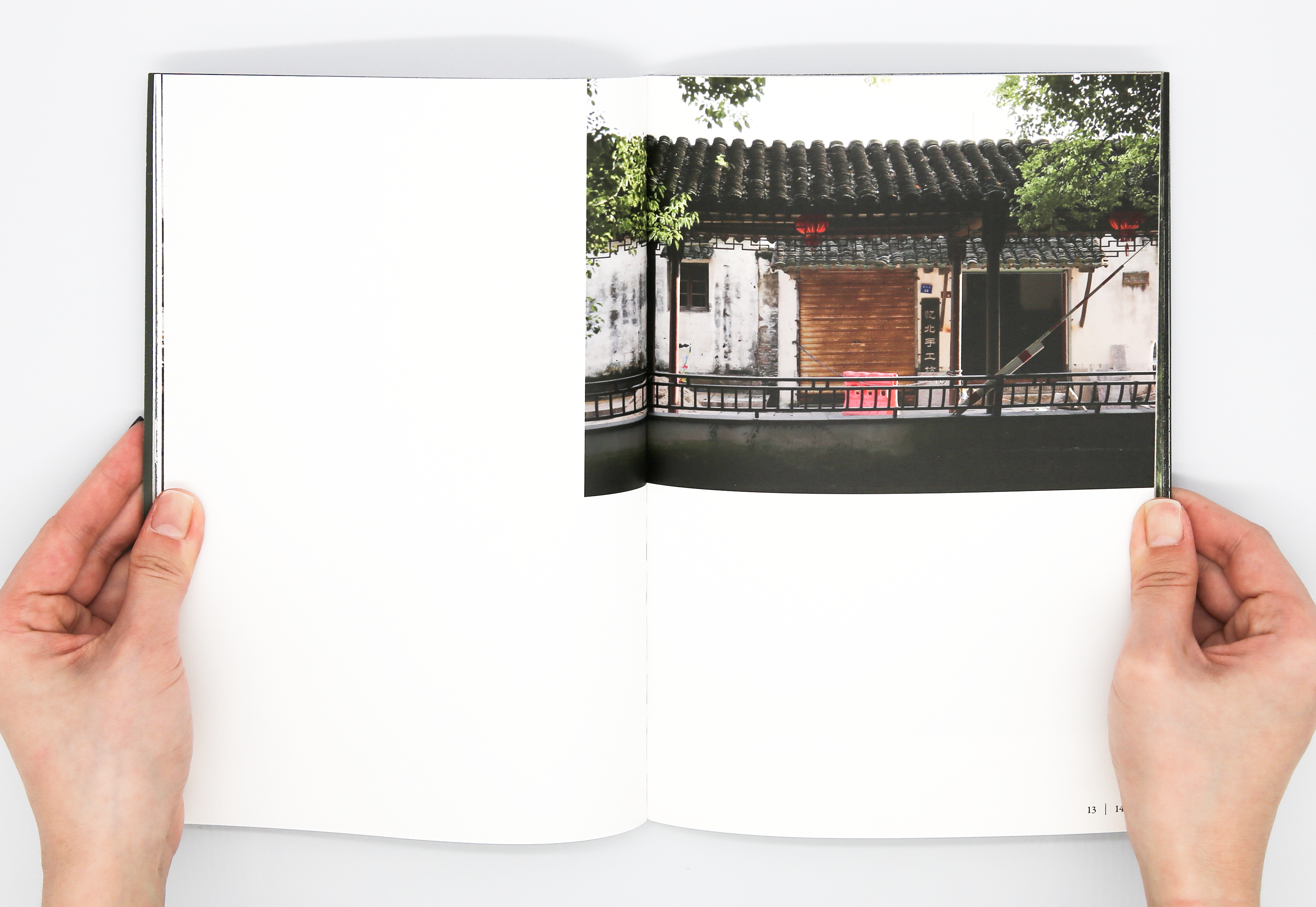
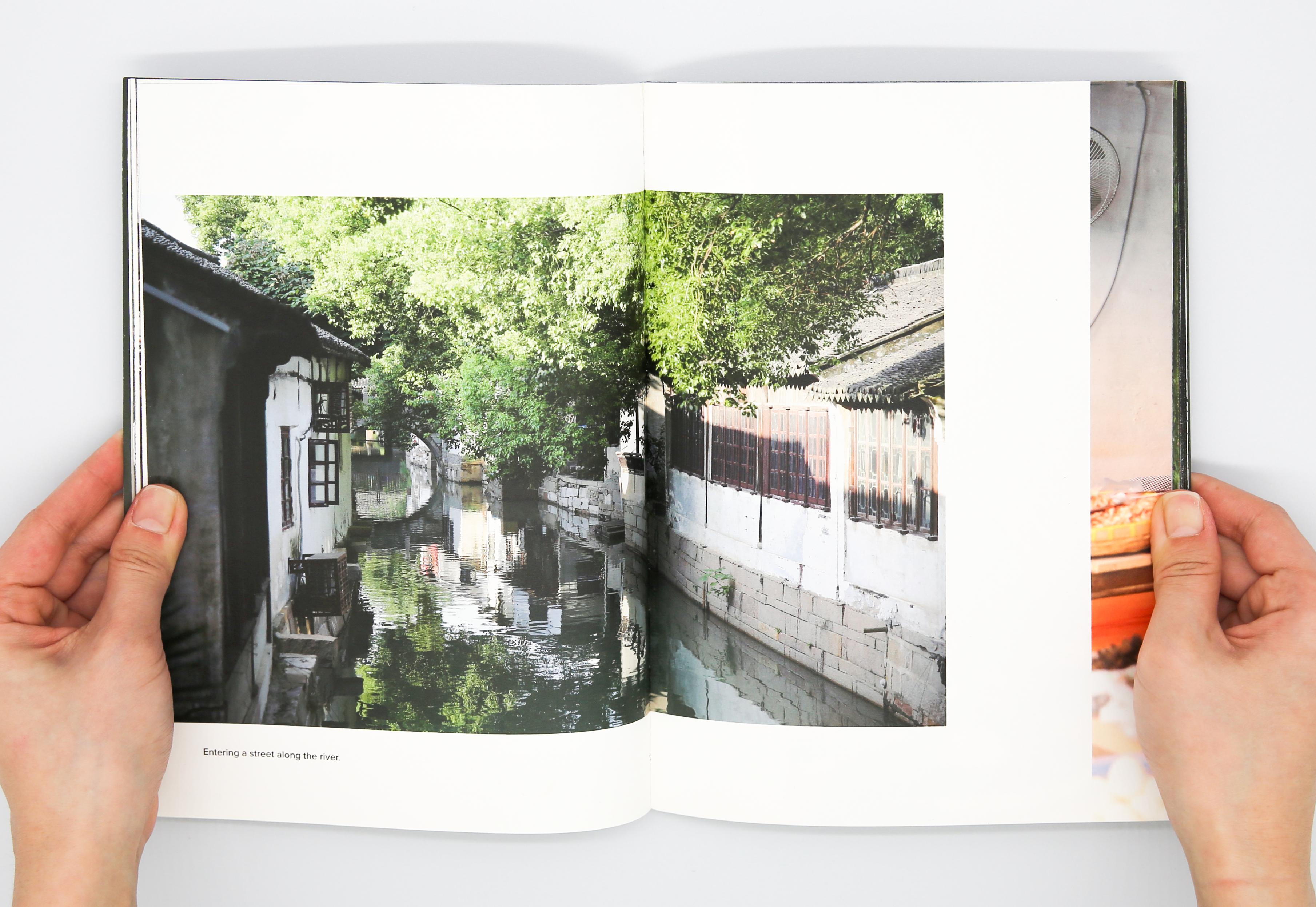
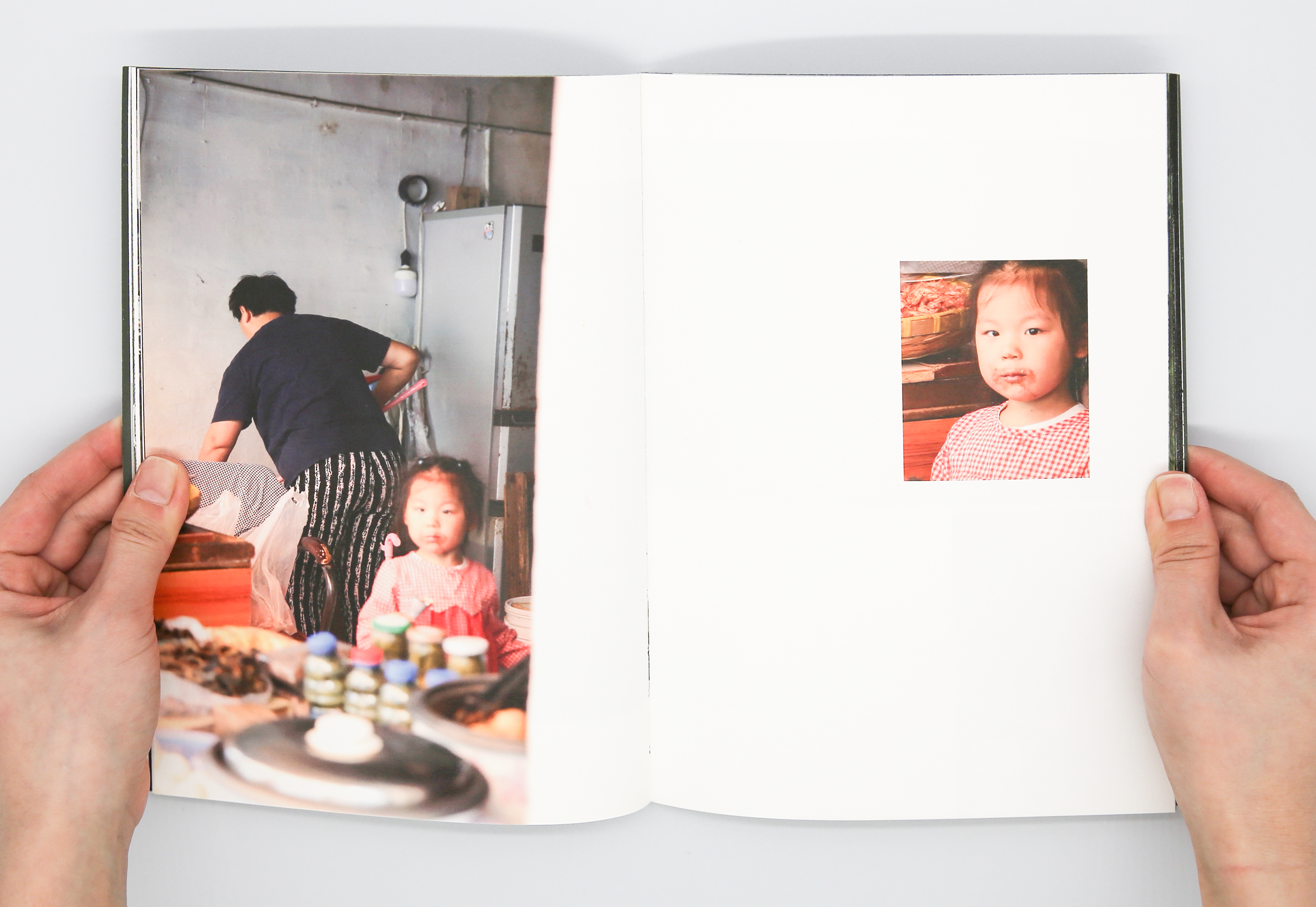
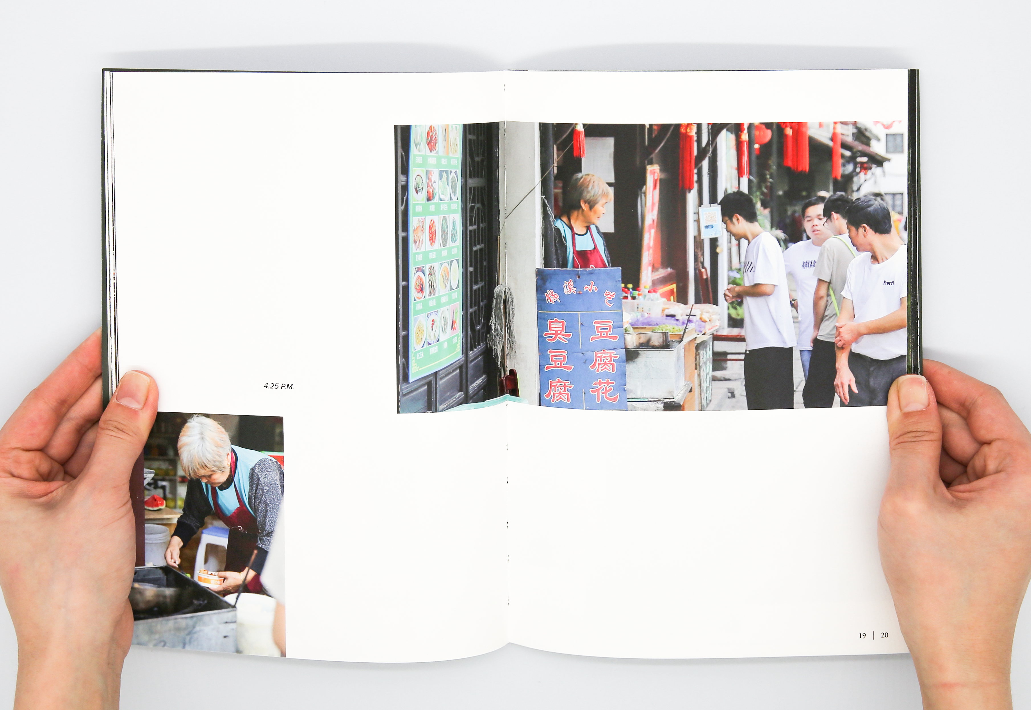
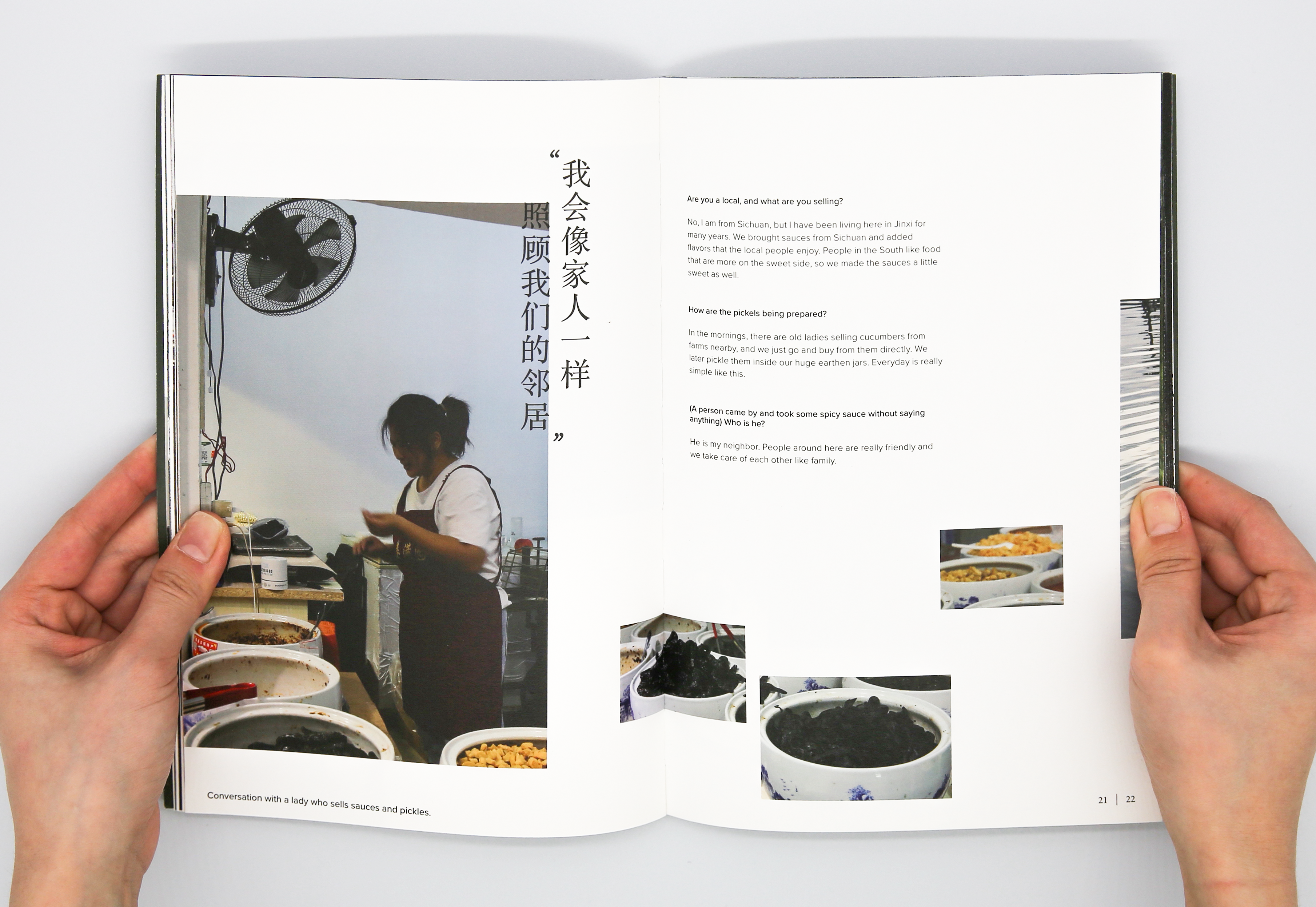
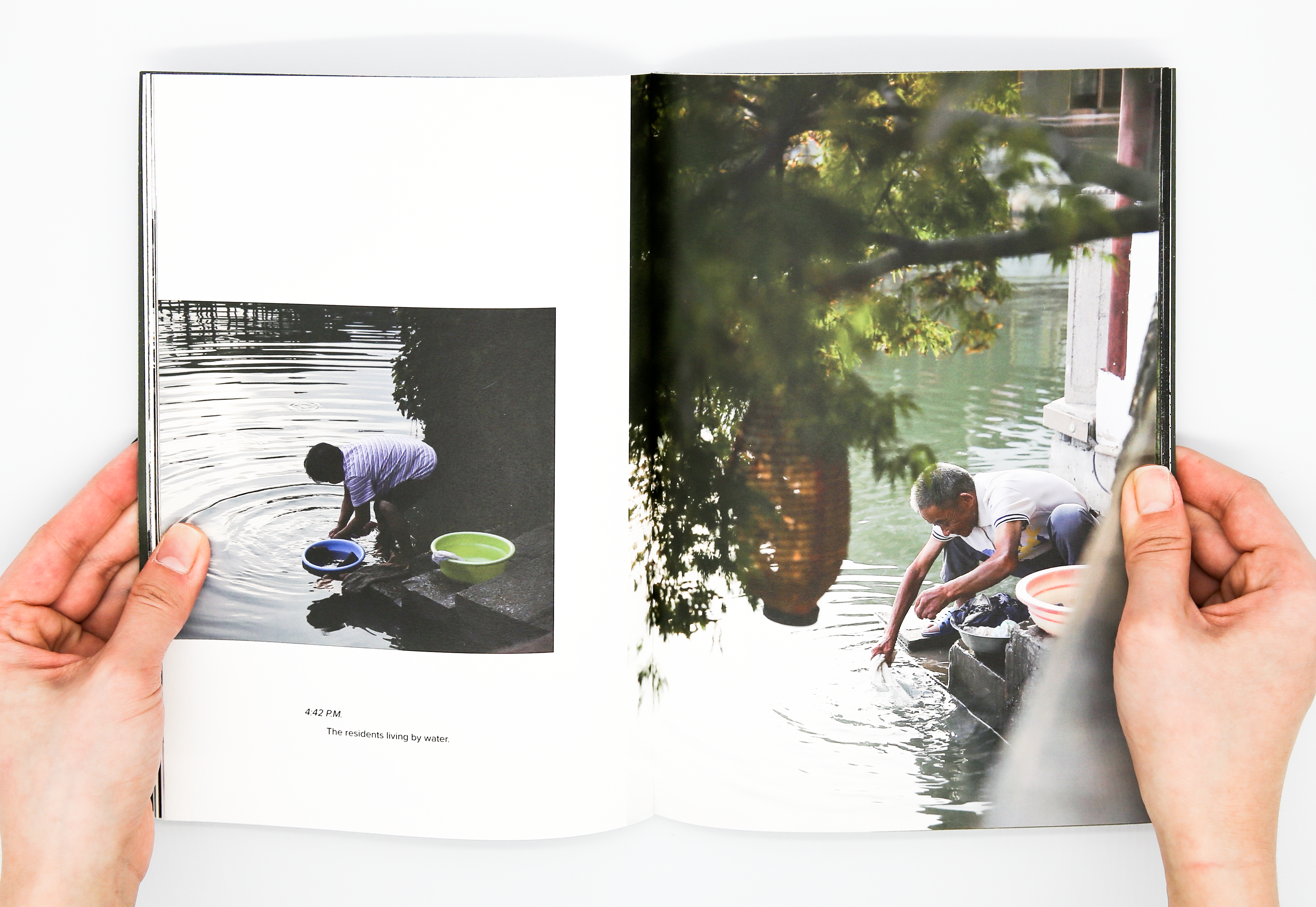
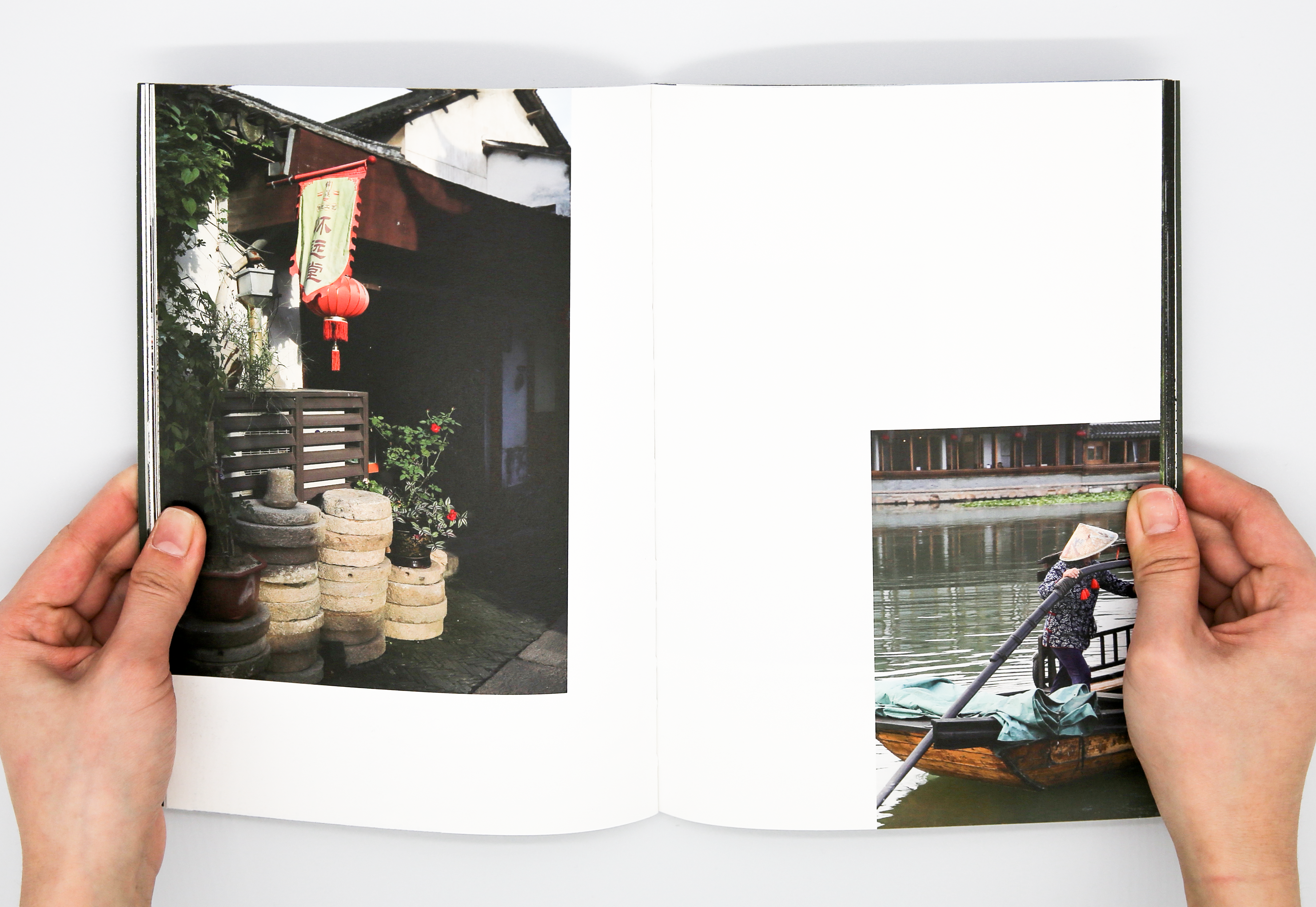
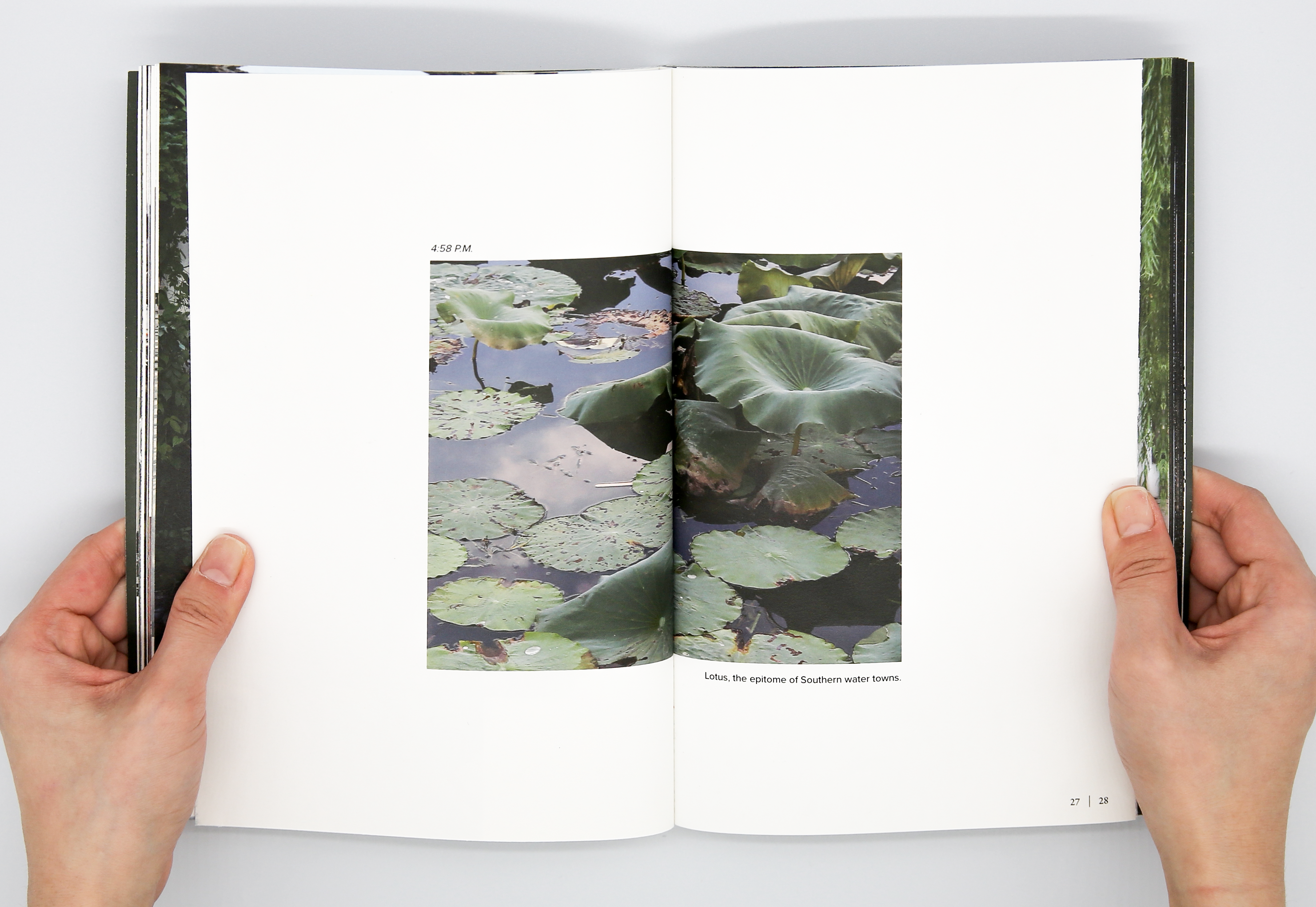
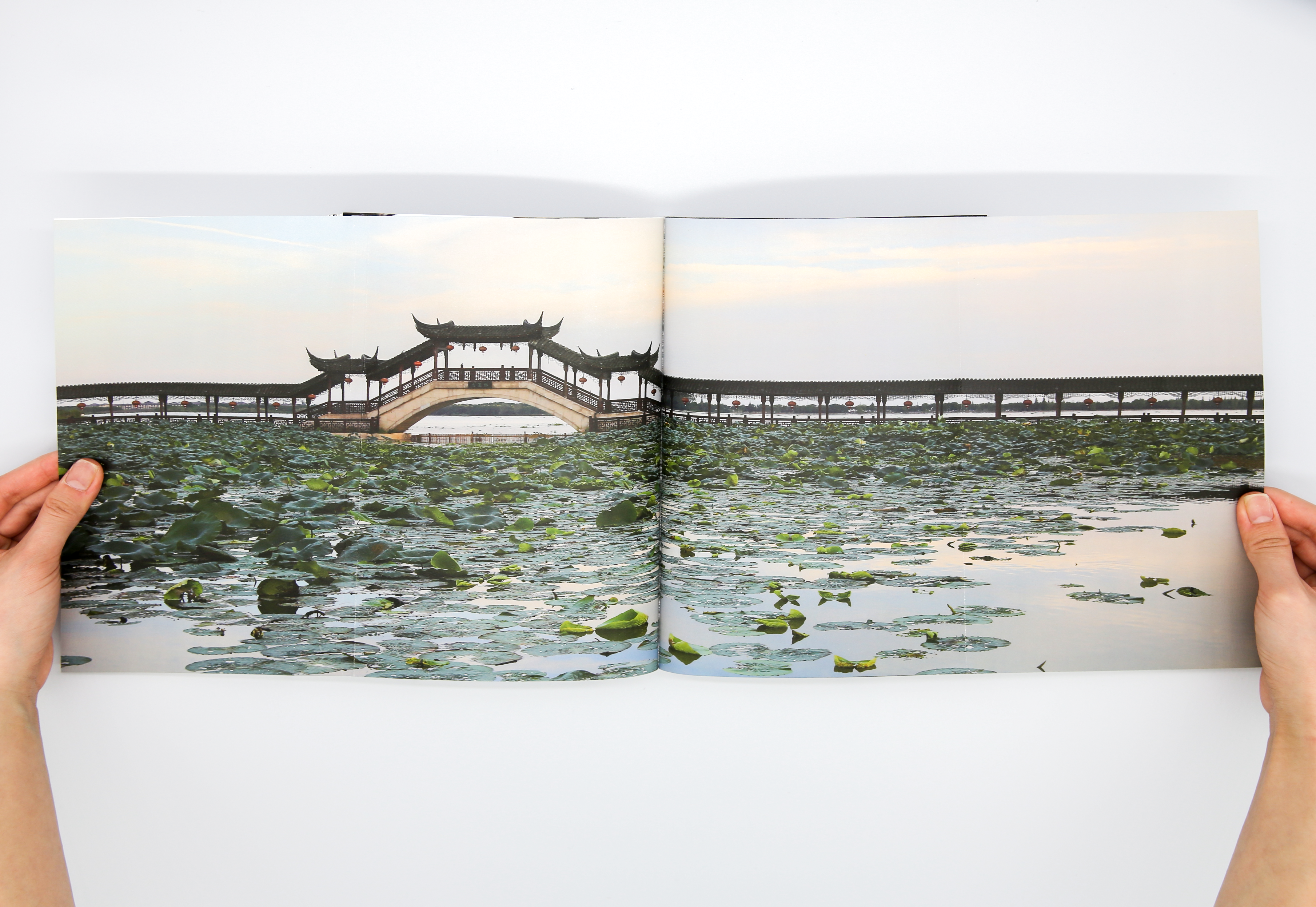
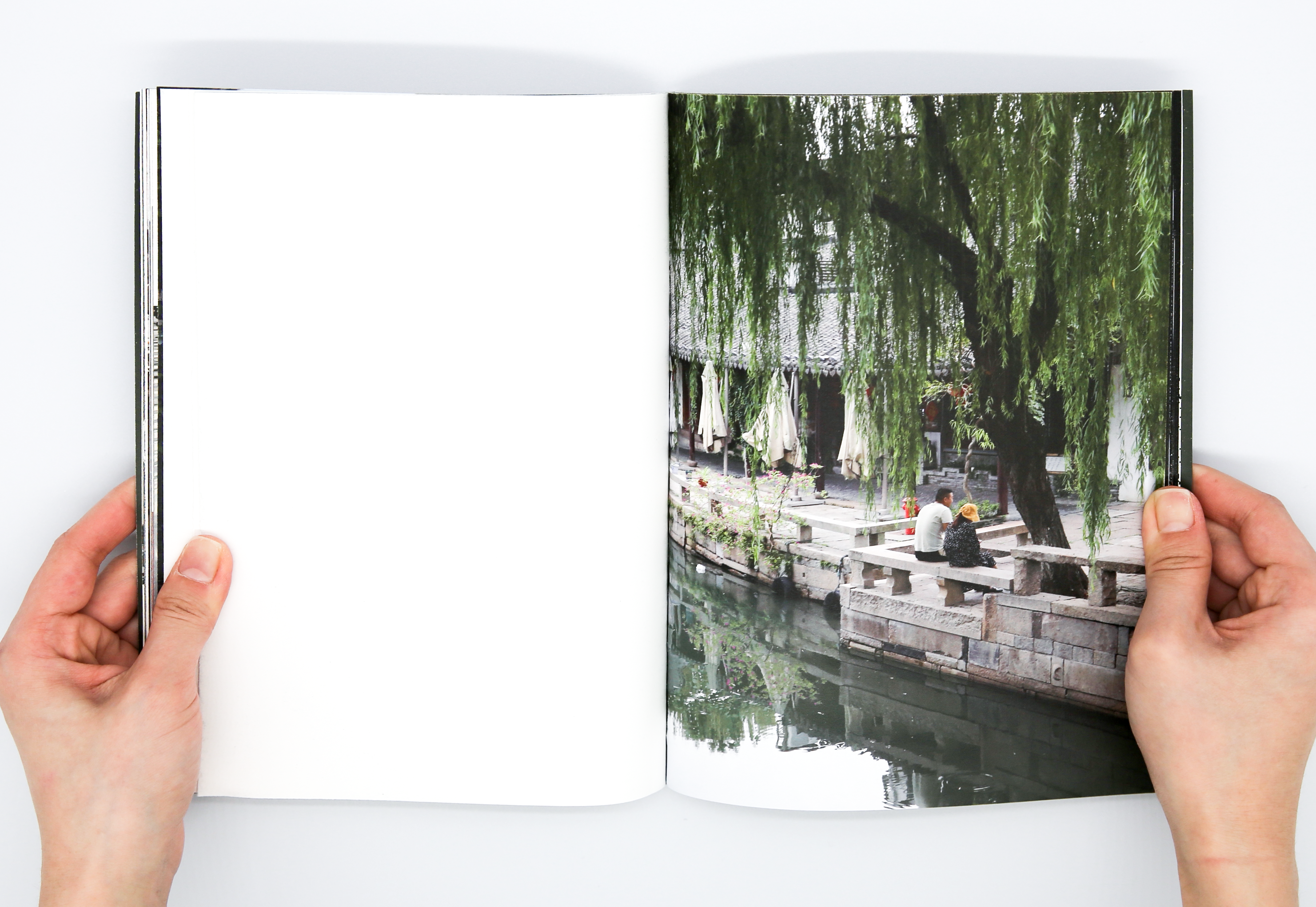
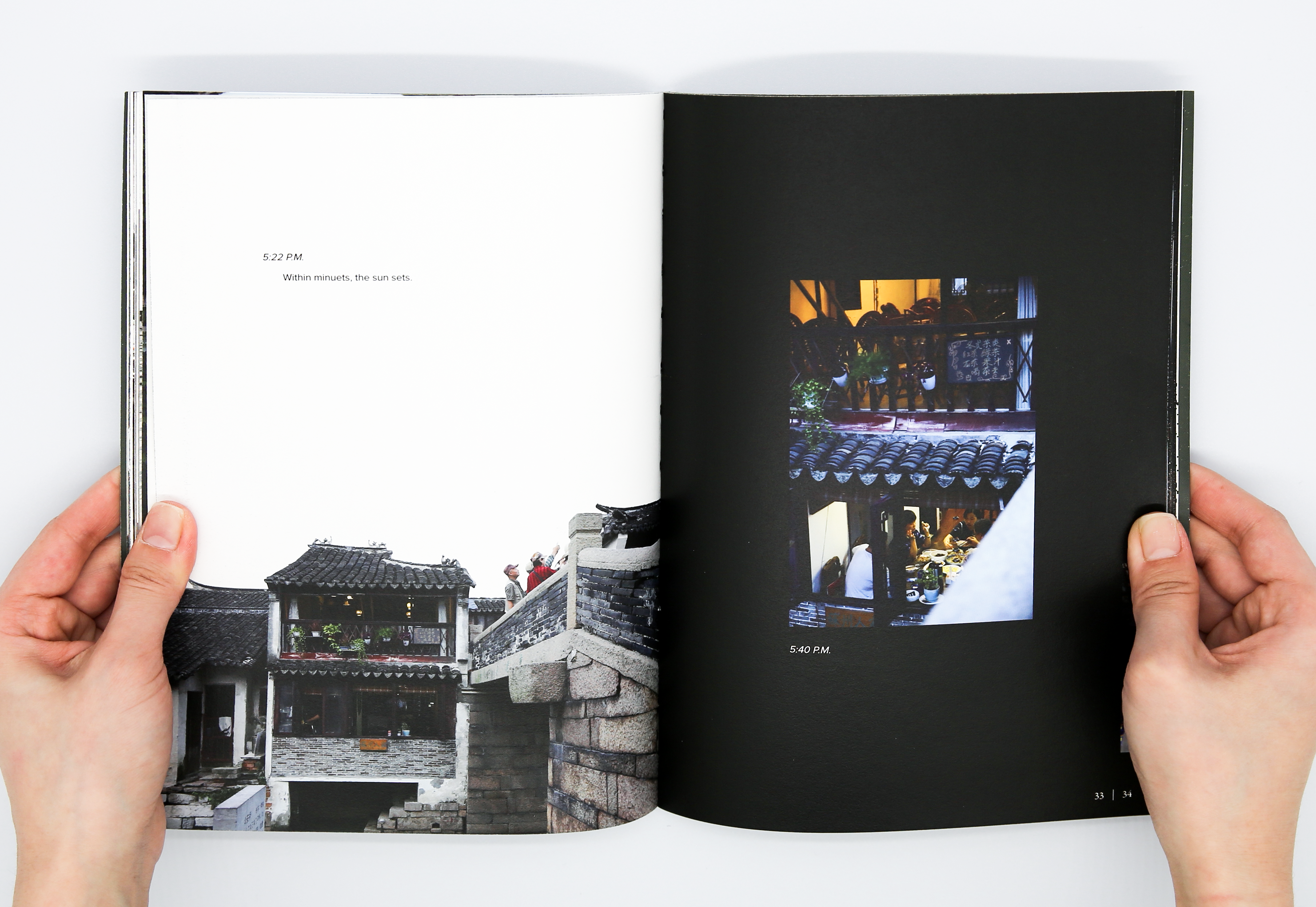
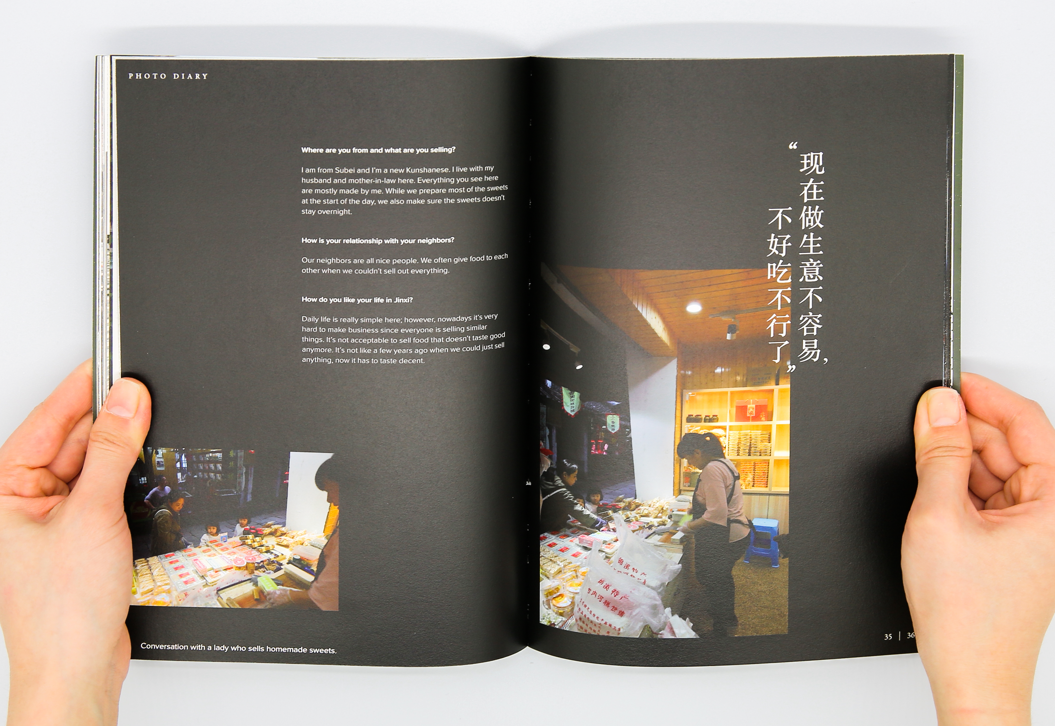
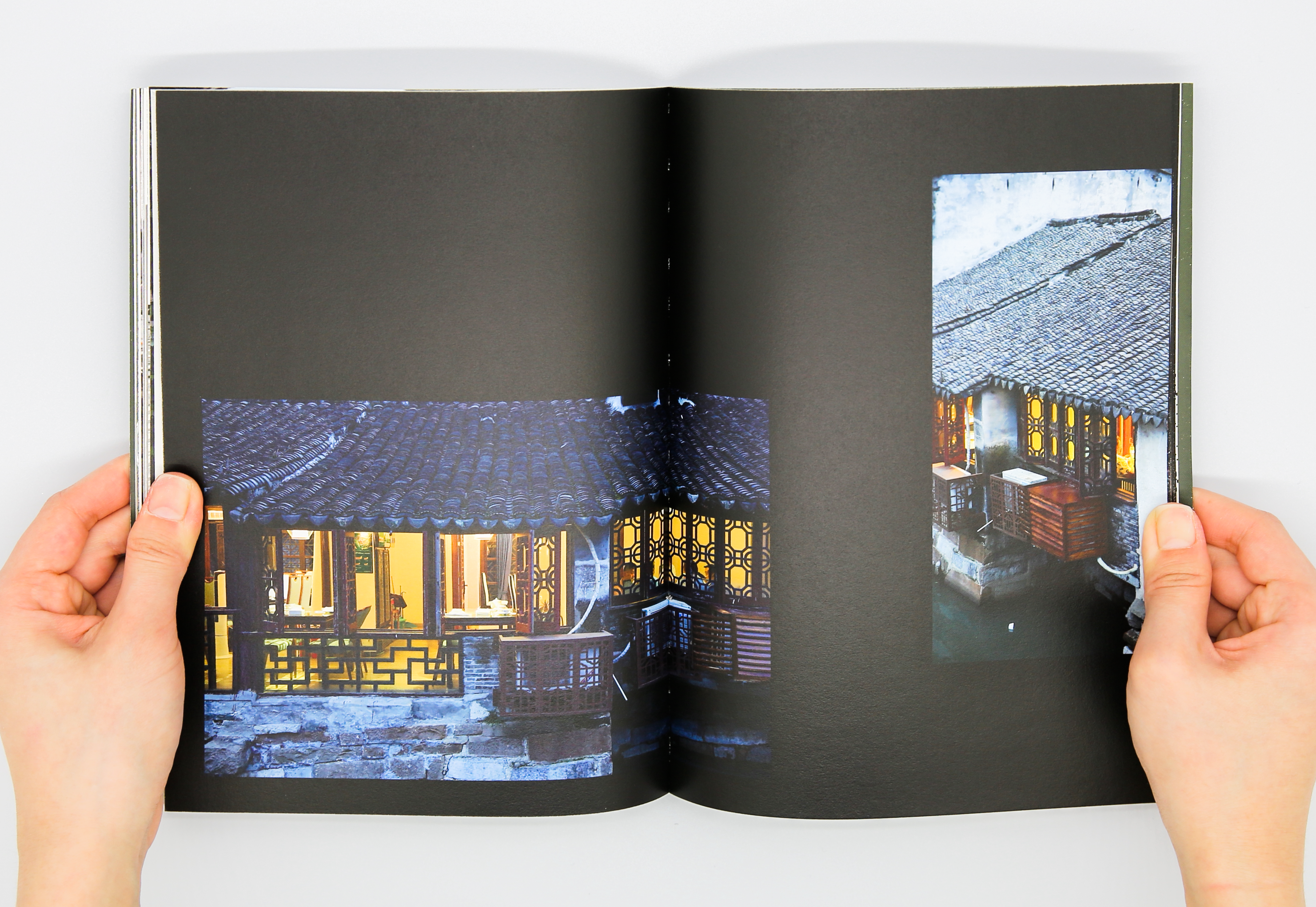
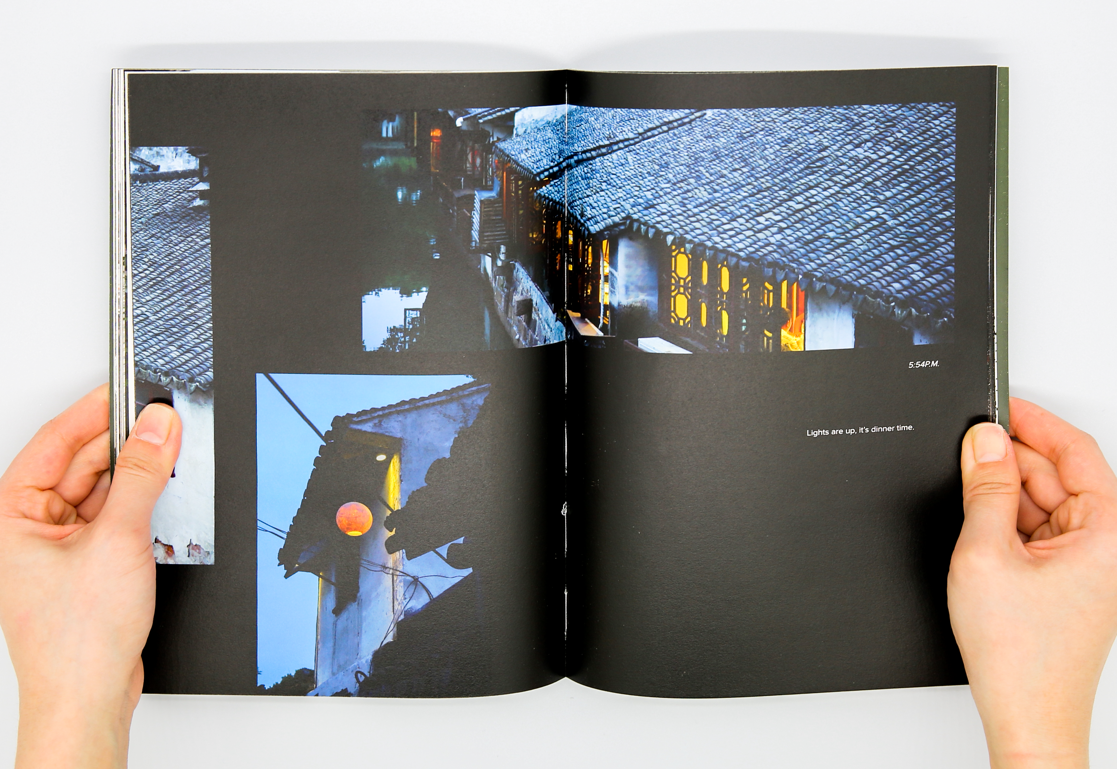
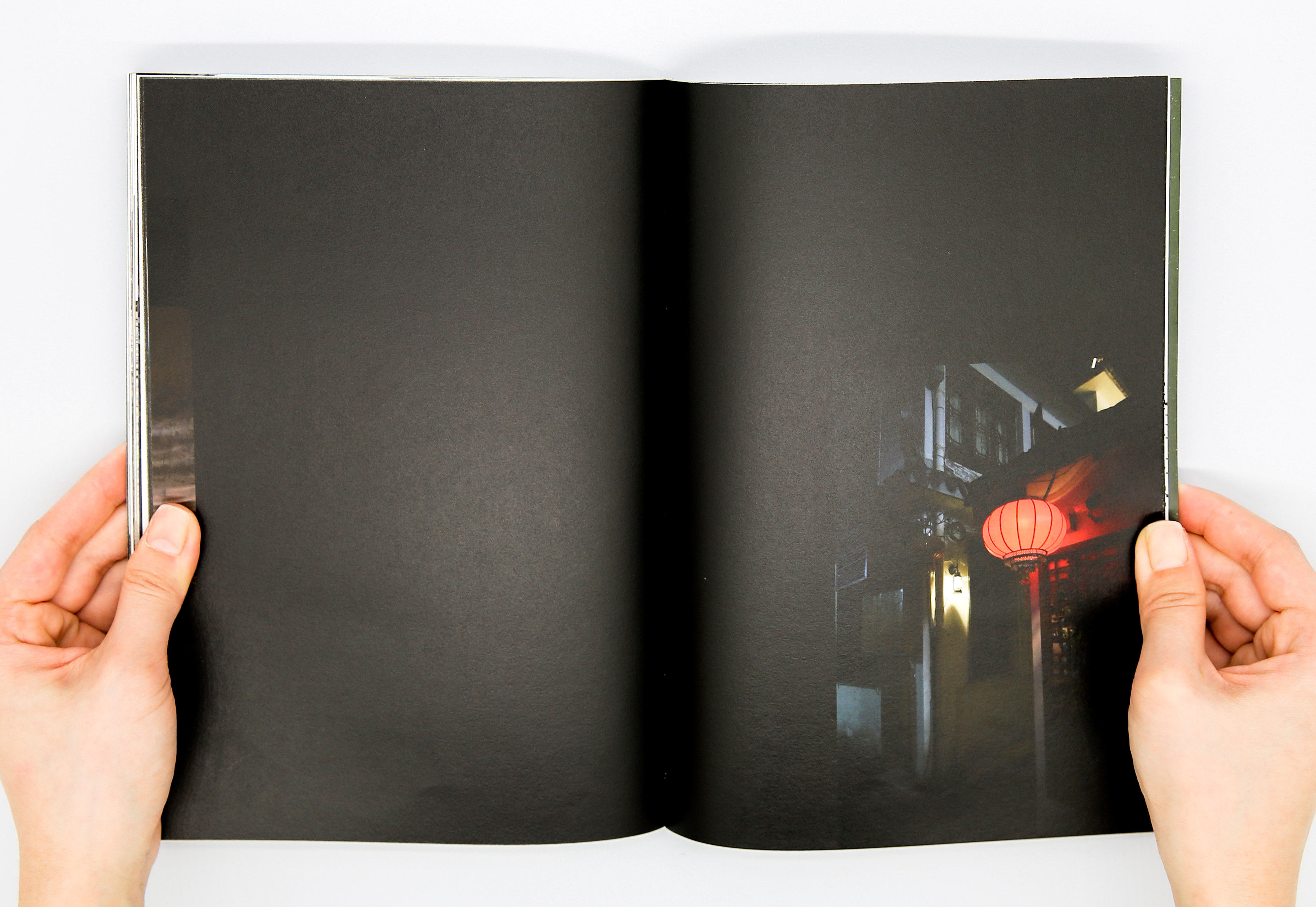
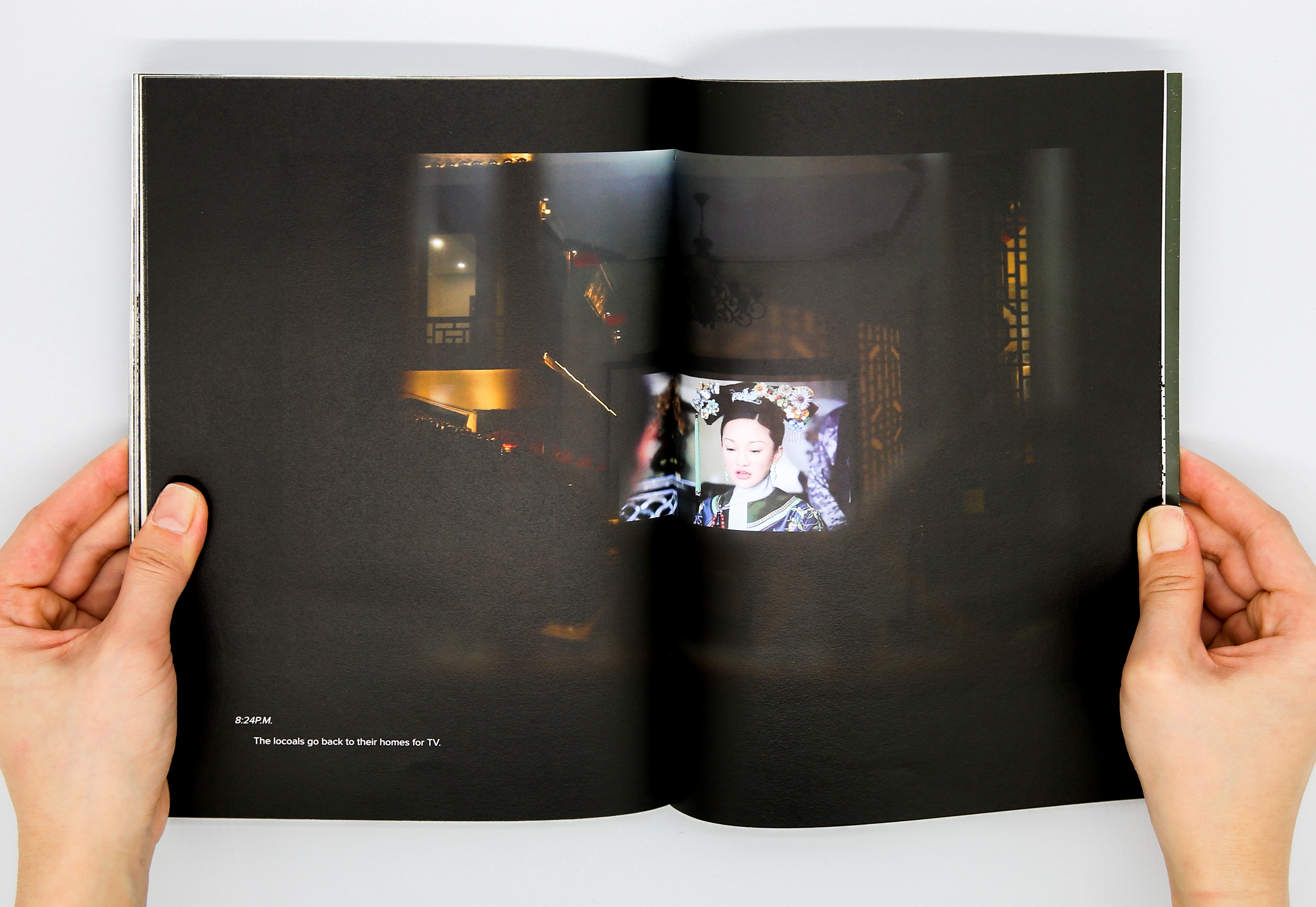
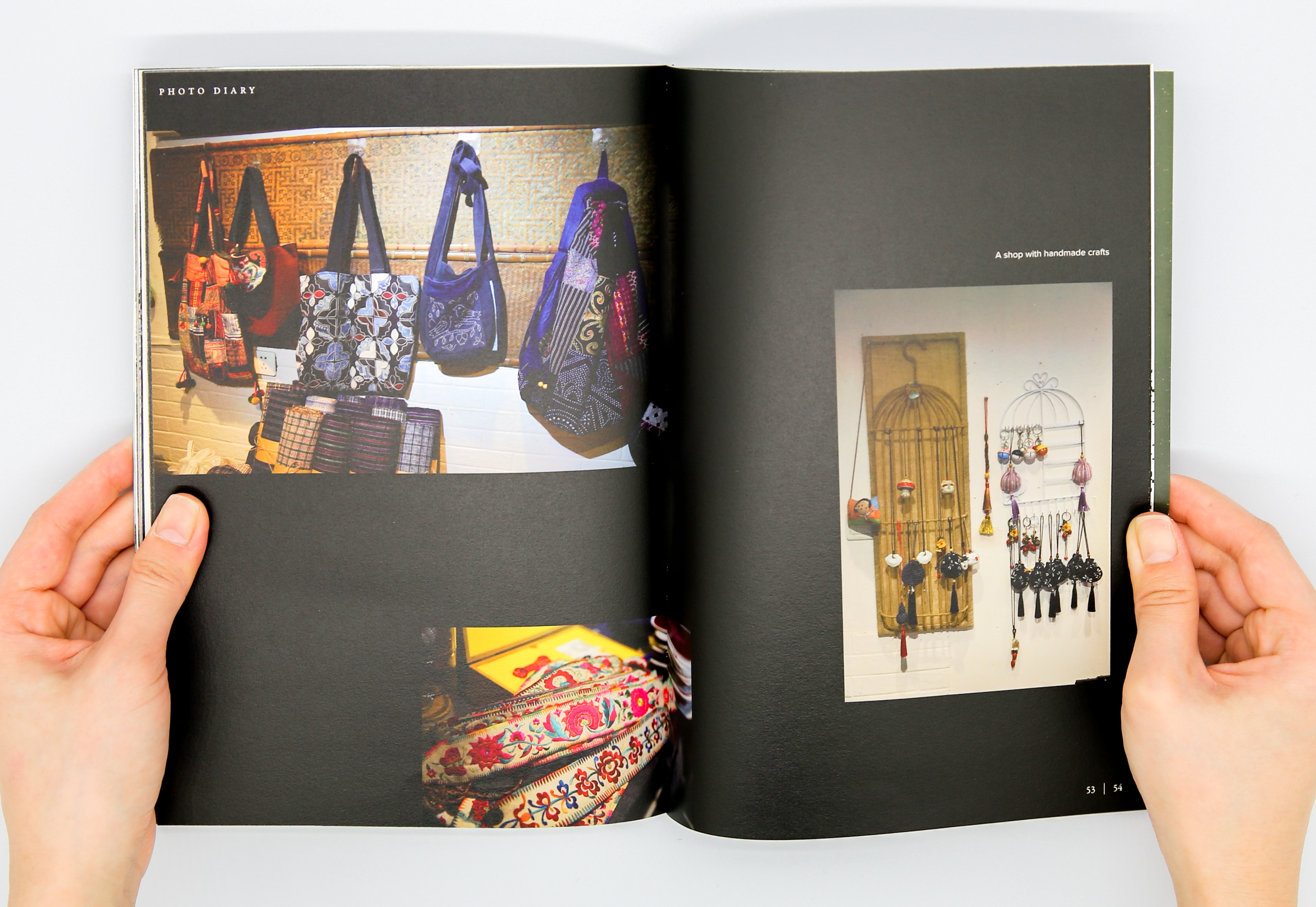
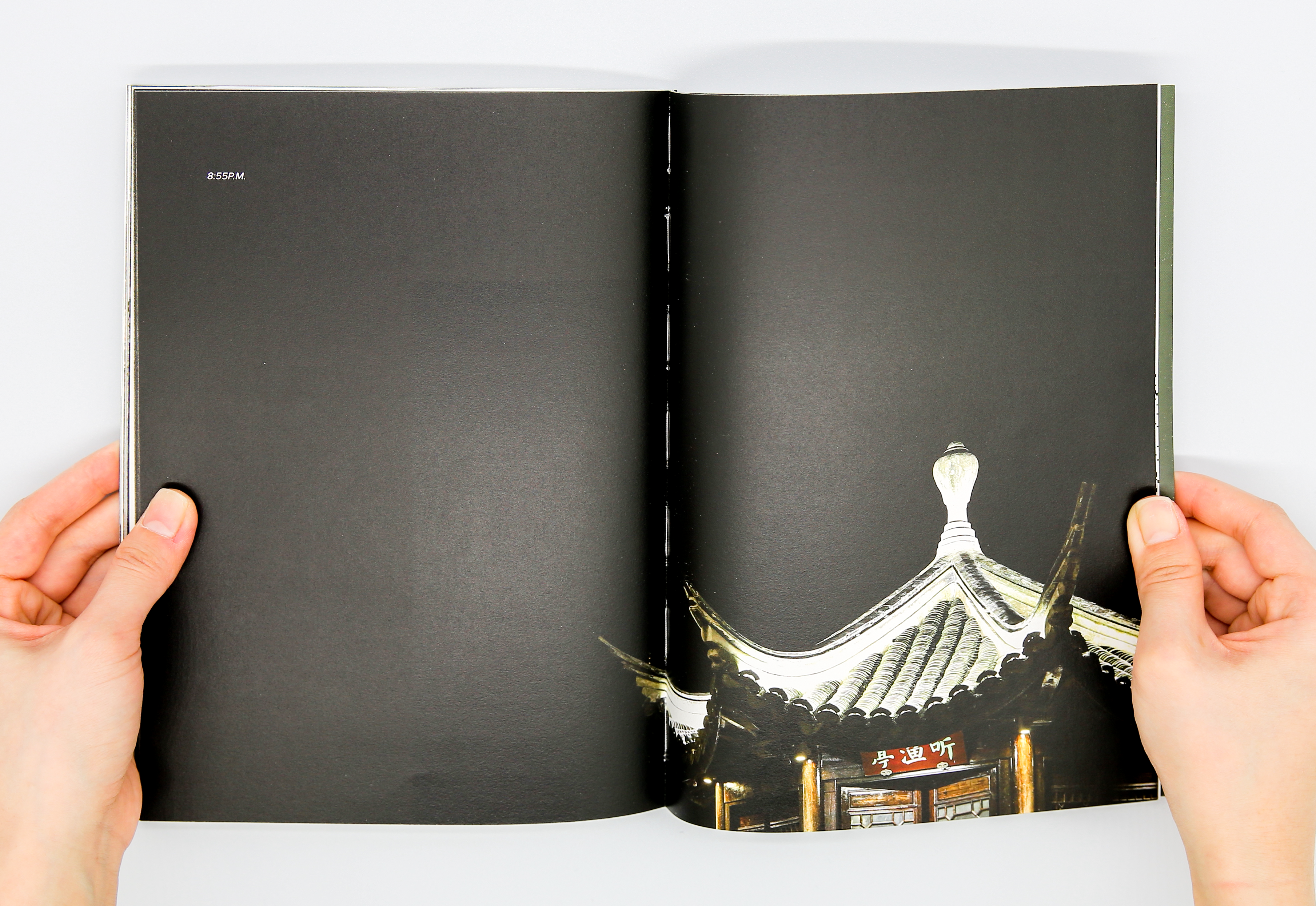
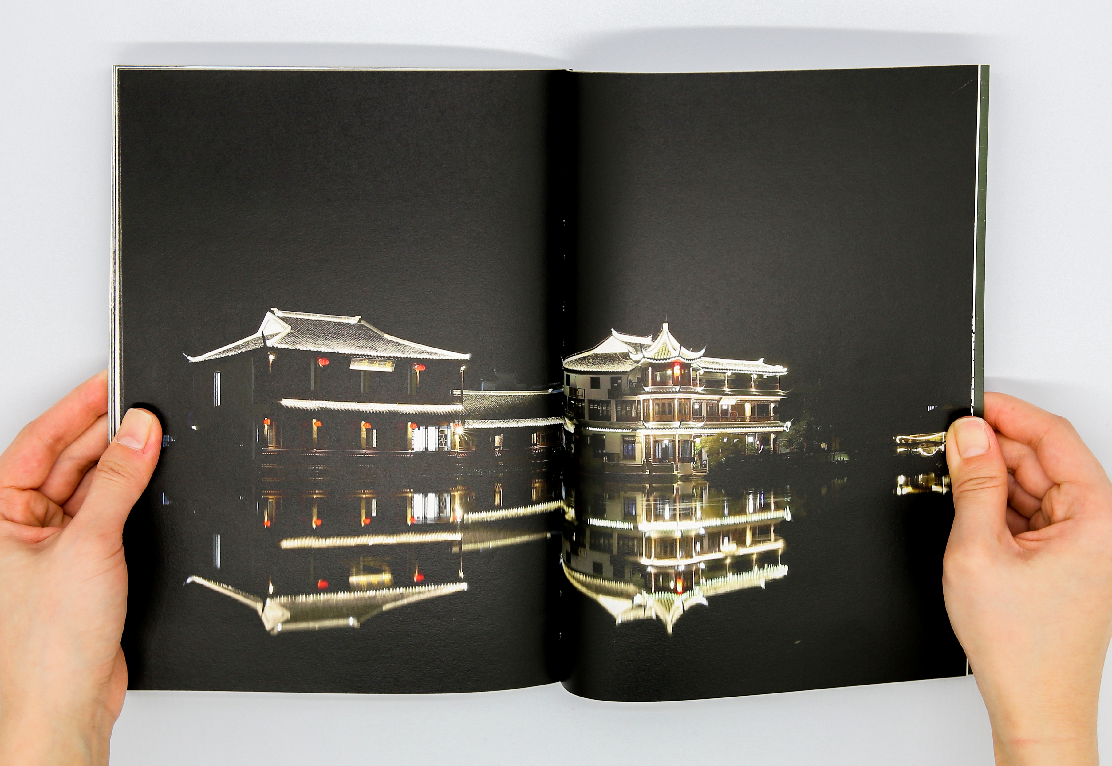
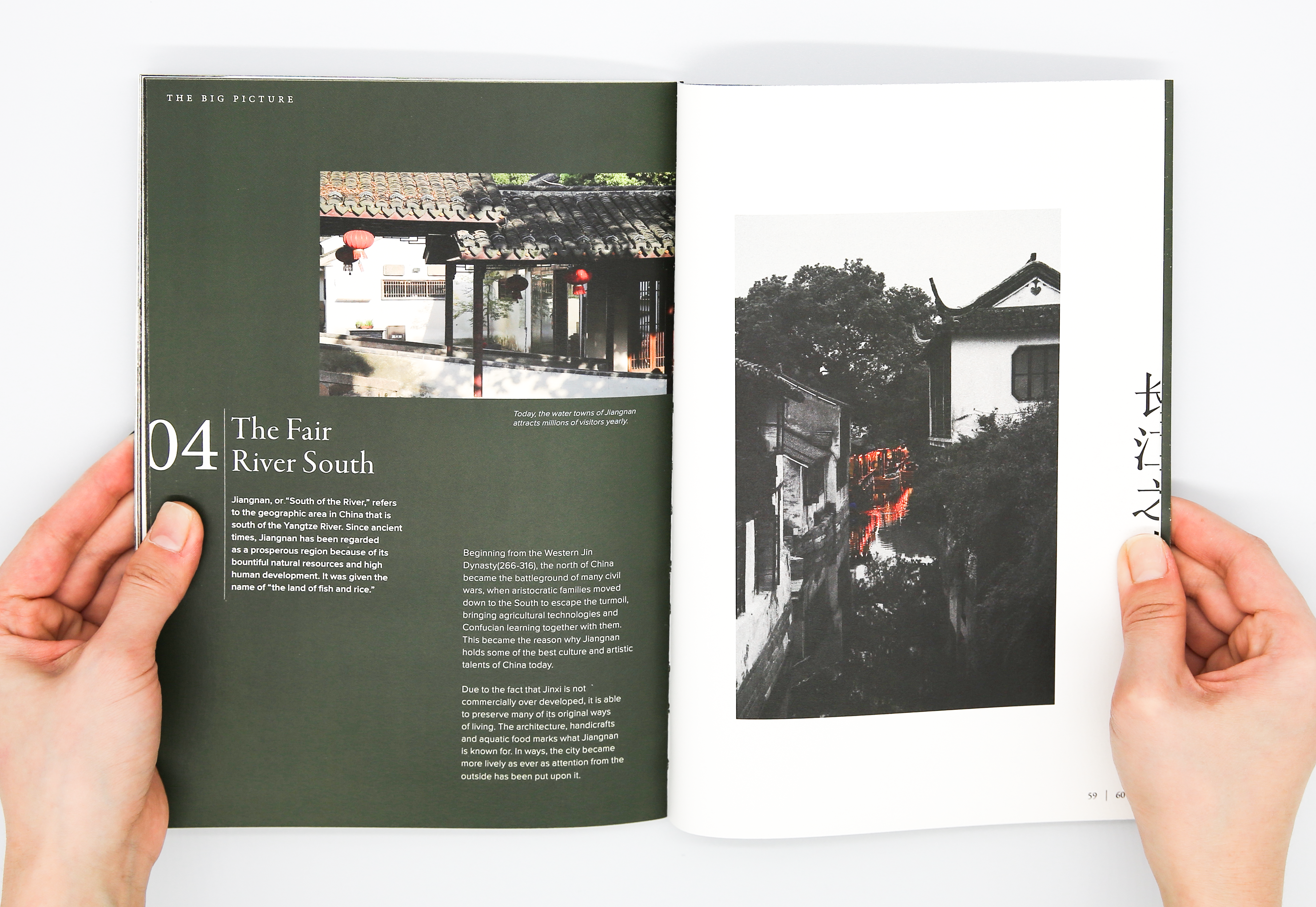
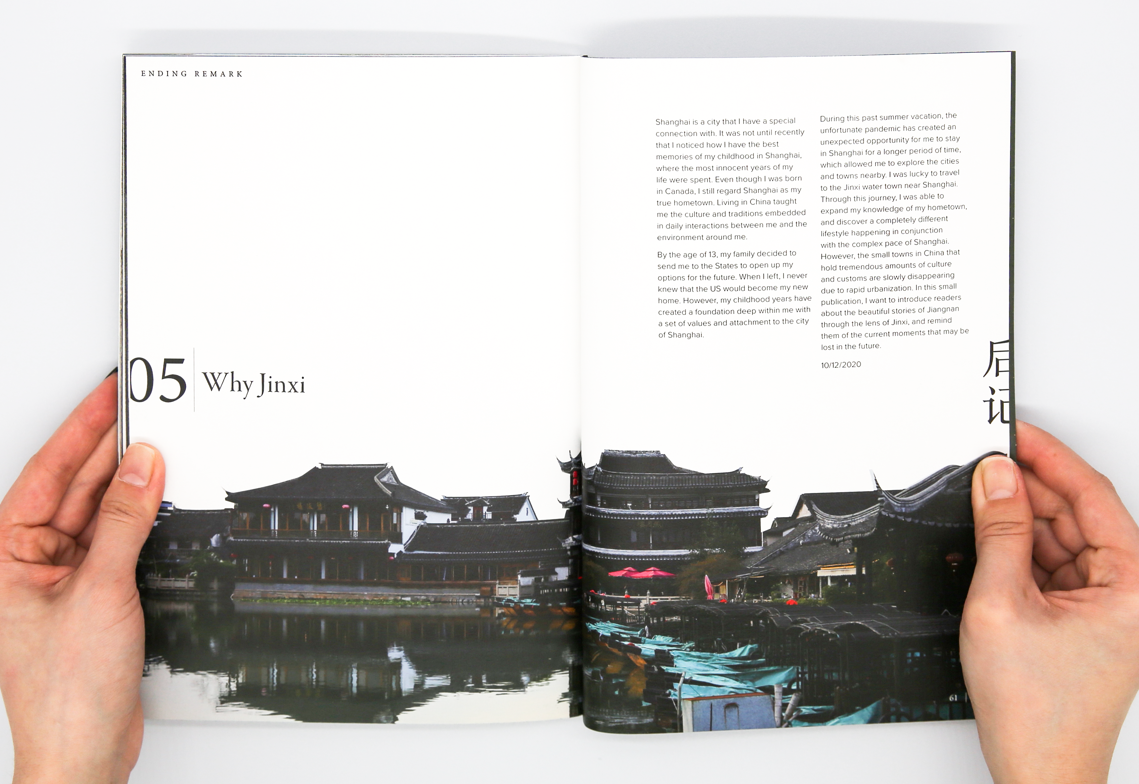
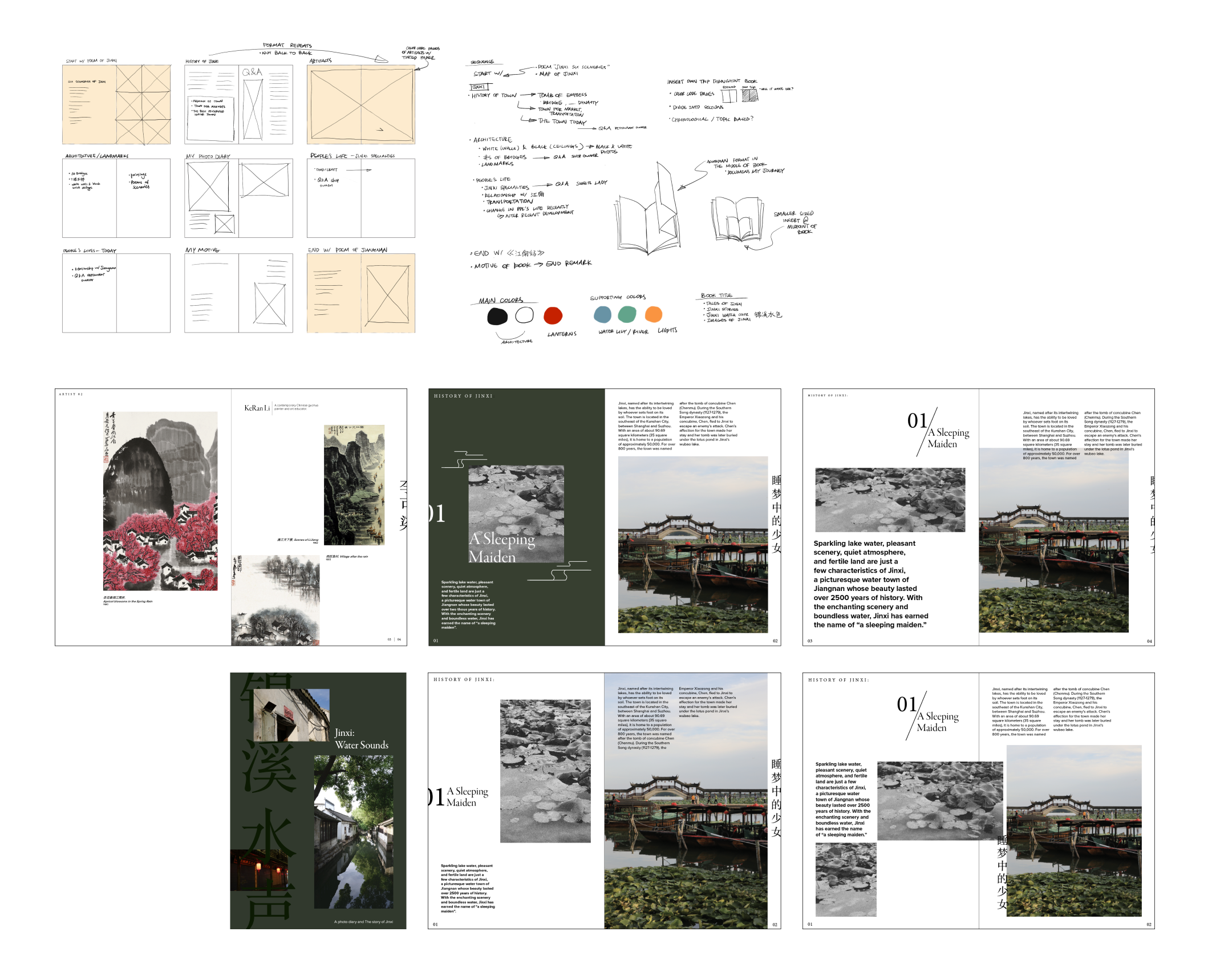
Jinxi: Water Sounds is a book inspired by a trip to the water town
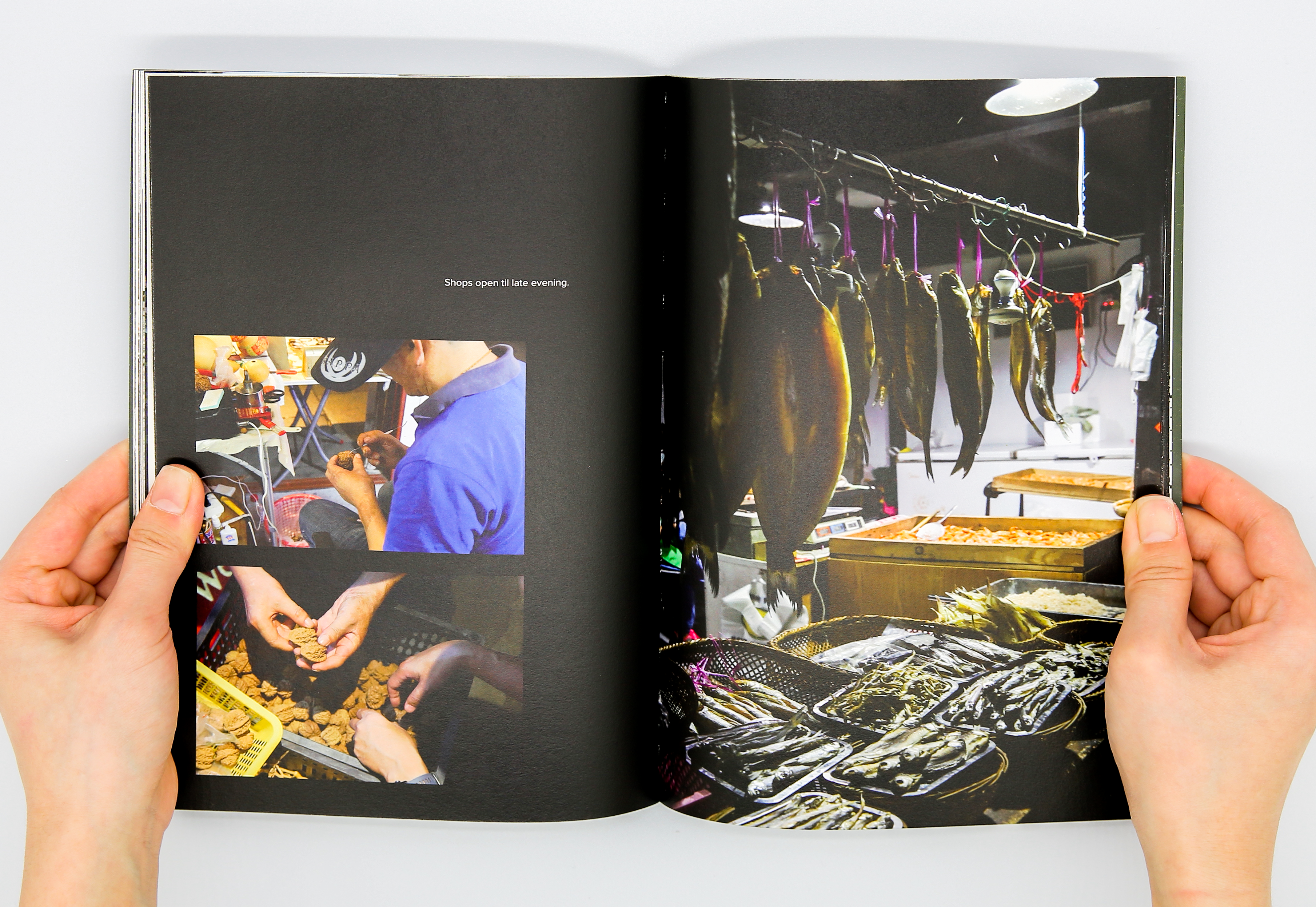
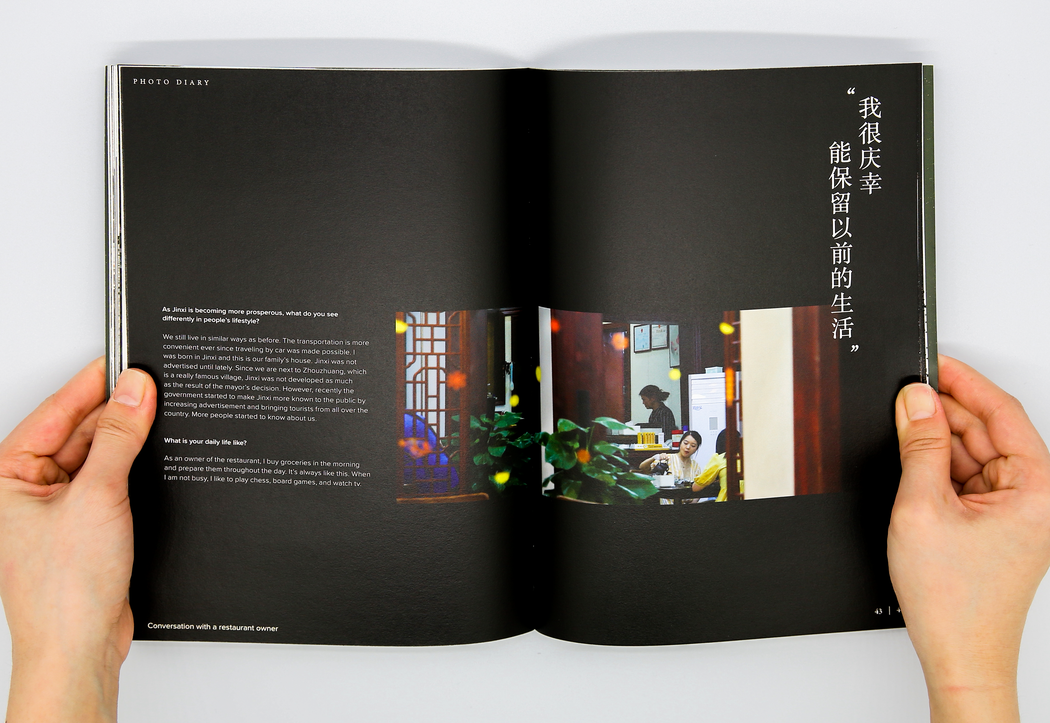
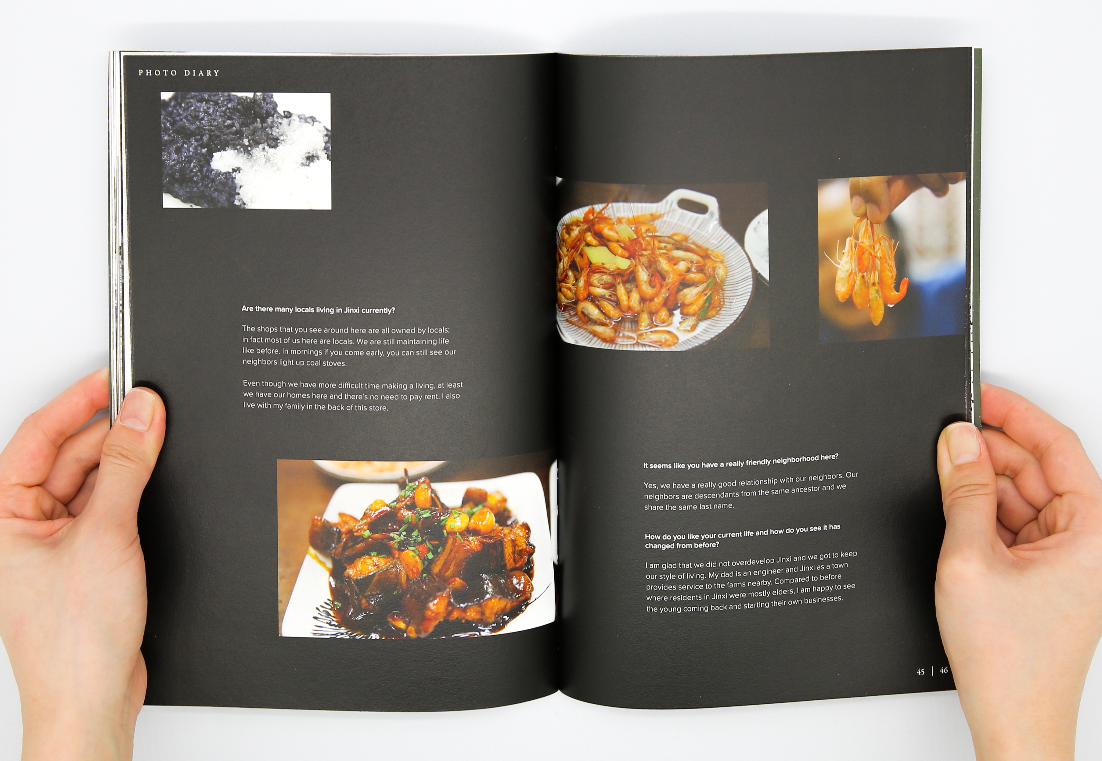
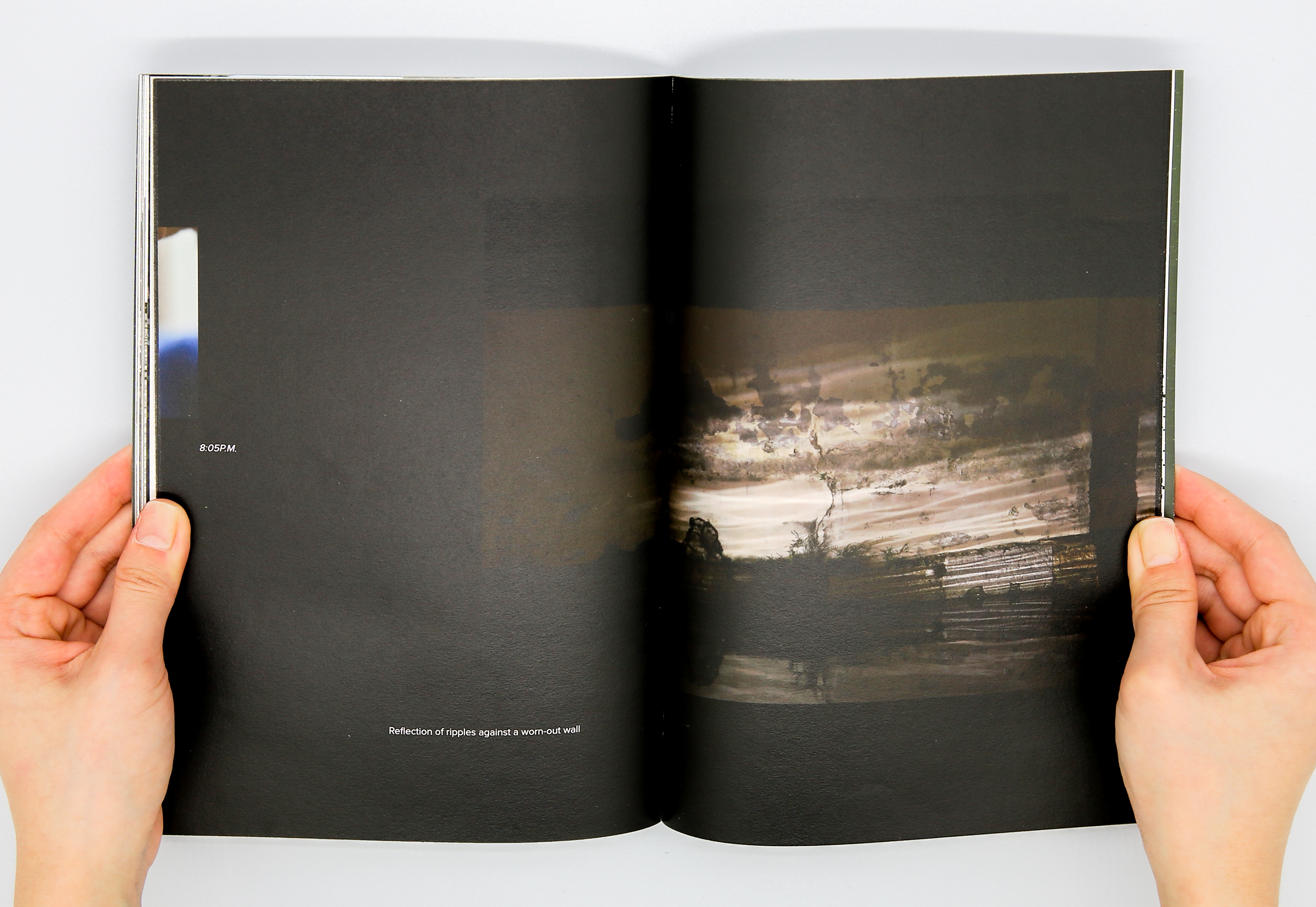
This is a materialization of one of the many journeys that I took during the pandemic to understand my hometown, Shanghai. Through my own camera lens and conversations with the locals, I explored the extraordinary lifestyle that people lead just 57 kilometers outside of Shanghai.
Team
Individual
Skills
Graphic Design
Photography
Individual
Skills
Graphic Design
Photography
Overview
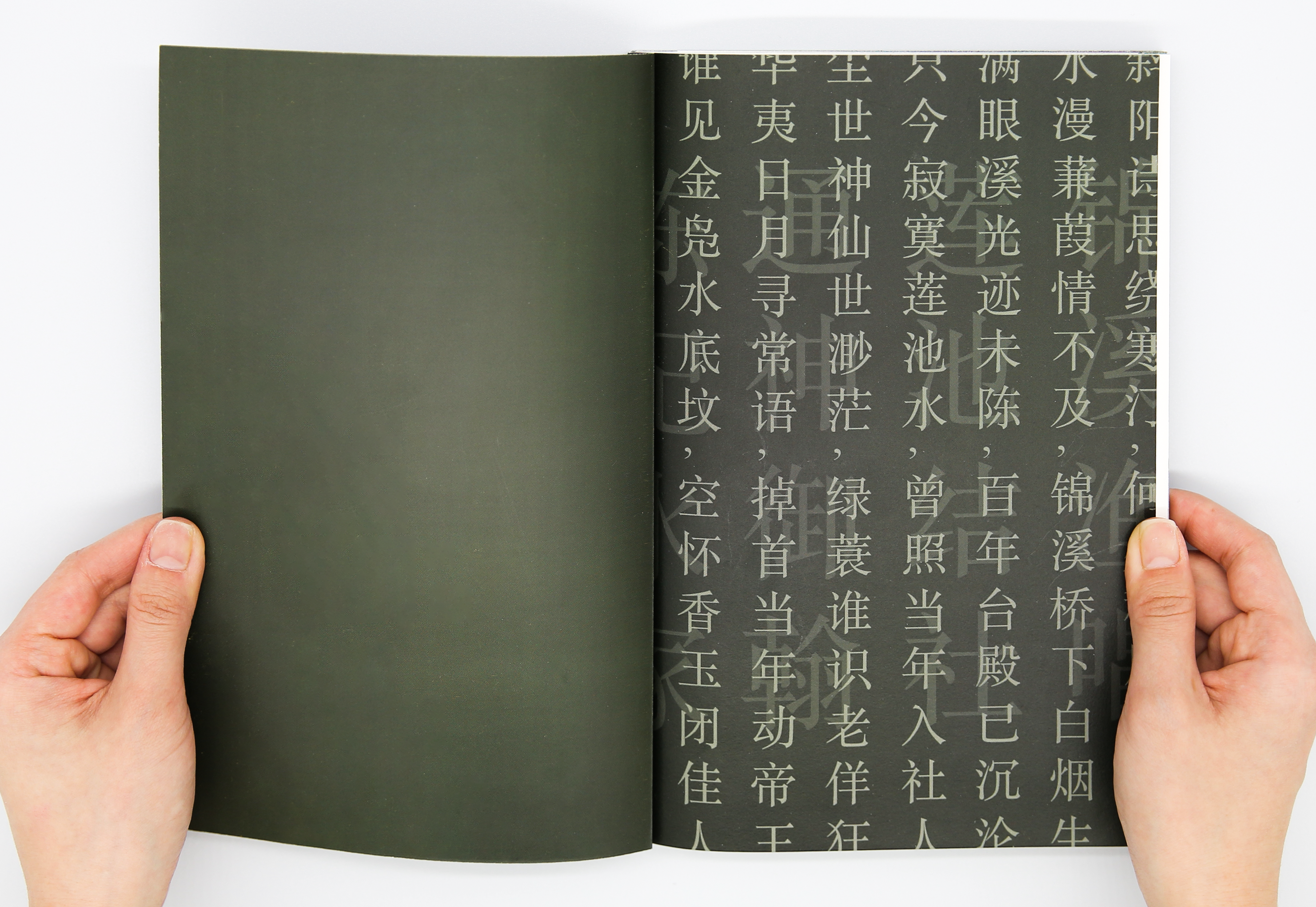
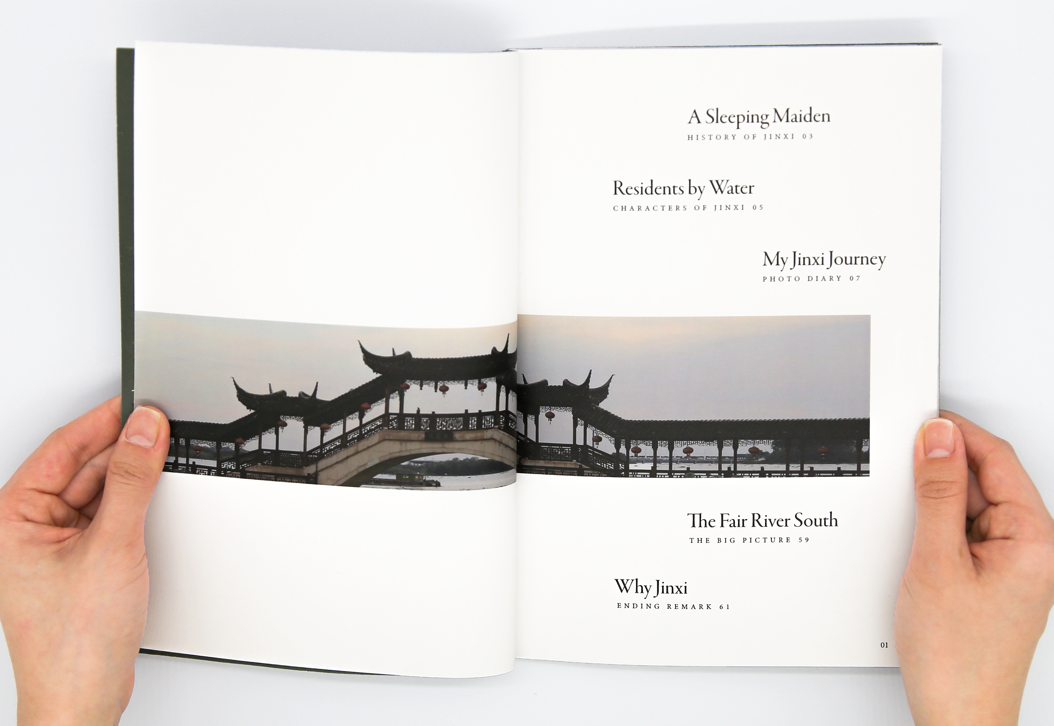
This book features my personal photography diary of a day-trip to Jinxi, translated documentation of my interviews with the people, and my research on the history of water towns.
6.5 x 9.5 inches, 61 pages


Process
© CHARMAINE QIU 2025