Fall 2021- Spring 2022
Simulating the communication between mobile app and vehicle environments for Unigo, an inclusive car riding app.
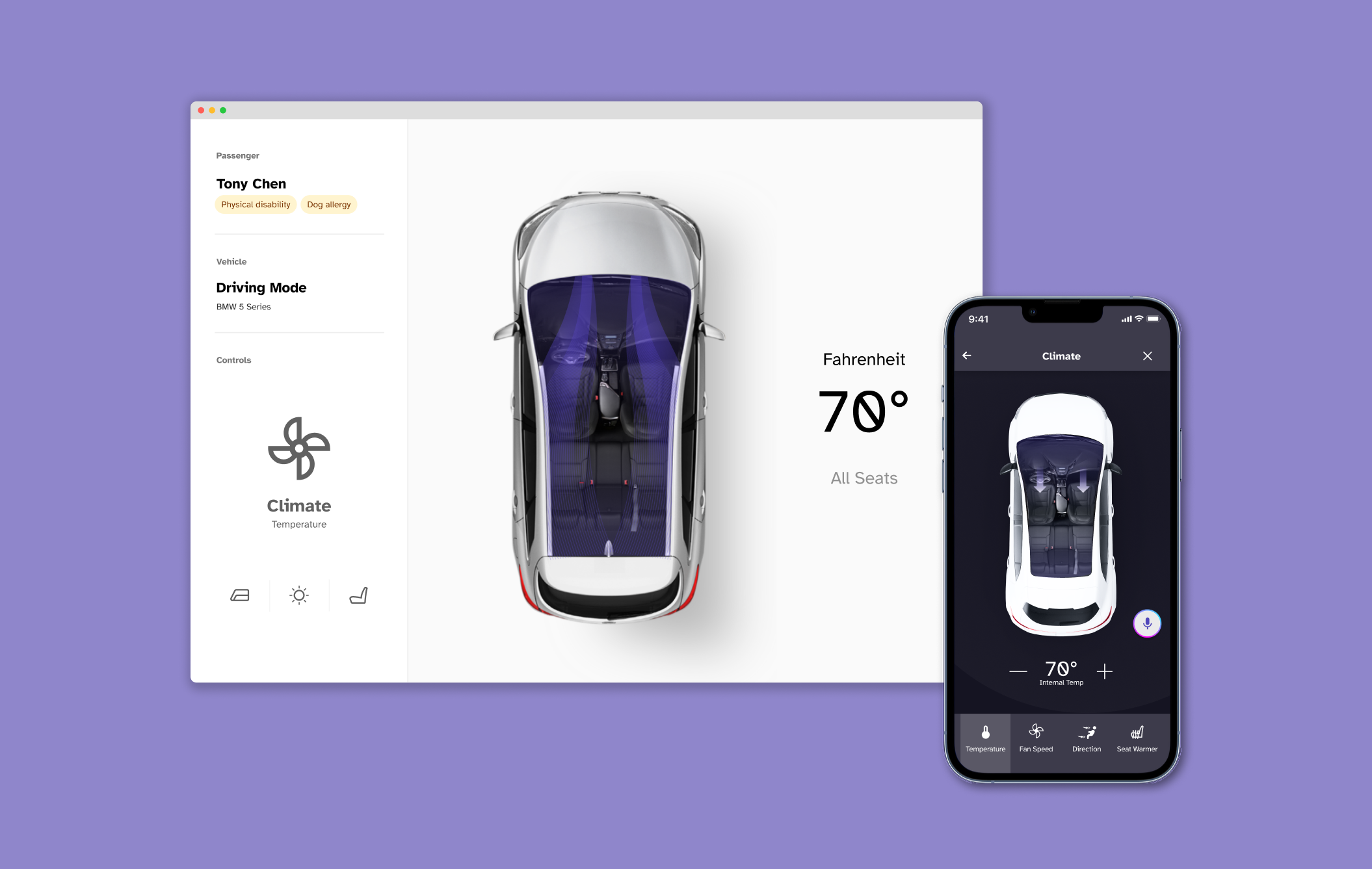
Unigo provides disabled users control of their autonomous vehicle ride experience with an accessible smartphone-based application design. The app focuses on allowing riders to control different aspects of the vehicle during the ride. The web-based simulator is designed for user testing the app by displaying how the in-car environments might change based on the control of the app. I was responsible for designing the interface of the simulator.
This project was recognized as a U.S. DOT Inclusive Design Challenge Stage I Semifinalist Awardee.
Team
John Chae
John Chae
Skills
UI/UX Design
Design for User Testing
Animation
Research
UI/UX Design
Design for User Testing
Animation
Research

Background
How is the simulator connected to Unigo?
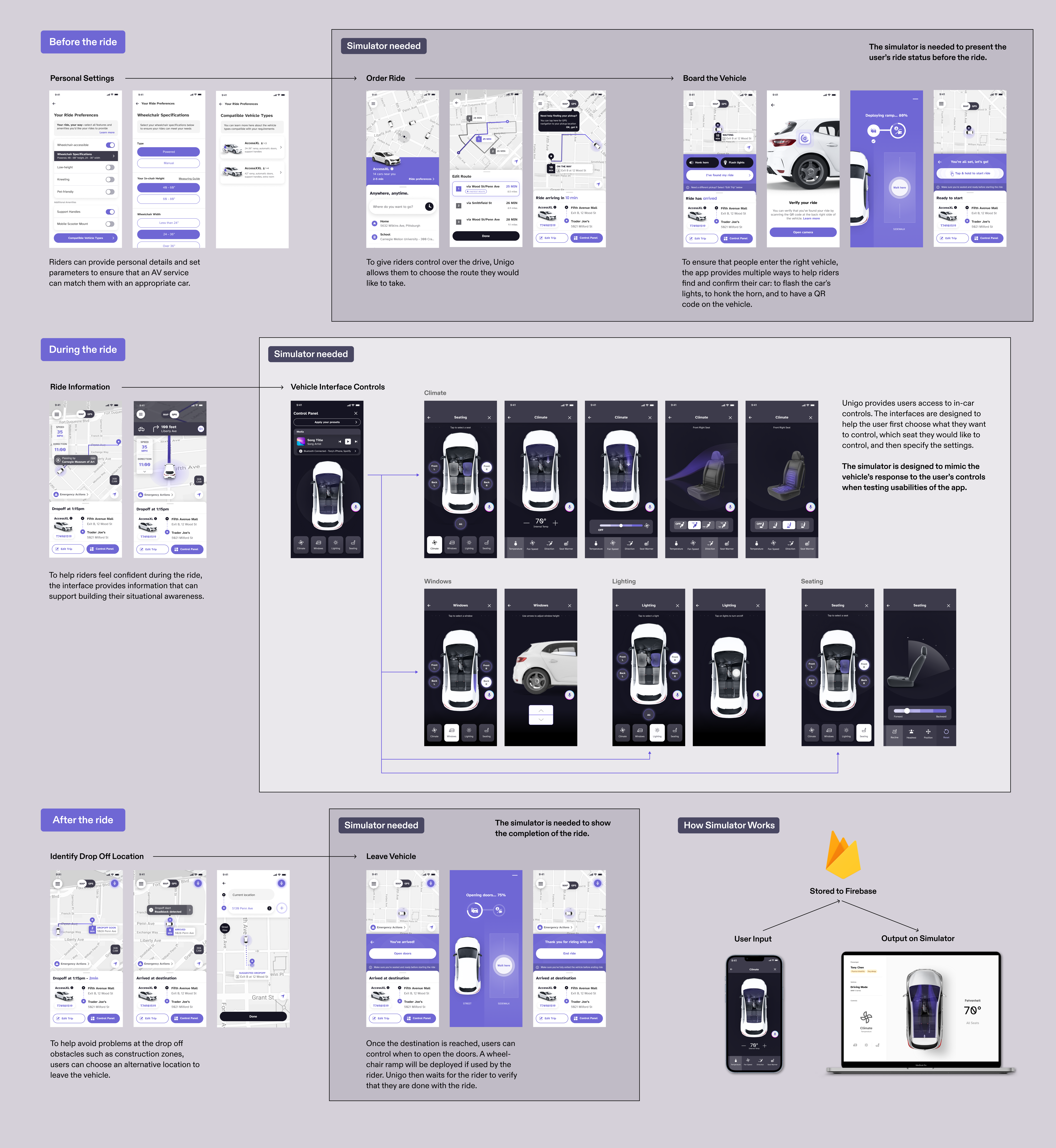
The user testing of Unigo is conducted remotely with volunteered community members to refine usability and discover any missed features. The simulator takes the form of a website interface that is displayed on the tester’s screen in real time as they control the car features on their downloaded app.
The following diagram shows the user flow of the app, and where the simulated interface is needed to test the usability of Uningo.
The following diagram shows the user flow of the app, and where the simulated interface is needed to test the usability of Uningo.
The Ask
How can we conduct user testing of a car-riding app without actual vehicles?
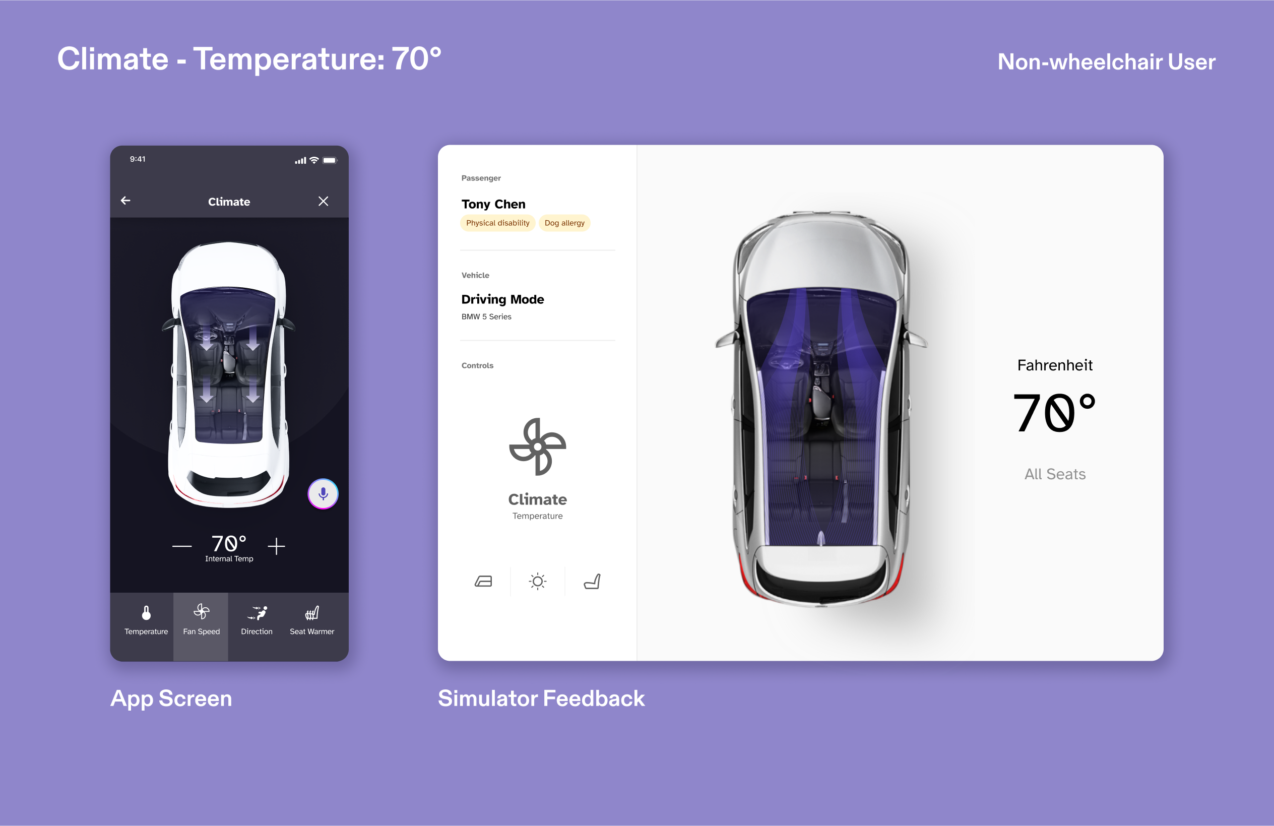
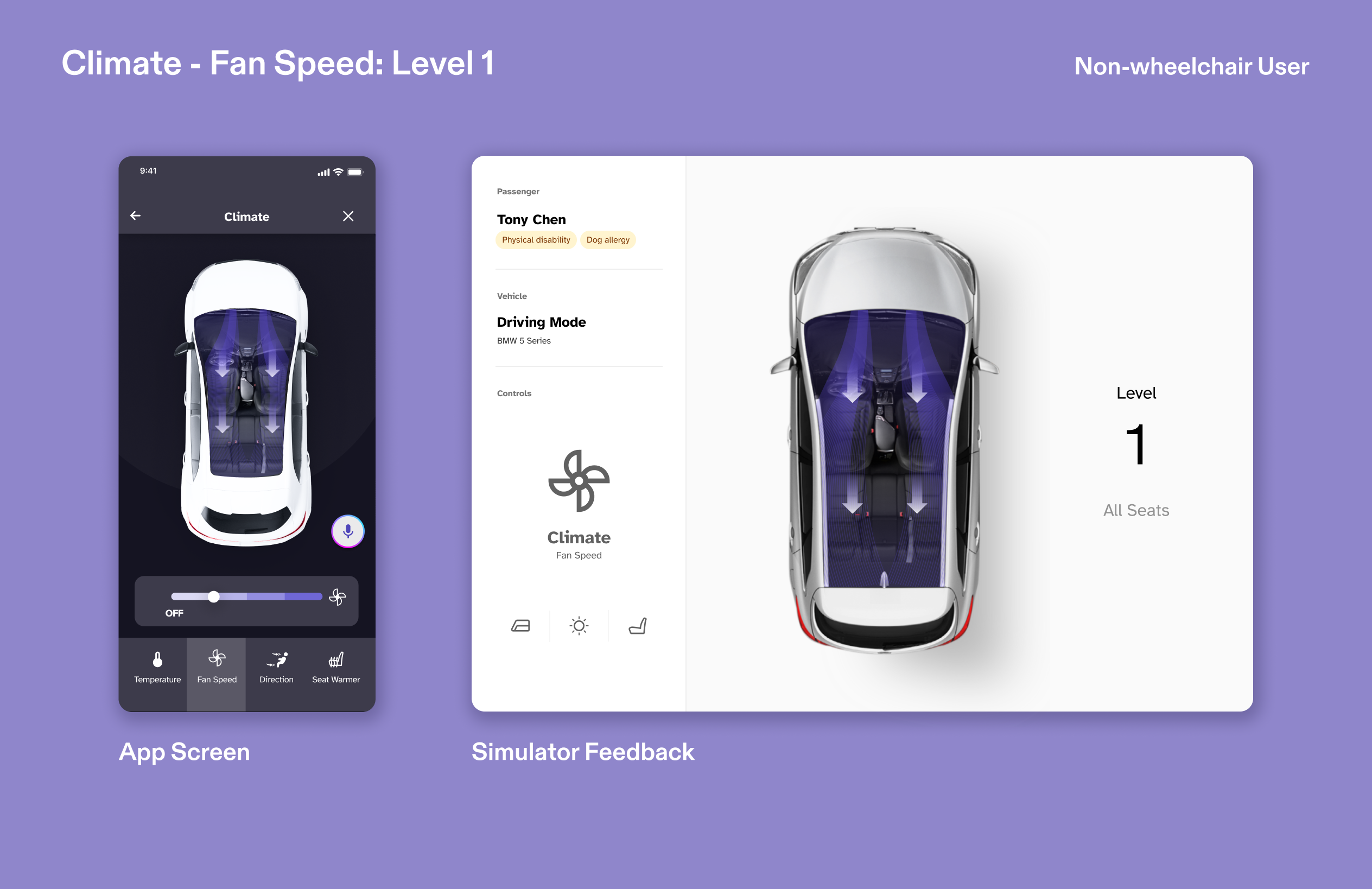
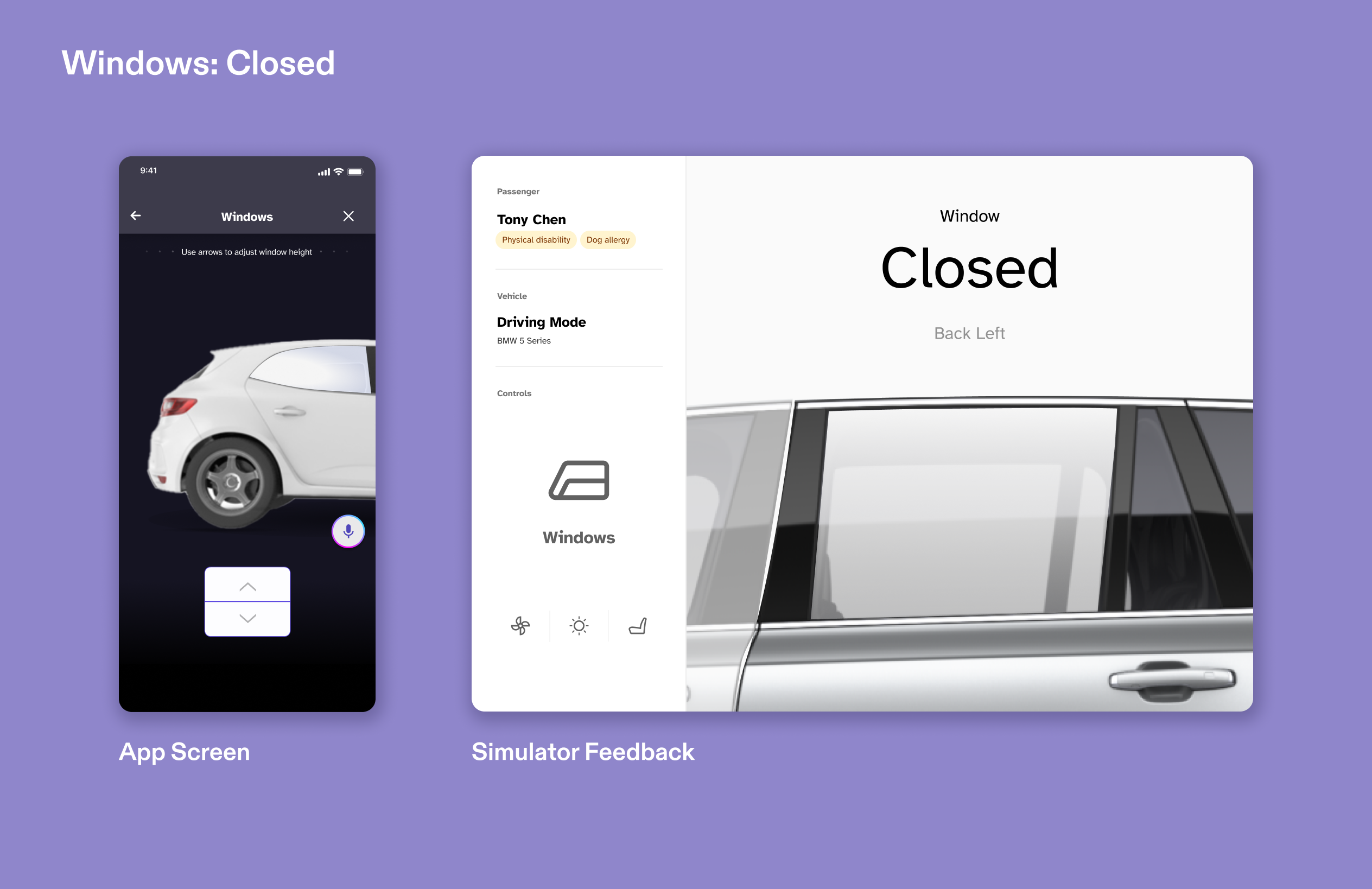
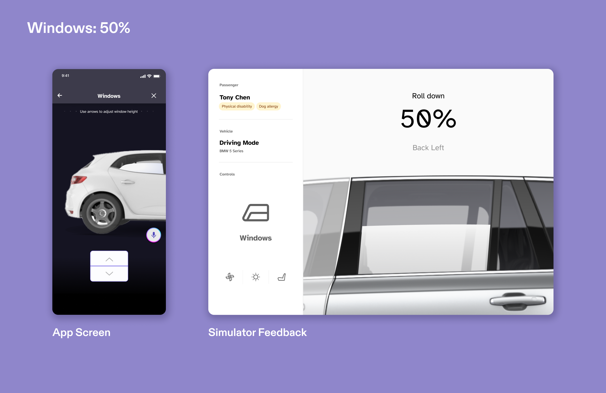
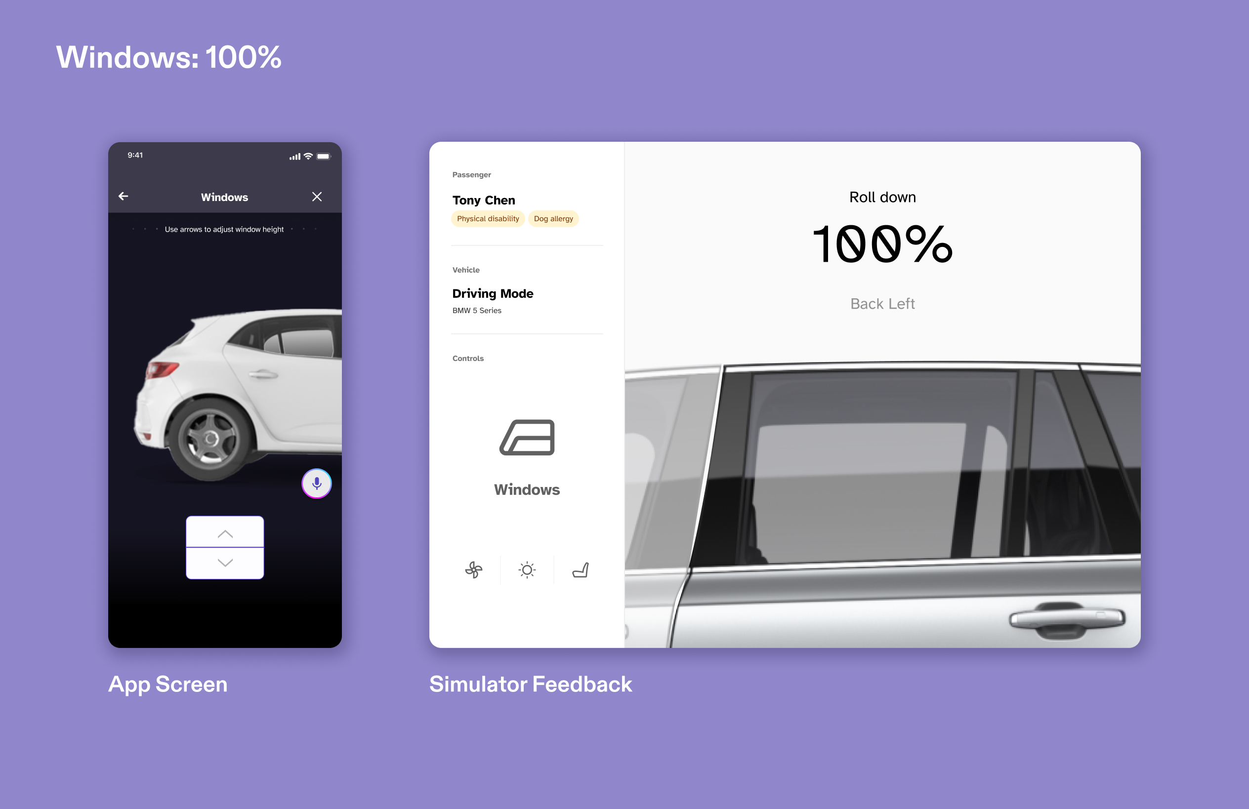
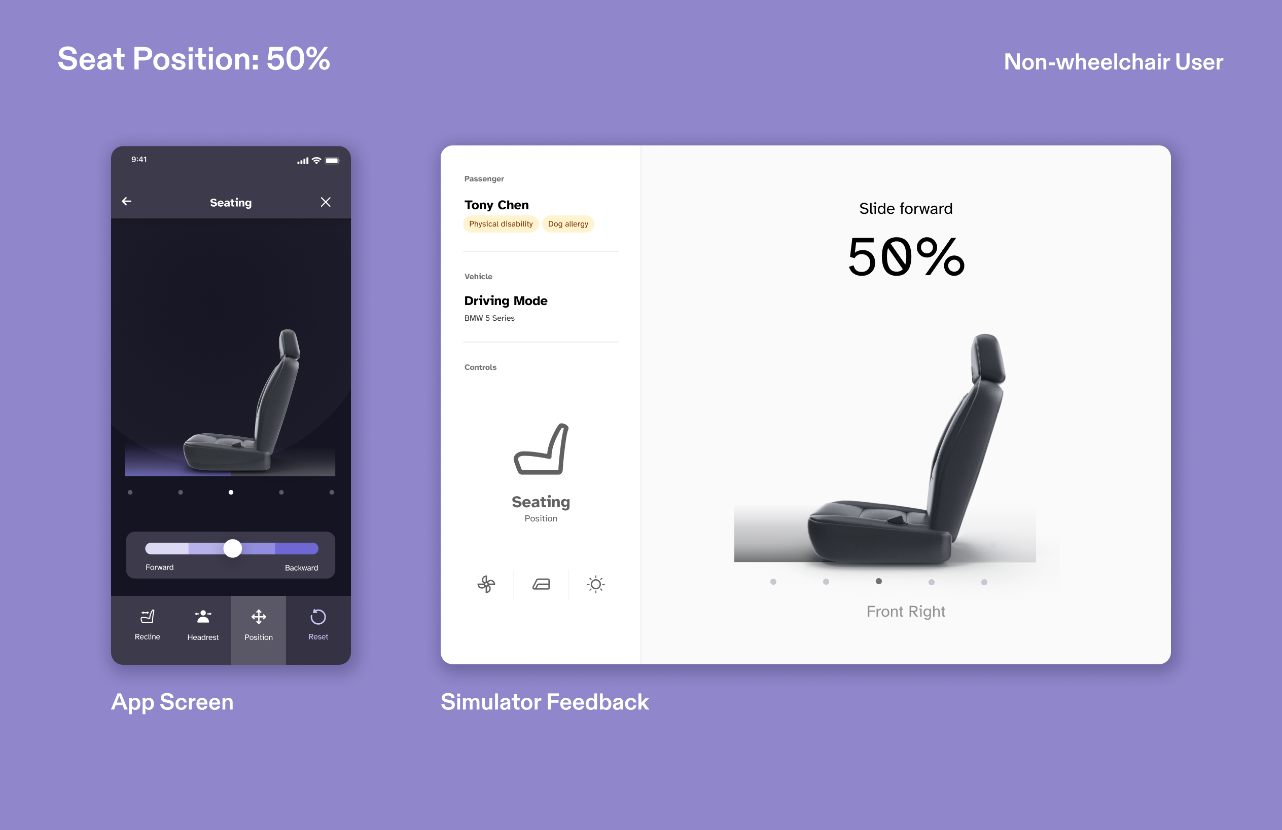
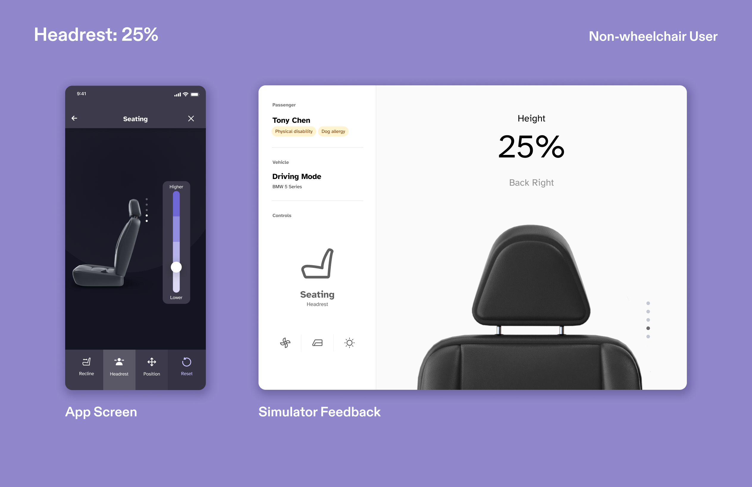
The simulator screen displays the user’s environments both outside and inside the vehicle to illustrate the full riding experience for the tester. While the outside vehicle responds to the user's input by playing an animation, the inputs made inside the vehicle are shown with an interface that presents the car's status in return. Like the app, the simulator's visual changes based on if the tester is a wheelchair user or not.
How can we conduct user testing of a car-riding app without actual vehicles?
The simulator screen displays the user’s environments both outside and inside the vehicle to illustrate the full riding experience for the tester. While the outside vehicle responds to the user's input by playing an animation, the inputs made inside the vehicle are shown with an interface that presents the car's status in return. Like the app, the simulator's visual changes based on if the tester is a wheelchair user or not. Outside the Vehicle
 Setting up and confirming
 Arrived and unlocking doors
 Scanning vehicle to verify
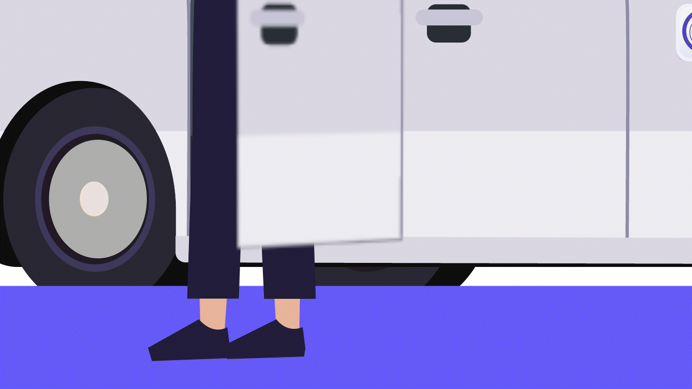 Confirming destination and leaving ride
Inside the Vehicle


Research
What features does the simulator need to test?
Working closely with the User Testing team, who devised the interaction sequence for validating the app, we have determined the key features to be tested with the simulator. This testing will enable us to refine the app based on actual user feedback.
Our team decided to use animation to portray the environment when the user is outside the vehicle. Once the user boards the vehicle, we will use a dashboard design to provide feedback on their interaction to feature controls to the vehicle.
What features does the simulator need to test?
Working closely with the User Testing team, who devised the interaction sequence for validating the app, we have determined the key features to be tested with the simulator. This testing will enable us to refine the app based on actual user feedback. Our team decided to use animation to portray the environment when the user is outside the vehicle. Once the user boards the vehicle, we will use a dashboard design to provide feedback on their interaction to feature controls to the vehicle.

Simulator Features Flow
Based on the existing flow of Unigo's vehicle controls page, we mapped each feature and level of control that the dashboard of the simulator needs to give a response to. Seating ontrols for wheelchair users is uneccessary since they will be seated on their wheelchairs.
Dashboard Features Flow
Design System
Utilizing a cohesive design system that meets accessibility guidelines
Our team referenced the existing design system of the app to create cohesion between screens during user testing. We followed established typeface, icon style, and colors while keeping in mind to use appropriate contrast levels according to Web Content Accessibility Guidelines (WCAG).
High contrast in text size gives immediate feedback while simple terms are accessible for screen reader users.
To ensure the color contrast meets AA standard, a plug-in is used to verify the contrast of color pairings.
Interface design
Designing the simulator dashboard
The simulator dashboard is designed to give context and visualize the user’s control with a clear and easily understandable interface. We created a structure, containing a main feedback display and a sidebar, that presents information in a hierarchical manner to enhance the user-testing process.
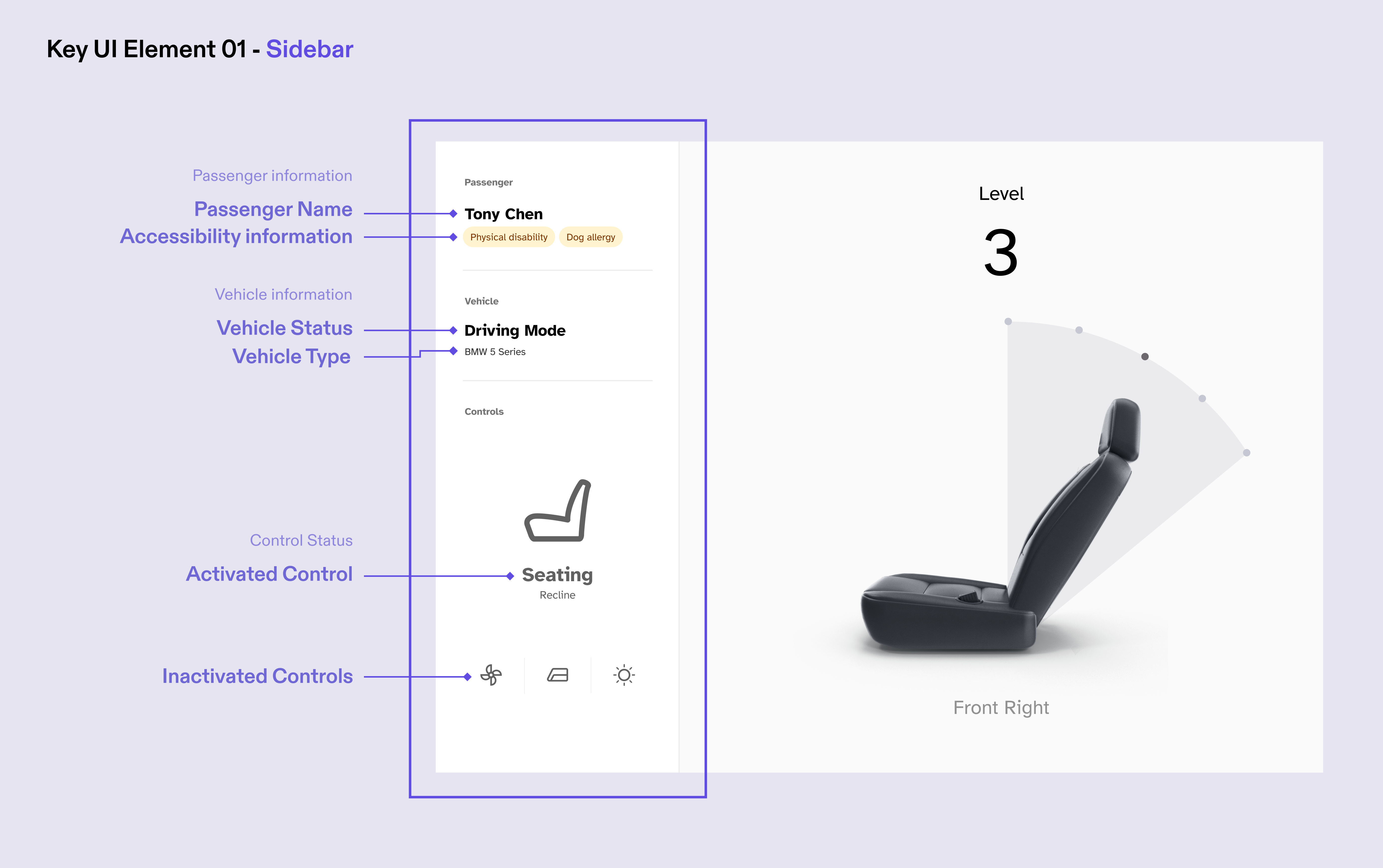
The sidebar organizes content into categories, separating the context and results of the user’s controls with corresponding labels. It also frees up enough space for testers to focus on the main content area.
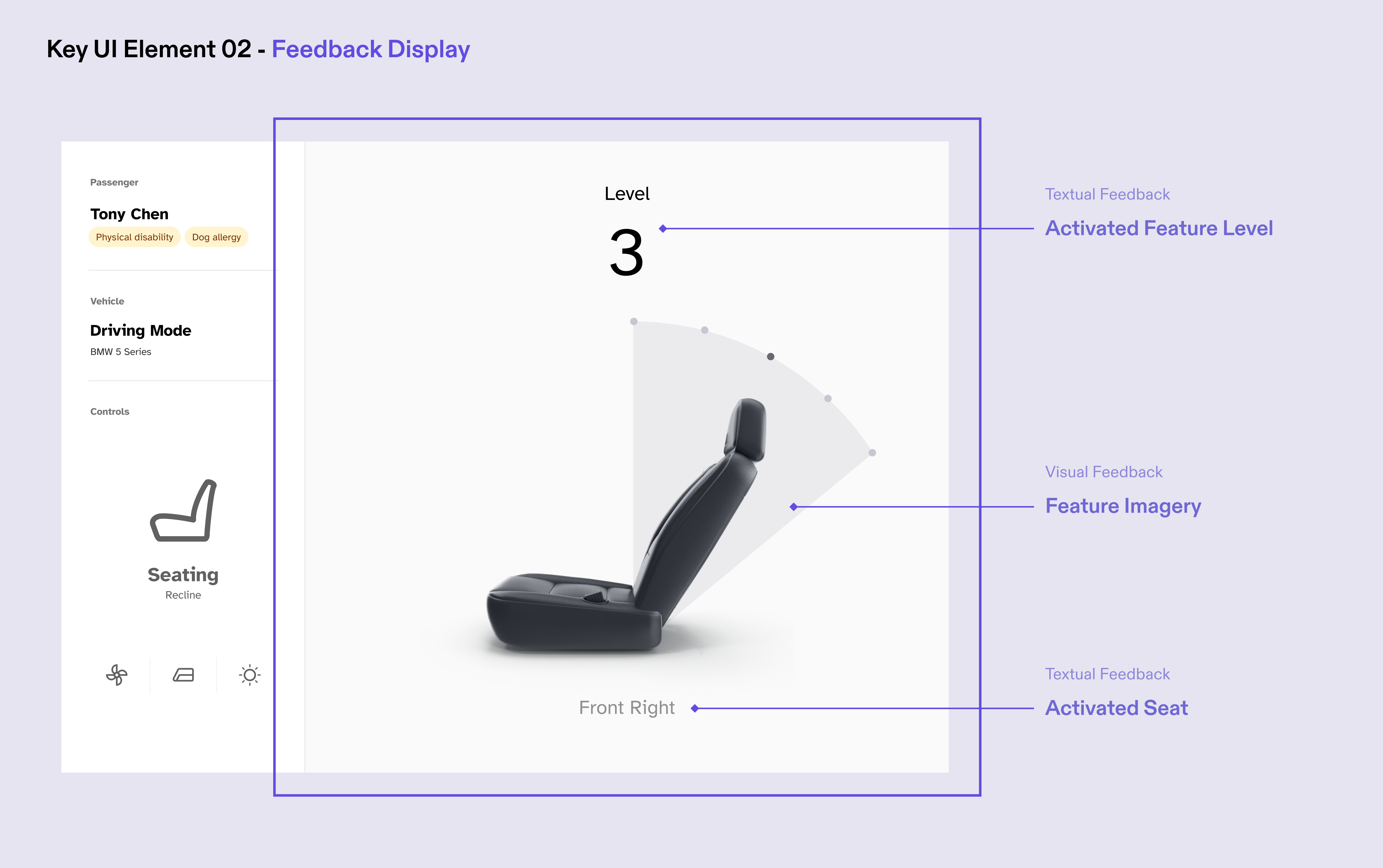
The Feedback Display section offers testers an insightful and intuitive experience through its combination of textual and visual feedback. With large text and centered images, the simulator presents testers with an immediate and clear representation of the activated feature.
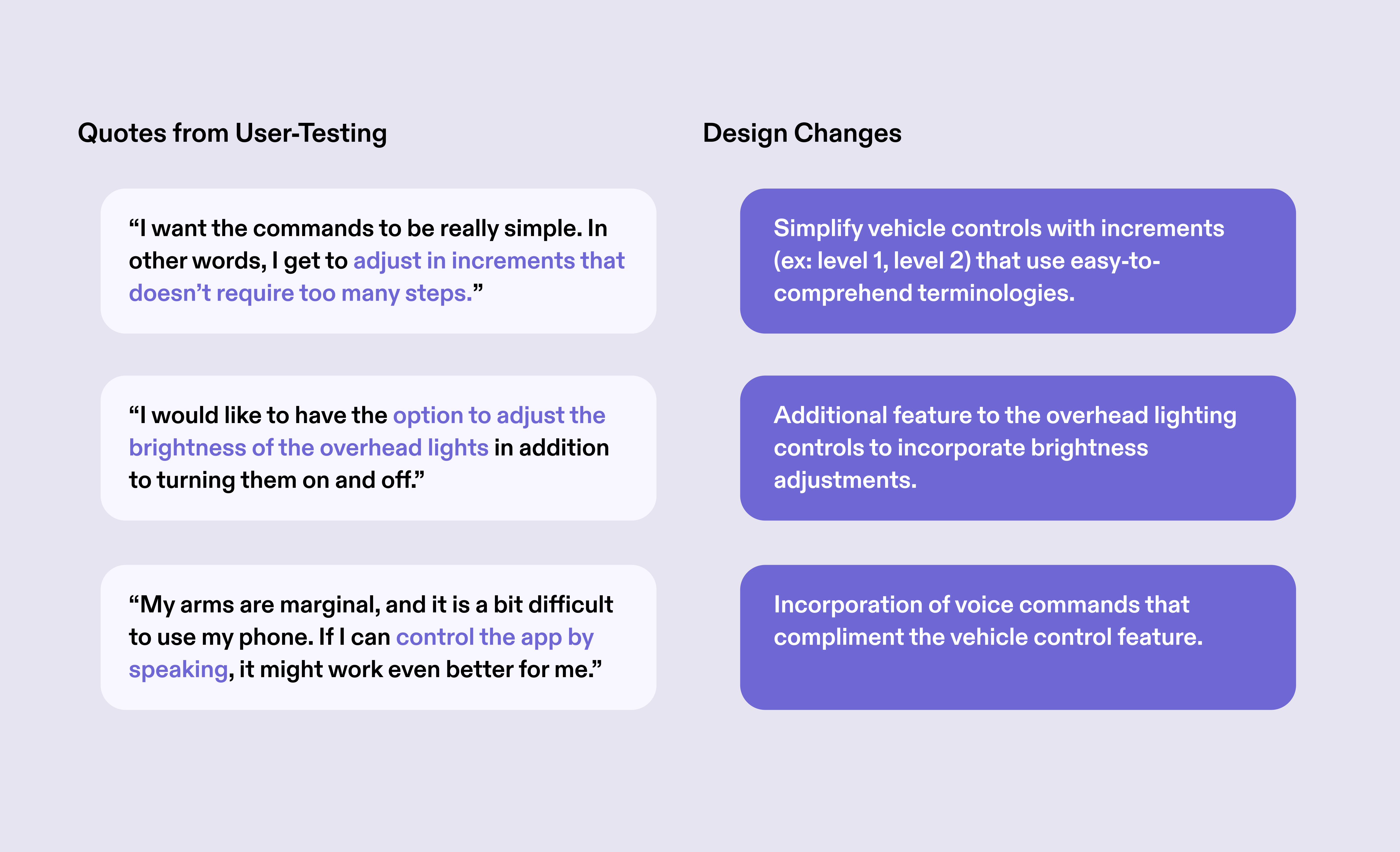
User-testing results
What insights did our team gain from user-testing with the simulator?
The user testing team worked with community members to test the application, document feedback and proposed design changes. Our team was able to recieve insightful feedback and suggestions based on simulator-assisted testing.

The control panel received positive feedback for simplifying the control of different aspects of the car that were important to comfort and the overall ride experience. Our team gathered key insights from the testing results, and continued to work on design changes to the app that reflect the users’ concerns on the control panel.
Reflection
This project provided me with an unique opportunity to gain experience in design for user testing, where a simulation environment was necessary to overcome the limitations of inaccessible resources. I leveraged design skills to address the challenge of eliciting real-life feedback from users interacting with the prototyped app. Through close collaboration with the User Testing and Development teams, I was able to expand my understanding of design for accessibility, and contribute to the validation of the app with our special user group.
Part-time
Oct 2022 - May 2023
Oct 2022 - May 2023
Redesigning the tutor’s experience of PLUS, an AI-assisted tutoring software
PLUS is an after-school math learning solution that combines highly trained human tutors with cutting-edge, AI-driven software to boost learning gains for middle school students from historically underserved communities. PLUS tutors are currently serving students in Pennsylvania, Maryland, and California.
I was responsible for redesigning the tutor login’s homepage, message center, notification feature, and the organization of lessons in both web and mobile interfaces. The redesigned pages are officially launched.
Team
Individual
Individual
Skills
UI/UX Design
User Research
UI/UX Design
User Research
Outcome
Enhanced tutor’s login navigation and aligned UI with updated visual system for web and mobile views
01. Reimagined Information Architecture of Tutor’s Homepage - Intuitive Starting Point for Seamless Navigation Across the App's Pages
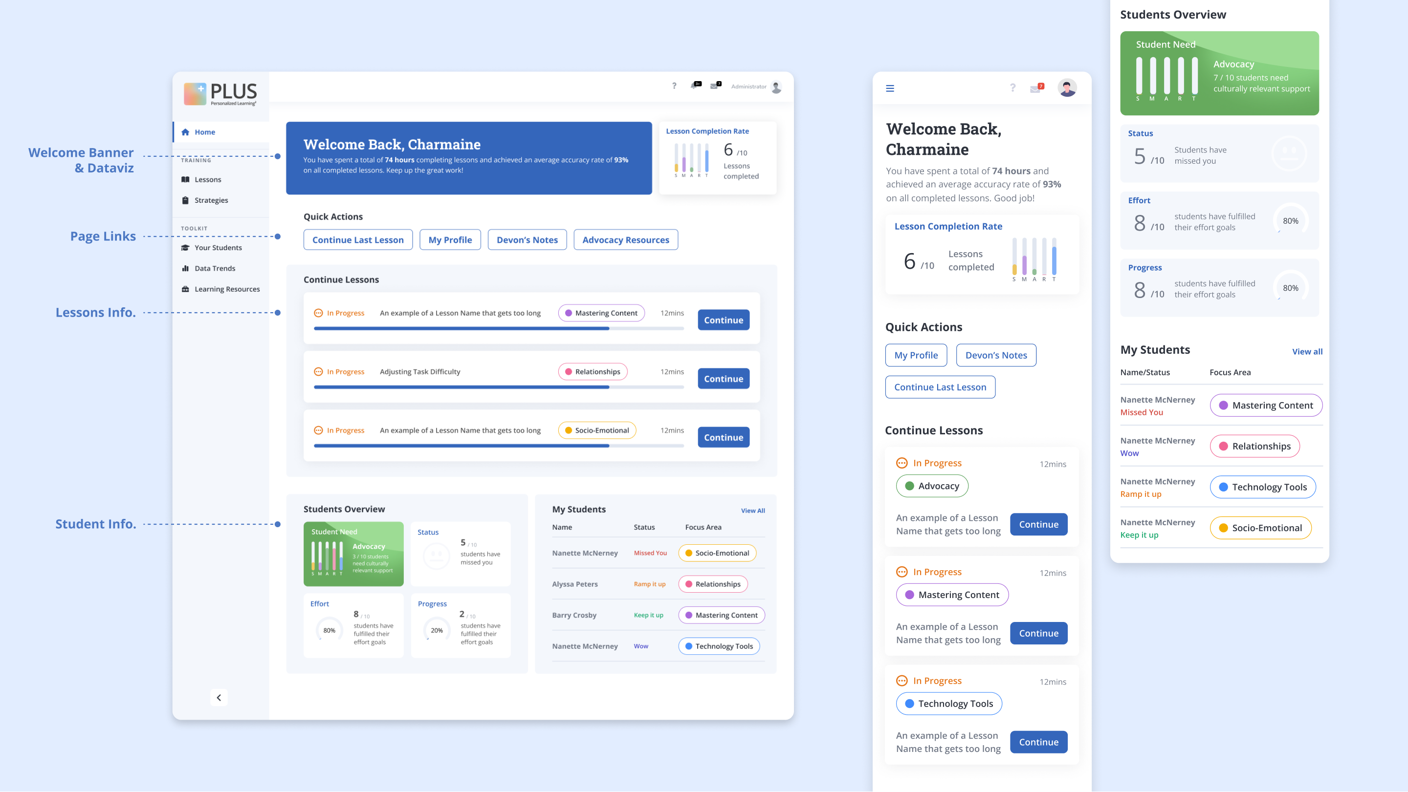
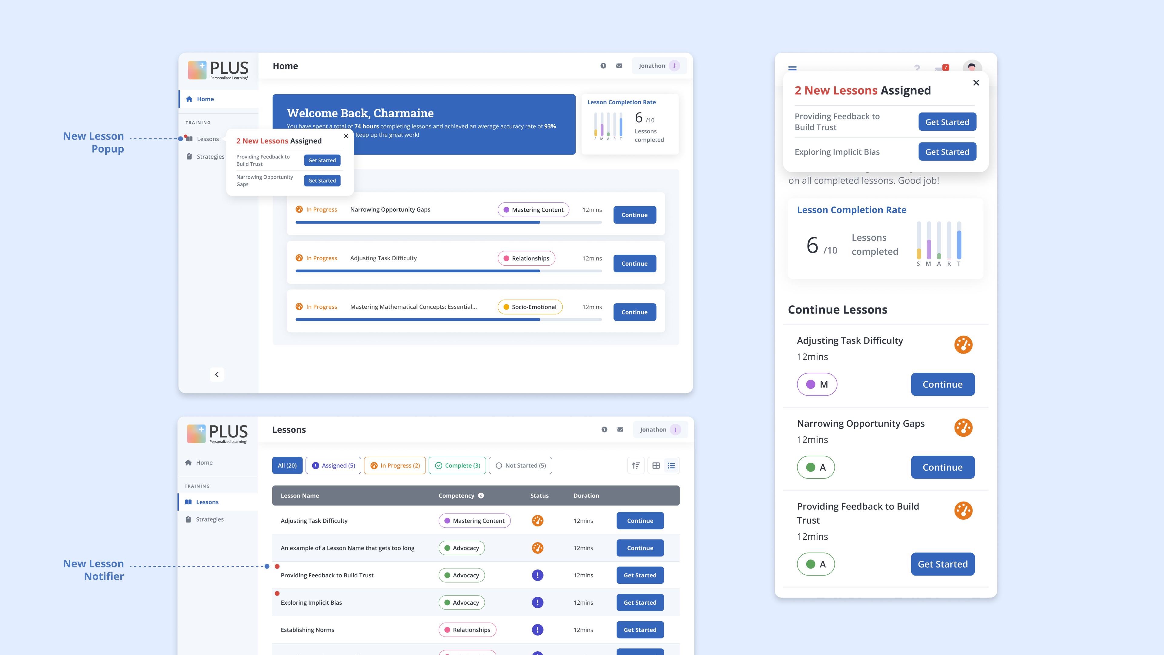
02. Visualized New Lesson Notifications - Informing Tutors with Timely Updates and Direct Access to Lessons
03. Redesigned message center - Aligning Visual system to Brand Guidelines

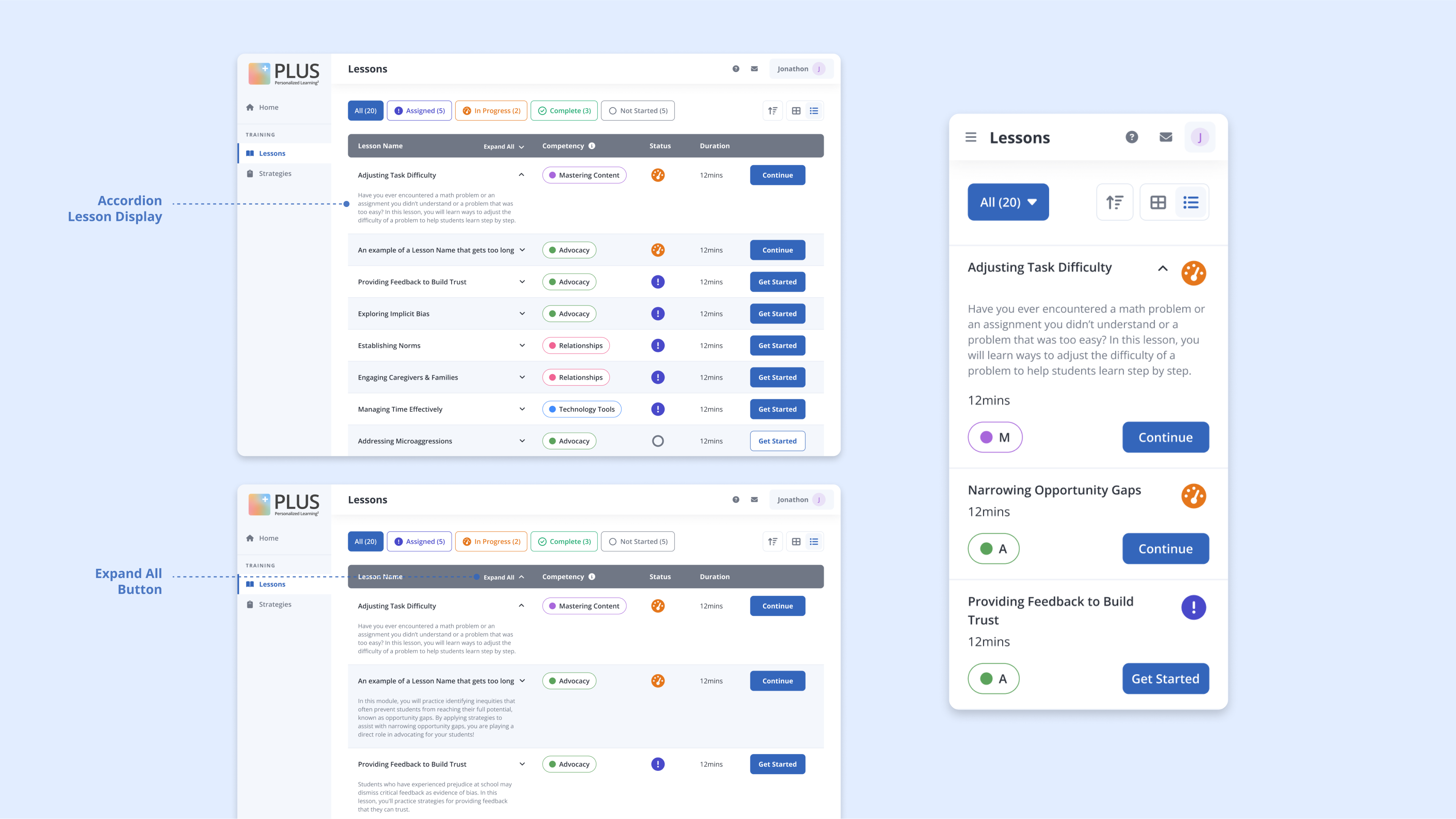
04. Incorporated Expandable Lesson Detail Display - Allowing Tutors with Versatility in Viewing Training Lessons
Spring 2022
8 weeks
8 weeks
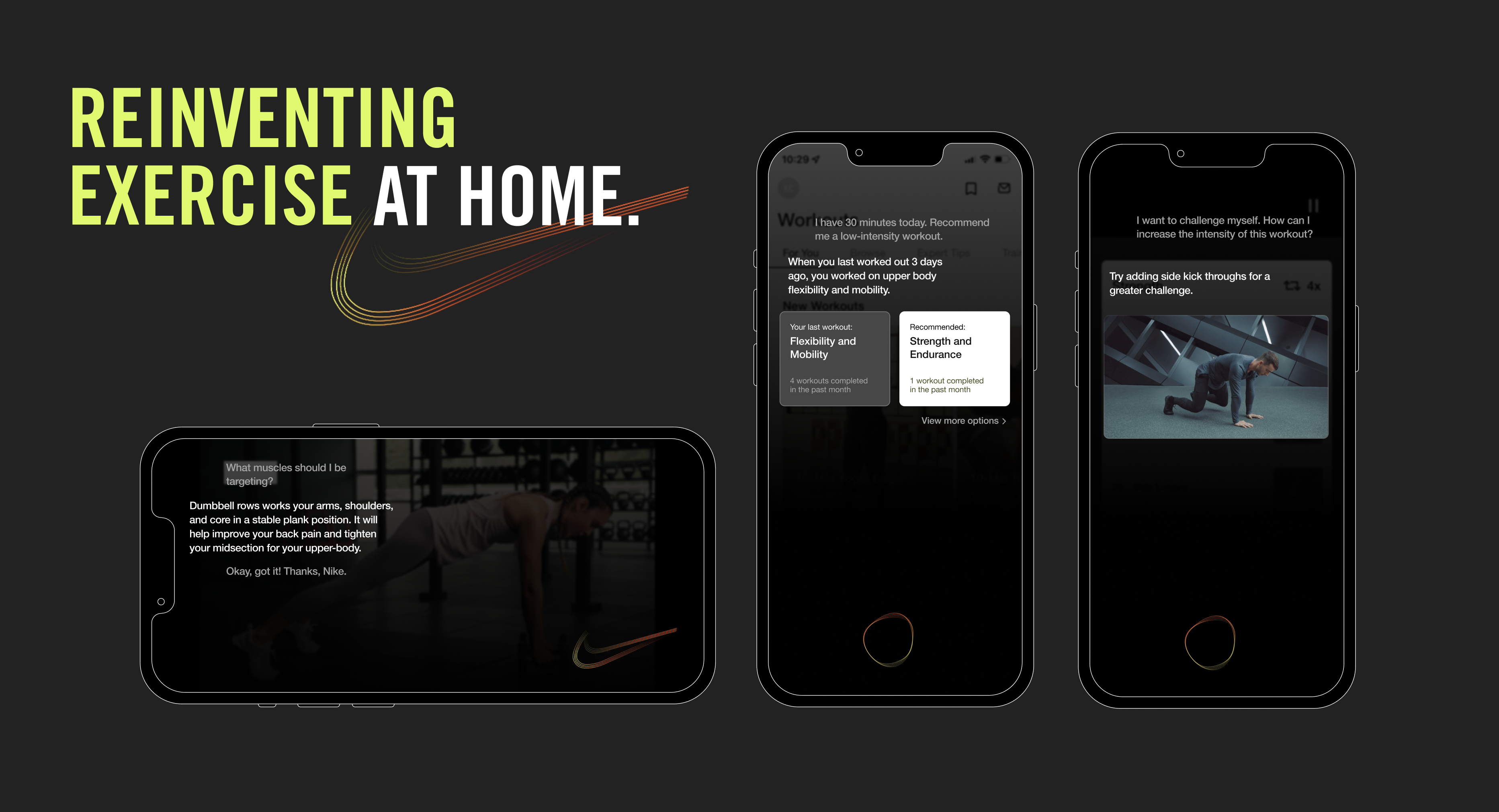
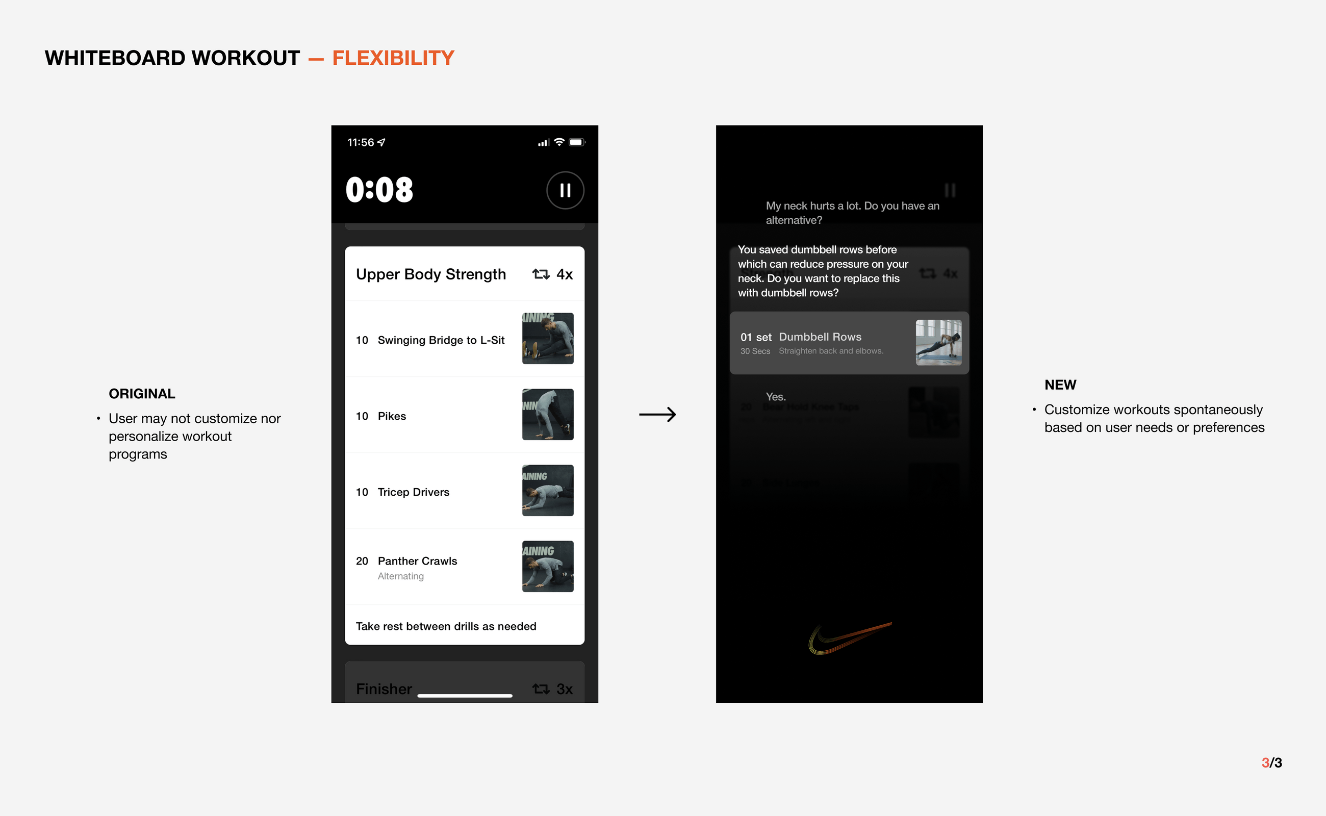
Nike, Your Personal Trainer is an intelligent assistant for at-home workout
Nike Training Club is an app that provides workout programs that are intentional and flexible for at-home workouts. Our project integrates data-driven conversation, in the form of a CUI, to guide users at all stages of fitness expertise to reshape what it means to exercise at home.
I was responsible for designing UI/UX prototypes, CUI visuals, and conducting research.
Team
Sammie Kim
Francis Park
Elysha Tsai
Sammie Kim
Francis Park
Elysha Tsai
Skills
UI/UX
Motion Design
UX Research
Tools
Figma
After Effects
UI/UX
Motion Design
UX Research
Tools
Figma
After Effects
Concept
How might we elevate the at-home workout experience?
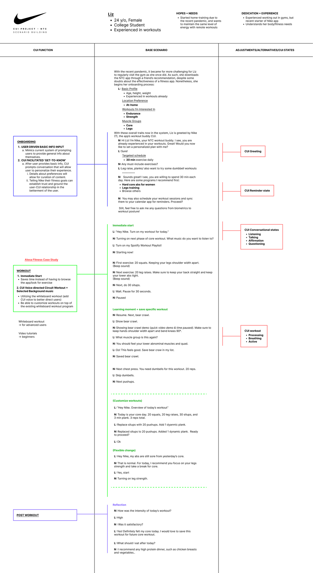
Nike, your personal trainer, offers guidance according to an athletes individual training needs. With the CUI, Focus on Form TODAY by following professional trainer-led videos; Own your Workout TOMORROW by customizing personalized sessions. Nike allows athletes to build confidence, self-efficacy, and personal growth through in depth at-home workout curation.
How might we elevate the at-home workout experience?
Nike, your personal trainer, offers guidance according to an athletes individual training needs. With the CUI, Focus on Form TODAY by following professional trainer-led videos; Own your Workout TOMORROW by customizing personalized sessions. Nike allows athletes to build confidence, self-efficacy, and personal growth through in depth at-home workout curation.
Concept Video
Key Feature 01
Customization based on User Preference
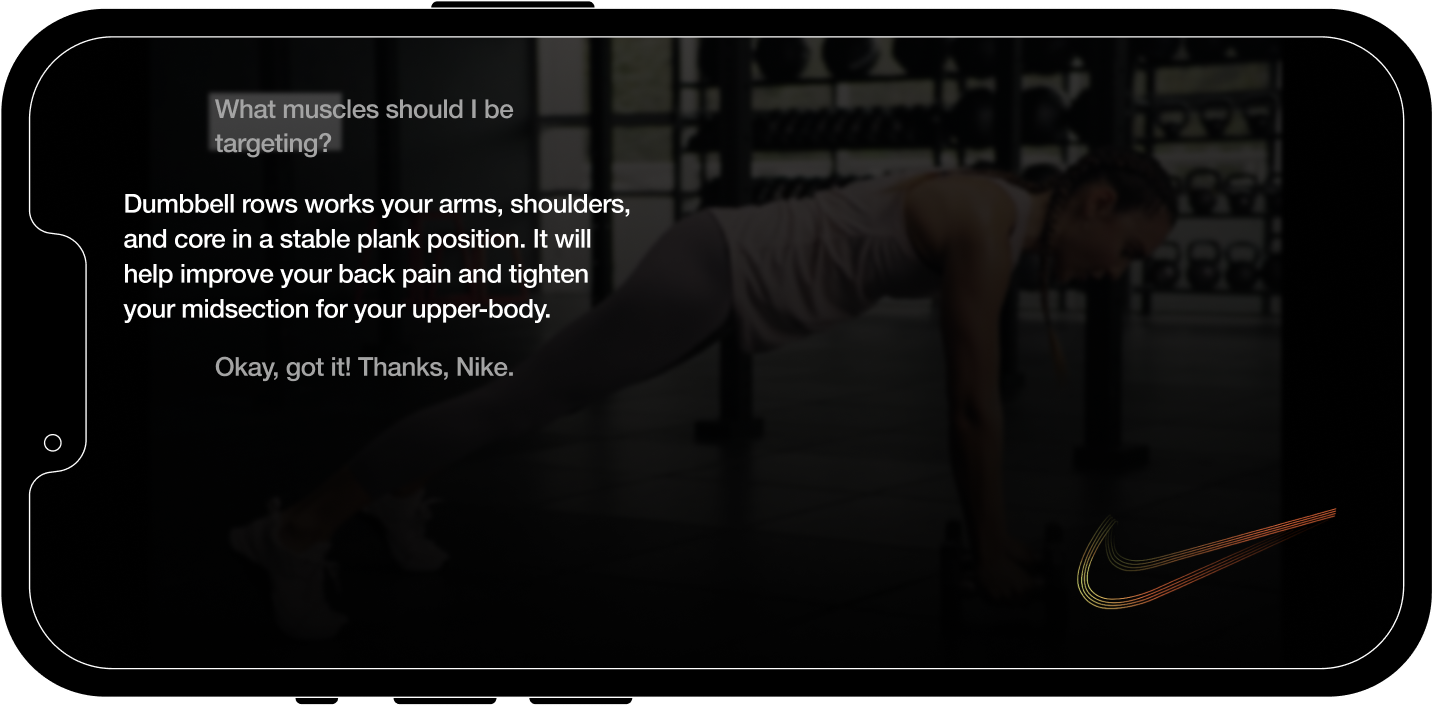
Interacting with the CUI allows users to customize their workout routines by saving specific exercises from videos and making changes to workouts on the spot.
Customization based on User Preference
Interacting with the CUI allows users to customize their workout routines by saving specific exercises from videos and making changes to workouts on the spot.
Key Feature 02
Guidance from Professional Trainers
While exercising, users can receive answers and demonstrations, from real trainers, to questions on form and benefits of specific exercises.
Guidance from Professional Trainers
While exercising, users can receive answers and demonstrations, from real trainers, to questions on form and benefits of specific exercises.
Key Feature 03
Recommendation based on User Goals
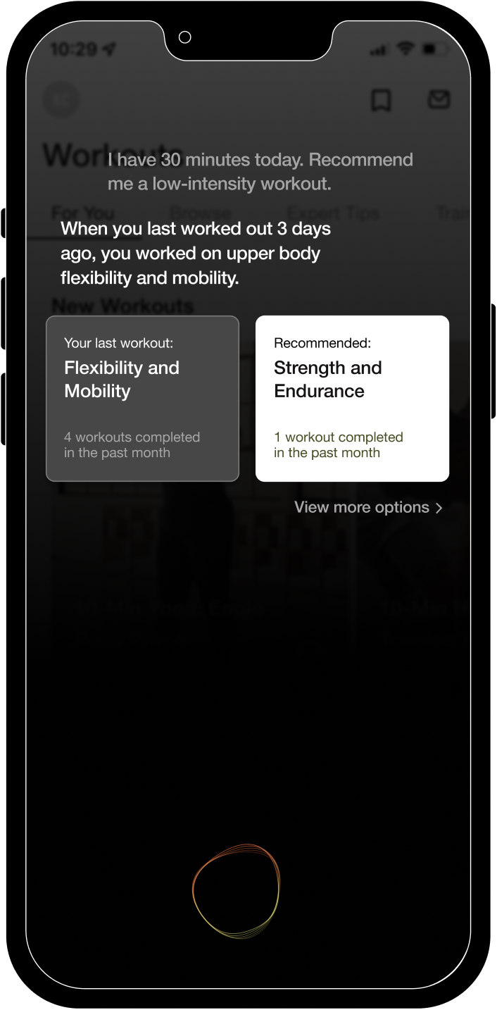
Smart recommendations on workouts and alternatives are generated based on the user’s exercise history and goals
Recommendation based on User Goals
Smart recommendations on workouts and alternatives are generated based on the user’s exercise history and goals
CUI Visuals
The 6 different states of the CUI visualizes its communication with the user through motion. The design is inspired by the Nike swoosh, which transforms into different dynamic shapes that encourage movement and excitement from the user.
6 Different States
The 6 different states of the CUI visualizes its communication with the user through motion. The design is inspired by the Nike swoosh, which transforms into different dynamic shapes that encourage movement and excitement from the user.


Background Research
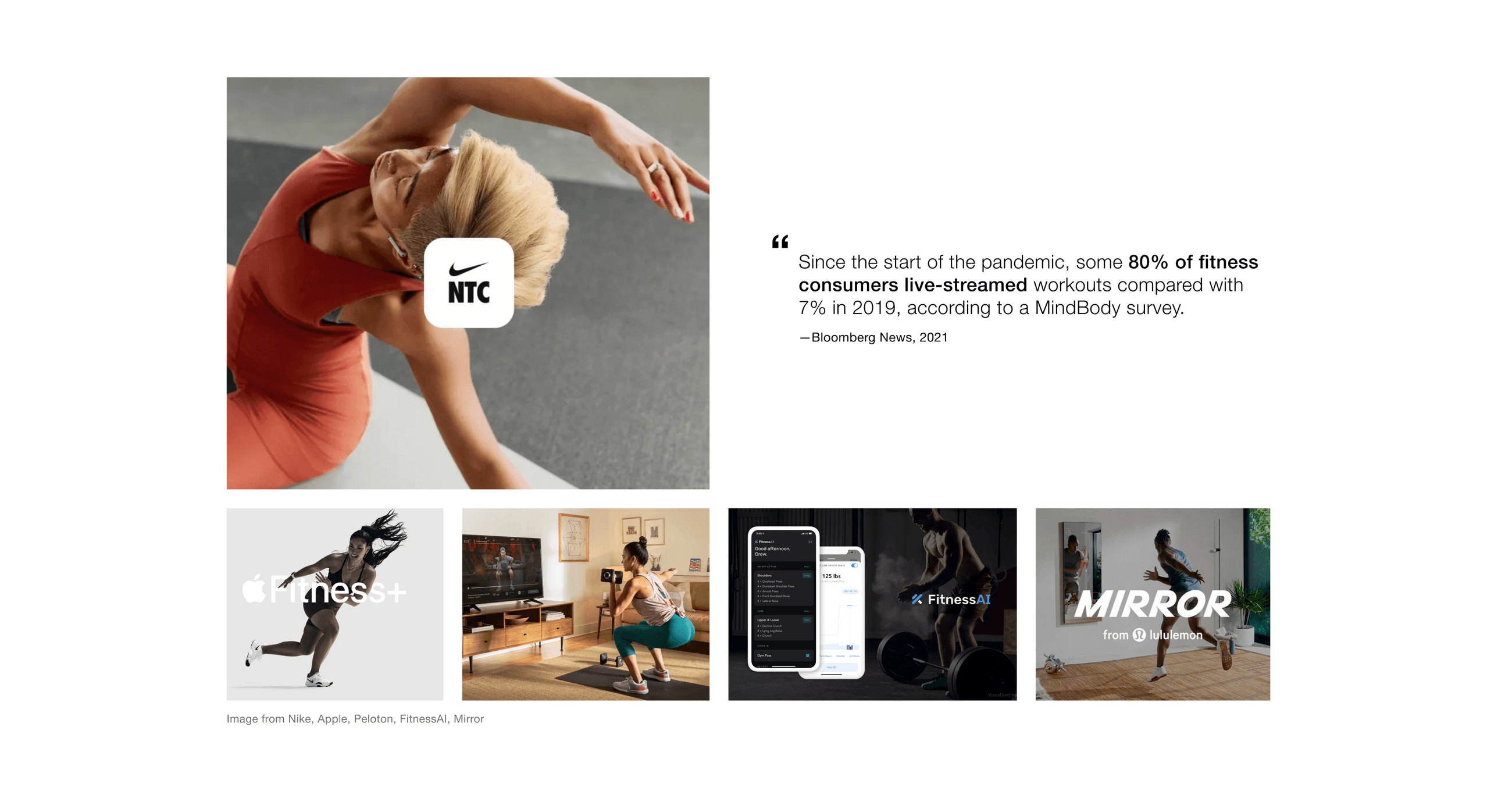
Since the pandemic began, there has been a rise in demand for fitness streaming. This is a leading cause of the desperate need for more flexible workout routines due to the limitation in public workout spaces. We identified Nike Training Club (NTC) as an existing platform that offers a broad spectrum of fitness options for at-home users; however, the remote modalities have brought a sense of impersonality to the workout experience.
Our challenge was to examine the interaction within the NTC mobile app and identify interventions that can address current pain points to elevate the at-home workout experience.
The Context and Challenge
Since the pandemic began, there has been a rise in demand for fitness streaming. This is a leading cause of the desperate need for more flexible workout routines due to the limitation in public workout spaces. We identified Nike Training Club (NTC) as an existing platform that offers a broad spectrum of fitness options for at-home users; however, the remote modalities have brought a sense of impersonality to the workout experience.
Our challenge was to examine the interaction within the NTC mobile app and identify interventions that can address current pain points to elevate the at-home workout experience.
User Research
To gather insights from app users, we carefully examined the reviews that illustrate the frustrations of the current experience. Many users seek more guidance in workouts due to the lack of explanations in trainer-led videos. Other users hope for personalization that helps curate unique experiences based on their fitness needs.
We identified the opportunity to utilize artificial intelligence in the form of a CUI to offer more personal guidance and facilitate conversations that help users grow emotionally and physically.
What does an athlete need?
To gather insights from app users, we carefully examined the reviews that illustrate the frustrations of the current experience. Many users seek more guidance in workouts due to the lack of explanations in trainer-led videos. Other users hope for personalization that helps curate unique experiences based on their fitness needs.
We identified the opportunity to utilize artificial intelligence in the form of a CUI to offer more personal guidance and facilitate conversations that help users grow emotionally and physically.
Platform Research
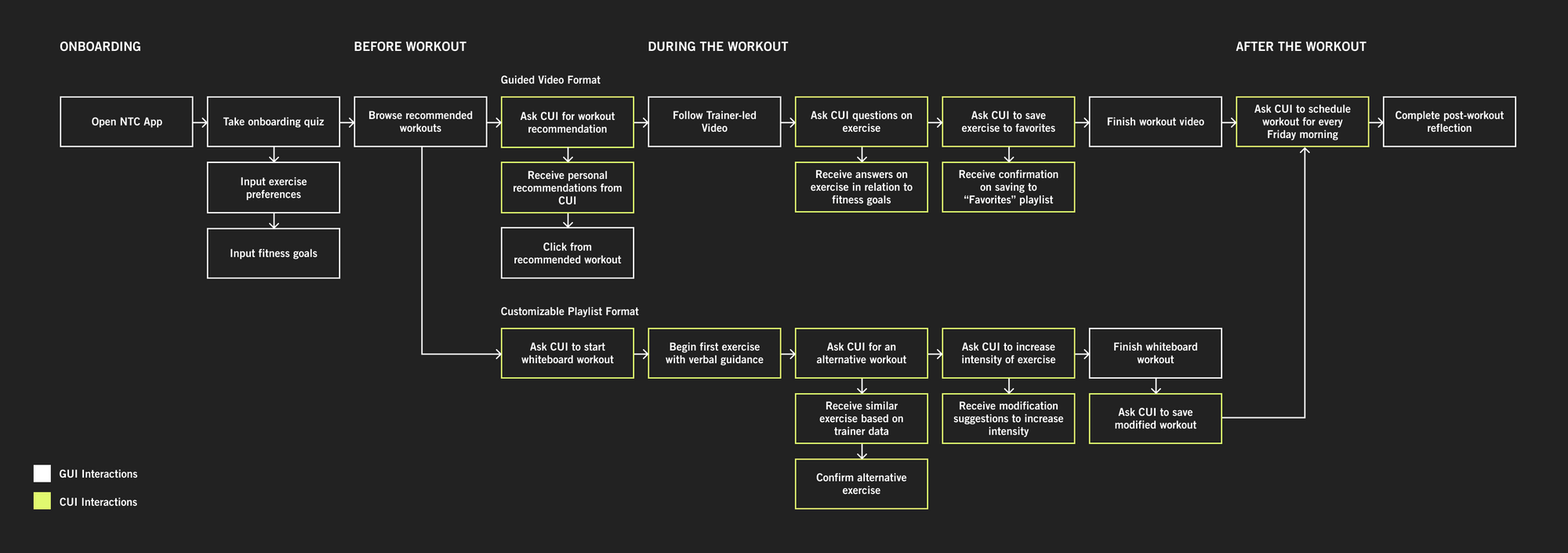
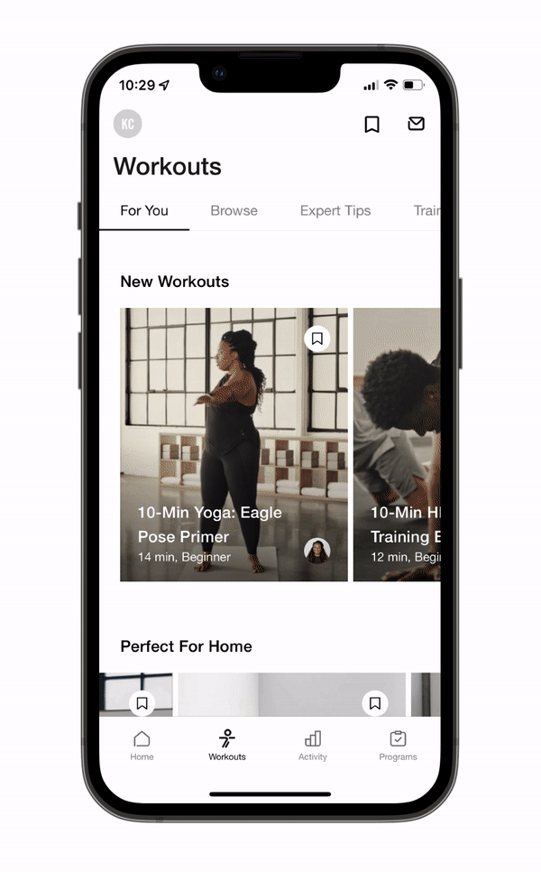
Our team studied the NTC app by illustrating the current user flow from the onboarding to the post-workout experience. By using the app ourselves, we were abel to map out UI painpoints and CUI opportunities. We identified two main types of exercising methods, trainer-led classes and whiteboard workouts. Each method targeting a different type of user, we decided to focus on the CUI’s intervention in both processes.
The Current NTC App
Our team studied the NTC app by illustrating the current user flow from the onboarding to the post-workout experience. By using the app ourselves, we were abel to map out UI painpoints and CUI opportunities. We identified two main types of exercising methods, trainer-led classes and whiteboard workouts. Each method targeting a different type of user, we decided to focus on the CUI’s intervention in both processes.
Platform Research
To visualize the user’s emotions, needs, and interactions with NTC, our team created a journey map highlighting the differences between guided video and customizable playlist formats.
Journey Mapping
To visualize the user’s emotions, needs, and interactions with NTC, our team created a journey map highlighting the differences between guided video and customizable playlist formats.

Research Findings
We synthesized our research findings into three pain points that can be addressed with CUI opportunities, which guided our design process.
Pain Points + Opportunities
We synthesized our research findings into three pain points that can be addressed with CUI opportunities, which guided our design process.
1. Imbalanced proportion of flexibility and guidance in existing workout formats
Customization of workout formats based on user preference and physical condition
2. Lack of feedback and guidance while working out
Integration of real time feedback drawn from professional trainer database
3. Lack of personalization in workout selection
Curated recommendations based on workout history and user goals, generated by long-term relationship with CUI
Concept Development
To design for a range of experience levels, we identified personas of the Beginner Athlete and the Experienced Athlete to demonstrate the different interactions with the CUI.
Personas
To design for a range of experience levels, we identified personas of the Beginner Athlete and the Experienced Athlete to demonstrate the different interactions with the CUI.

Concept Development
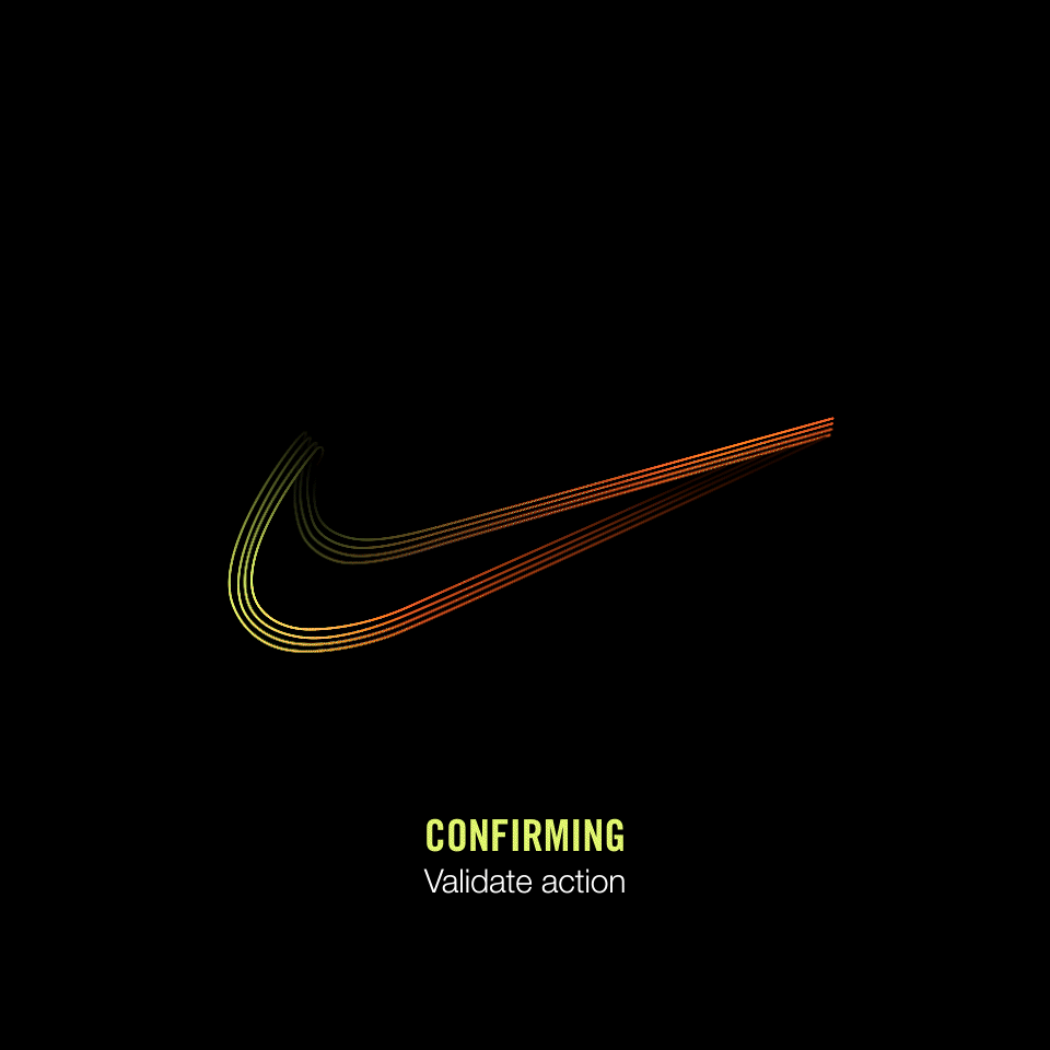
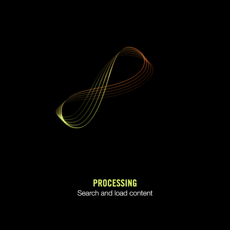
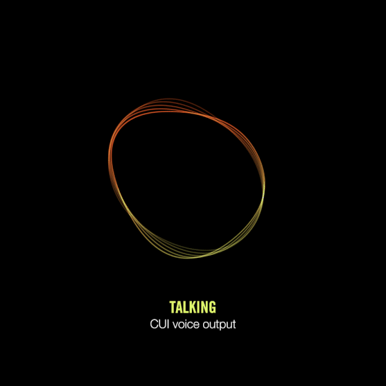
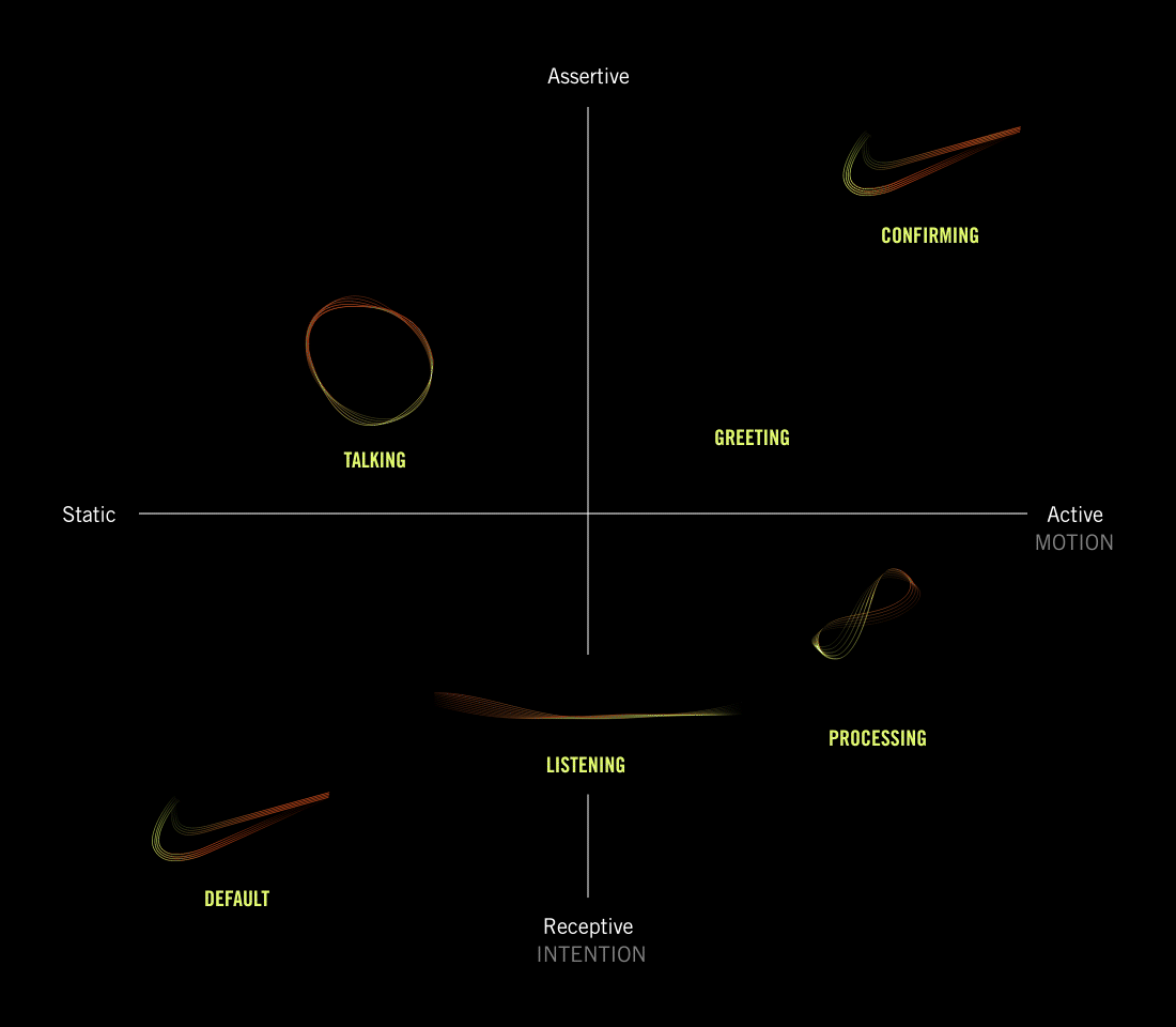
Based on the personas and opportunities with an CUI intervention, we brainstormed conversational flows that follow scenarios covering onboarding, scheduling, working out, and post-workout. Eventually, we surmised six final CUI states: default, greeting, listening, talking, processing, and confirming.
Conversation Flows
Based on the personas and opportunities with an CUI intervention, we brainstormed conversational flows that follow scenarios covering onboarding, scheduling, working out, and post-workout. Eventually, we surmised six final CUI states: default, greeting, listening, talking, processing, and confirming.

Visual Identity
When exploring the visual representation of the CUI, our team focused on Nike’s characters of bold, energetic, and flexible by distorting shapes, creating contrast in sizes, and using vibrant colors.
![]()
We observed the greatest potential within stroke and line focused visuals, as they felt most dynamic and adaptable when transforming into various states. The energy embedded within the lines also resembled body movement, athletic gestures, and even shoe laces. We eventually generated a unique, abstracted swoosh logo composed of lines that would flexibly loop and intermingle when switching states.
Designing the CUI
When exploring the visual representation of the CUI, our team focused on Nike’s characters of bold, energetic, and flexible by distorting shapes, creating contrast in sizes, and using vibrant colors.
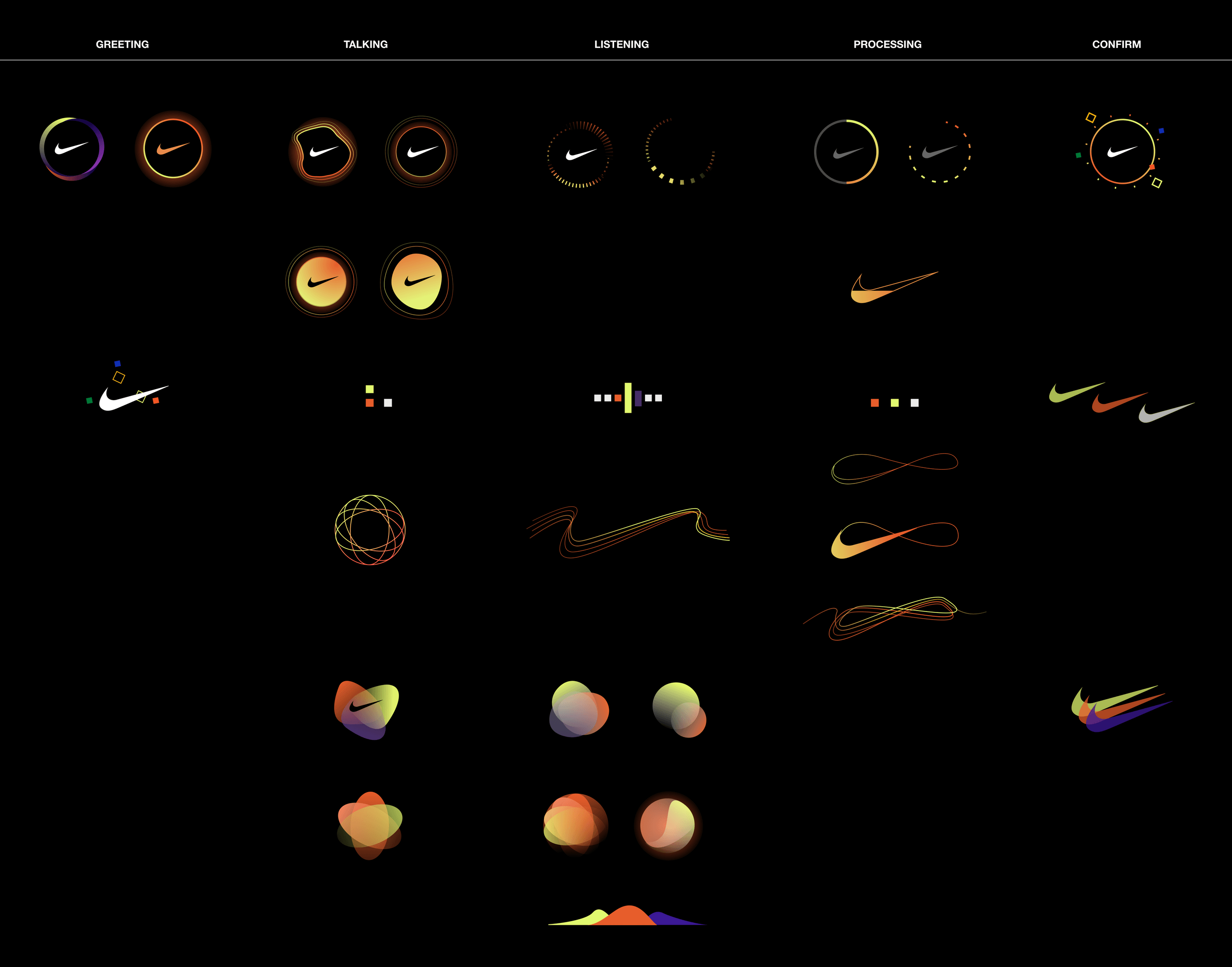
We observed the greatest potential within stroke and line focused visuals, as they felt most dynamic and adaptable when transforming into various states. The energy embedded within the lines also resembled body movement, athletic gestures, and even shoe laces. We eventually generated a unique, abstracted swoosh logo composed of lines that would flexibly loop and intermingle when switching states.
Interface Design
Based on the narrative illustrating the CUI’s purpose, we developed a user flow for the mobile interface following the user’s journey from Today to Tomorrow. We carefully studied the flow of the NTC app and integrated the functions of the CUI into screen designs.
Mobile User Flow
Based on the narrative illustrating the CUI’s purpose, we developed a user flow for the mobile interface following the user’s journey from Today to Tomorrow. We carefully studied the flow of the NTC app and integrated the functions of the CUI into screen designs.
Interface Design
When designing the interface, our team studied the design system of the NTC app, and adapted the styling into CUI screens. We created new UI elements like cards and buttons that further followed the established visual system of the app.
Design System
When designing the interface, our team studied the design system of the NTC app, and adapted the styling into CUI screens. We created new UI elements like cards and buttons that further followed the established visual system of the app.
Interface Design
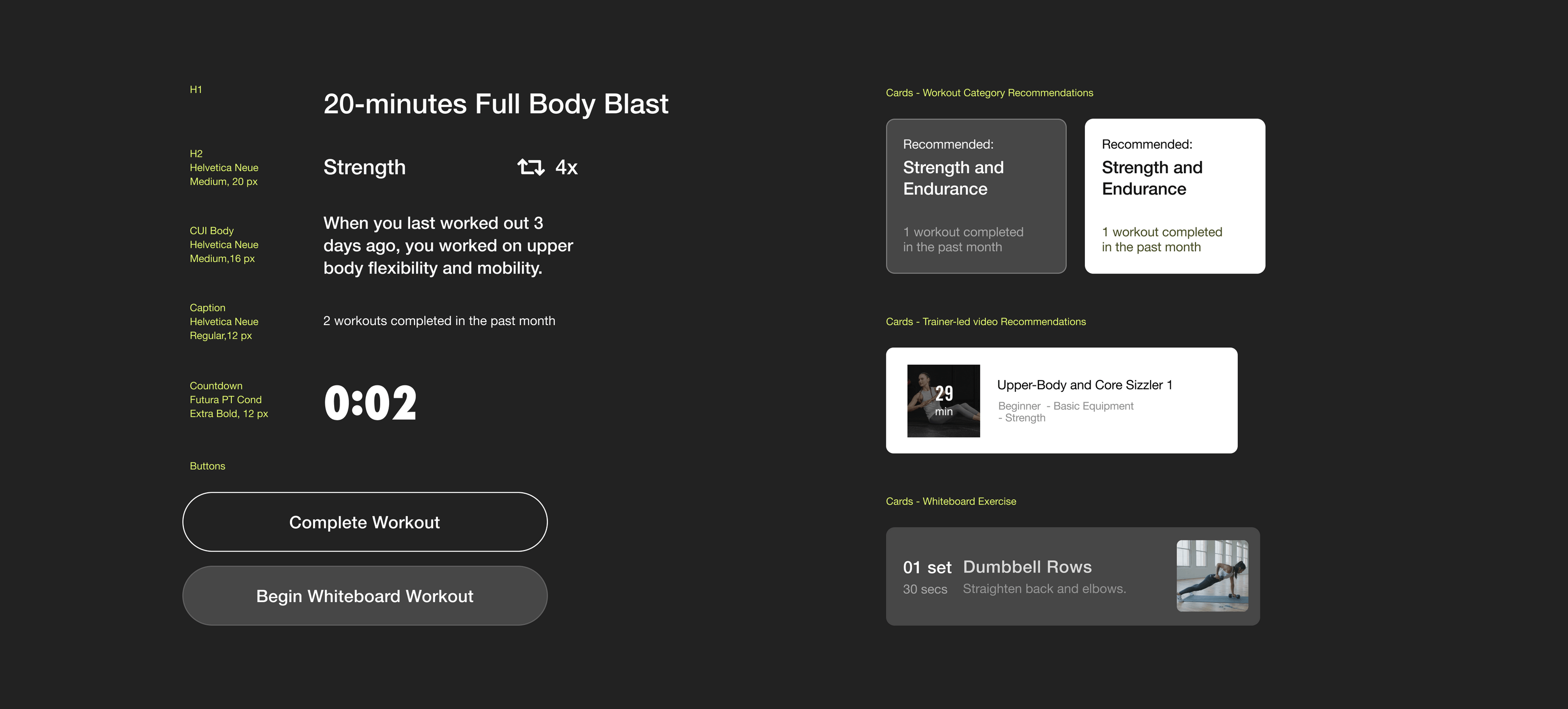
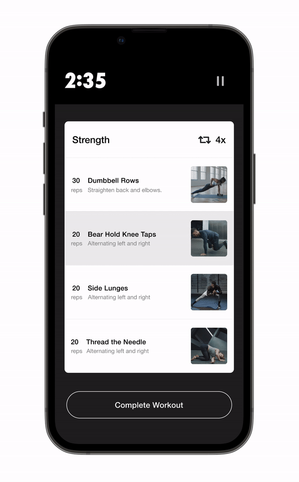
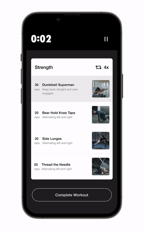
Key design decisions were made based on the conversational needs for both guided videos and customizable workout playlists. For guided videos, we catered the CUI chat feature to fit within a landscape view that is most natural to users who are watching and following the video.
Key Design Decisions
Key design decisions were made based on the conversational needs for both guided videos and customizable workout playlists. For guided videos, we catered the CUI chat feature to fit within a landscape view that is most natural to users who are watching and following the video.
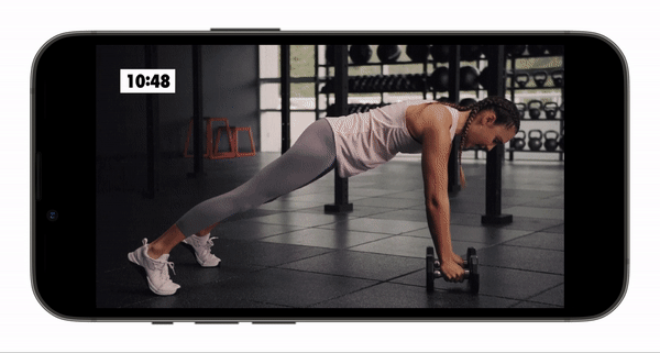
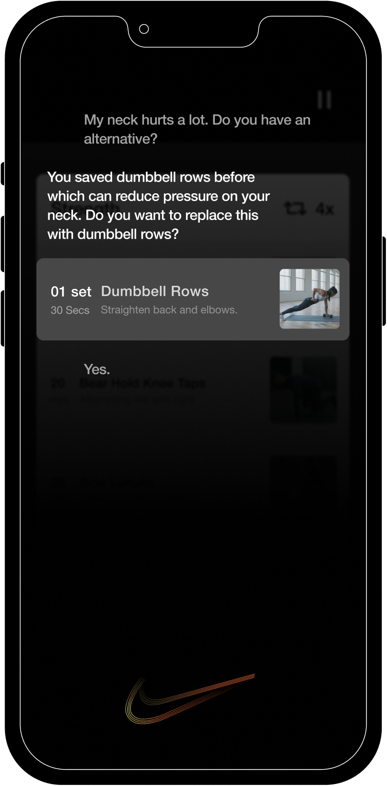
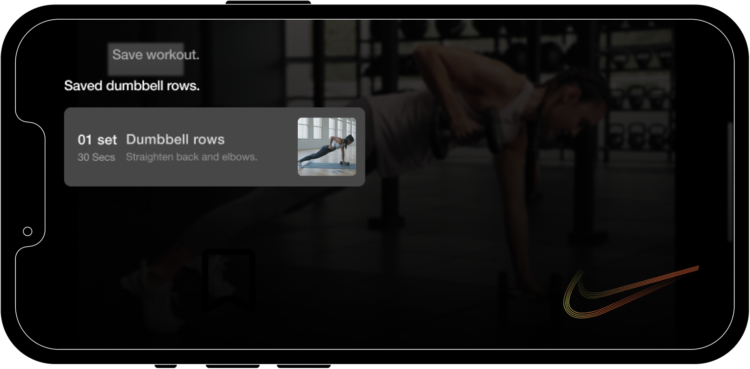
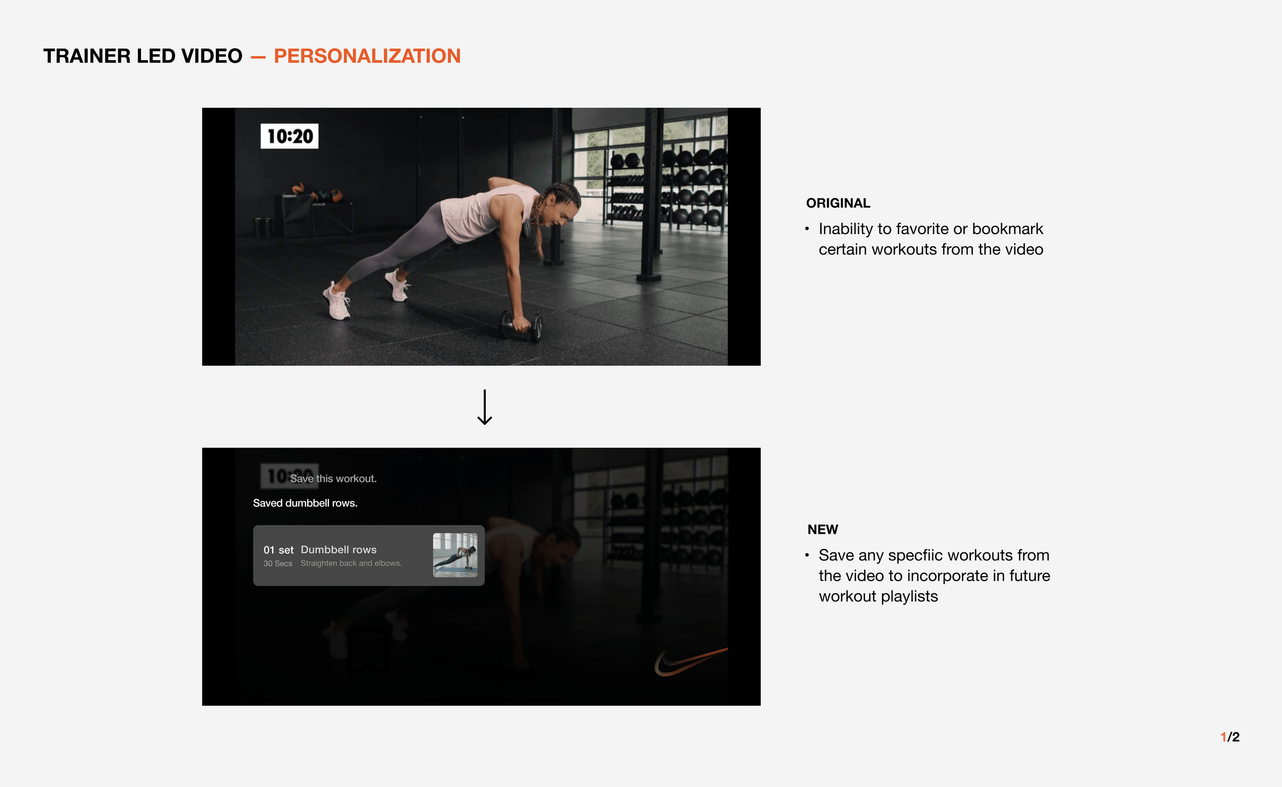
Key Interaction 01
Save Specific Exercise
Activate CUI to save a specific exercise from a trainer-led video. The exercise can be accessed when creating customizable workout sessions in the future.

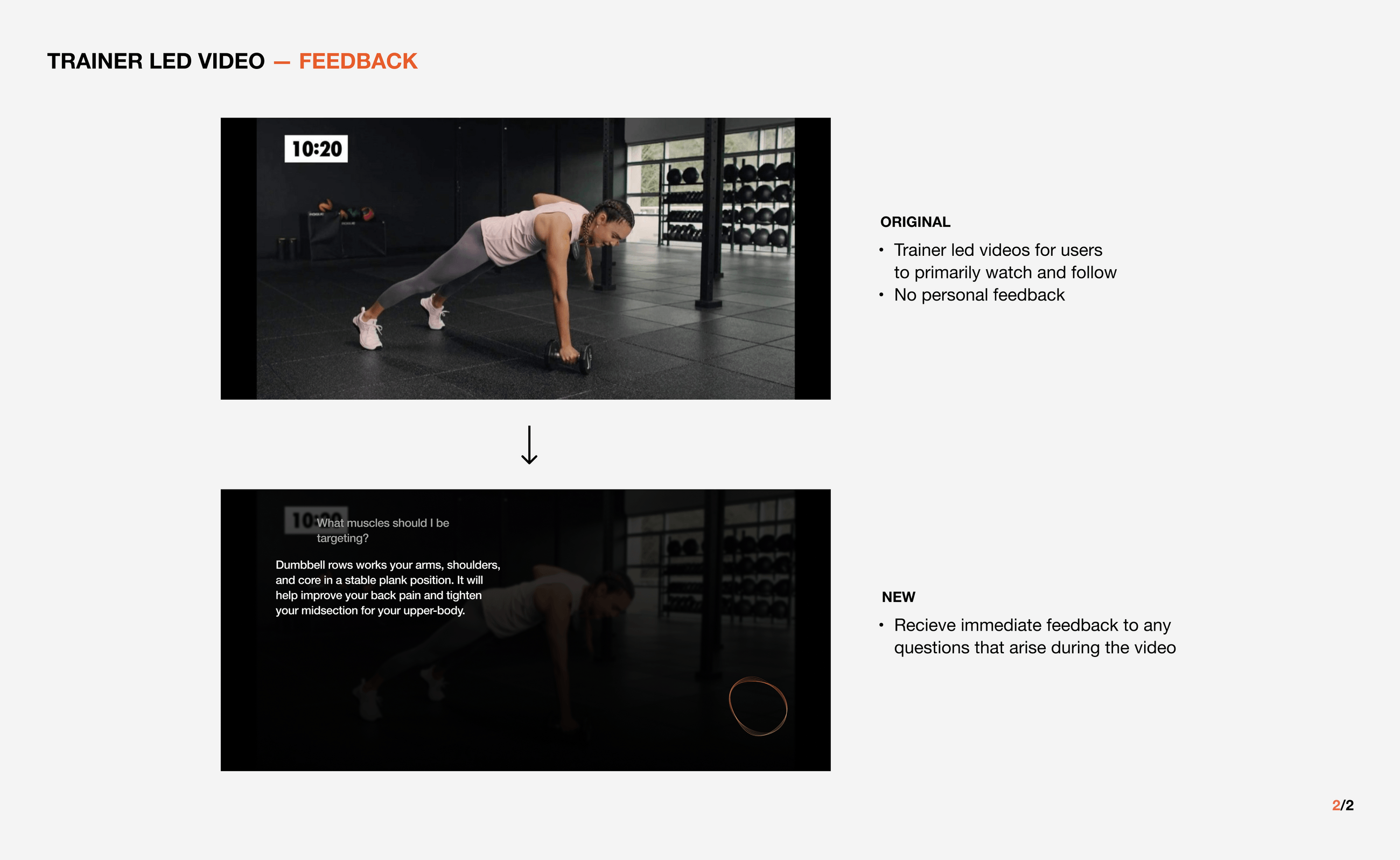
Key Interaction 02
Receive Immediate Feedback
Receive immediate feedback to any questions that arise during the trainer led videos. The input from CUI will be drawn from a database backed by real trainers from Nike.
Key Interaction 03
Provide Smart Recommendation
CUI provides a smart recommendation feature based on the user’s workout history and personal goals.

Key Interaction 04
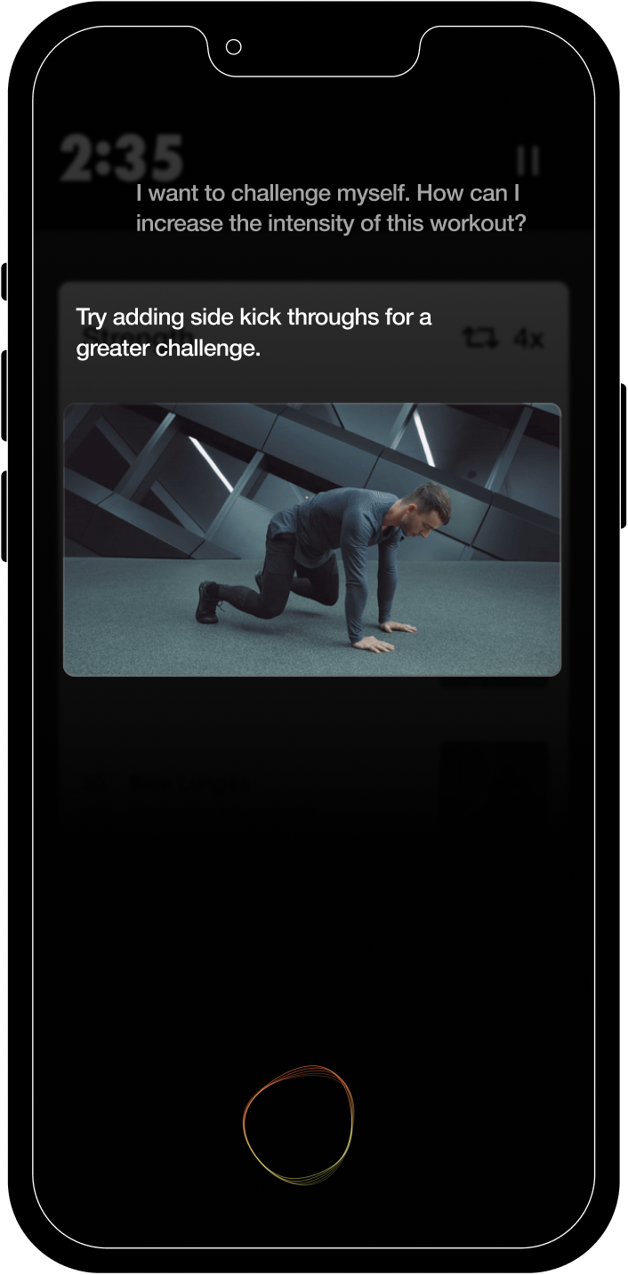
Demonstrate Exercise Movements
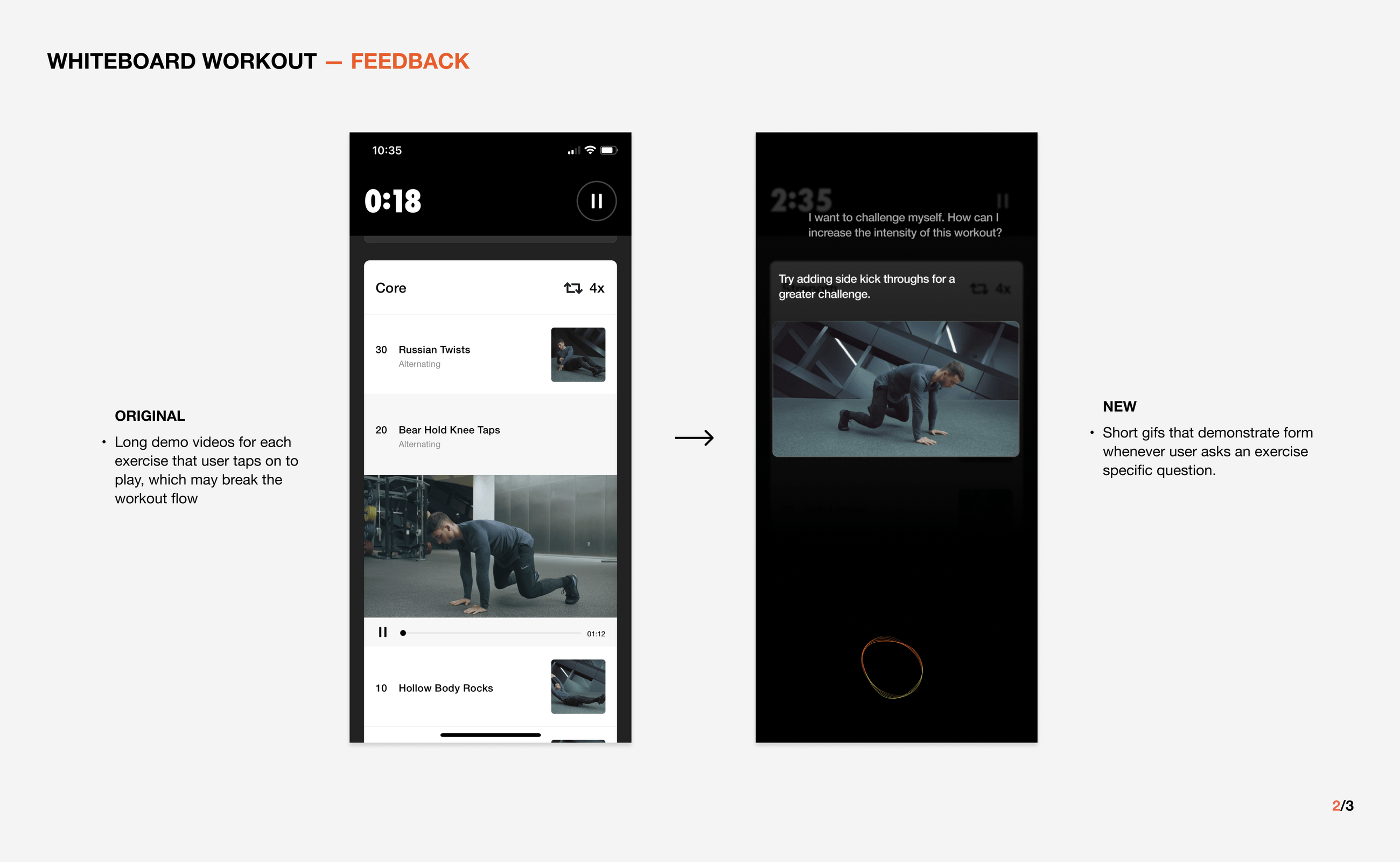
Users can modify the intensity of exercises by asking for an alternative. A short gif will be played to easily demonstrate the movements of the changed exercise.
Key Interaction 05
Customize Workouts on the Spot
Activating the CUI allows users to replace exercises based on physical condition and preference. The recommendation will be sourced from saved exercises from the user profiles.
Reflection
This project allowed me to integrate conversation design into a service intervention. It was a gratifying experience to think about ways that we could reform Nike’s platforms to renew their values in a completely new medium. Asking ourselves the questions about creating something that doesn’t exist in a way that would integrate naturally into a brand that is so established was an ambitious but necessary exercise in getting familiar with design as a package deal of visuals, strategy, and innovation. Having access to so many touch-points like motion, uiux/visual design, and even copywriting taught us the value in taking a holistic critical approach to evaluating the quality of communication at every stage of the process.
2022
7 weeks
7 weeks
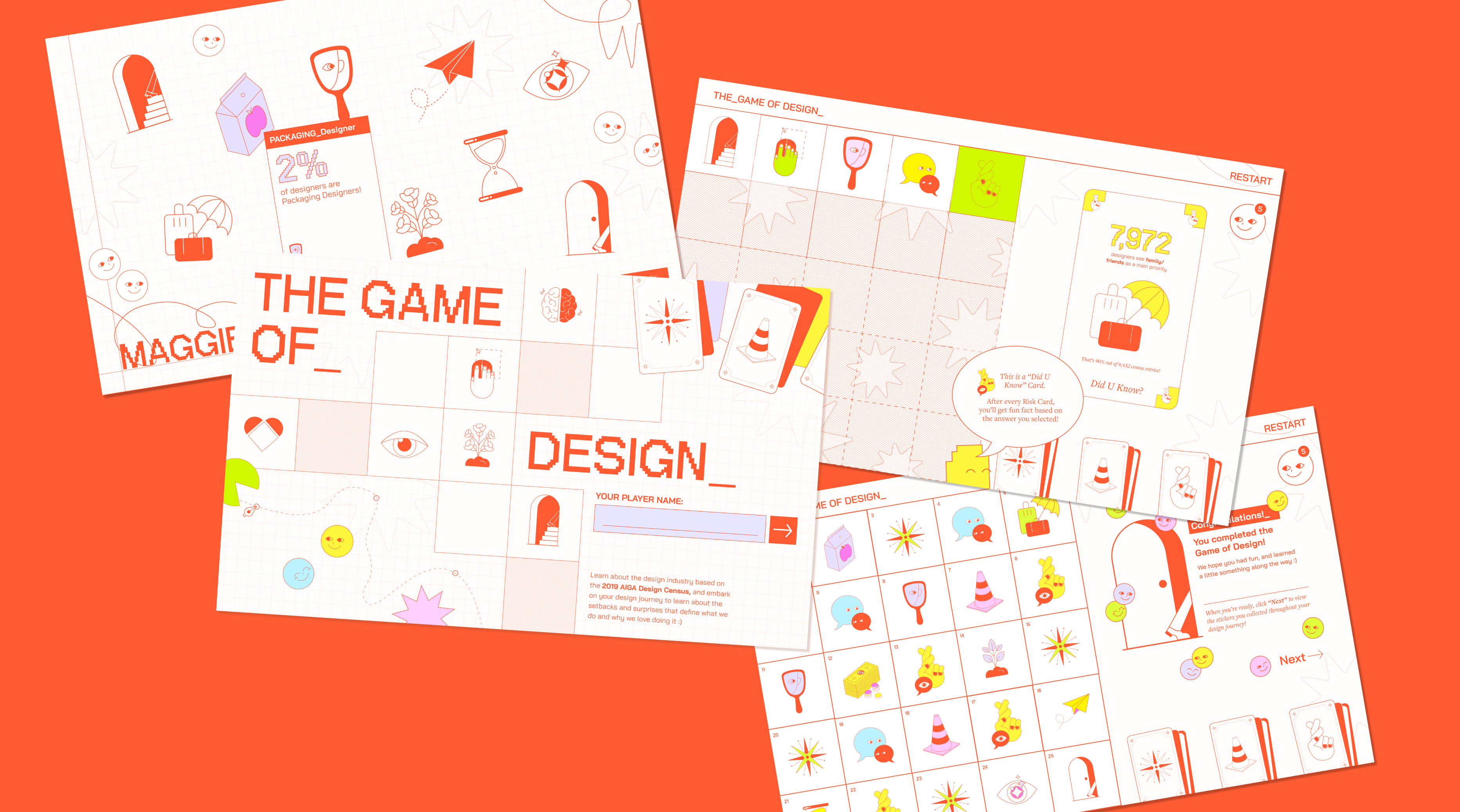
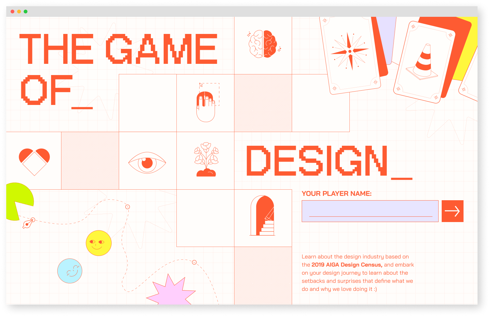
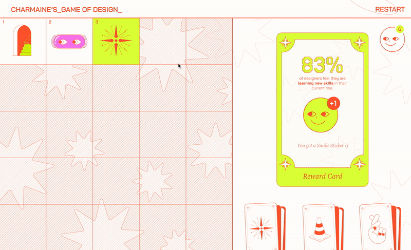
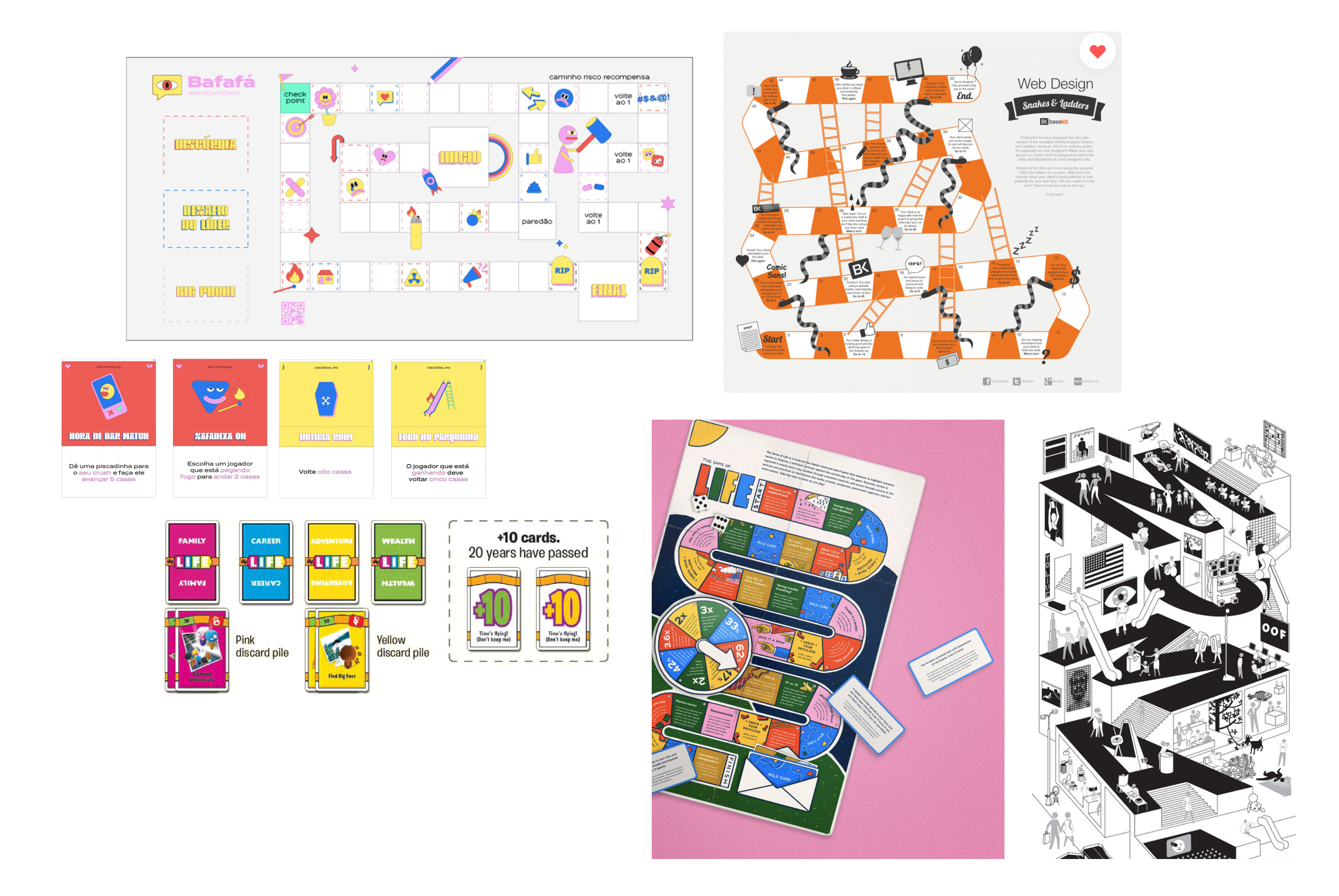
The_Game of Design_ is a digital board game of a designer’s journey
The AIGA Design Census is a comprehensive report featuring 9,432 entries that highlight both factual and emotional aspects of the design industry. To showcase this intricate data, our team created an interactive board game, allowing designers to learn more about their place in the community.
I was responsible for developing branding, illustrations, and UI/UX prototypes.
Team
Dorothy Li
Maggie Ma
Dorothy Li
Maggie Ma
Skills
Branding
Illustration
Web Design
Data Visualization
Branding
Illustration
Web Design
Data Visualization
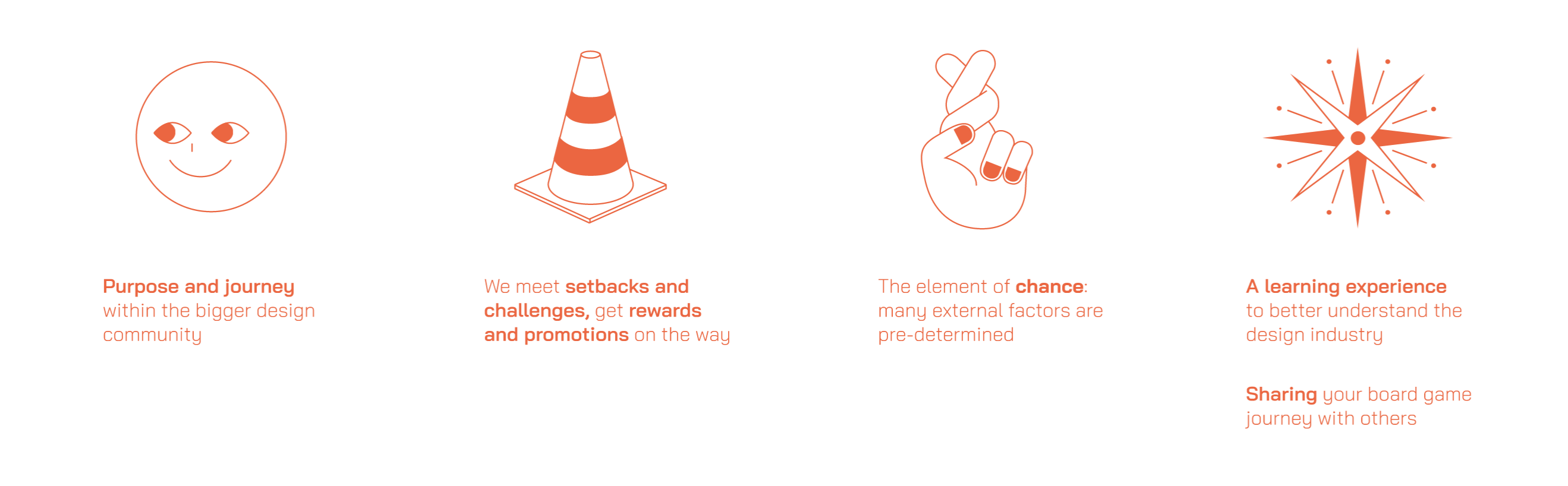
Concept - A Digital Board Game
As designers, we each embark on unique journeys of growth and self-discovery. Our board game visualizes the realities of the design industry by curating personalized gameplay based on the user’s background in design.
How might we educate designers about their place in the current industry?
As designers, we each embark on unique journeys of growth and self-discovery. Our board game visualizes the realities of the design industry by curating personalized gameplay based on the user’s background in design.
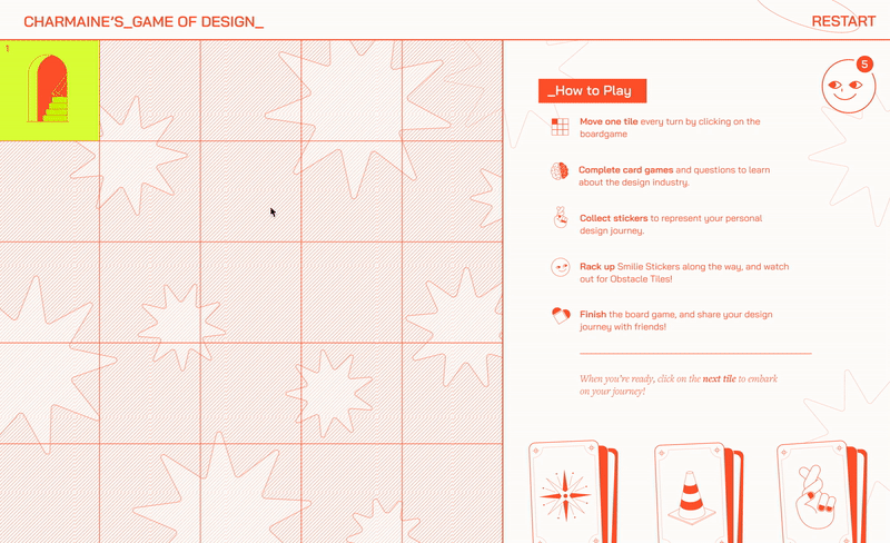
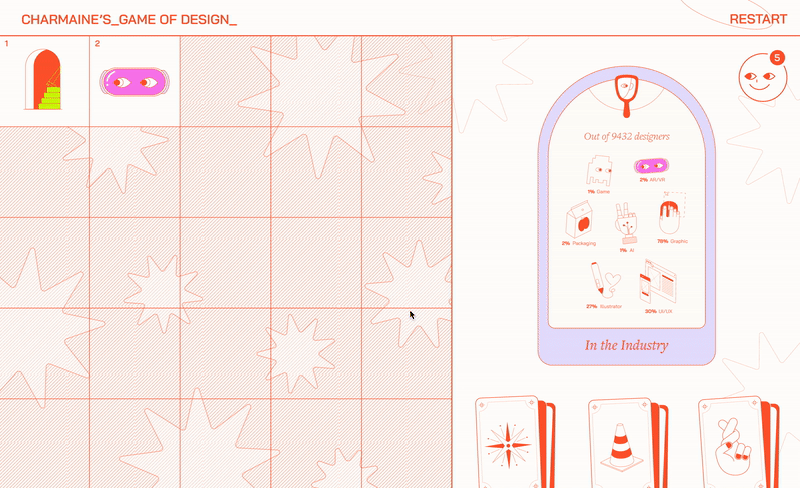
The Site
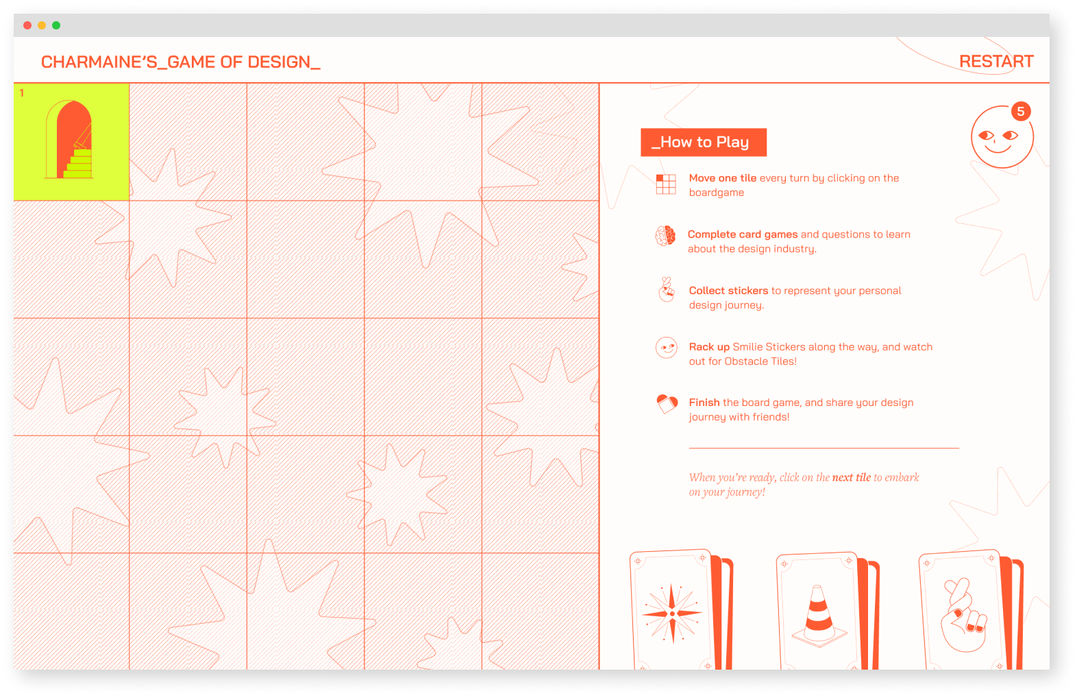
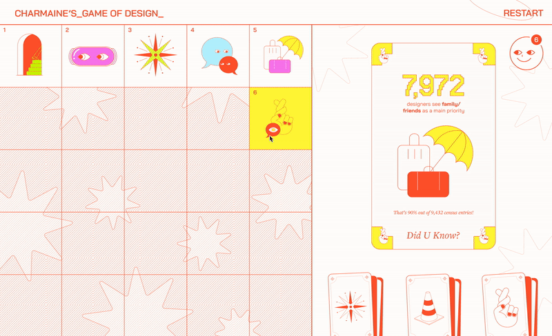
The site features a board game-like navigation, where each block triggers an interaction. To add a sense of unpredictability, the overall board remains hidden until the user reaches each new block.
The site features a board game-like navigation, where each block triggers an interaction. To add a sense of unpredictability, the overall board remains hidden until the user reaches each new block.
Landing Page
![]()
Instruction Page
![]()
Instruction Page
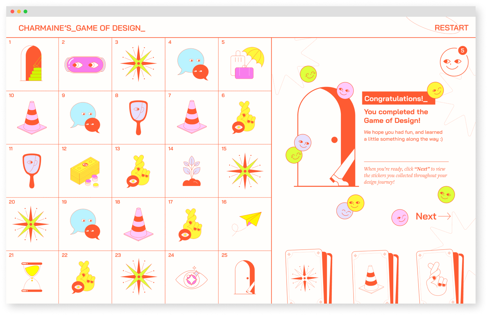
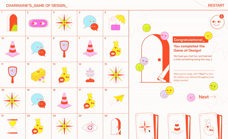
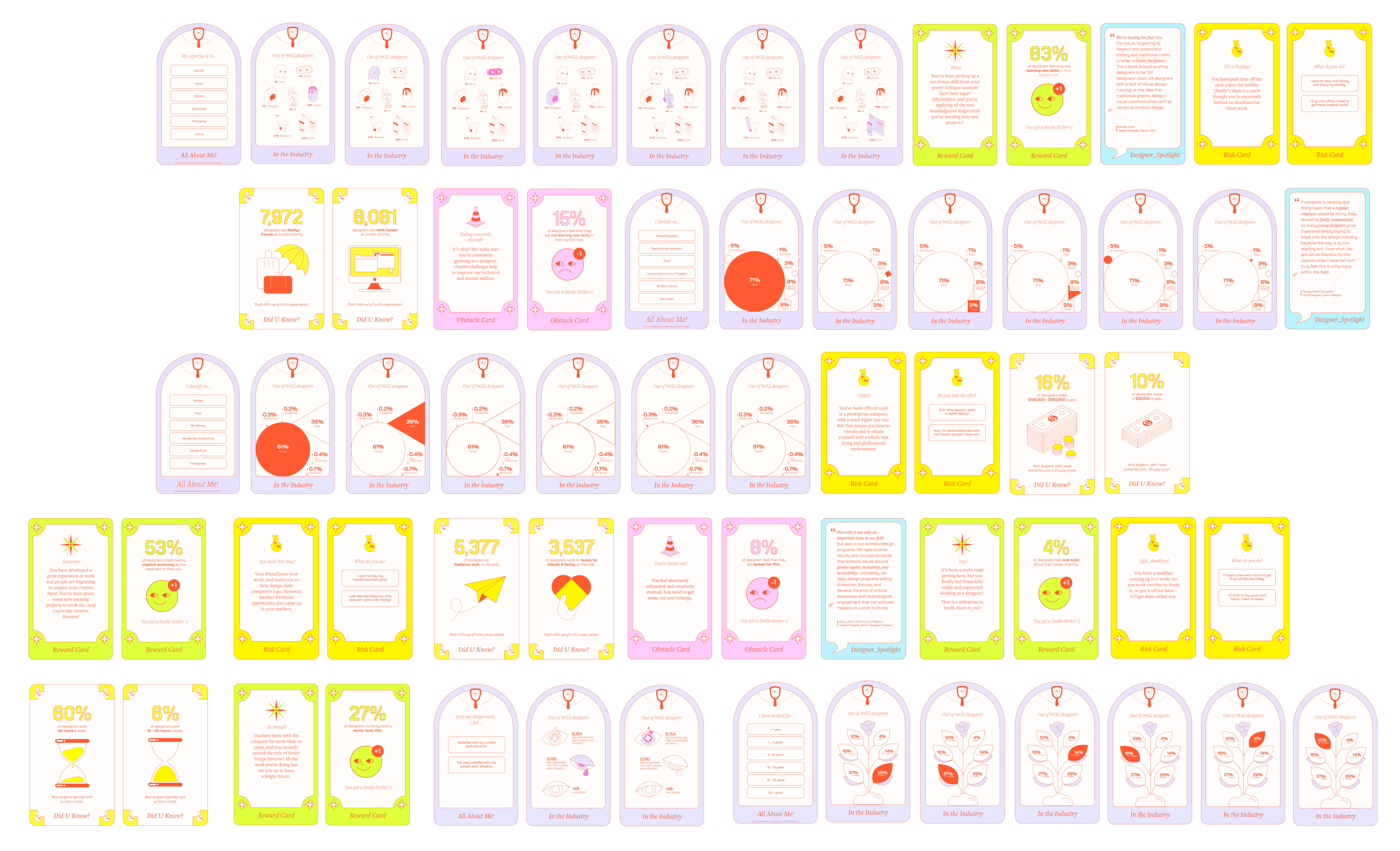
User Flow
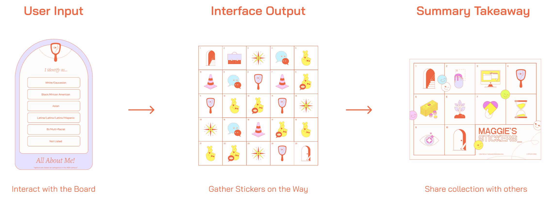
The player navigates through 25 blocks on the board by interacting with cards that appear on each block. By inputting their answers on the cards, players collect stickers as rewards. As a final takeaway, players receive a personalized sticker collection that reflects their own statistics, which they can learn from and share with others.
Interacting with Data
The player navigates through 25 blocks on the board by interacting with cards that appear on each block. By inputting their answers on the cards, players collect stickers as rewards. As a final takeaway, players receive a personalized sticker collection that reflects their own statistics, which they can learn from and share with others.
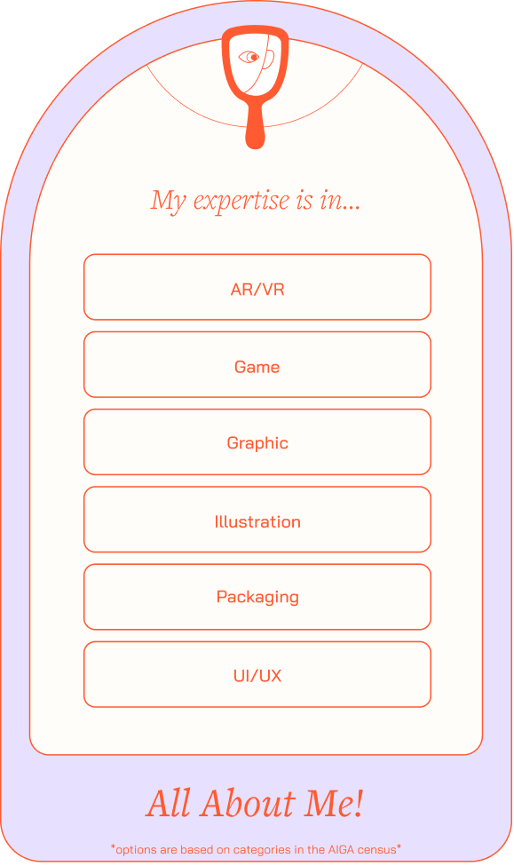
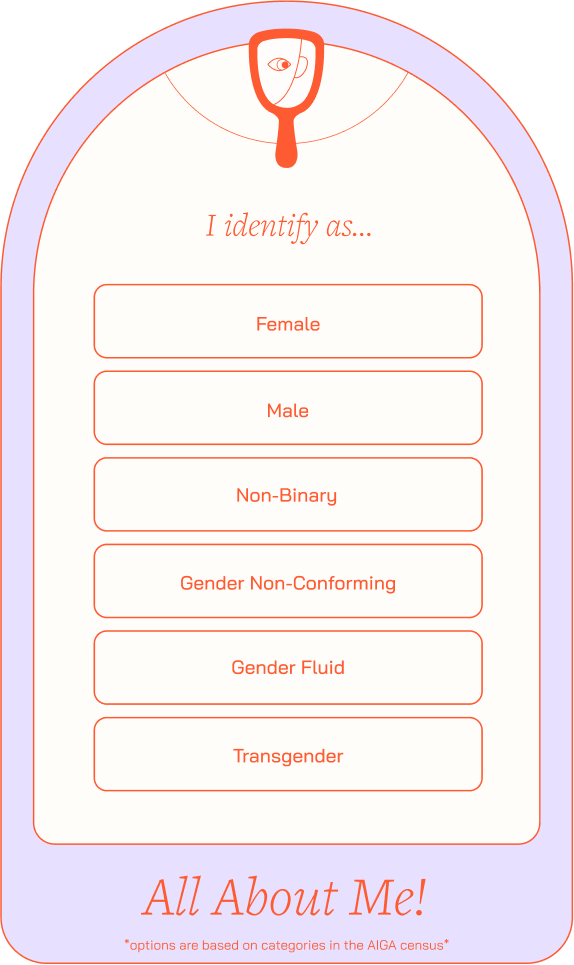
Card Type 01
About Me Card
About Me Card
Invites players to provide answers based on their personal experiences and backgrounds.
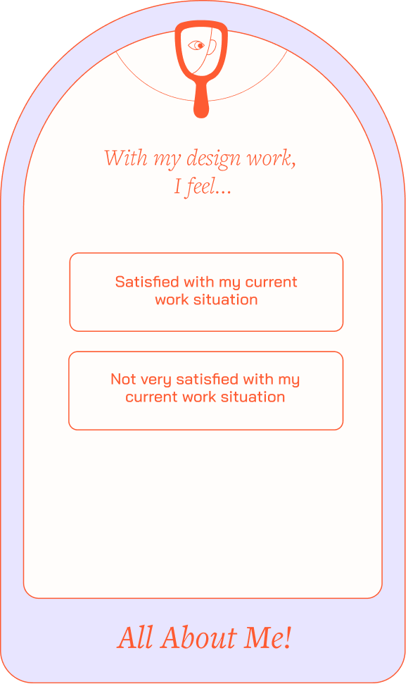

Click to view variations
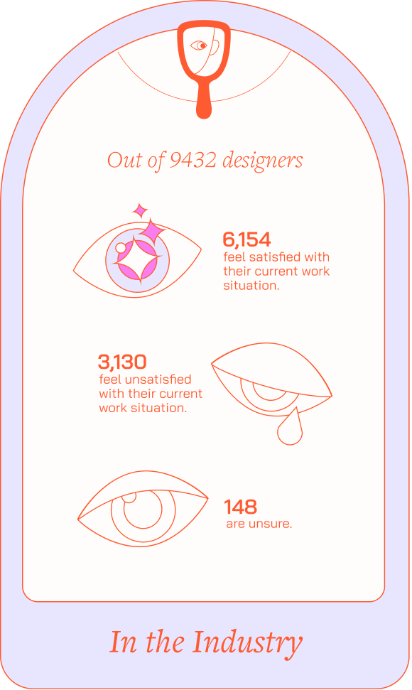
Card Type 02
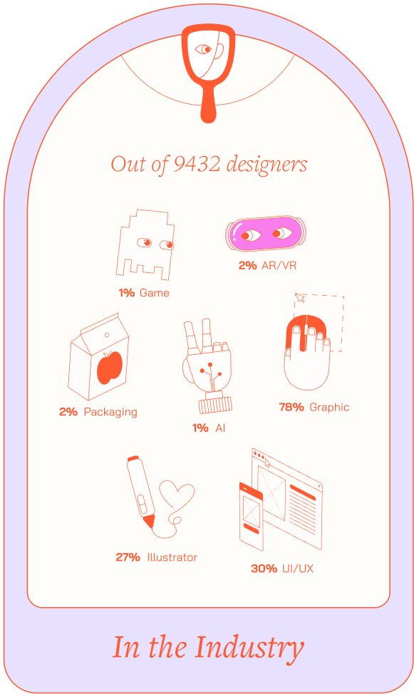
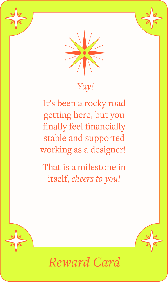
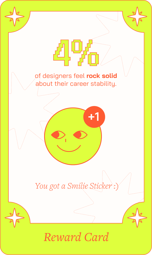
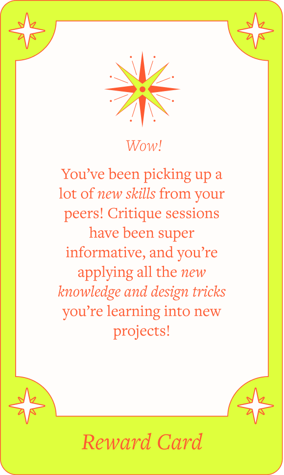
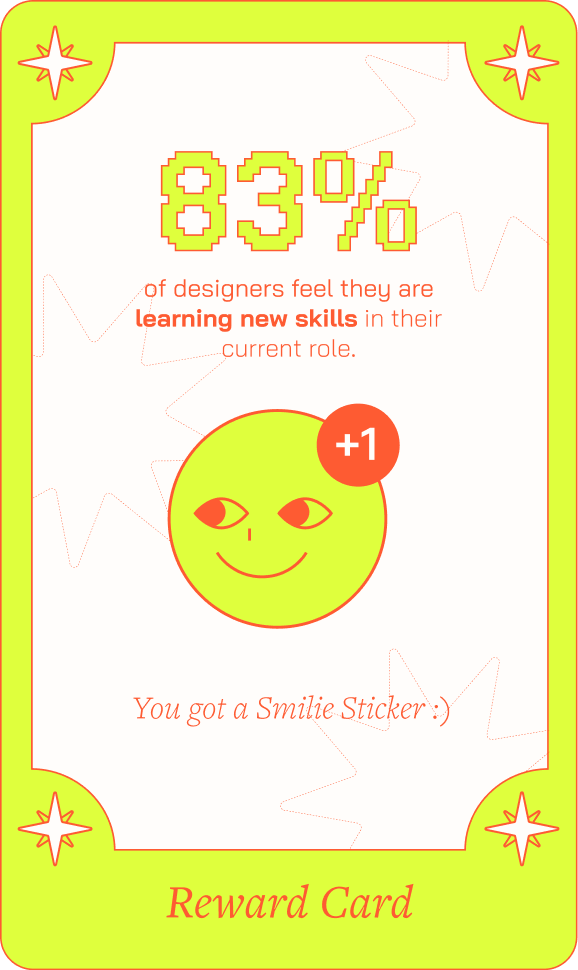
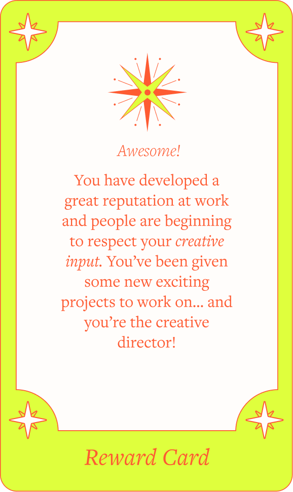
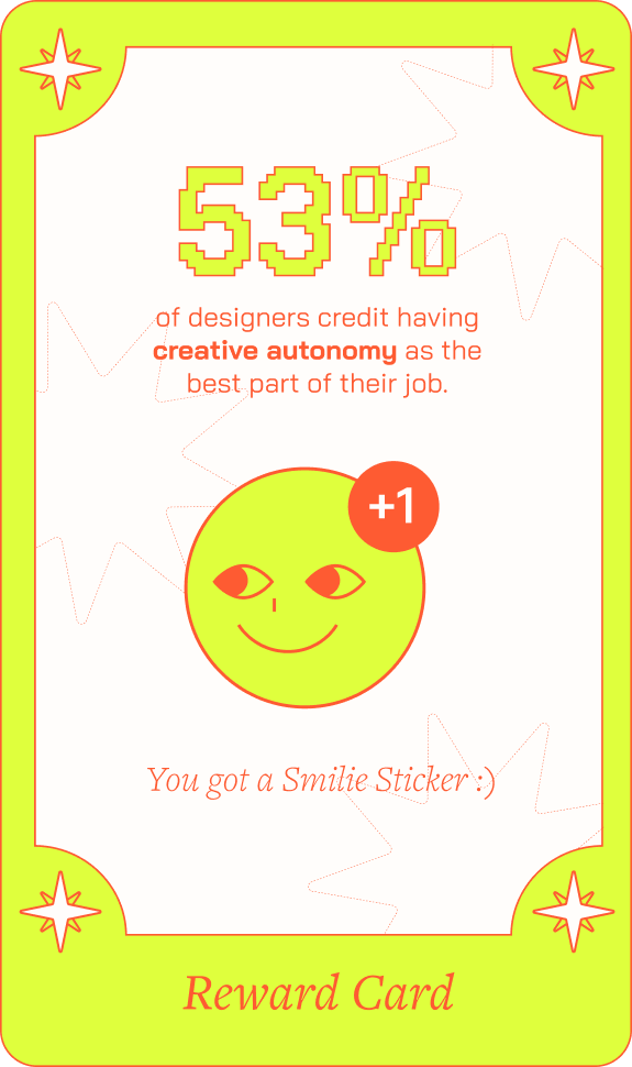
Reward Card
Reward Card
Presents players with a reward scenario where they learn facts about the industry and earn a happy face sticker.
Click to view variations
Card Type 03
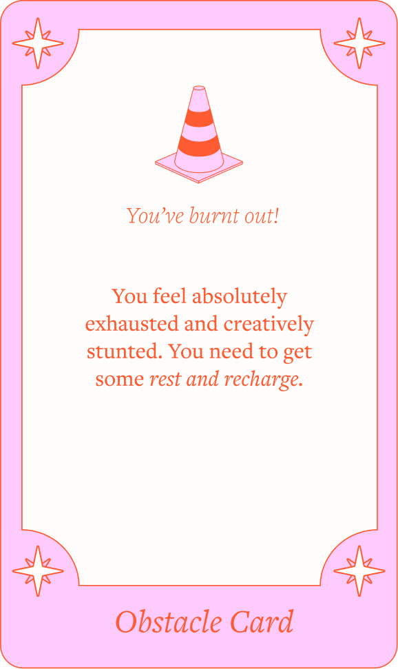
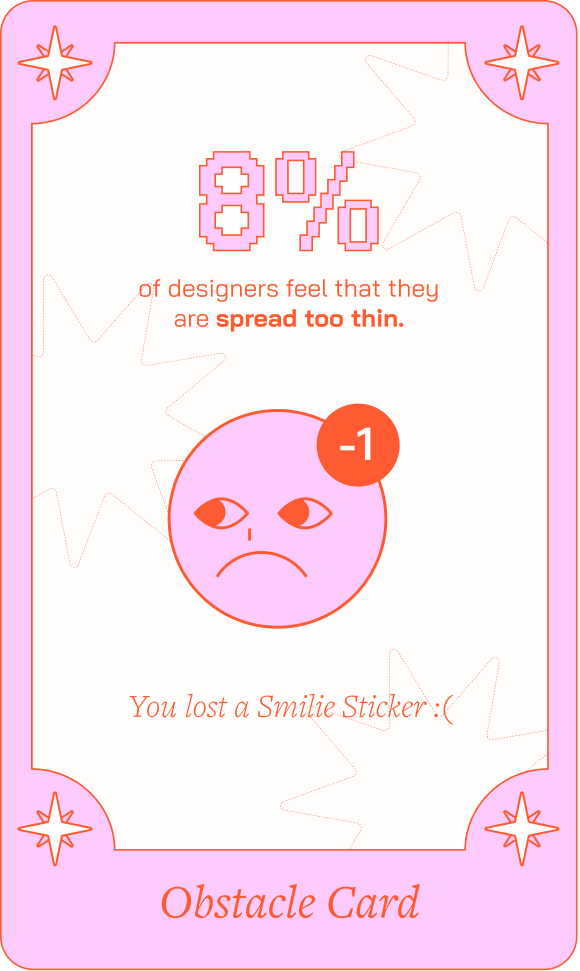
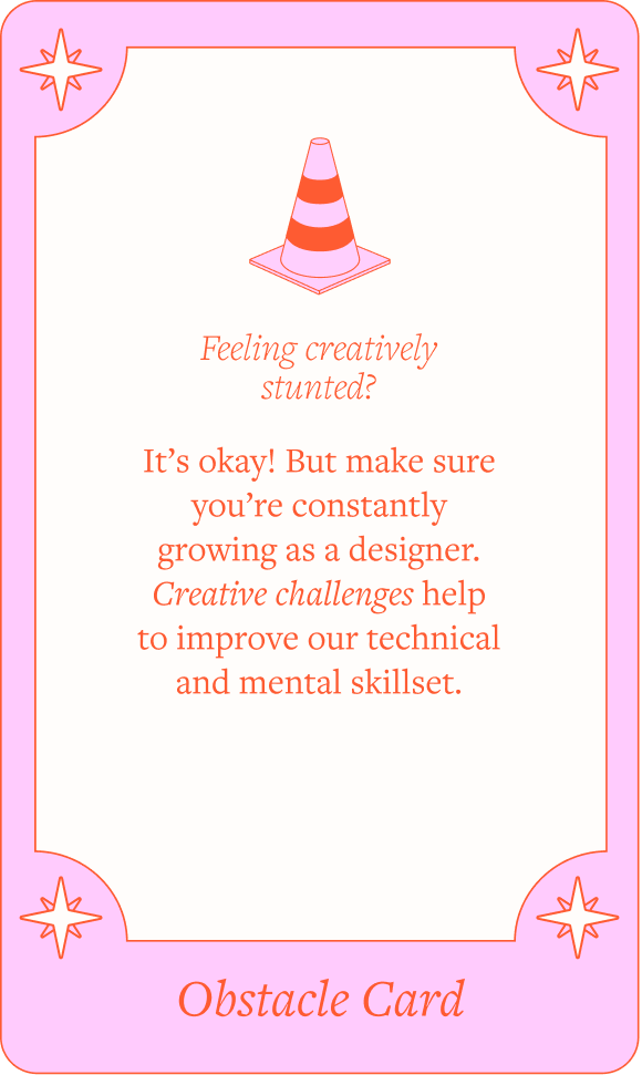
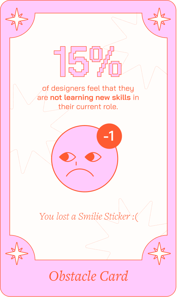
Obstacle Card
Obstacle Card
Presents players with an obstacle scenario where they learn facts about the industry and have a happy face sticker taken away.
Click to view variations
Card Type 04
Quote Card
Introduces a quote by a real designer, offering a personal perspective on the design industry.
Click to view variations
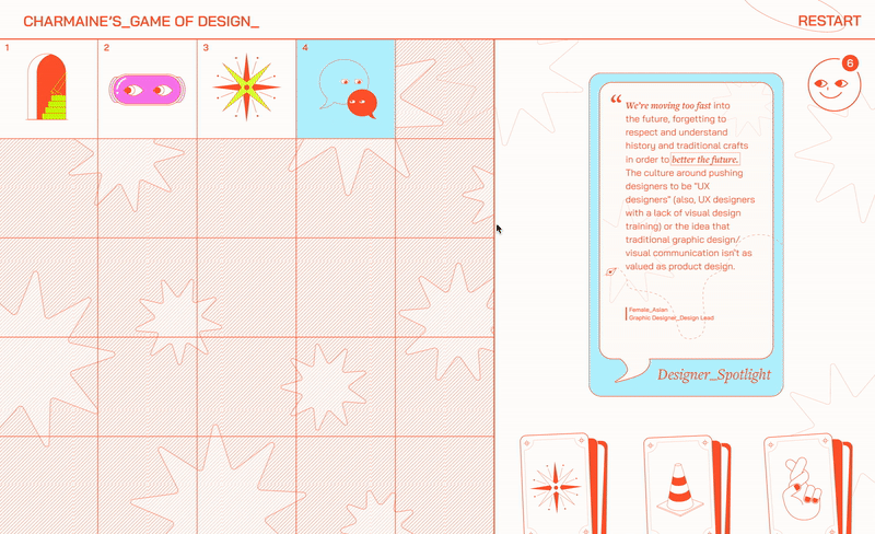
Card Type 05
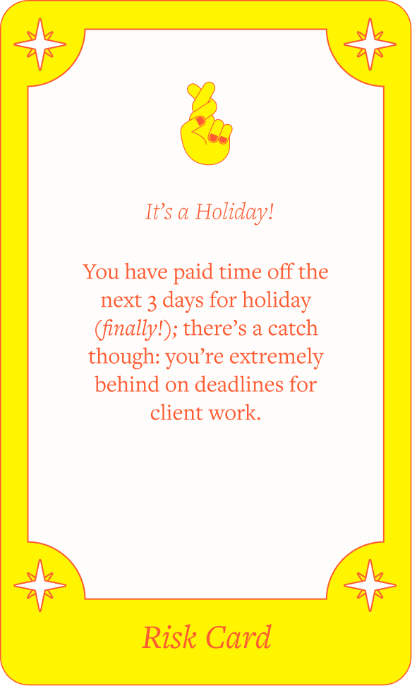
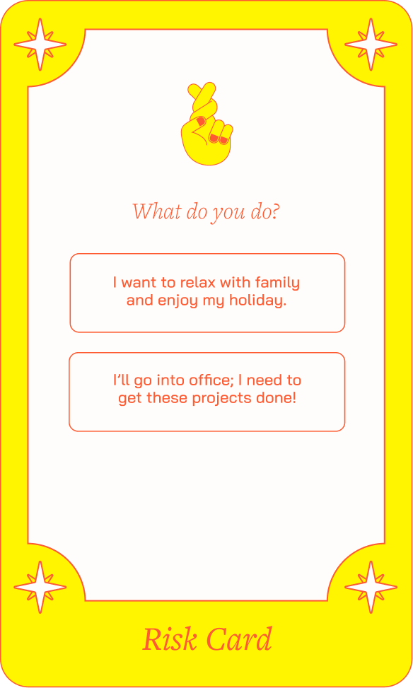
Risk Card
Risk Card
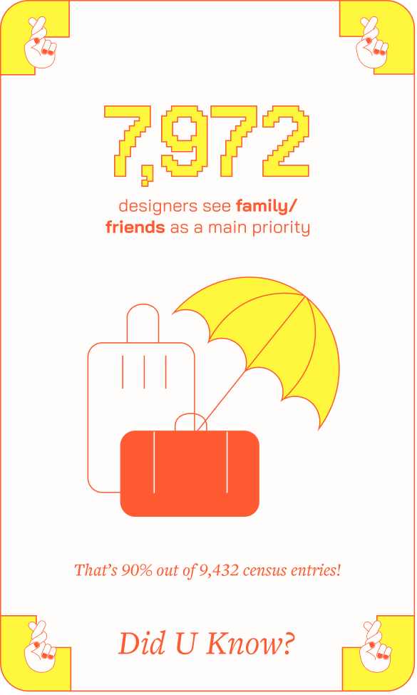
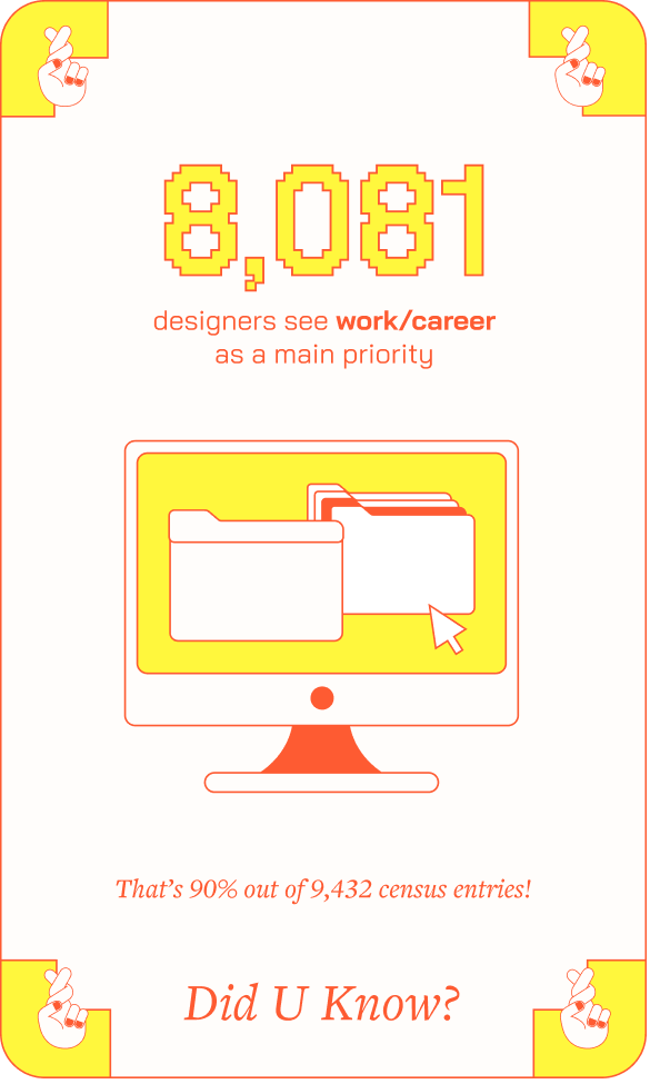
Presents players with scenarios that lead to different outcomes based on their choices. The reverse side of the card displays relevant data related to the chosen outcome.
Click to view variations
Ending the Journey with Purpose
After navigating through all the blocks, the final screen displays all the stickers collected by the player. Hovering over each sticker reveals the statistics associated with their choices throughout the journey.
Completion page
![]()
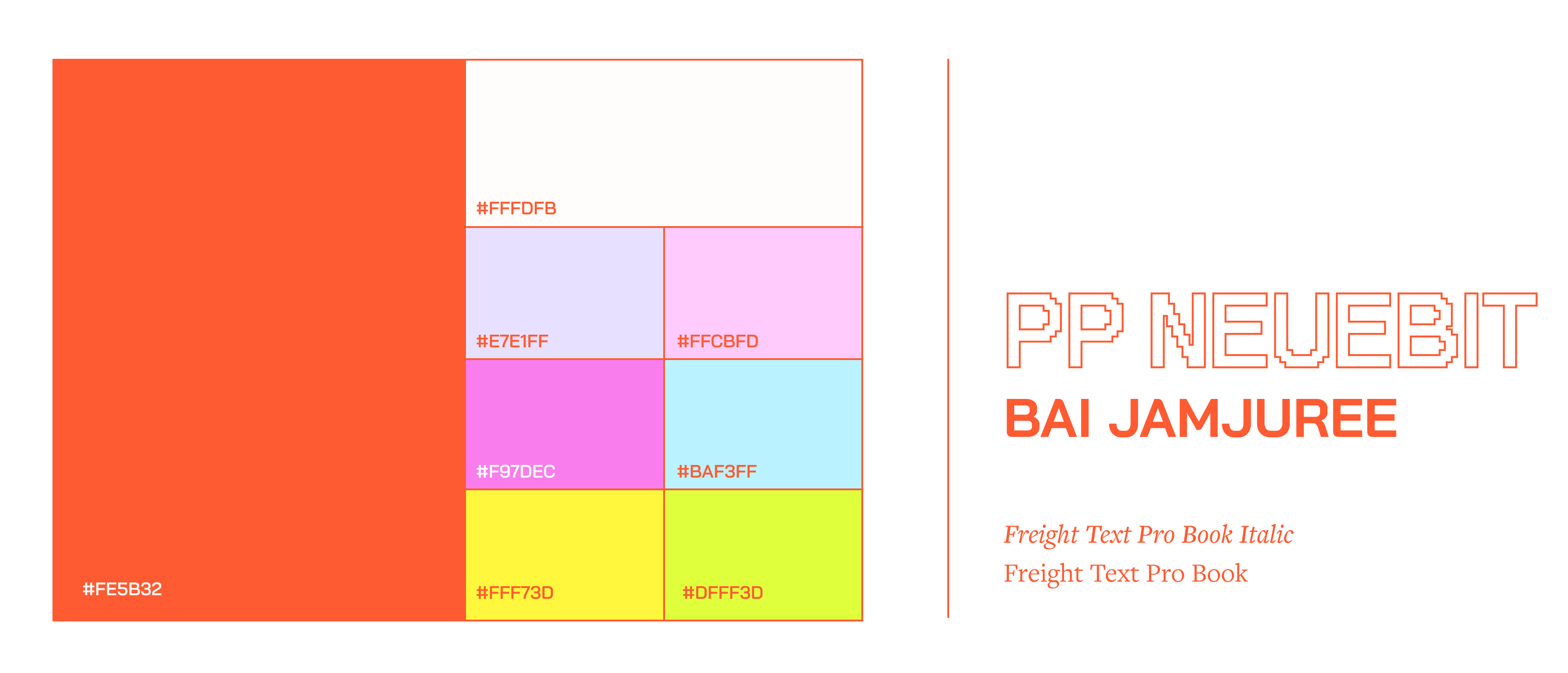
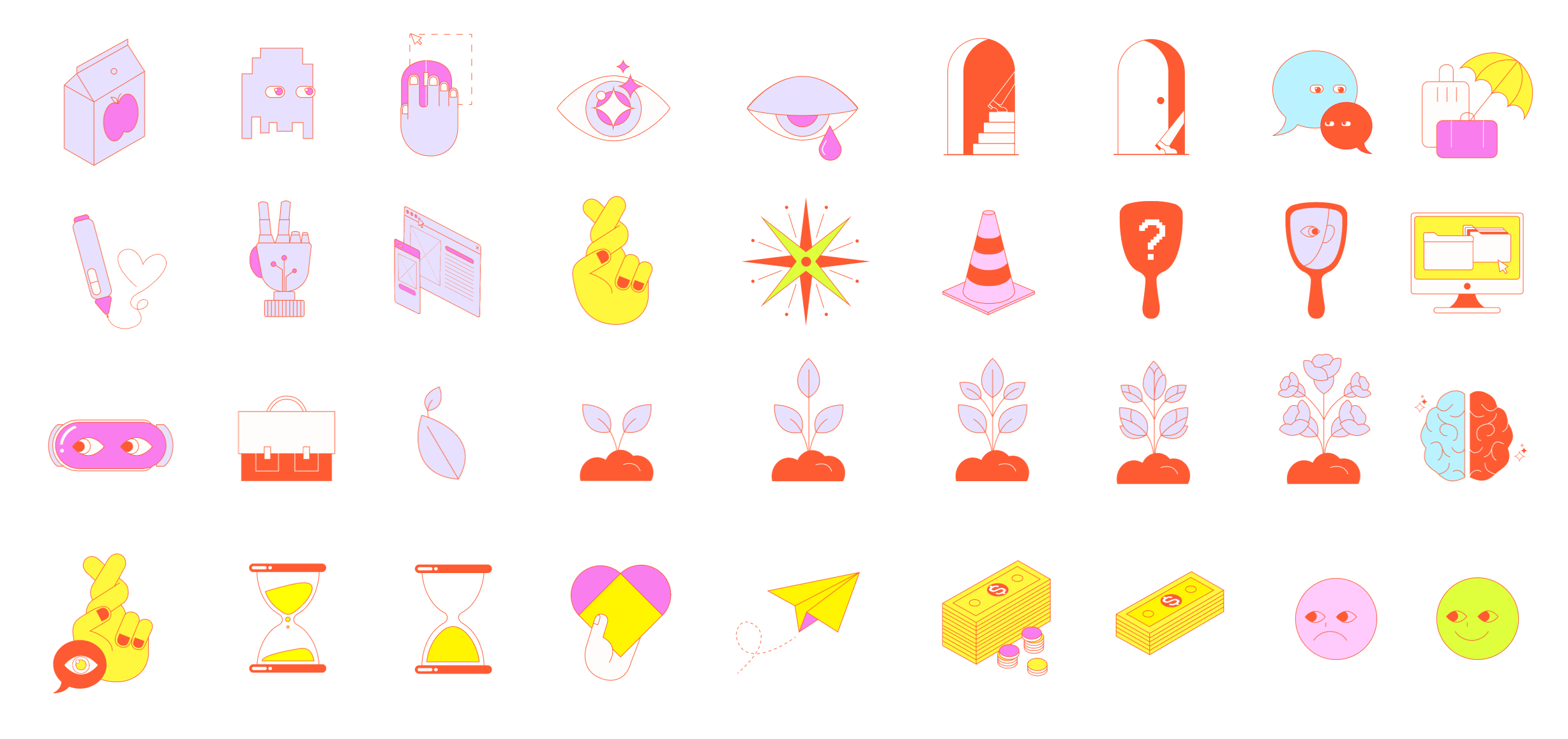
Visual System
Creating a Playful Identity of the Board Game
The use of a game-like typeface and vibrant colors creates a lighthearted mood reminiscent of playing a board game. The accompanying stickers and cards feature a simple yet quirky design, adding extra personality to the brand.
Additionally, we employed various data visualization techniques to introduce diversity across the different types of cards.
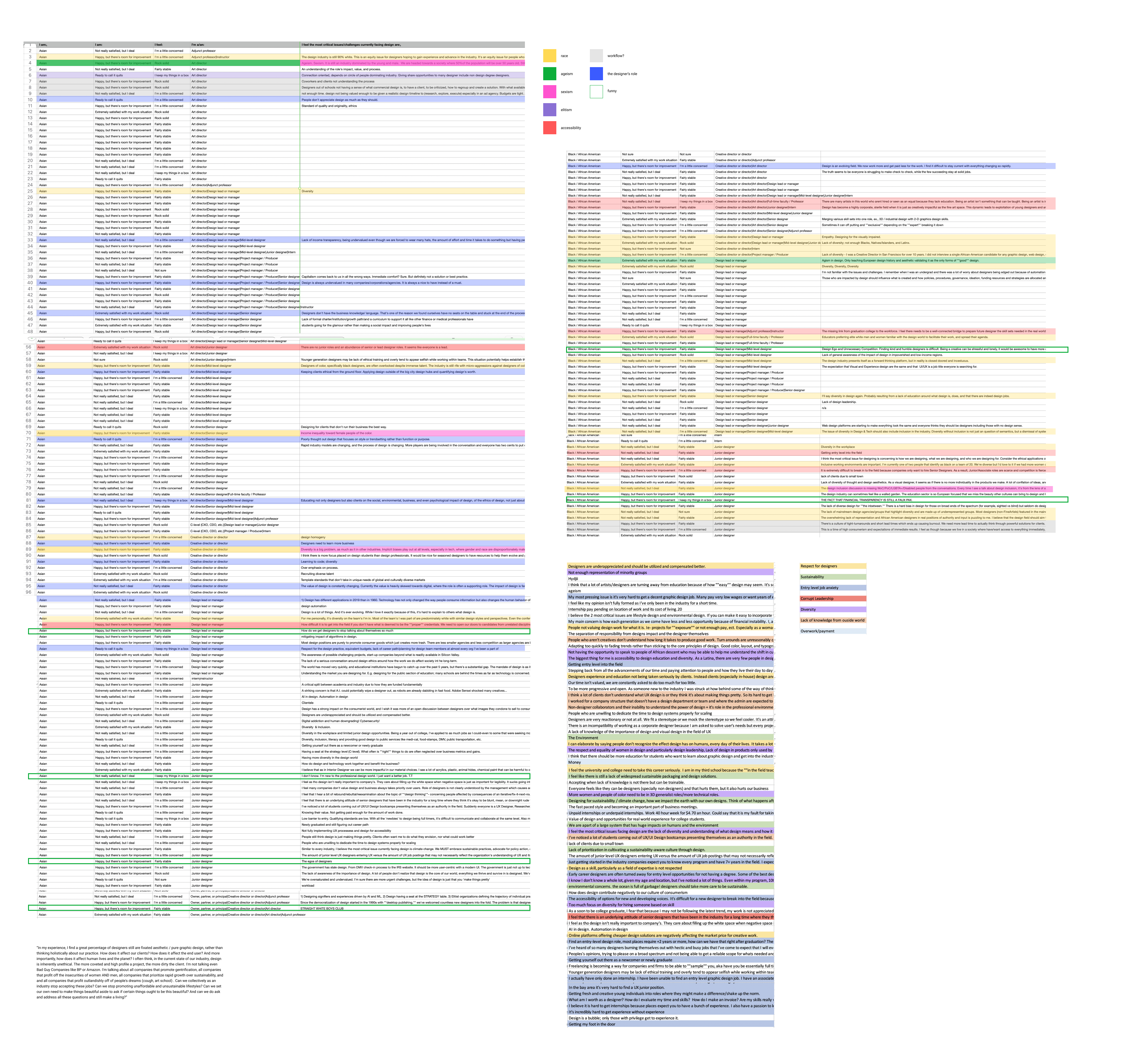
Initial Research
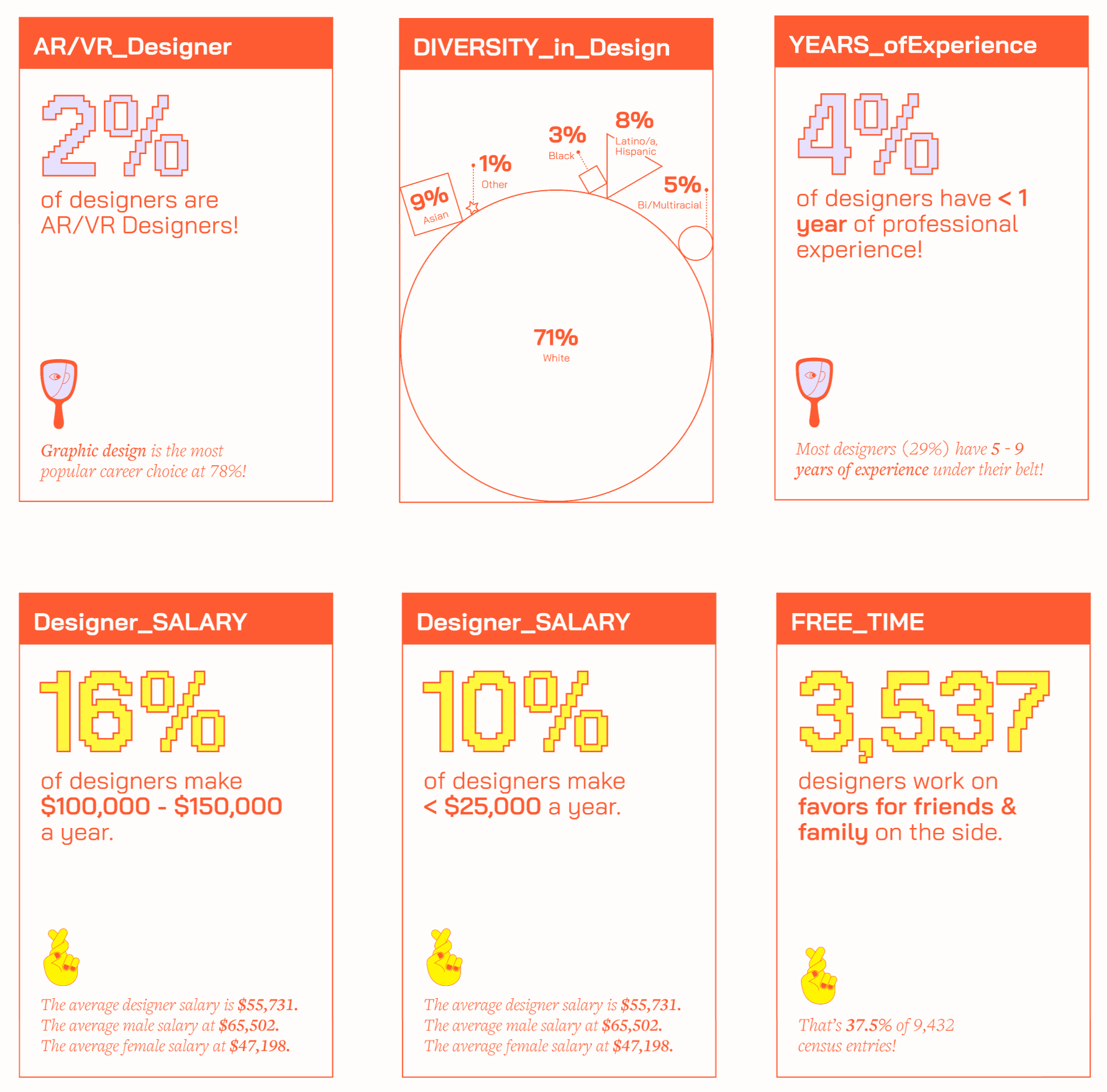
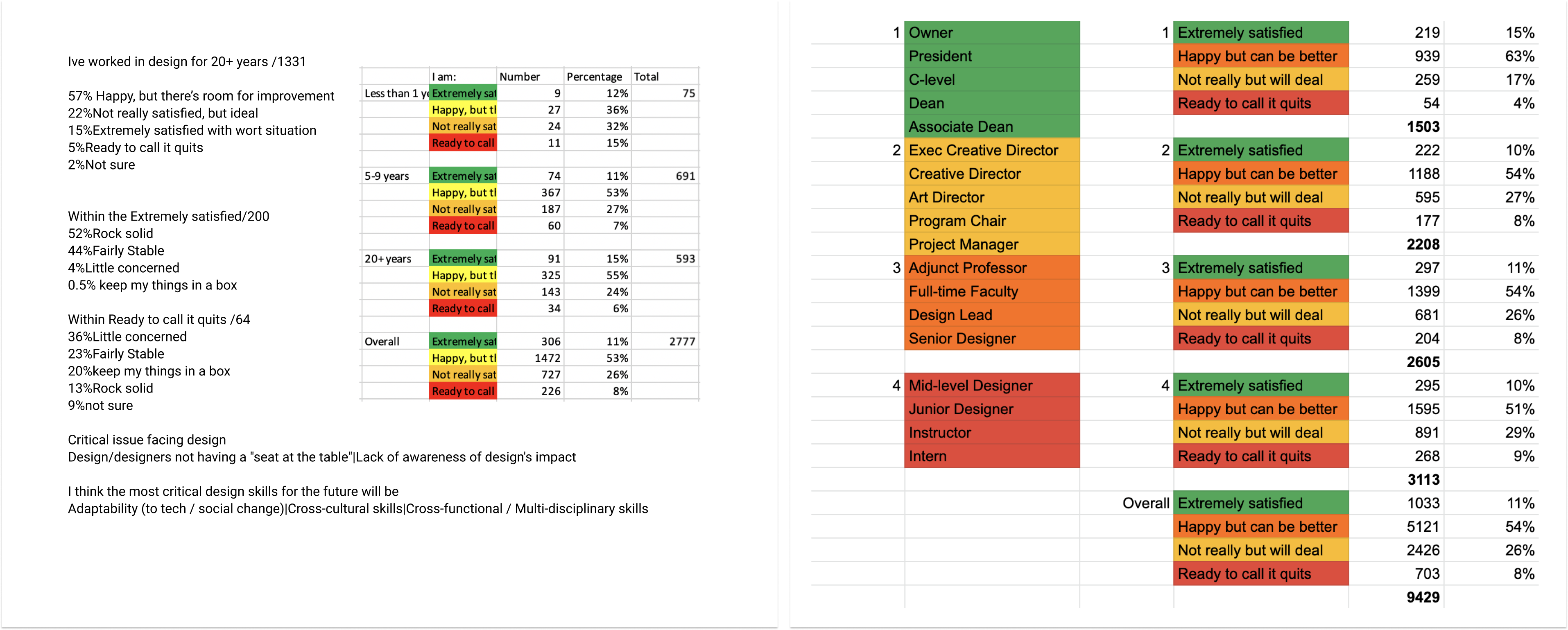
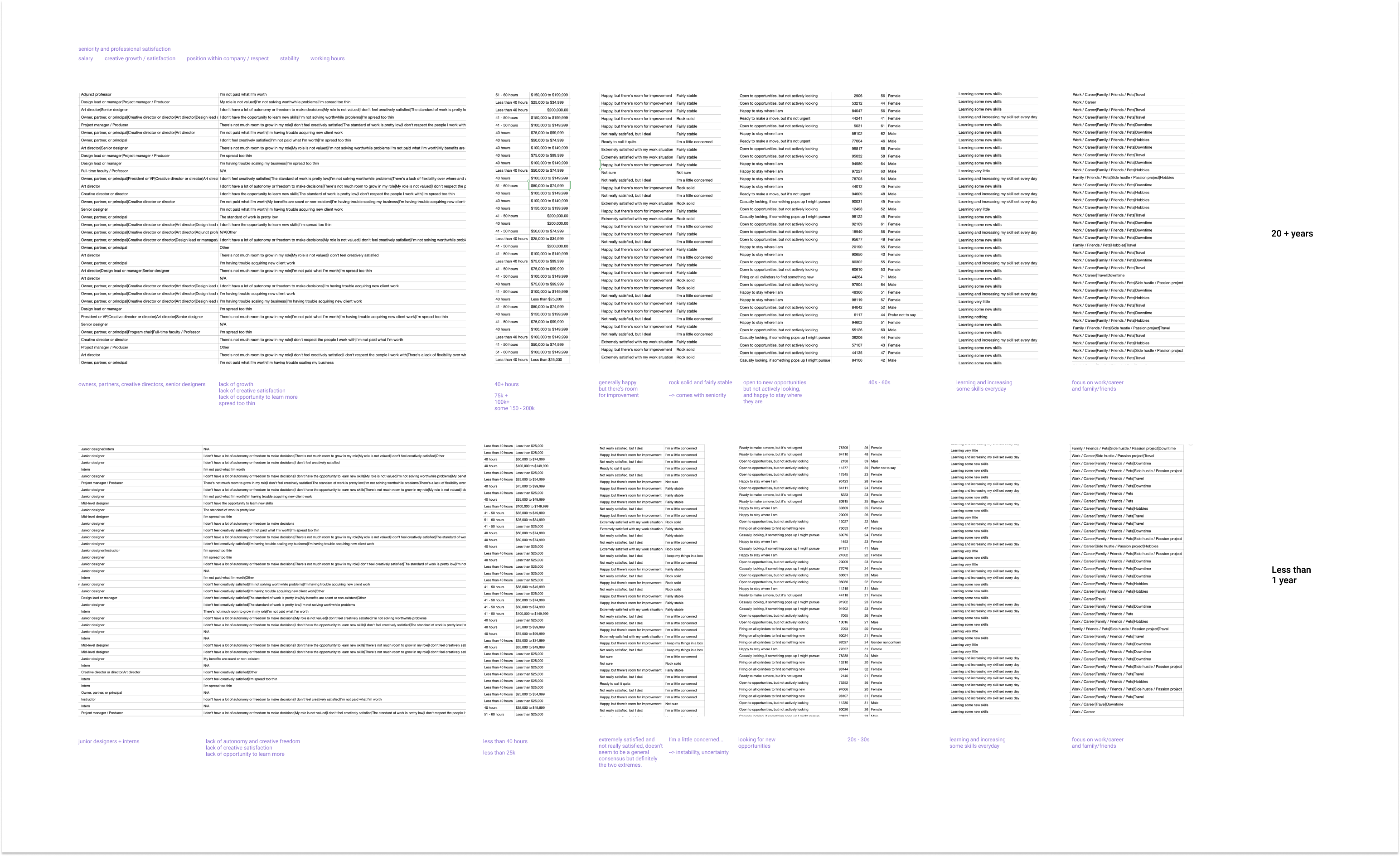
Working with the AIGA Dataset
Before beginning the design process, our team analyzed the dataset to identify correlations between different categories. We were particularly interested in designers' job satisfaction and compared these levels across various factors such as job title, salary, years of experience, and gender.
![]()
![]()
![]()
The Concept
The Board Game Narrative
Our team chose to create a digital board game because it serves as a metaphor for an unpredictable yet charming journey filled with challenges and surprises. We recognized the opportunity to integrate various interactions that lead to unique outcomes throughout the journey.
![]()
Working with the AIGA Dataset
Before beginning the design process, our team analyzed the dataset to identify correlations between different categories. We were particularly interested in designers' job satisfaction and compared these levels across various factors such as job title, salary, years of experience, and gender.
The Concept
The Board Game Narrative
Our team chose to create a digital board game because it serves as a metaphor for an unpredictable yet charming journey filled with challenges and surprises. We recognized the opportunity to integrate various interactions that lead to unique outcomes throughout the journey.
Moodboard
When designing the layout of the board, we focused on achieving an optimal balance between the board itself, the cards, and the collected stickers. We settled on a layout that features an overview of the board, allowing users to track their progress through the journey while engaging with the interactive elements of the cards. 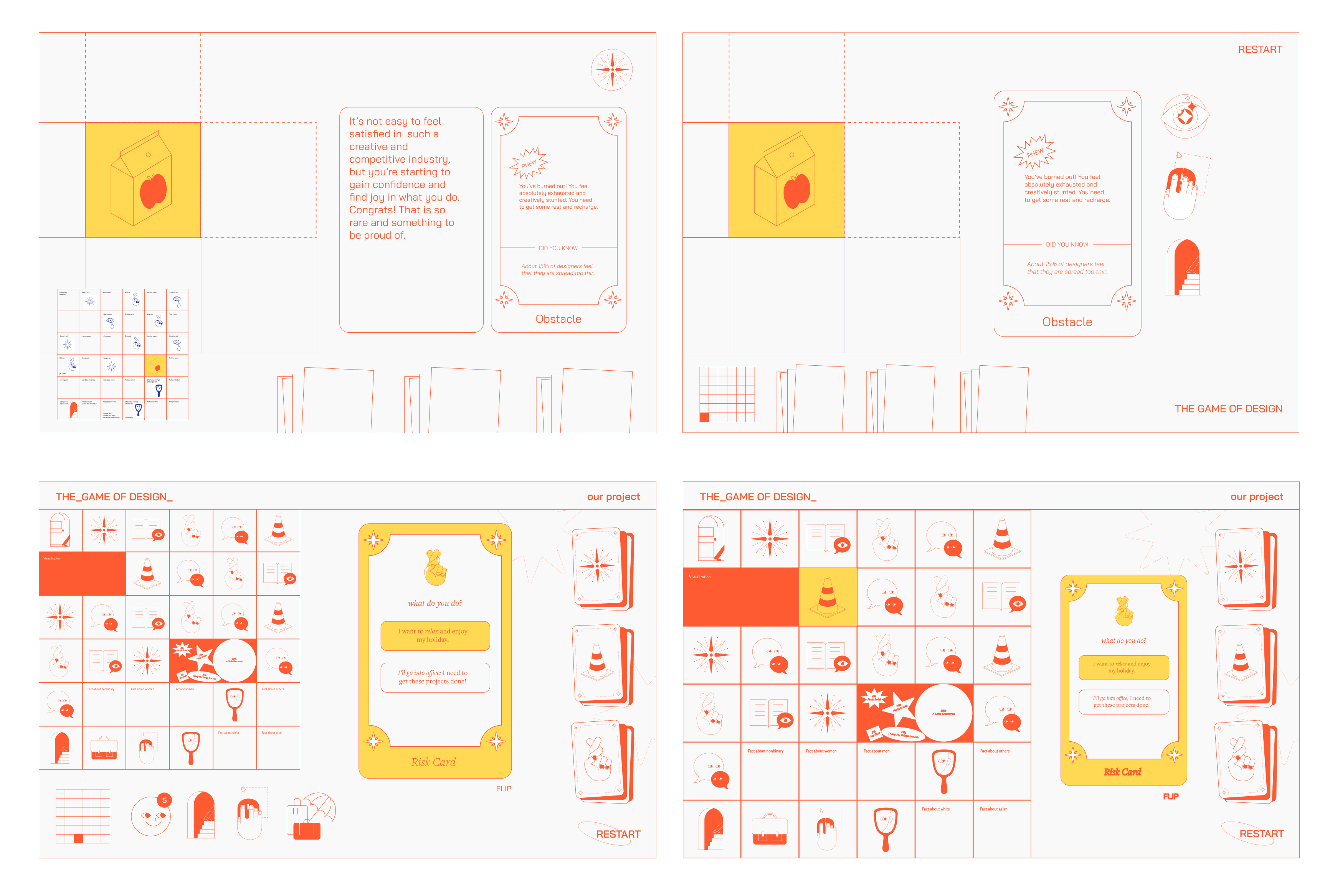
Layout exploration
Reflection
This project provided me with the opportunity to delve into data visualization through the creation of a digital game, adopting a highly visual approach. It was intriguing to integrate customization features of the game as educational tools. After establishing the visual system and the flow of the board, I transitioned to an asset-based workflow, preparing assets for delivery to the developer.
Given more time, I would explore additional micro-interactions, such as sticker animations and dynamic hints, to maintain engagement throughout the journey.
Fall 2021
10 weeks
10 weeks
Super Control is a misson control system for the future of trucking
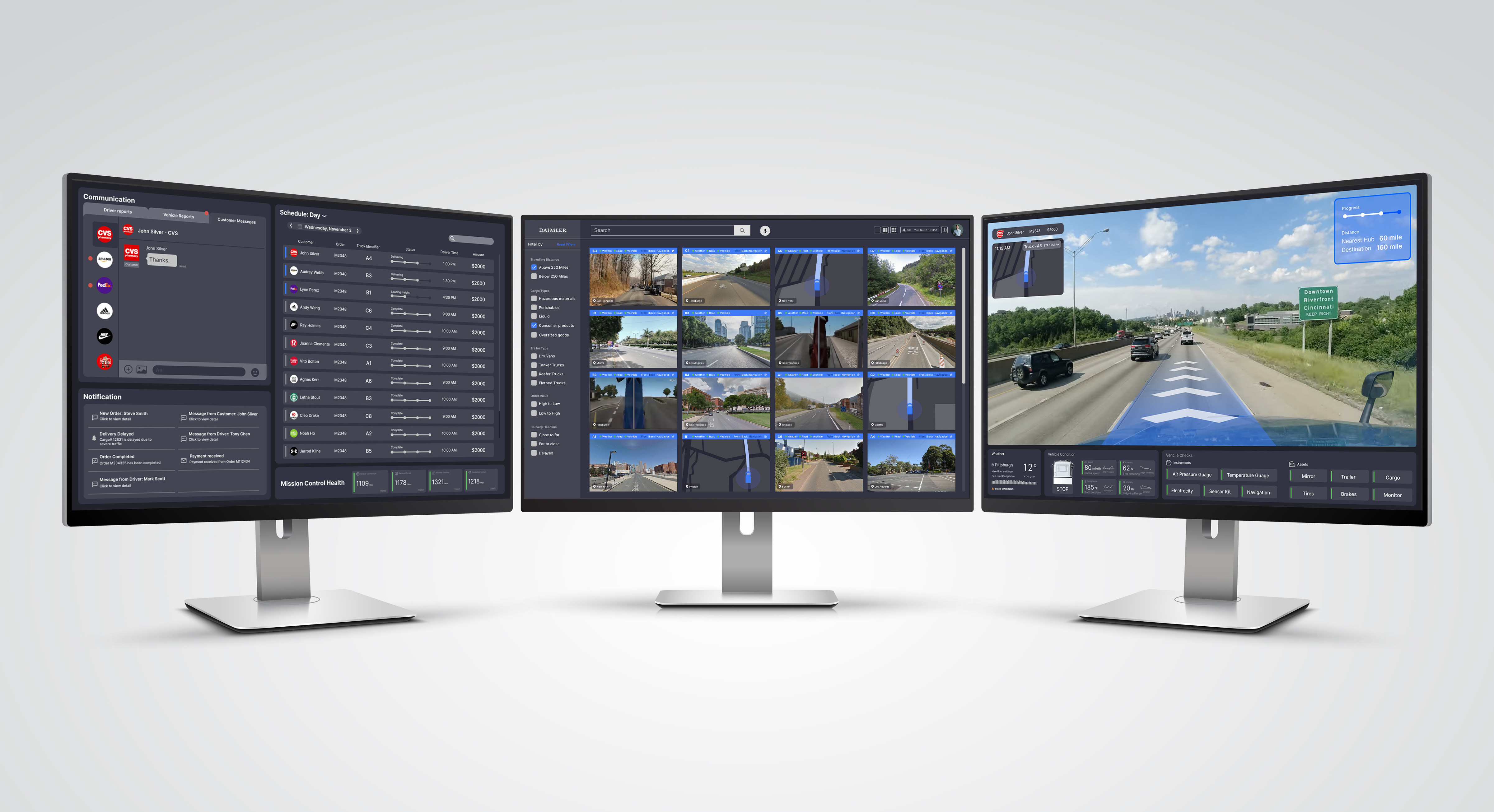
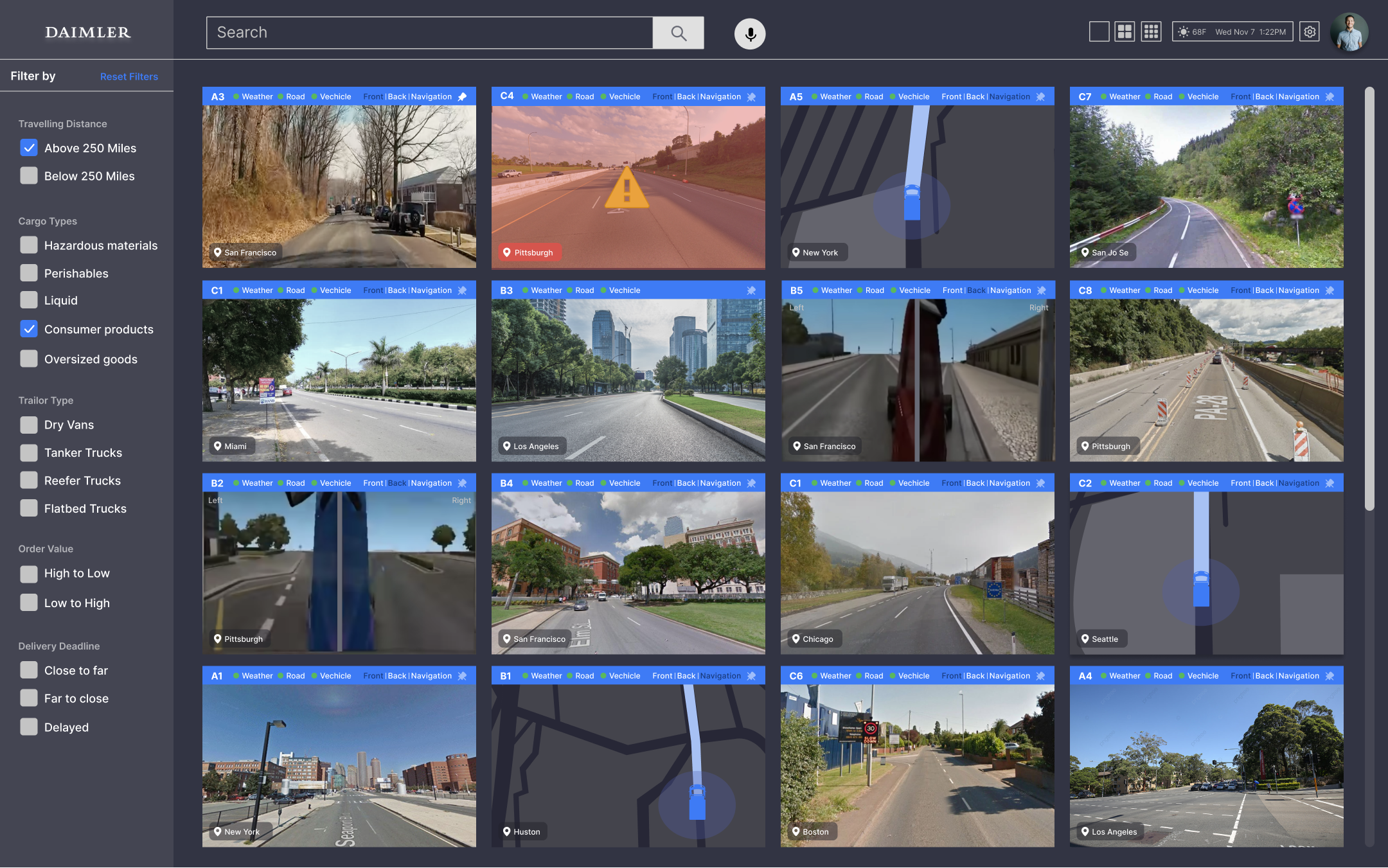
Daimler Trucks introduced to the world autonomous trucking to make roads safer and to boost productivity. Our team was tasked to design tools to bridge the gap between the new and the existing technology. The project is a three-screen mission control system that allows dispatchers of Daimler to efficiently manage and monitor autonomous trucks while maintaining seamless communication with stakeholders.
I was responsible for developing UI/UX prototypes and conducting user research.
Client
Daimler
Team
Hazel Zhang
Daimler
Team
Hazel Zhang
Skills
UIUX Design
UX Research
UIUX Design
UX Research
Problem Space
How might we design a mission control system that efficiently manages autonomous trucks?
The trucking industry serves a major role in our everyday lives as it provides transportation for countless essential goods. Within the industry, it is evident that there needs to be new technology not only to continue innovation, but also to fix issues related to driver shortages and communication.
Our project addresses problems in the current trucking industry we discovered through research. Our team envisioned an innovative mission control system for managing autonomous trucks and creating seamless connections between the management level of Daimler and the stakeholders attatched to the daily interactions.
Our project addresses problems in the current trucking industry we discovered through research. Our team envisioned an innovative mission control system for managing autonomous trucks and creating seamless connections between the management level of Daimler and the stakeholders attatched to the daily interactions.
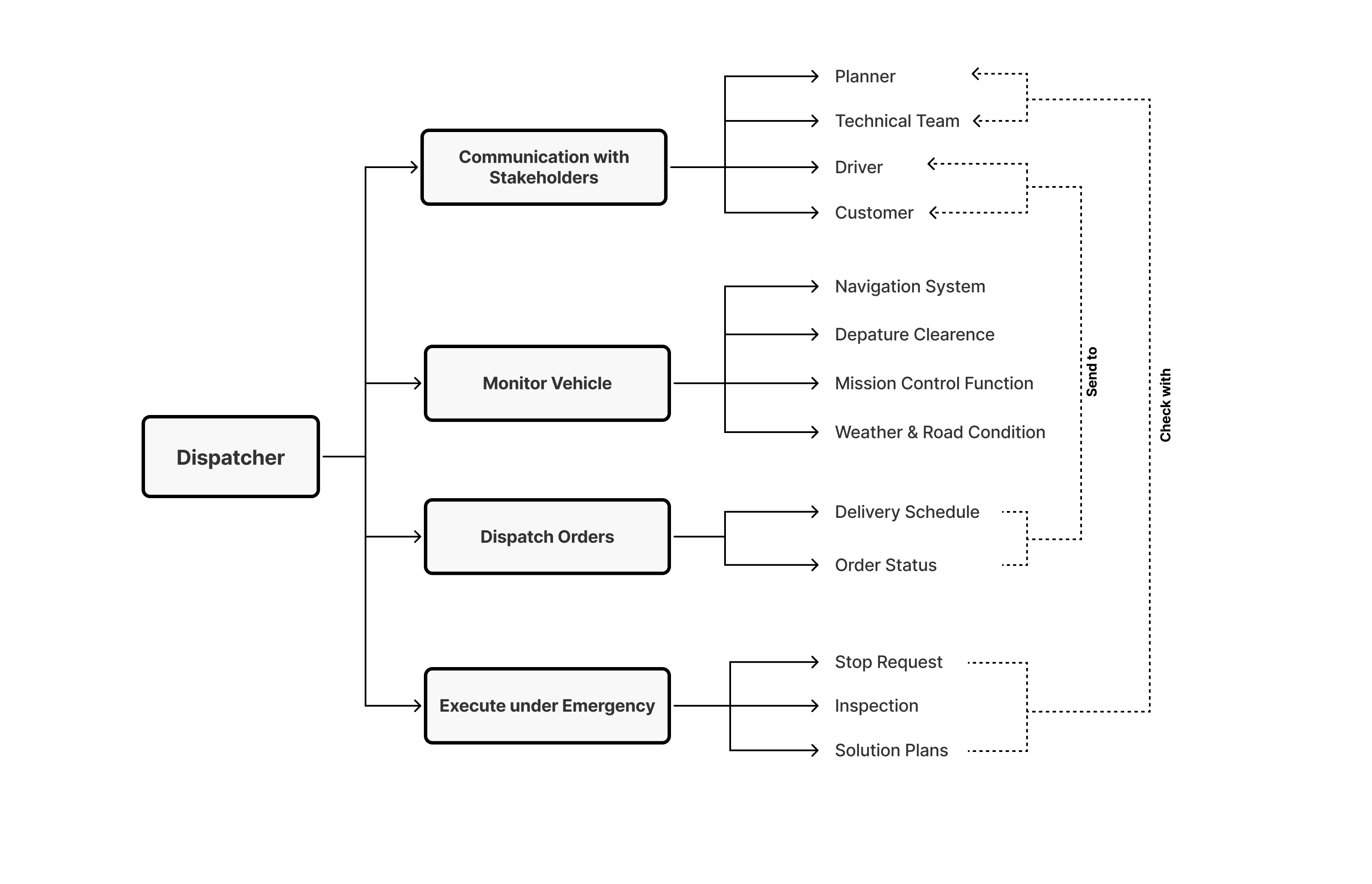
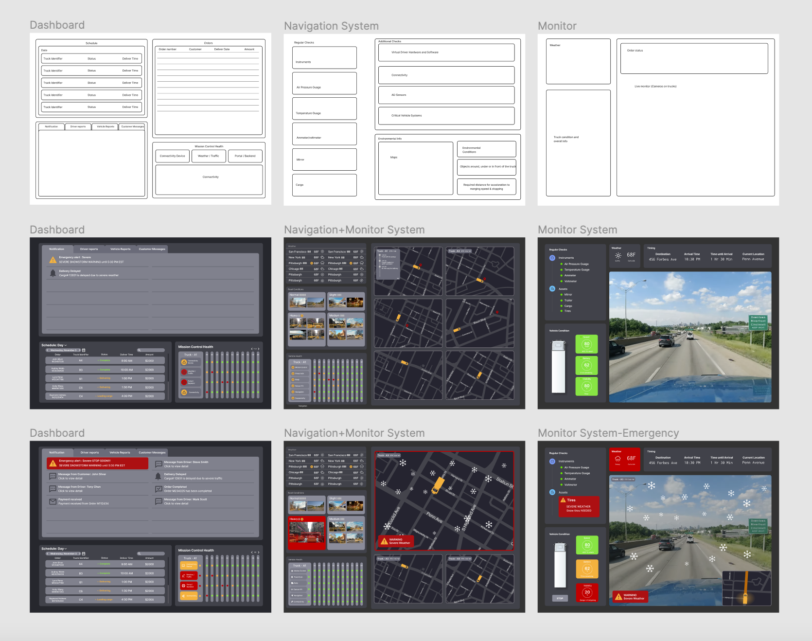
Left Screen
The left screen offers a multifunctional dashboard for the dispatchers to carry out their responsibilities of monitoring truck status and communication. This screen includes an overview of order status, an inbox for messaging customers and viewing driver reports, a general notification center, and a display of the system’s health.
Main Dashboard
The left screen offers a multifunctional dashboard for the dispatchers to carry out their responsibilities of monitoring truck status and communication. This screen includes an overview of order status, an inbox for messaging customers and viewing driver reports, a general notification center, and a display of the system’s health.
 Normal situation
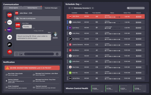 Emergency situation
Center Screen
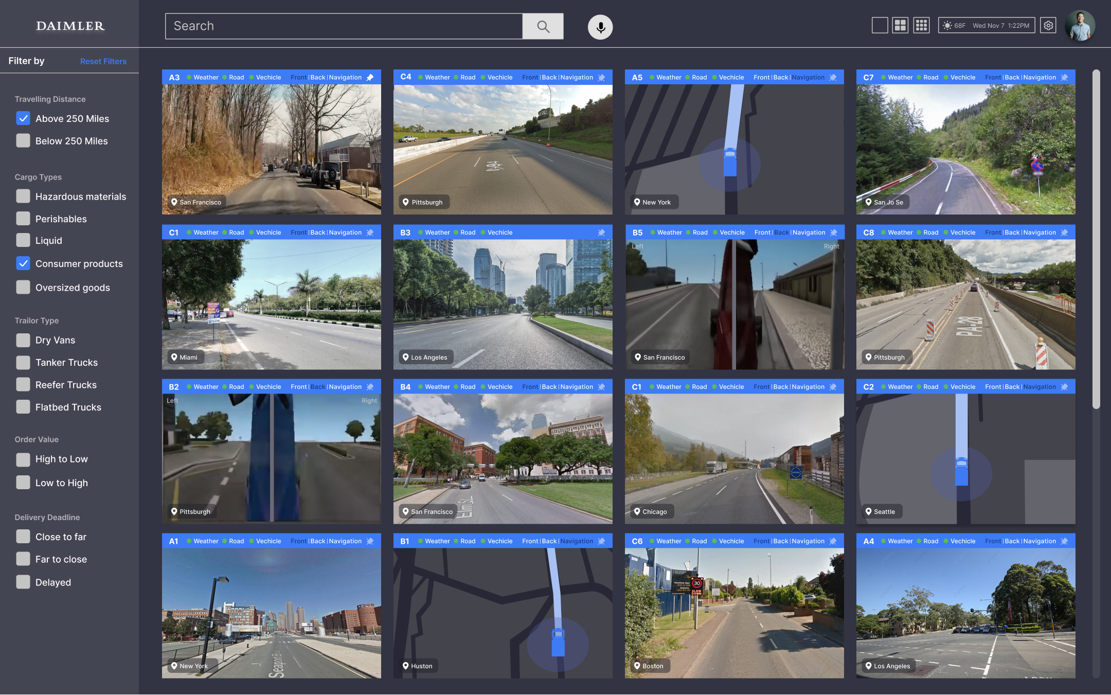
The center screen provides a comprehensive overview with a filtering system of all monitor footages captured by vehicles on the road. The images would be presented as screenshots that updates every five minutes, and would be shown in live footage while hovered.
Comprehensive Monitor
The center screen provides a comprehensive overview with a filtering system of all monitor footages captured by vehicles on the road. The images would be presented as screenshots that updates every five minutes, and would be shown in live footage while hovered.
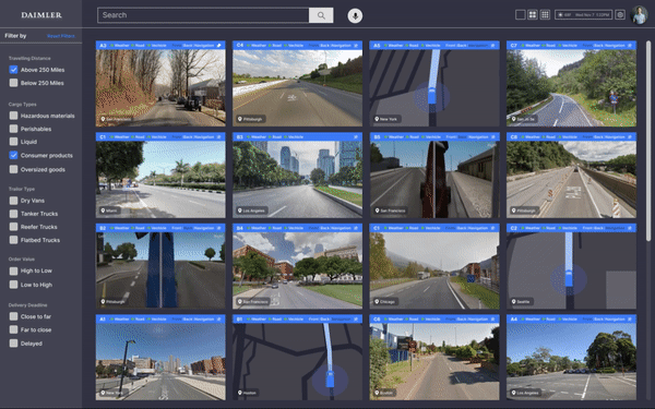
Normal situation
Emergency situation
Right Screen
The right screen provides a detailed individual monitor that displays more information related to a specific truck. The dispatcher can view a large scale live footage of a truck’s surroundings, and further inspect the health and status by checking the vehicle’s condition.
Individual Monitor
The right screen provides a detailed individual monitor that displays more information related to a specific truck. The dispatcher can view a large scale live footage of a truck’s surroundings, and further inspect the health and status by checking the vehicle’s condition.
Normal situation
Emergency situation
Background & User Research
The Current State of Trucking
We began by researching the current state of trucking to gain a better understanding of who we are designing for. We discovered some challenges in the current trucking industry that can be solved by autonomous technology:
1. The ever-growing truck driver shortage
2. Long hours on the road causing high accident rate
3. Disorganized communication between old school drivers and dispatchers
1. The ever-growing truck driver shortage
2. Long hours on the road causing high accident rate
3. Disorganized communication between old school drivers and dispatchers

Concept Mapping
Through Daimler’s guidance on a deep dive into the day-to-day interactions within a trucking company, our team was able to illustrate a concept map with the key stakeholders and their relationships through actions with one another.
Context Setting
The Future State of Trucking
Concept Mapping
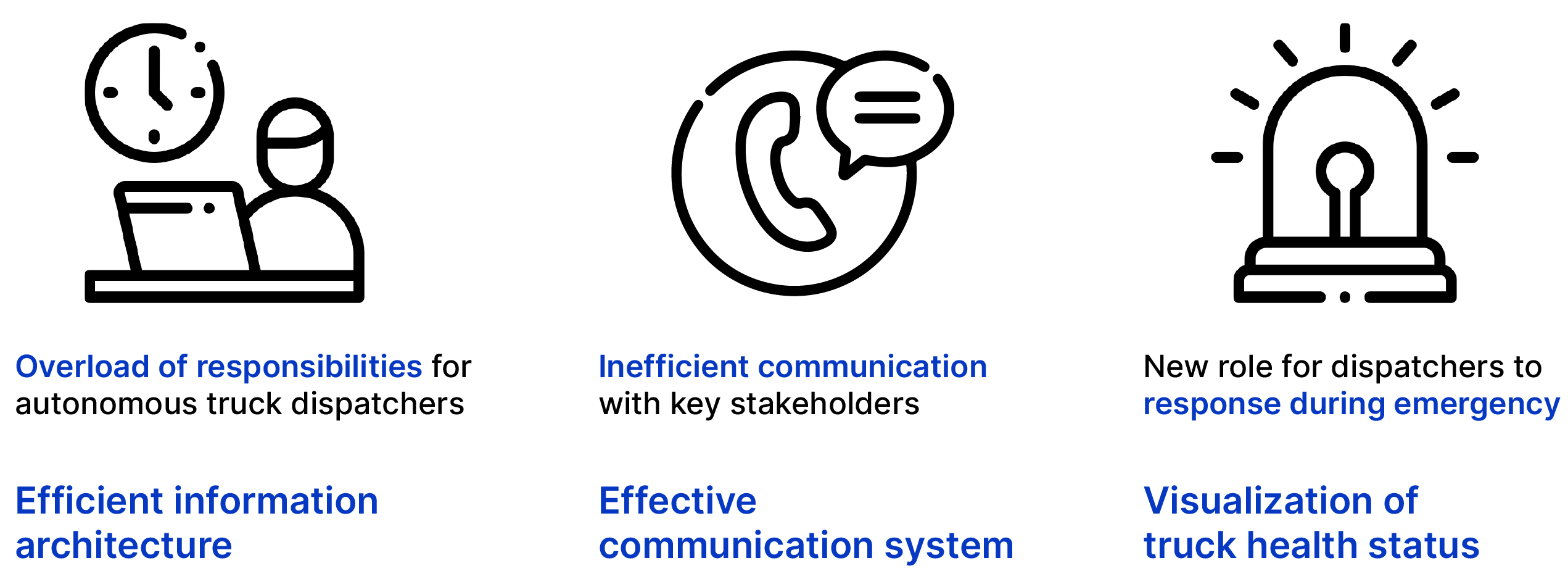
In our next step, we took the initial stakeholders and their interactions and visualized their new roles in the presence of autonomous trucks. We realized a shift in the dispatcher’s responsibilities as the technology evolves.
Gigamapping
Through gigamapping, we identified problems in different categories that the future autonomous industry may face, and connected their relevance across the map.
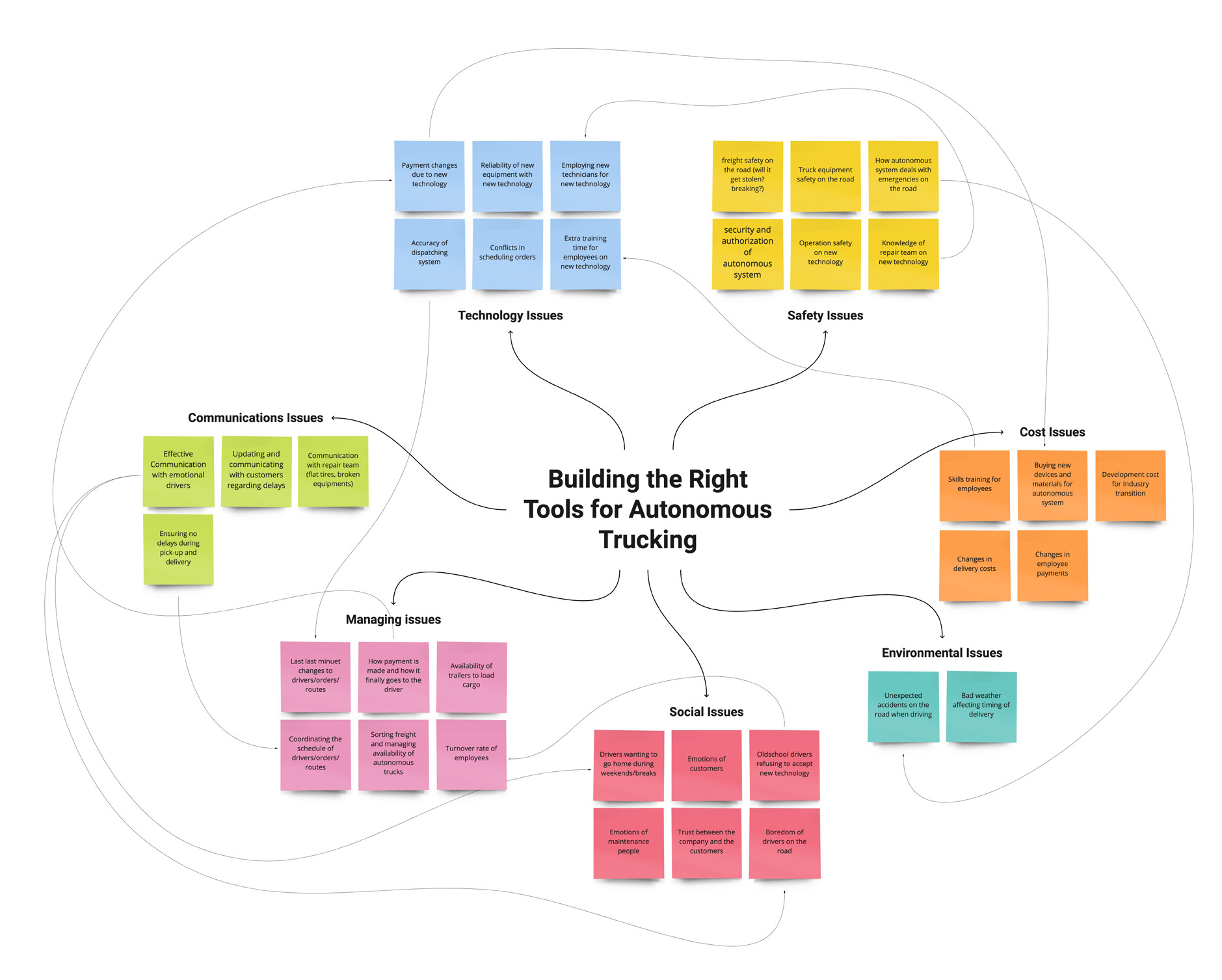
Research Findings
Pain Points
The research helped our team to identify some of the pain points that our mission control system can potentially address as the main goals stay the same to provide safe and efficient transportation of goods and services.
Pain Points
How does the current traditional dispatcher system transform and integrate with the future mission control system?
What type of interactions and workflow exist as hardware and software advance?
What type of interactions and workflow exist as hardware and software advance?
The research helped our team to identify some of the pain points that our mission control system can potentially address as the main goals stay the same to provide safe and efficient transportation of goods and services.
Design Solution
By talking to Daimler, our team identified the ideal working mode for dispatchers to be working together in a room with monitors. To provide ease in the navigation between the complex layers of content, our team devised the solution to be a three-screen mission control system that allows dispatchers of Daimler to:
efficiently manage and monitor autonomous trucks while maintaining seamless communication with stakeholders.
efficiently manage and monitor autonomous trucks while maintaining seamless communication with stakeholders.
We listed the essential features that our mission control system should embody
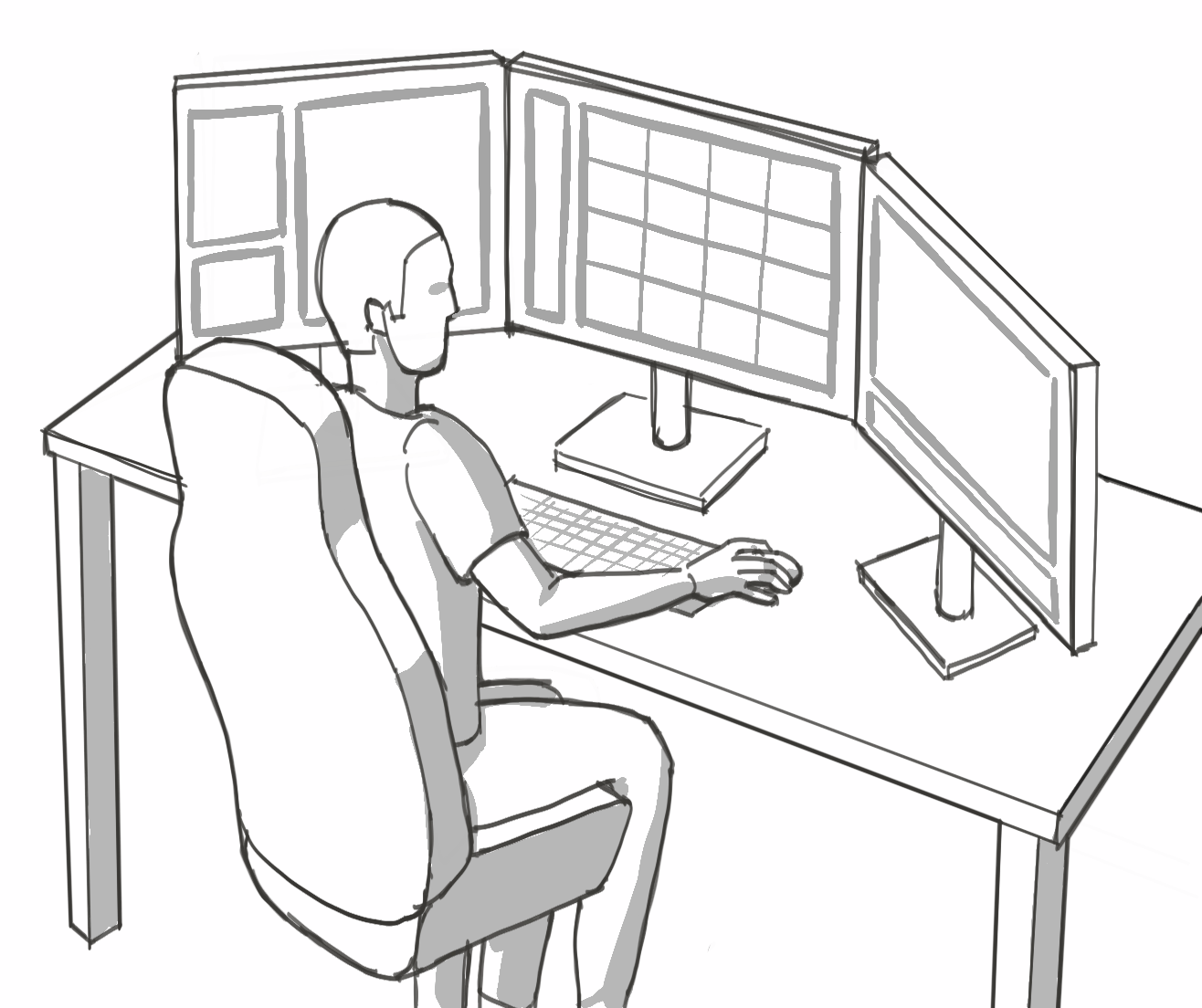
Design Prototyping
Screen Design Highlights
While designing the screens, we focused on organizing the necessary information and tools for a dispatcher by providing each screen with a main purpose. At the same time, we drew the system together by designing an adaptive interface system that coordinates between multiple screens.
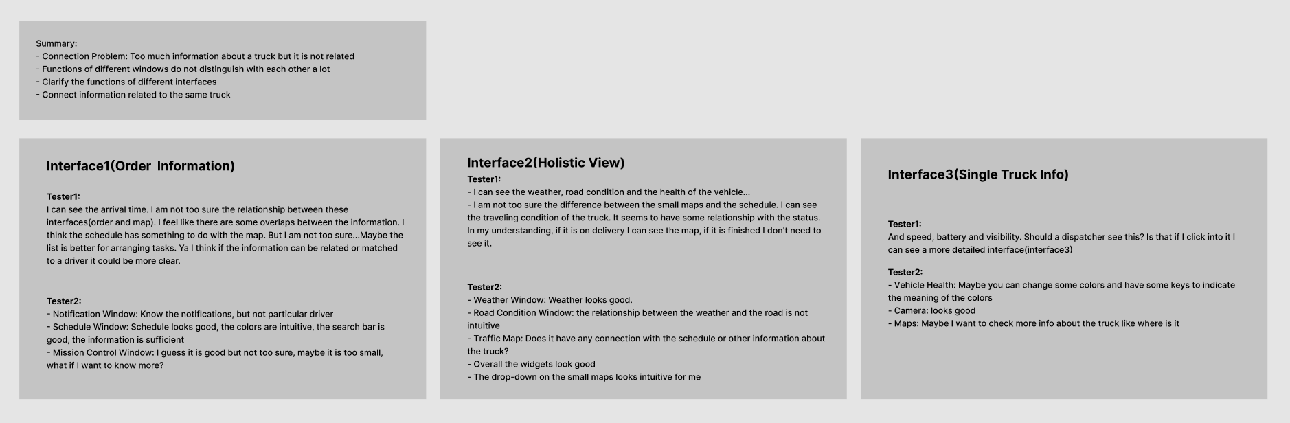
User Testing Results
We then tested with individuals of information systems and design backgrounds to gain more insights for our project. Our team was able to make changes to our design and structure:
- Connecting related information with the same styling
- Treating information with hierarchy
- Removing unnecessary and redundant knowledge
Final Screens
Reflection
This project was a great opportunity for me to work under a real client’s guidance. It was a journey to begin from scratch and dive into an industry that I am unfamiliar with. Since there were no existing products from Daimler, our team was able to work on the project with creative exploration of how mission control can change as technology advances.
Our team received positive comments from Daimler as it aligned with their current envisions of shifting towards a new monitoring system with larger screens. They especially liked our system’s ability to self monitor itself and the truck’s heath, which alleviates the dispatcher’s excessive communication needs.
© CHARMAINE QIU 2025