Typography study: Mrs Eaves
Fall 2019 - 4 weeks
An exploration of Mrs Eaves
to create a two-page spread(16” x 10.5”) and a video(1 minuet) that introduces the reader to the typeface - Mrs Eaves
Skills
Graphic Design
Animation
Background
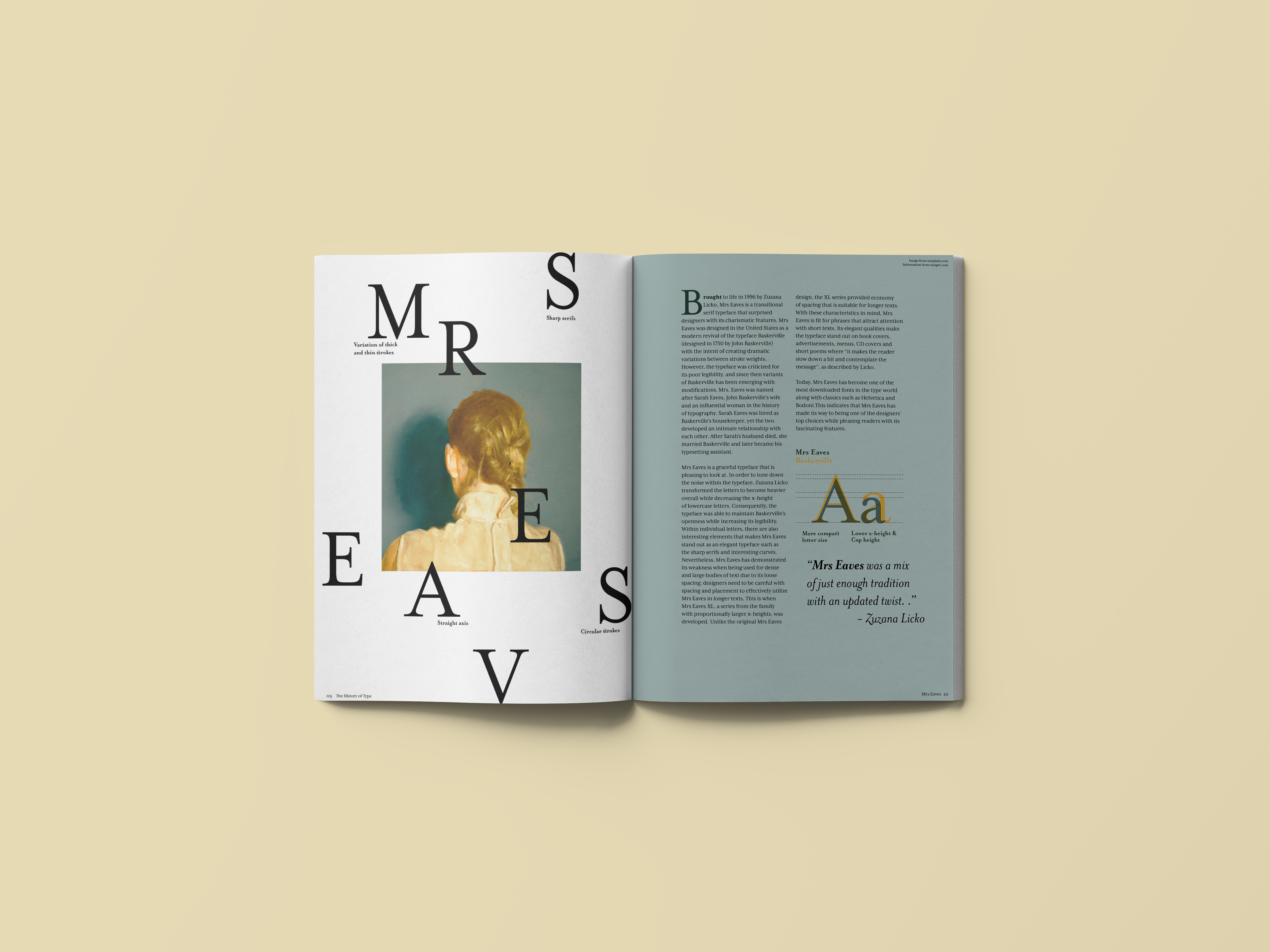
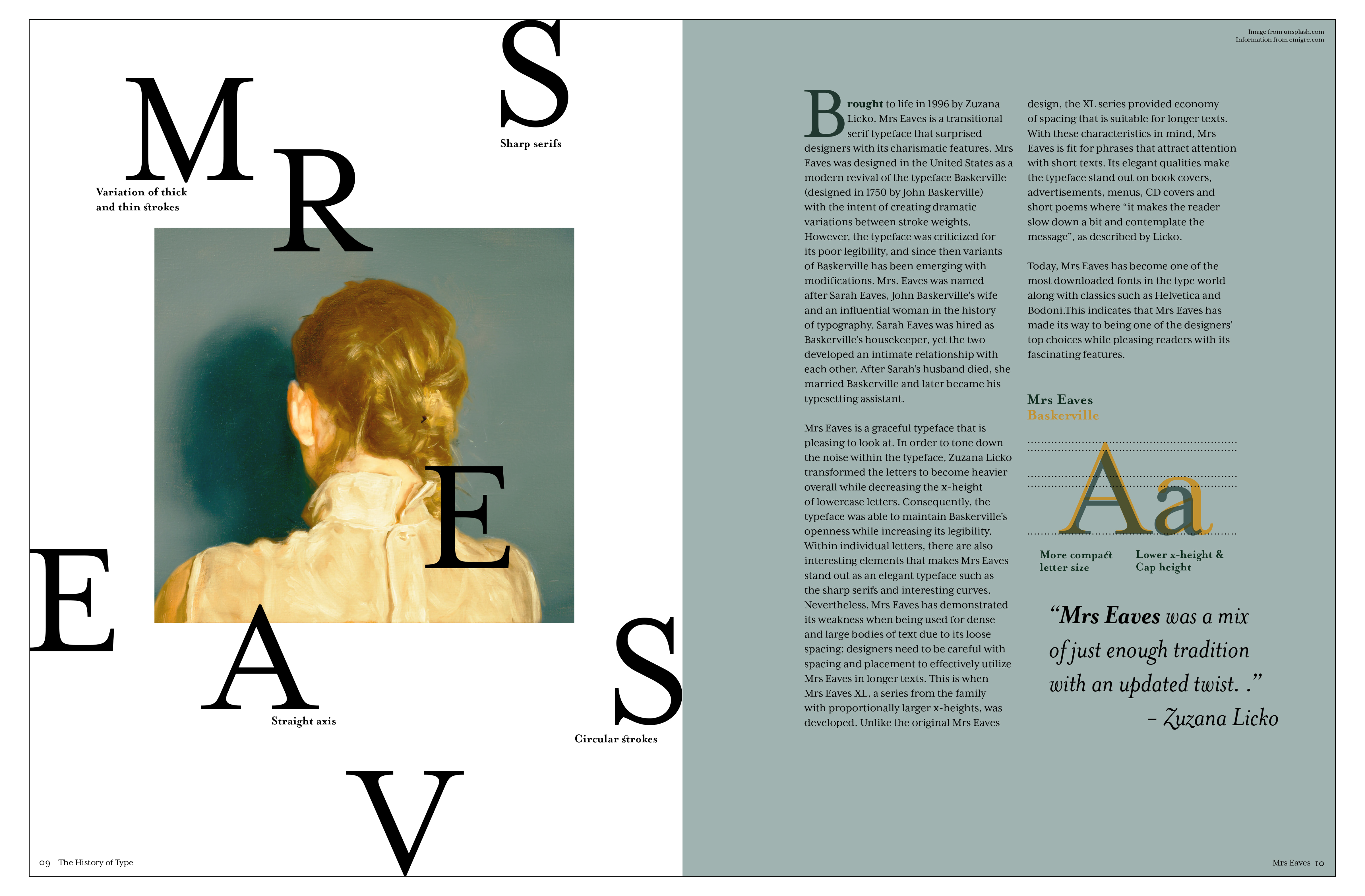
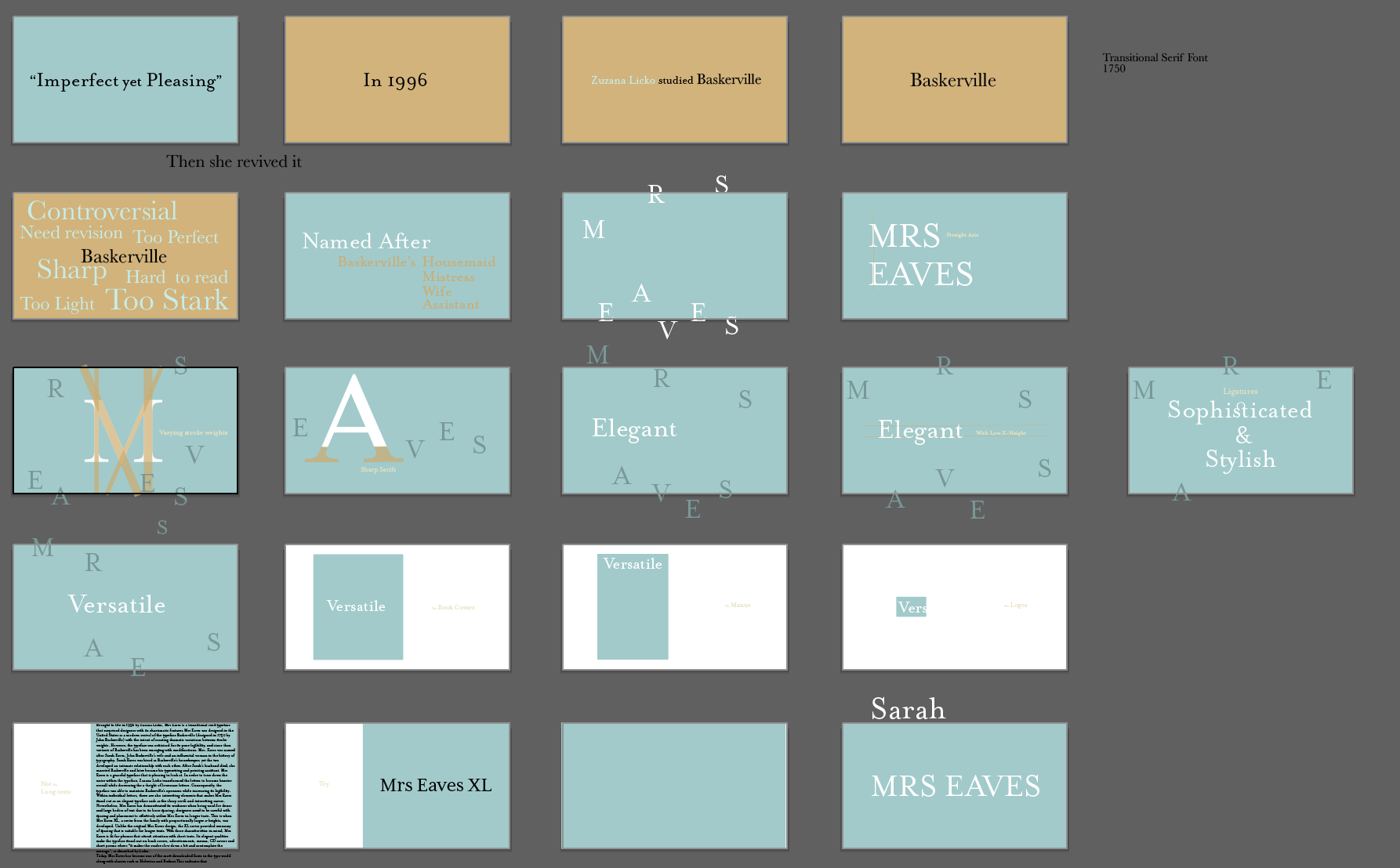
Mrs Eaves was a transitional serif typeface designed by Zuzana Licko in 1996 as a revival of Baskerville. Licko transformed the letters to become heavier overall while decreasing the x-height of lowercase letters. Consequently, the typeface was able to maintain Baskerville’s openness while increasing its readability.
The name of the typeface was honored after Sarah Eaves, Baskerville’s wife and an influential woman in the history of typography.

Process
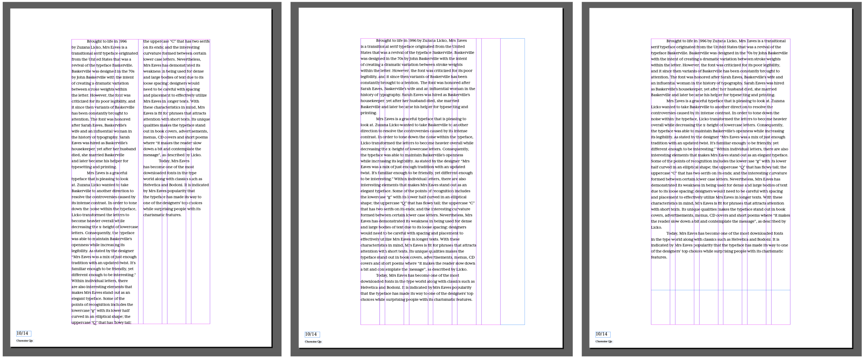
Typesetting, image finding, and layout sketching


Final Design
I decided to choose the image that portrayed a sense of mystery and shame to protray the story of Mrs Eaves.
The placement of letters invite the audience to make sense of the word "Mrs Eaves" as they see the image of a mysterious woman turned to her back. This composition evokes emotions from the viewer as they become interested in learning the story behind Mrs Eaves.
The Video
As a continuation of the typography spread, I created a type motion animation that highlights Mrs Eave's unique characteristics.
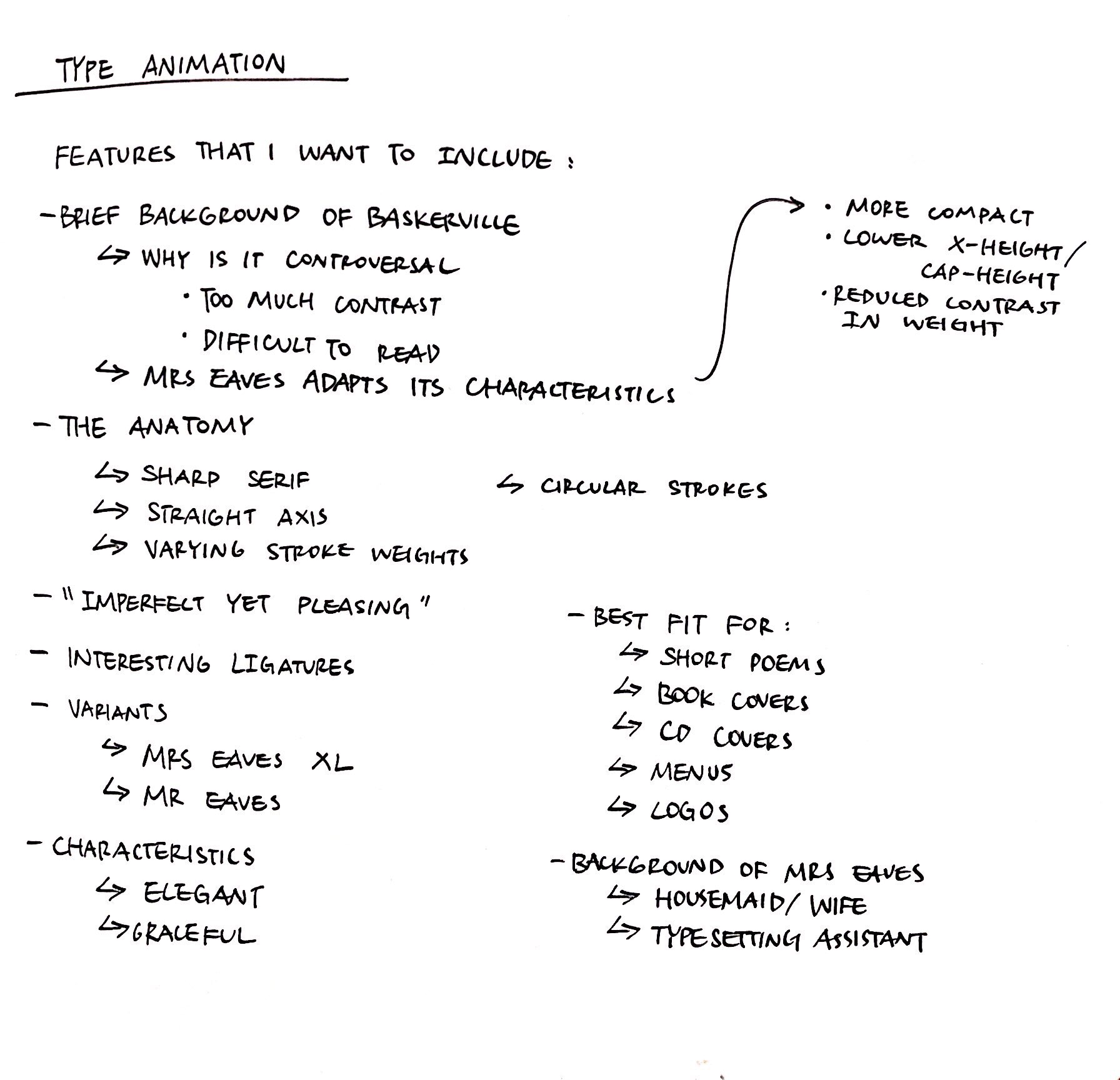

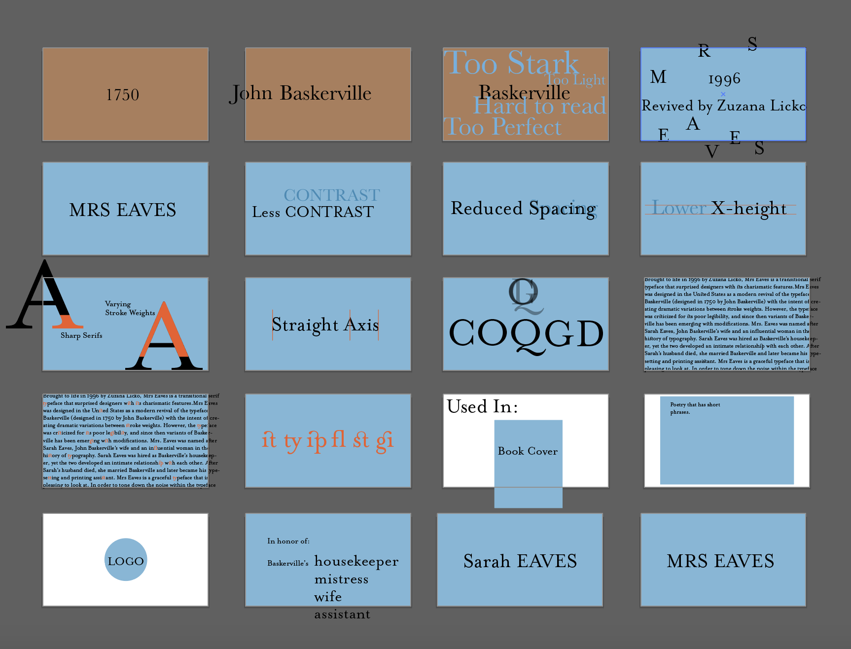
Final Storyboard
My final iteration consists of an introduction that draws attention to the viewer, a transition of color that shows the history of the typeface, visualizations of the typeface's anatomy, and the typeface in context.
Through this project, I learned to story-tell through motion graphics. The minuet long animation has helped me to communicate better as a designer, and incorporate my prior knowledge into communication practices.
© CHARMAINE QIU 2025