Spring 2021
6 weeks
6 weeks
Creating a brand identity for Vancouver SEGD 2022
As a global, multidisciplinary community of over 2200 members from 35 countries, SEGD plans, designs, and builds experiences that connect people to places.
I designed the identity for the SEGD 2022 conference, presuming the event would be held in Vancouver. Aiming to strengthen the connection between public spaces and their users through placemaking, I infused the identity of this cross-disciplinary event with elements that reflect the unique character of Vancouver.
Team
Individual
Individual
Skills
Branding
Experimental Type
Graphic Design
Signage Design
Branding
Experimental Type
Graphic Design
Signage Design

Concept
A Creative Space that is dynamic and constantly evolving in new directions without boundaries.
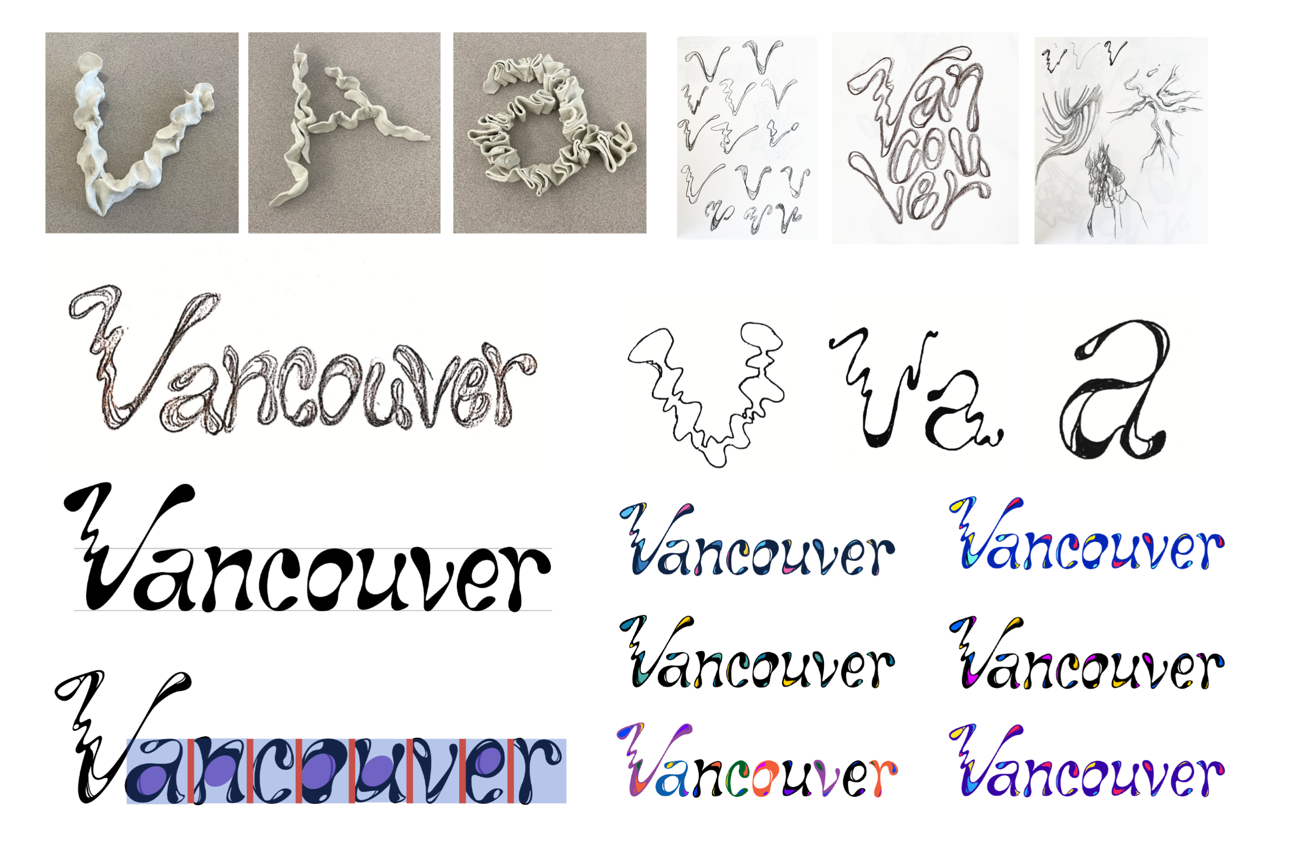
The logotype is inspired by Vancouver's natural surroundings, particularly its oceanic features, reflected in its free-flowing and fluid design. Guided by strokes of diverse weights, vibrant highlights, and a subtle slant to the letters, the design captures a sense of movement and dynamism.
A Creative Space that is dynamic and constantly evolving in new directions without boundaries.
The logotype is inspired by Vancouver's natural surroundings, particularly its oceanic features, reflected in its free-flowing and fluid design. Guided by strokes of diverse weights, vibrant highlights, and a subtle slant to the letters, the design captures a sense of movement and dynamism.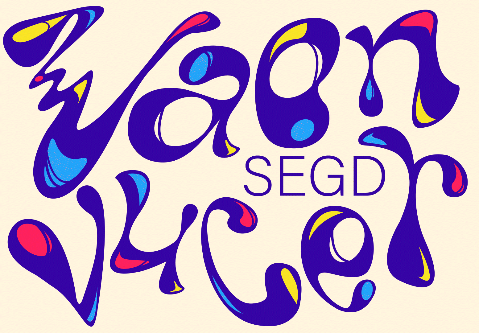
Logo Animation

Logotype with alternative color and arrangement
Design System
Color and Supporting Typeface
The primary color palette features a deep blue reminiscent of the ocean, complemented by a contrasting cream shade as the backdrop. Three additional supporting colors are selected to infuse elements of vibrancy into the creative event. To balance the intricacy of the logotype, a simple and legible typeface is chosen as the supporting font, creating a clear contrast.

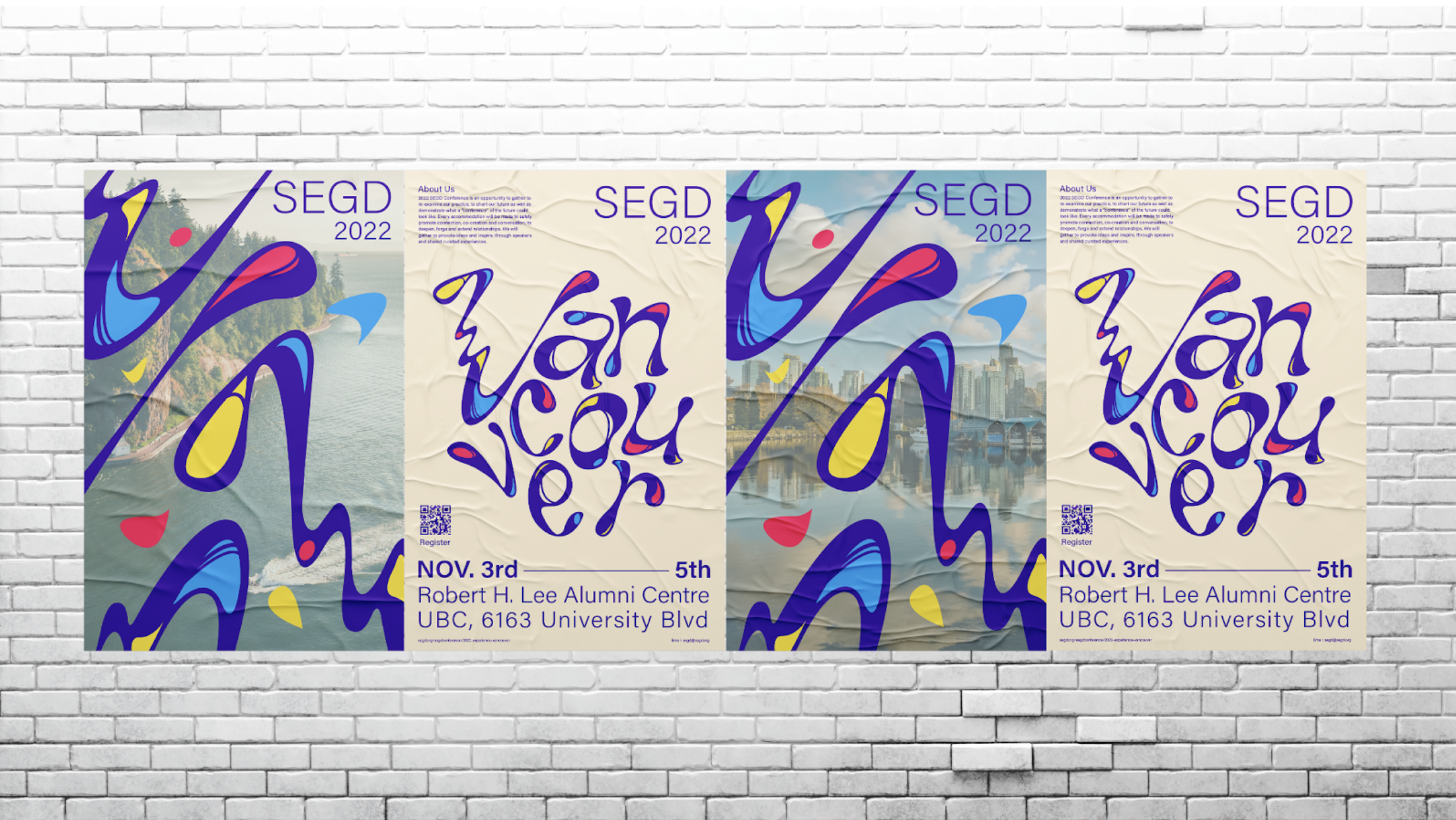
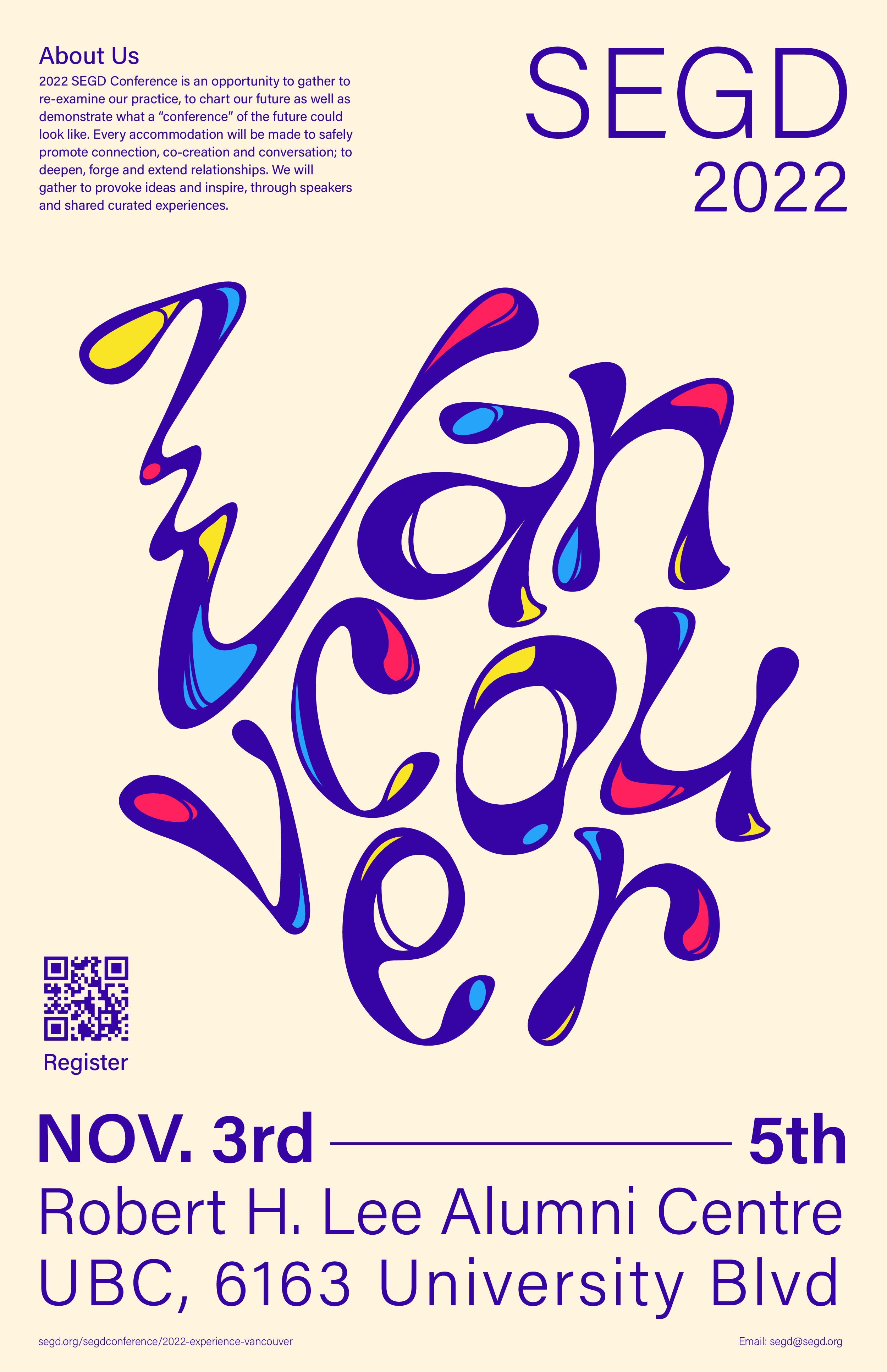
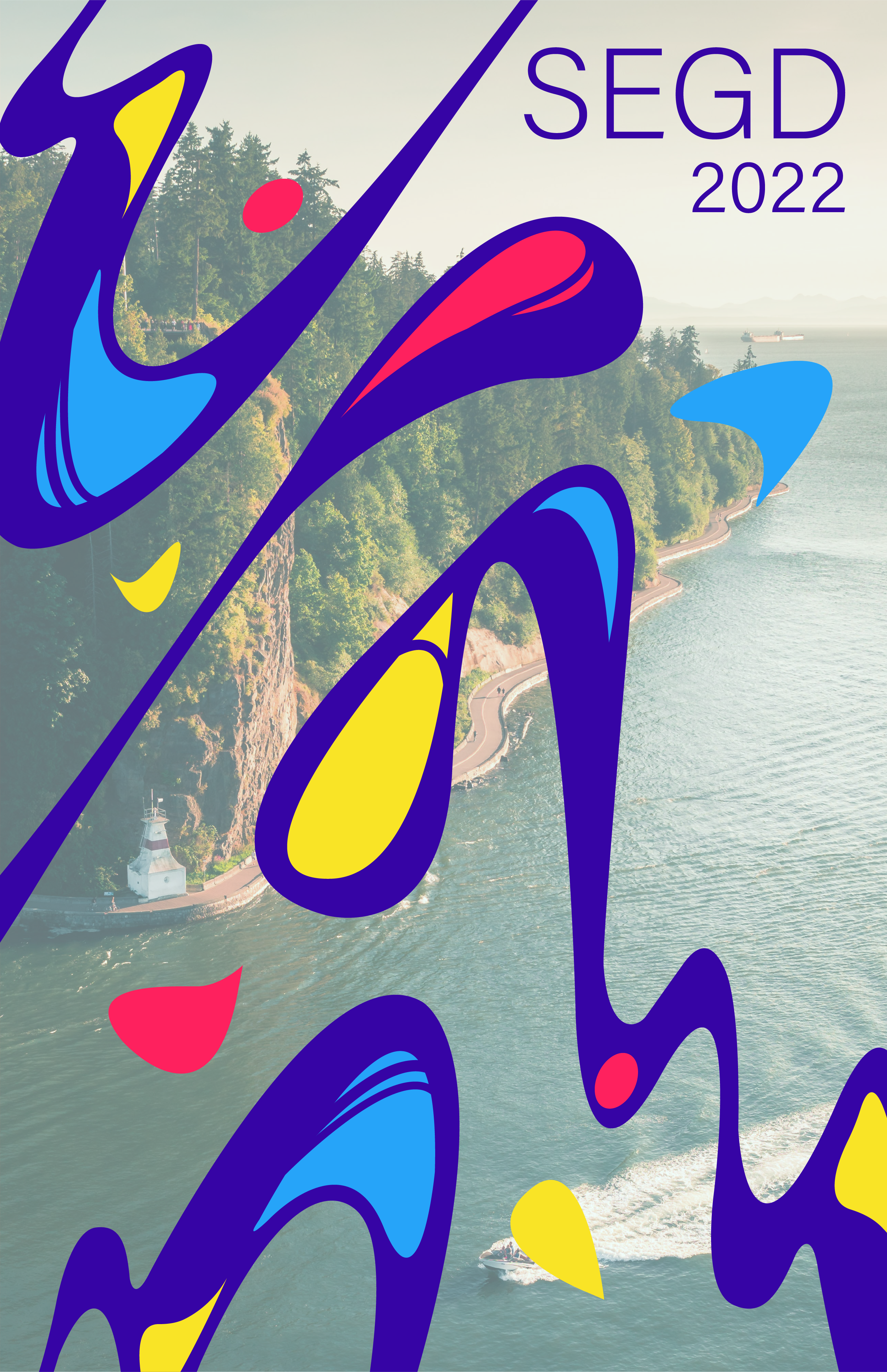
Communication piece
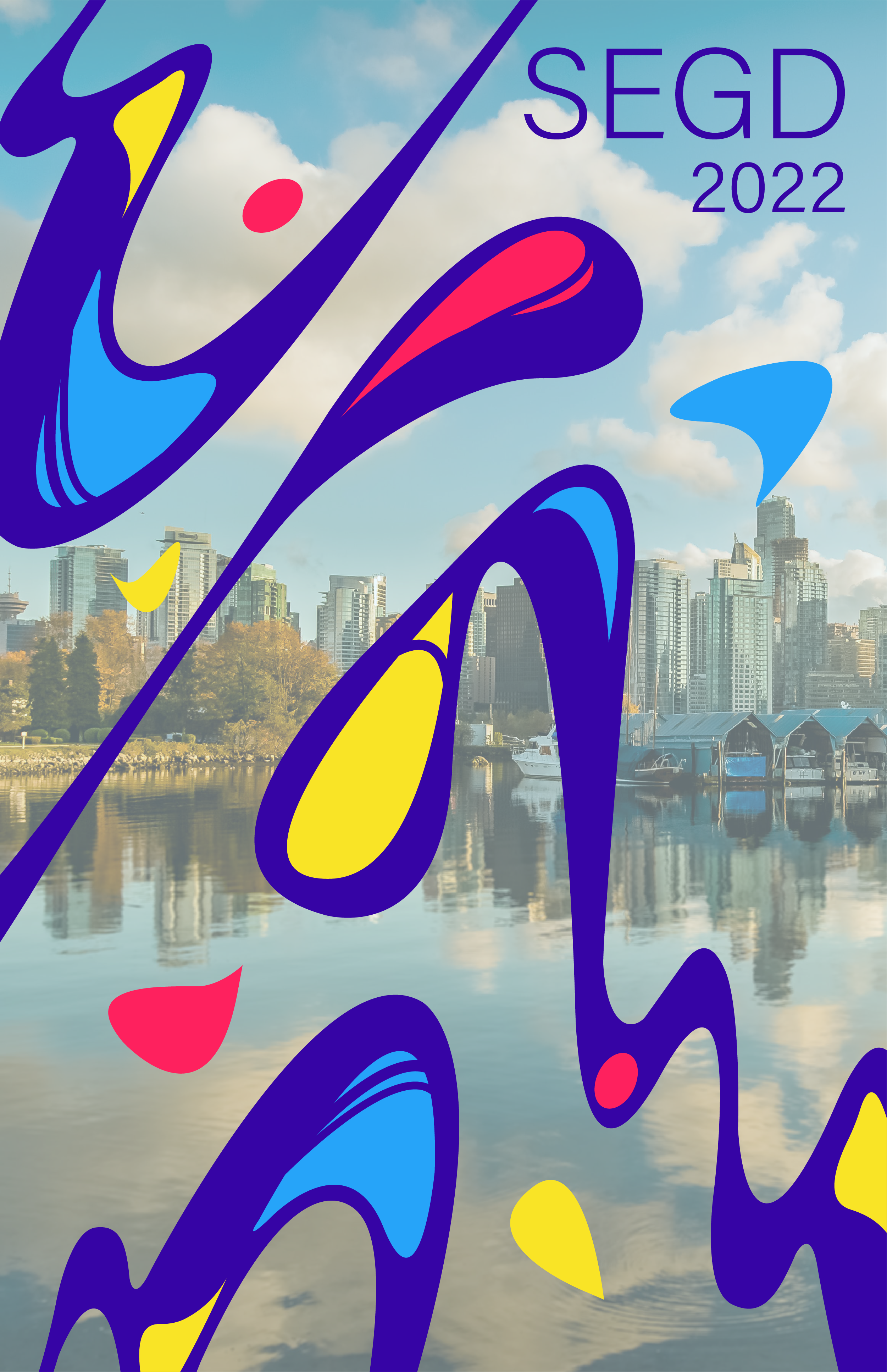
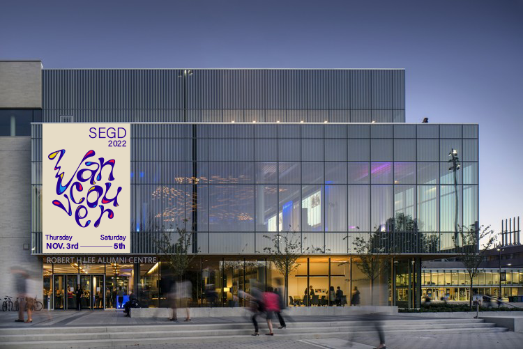
Posters
These posters serve as communication tools leading up to and during the event. I managed the amount of information on each poster according to its scale. For street posters, I juxtaposed close-up sections of the logotype with images of Vancouver, establishing a direct connection between the city and my design outputs.
Communication piece
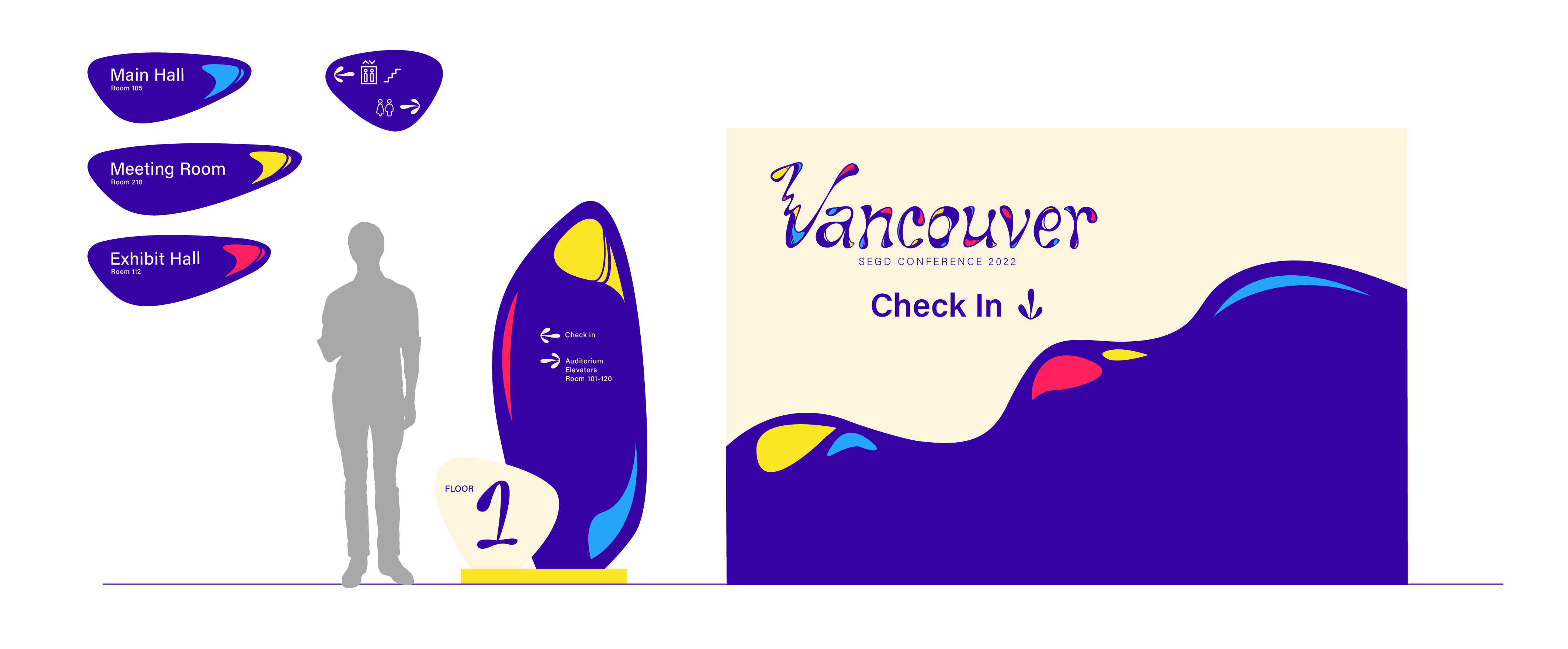
Interior Signage
I created navigational signage available in various scales, offering crucial information about each floor and the surrounding area.

Communication piece
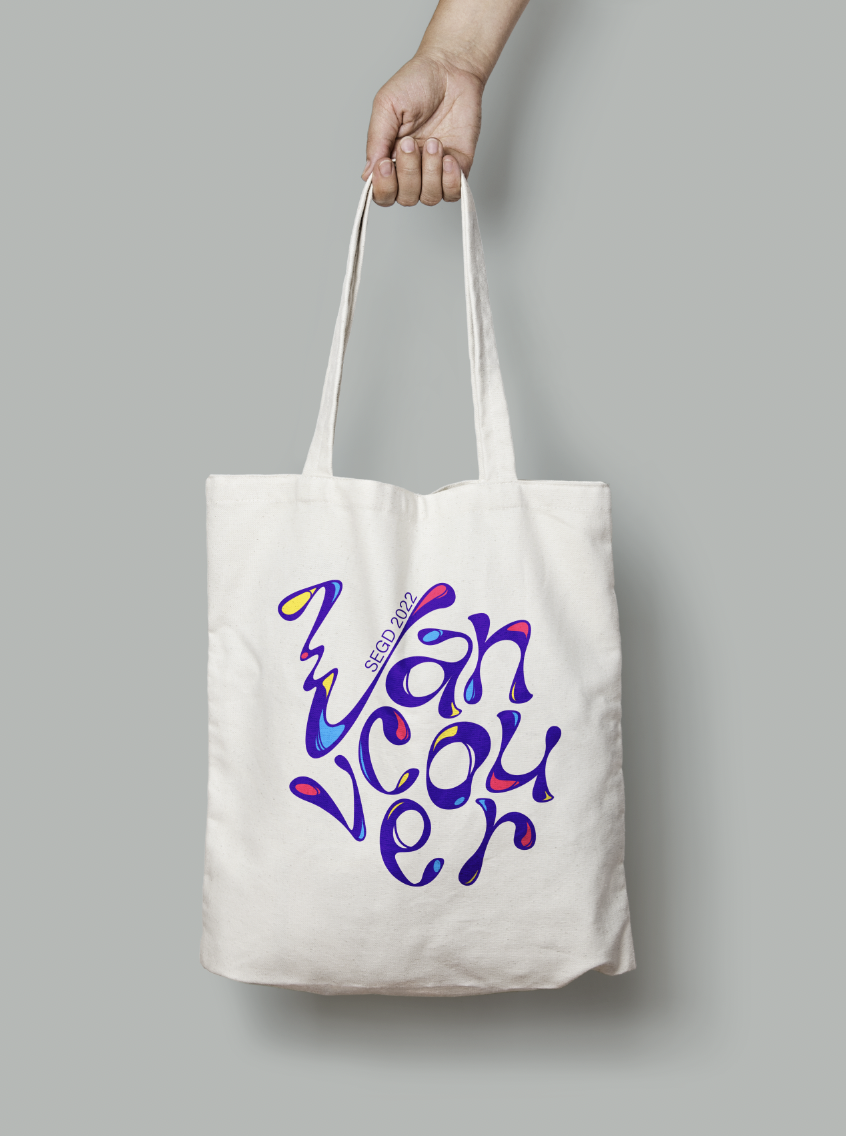
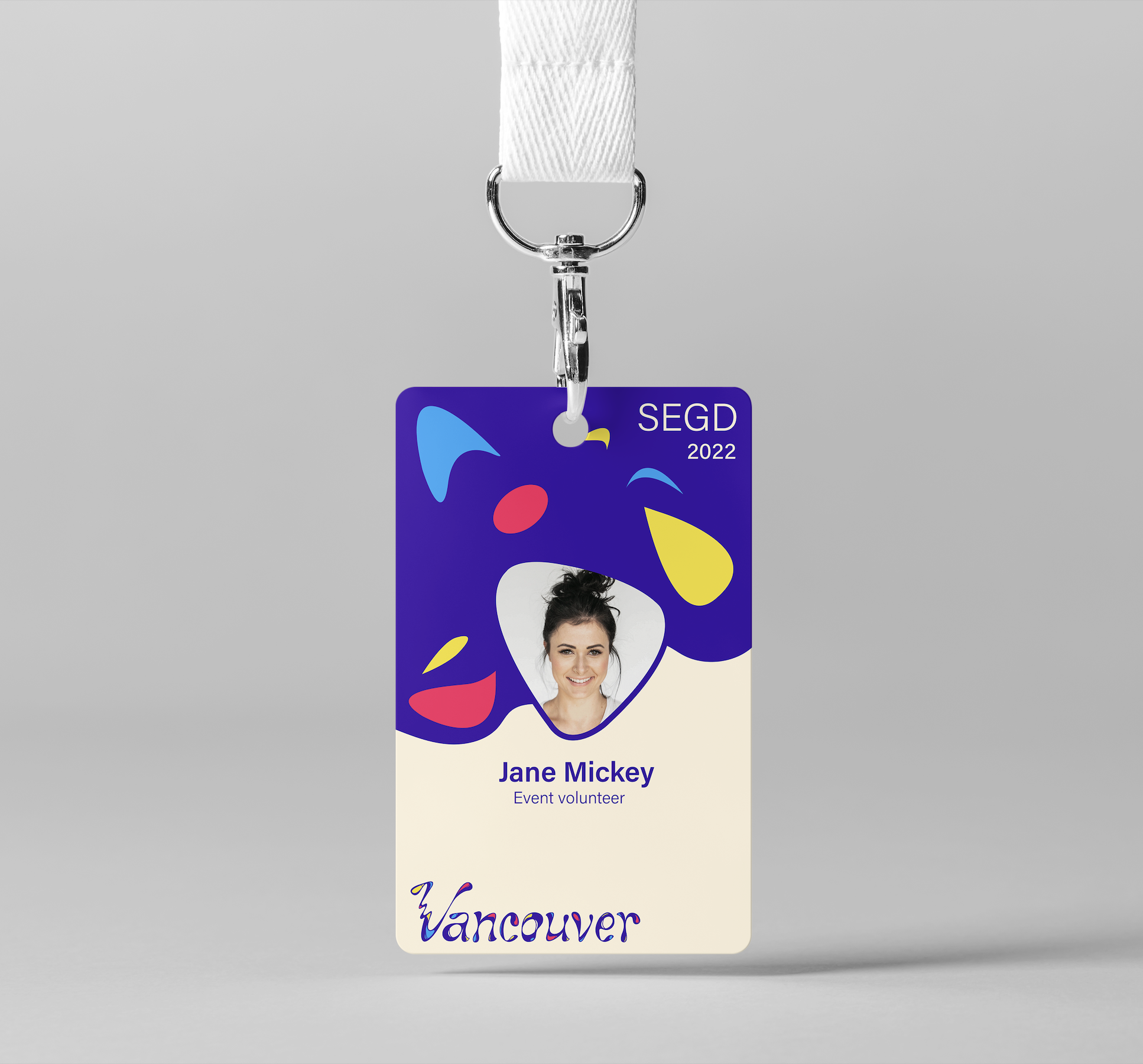
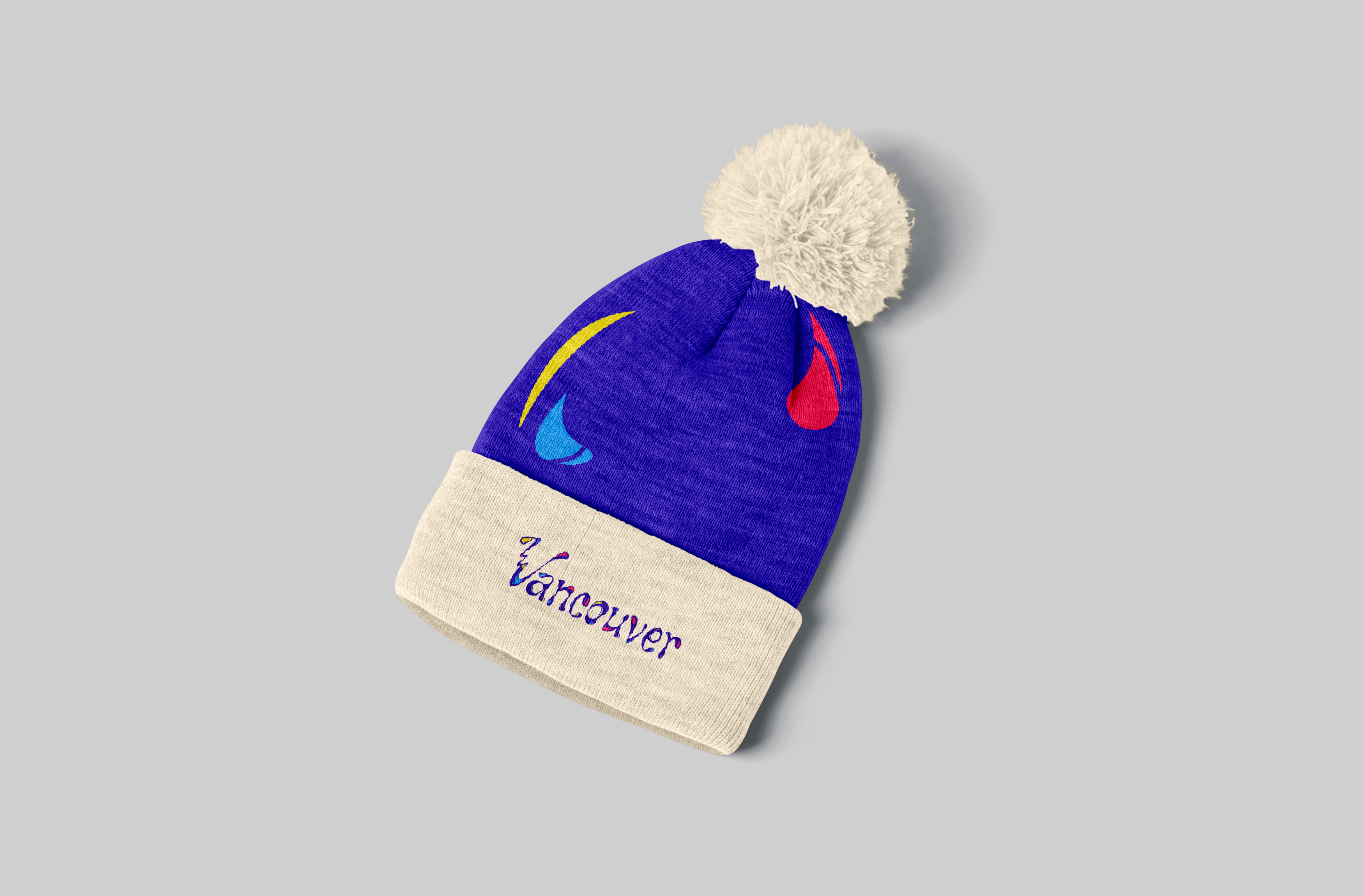
Merchandise
To bolster the event's identity, I crafted event-specific peripherals like name cards and merchandise, adhering to the established design system.
To bolster the event's identity, I crafted event-specific peripherals like name cards and merchandise, adhering to the established design system.


Process
![]()
Reflection
This project encouraged me to deeply explore the environment I'm designing for, extracting essential characteristics to guide my design choices. I discovered the significance of striking a balance between introducing transformation and new elements to the design while maintaining the overall coherence. Every variation and expansion in design should serve to enhance the event's identity.
© CHARMAINE QIU 2025